6 Failsafe Color Combinations That Designers Always Fall Back on – 'They're so Reliable!'
In a world of infinite color combinations, we talk to several designers to give you the easy options you can always count on

Anyone who's renovated their home without an interior designer knows what a task it is to pick out the right colors that go with your decor, complement your natural lighting, and also feel like an expression of 'you'. There are infinite combinations available that can easily lead to overwhelm, but how do you know which is the most reliable option?
According to Helen Shaw, paint expert at Benjamin Moore, choosing the perfect pairing has a lot to do with color theory. ‘Deciphering what colors go well together depends on where on the color wheel they sit,' she says. 'Consider creating a monochromatic scheme that uses varying levels of saturation of one color or, alternatively, an analogous scheme uses adjacent colors on the wheel.'
To make your job easier, we consulted several designers who share their insights on the different color combinations that they always fall back on whenever in doubt. Not only that, but they also shed a light on where these shades would look best and how to decorate with them for an on-trend paint idea you're guaranteed to love.
1. Black and White
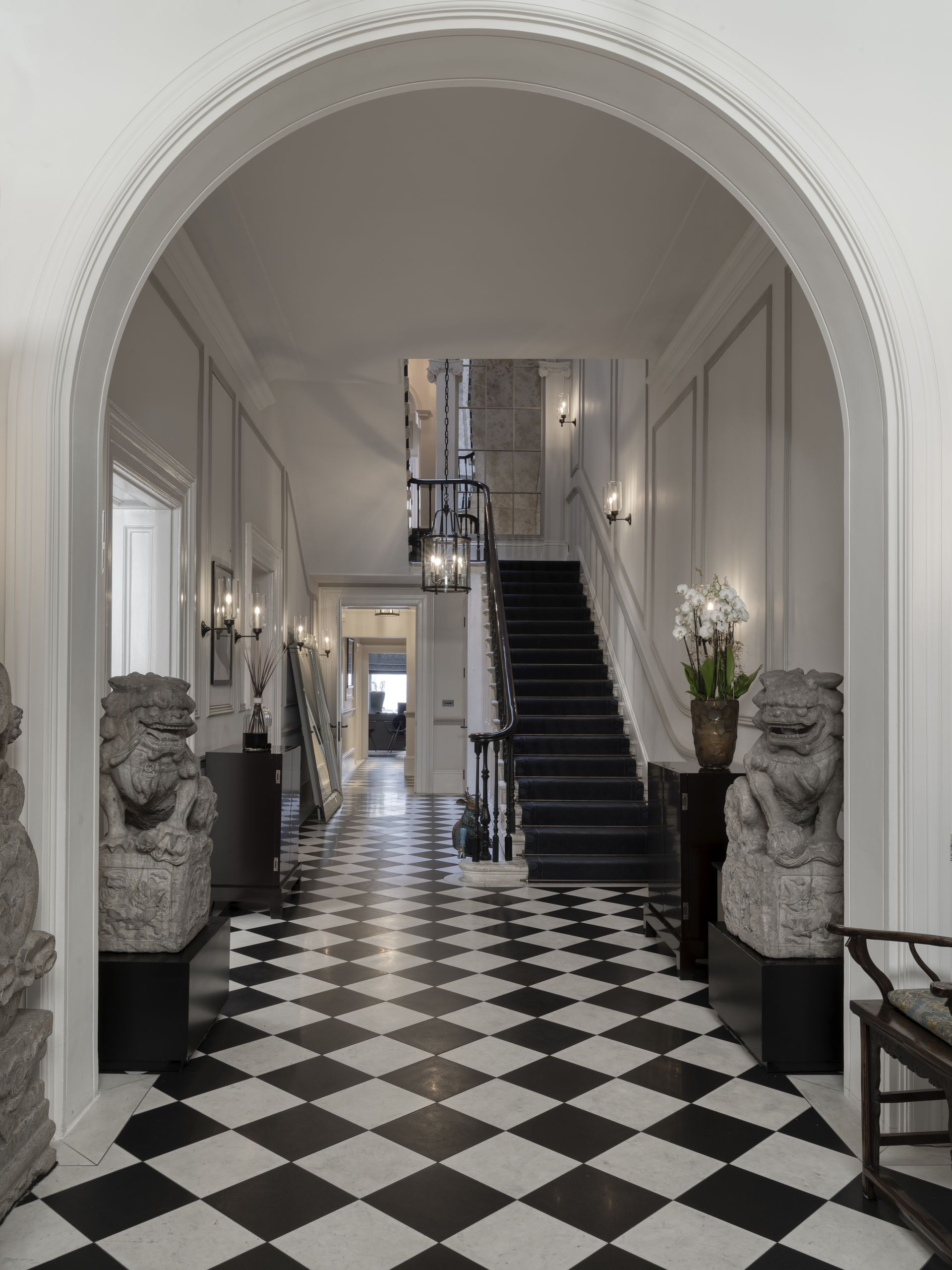
This timelessly classic pairing of black and white can never go out of style. The combination of these two colors is pure magic. 'For the last hundred years monochrome has been a constant and always makes an impact,' says Manuela Hamilford, founder of Hamilford Design. 'Monochrome has been a mainstay of design. It’s versatile and slick when done correctly, and we love to incorporate black and white in tiling for a clean finish in hallways and bathrooms. You can use a dark charcoal gray too, to give a slightly softer feel.'
2. Yellow and Off White

It might not be a first choice, but yellow is the one color you can't go far wrong with, especially paired with a cream or off-white. The sunshine positivity upon its sight is unmatched, and paired with the yellow undertones of a warm white, it will bring comfort to any space.
If you're someone who wants to make a bold statement, you can opt for colors like India Yellow by Farrow & Ball and pair it up with a subtle shade like Off White from the same brand, which can also be used on your furniture. 'While this color can be ideal for any room, Patrick O’Donnell of Farrow & Ball suggests that yellow kitchen ideas often work best. ‘The kitchen is the hub of the home, the rendezvous point at breakfast time, the social gathering in the evening,' he says. 'Consider positive and energizing colors - especially yellow, the color of creativity.’
3. Blue and White

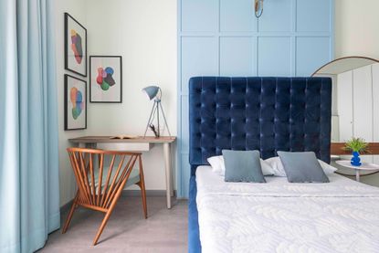
Blue is proven to have a cool and calming effect and, by incorporating this with white, you create a room that gives you beachy and relaxing vibes. 'Classic and timeless, this is one of our favorite combinations for comfortable living spaces,' says Alyssa Devoe, senior designer at KA Murphy Interiors.
Blue is a versatile color that can adapt itself to the way the decor is set. Light, steely blues have dominated color trend predictions for 2024 with the likes of Sherwin-Williams and Valspar announcing cooler tones of the shade as their Color of the Year. If you're thinking of going for a darker shade like royal blue, however, add wooden furniture to the room for a more warm and cozy heritage feel.
4. Pink and Orange

With the Barbiecore fever still in full swing, pink is certainly still having its moment. Paired with orange, these clashing tones can make a real impact, so if bold and bright is your vibe, don't hold back. 'It's a bright and cheerful duo to liven up a living room,' recommends Alyssa.
Even though it's a bold choice, you can still make it work more subtly through your decor. By pairing it up with gold interiors you can go for the royal, glam look or just let the walls speak for you but mixing it up with funky interiors.
5. Peach and Green

Two colors that are trending this season but also have enduring appeal are shades of green and pink. The hues go so well together despite being so different, and with a bit of thought to color theory, you can find the best shades for your space.
‘Opting for two colors that sit opposite one another will add a dash of invigoration - this is called a complementary scheme,' says Helen Shaw at Benjamin Moore. 'Pinks and greens produce a really pleasing aesthetic and there are many ways to create interplay between the shades.’
6. Forest Green and... anything
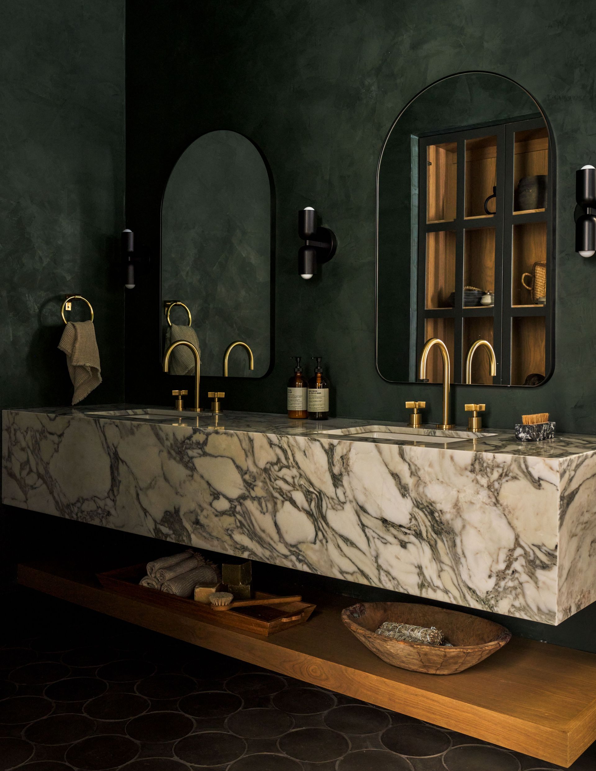
In the top charts of 2023, forest green is probably one of the most versatile colors we've come across. This regal shade of green goes with almost anything, from earthy browns to hot pinks. Pair it up with golden decor and it will give the impression of 21st century modern majestic interior.
'We love this strong color alongside metallic rust or antique gold or brass,' says Manuela, who especially loves this natural choice of color in a bathroom or powder room. 'As bathrooms are separate from the living areas of the home, they don’t need to fit into the overall theme or be committed to it on a large scale,' she adds. 'It also works well in dining areas, giving a sense of luxury.'

Price: $52.99
Quantity: 1 gallon

Price: $70
Quantity: 1 gallon

Price: $70
Quantity: 1 gallon
Be The First To Know
The Livingetc newsletter is your shortcut to the now and the next in home design. Subscribe today to receive a stunning free 200-page book of the best homes from around the world.

Devangi is currently pursuing an MA in Magazine Journalism from City, University of London and aspires to be a lifestyle journalist after finishing the course. As an up-and-coming talent in the industry, she has quickly adapted to the world of interior design and reports on all the latest news and trends.
-
 10 Rules For Decorating Small Spaces - How Designers Create A Cozy Room That Also Boosts The Square Footage
Experts reveal their tips and tricks on how to combine a welcoming vibe with space-stretching interior design techniques...
By Ruth Doherty Published
-
 'Subtle Gray' Is The New Color Trend Designers Are Using to Replace White — It's So Much Warmer and More Luxe
It’s the new shade grabbing designers’ attention and you should know about it. But what is ‘subtle gray’, and how can you use it?
By Raluca Racasan Published
