7 of the best cream wall paint colors, as chosen by designers – 'they look modern, and anything but magnolia'
Cream paint colors have had a bit of a bad rap, but designers swear they're the perfect neutral, that's versatile, warming and classic. These are the exact paint matches they're choosing
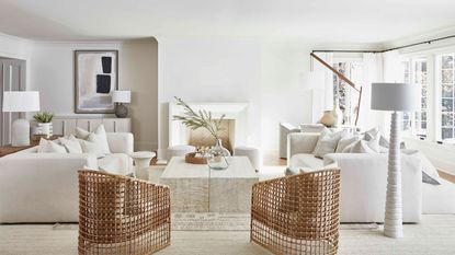

As anyone who has attempted to choose a cream paint will know, there are thousands to choose from, and not all cream paints were made equal. For such a well-used, well-love neutral, there’s a surprising amount that can go wrong when choosing a cream. Mostly because there’s the risk of going too creamy, too yellow, and tipping from chic but warm and soft into basically a pale yellow that’s favored by landlords the world over.
So what’s in the perfect, versatile cream paint? What tones and tints should you be looking for in order to create the warmth that cream rooms aim to achieve, without going too well… magnolia – a once-loved cream that is now despised by both designers and anyone with taste. We asked designers and color experts for their favorite brands and shades for a versatile cream paint color that gets the perfect balance between fresh and modern and warm and welcoming.
1. Greek Villa, Sherwin Williams
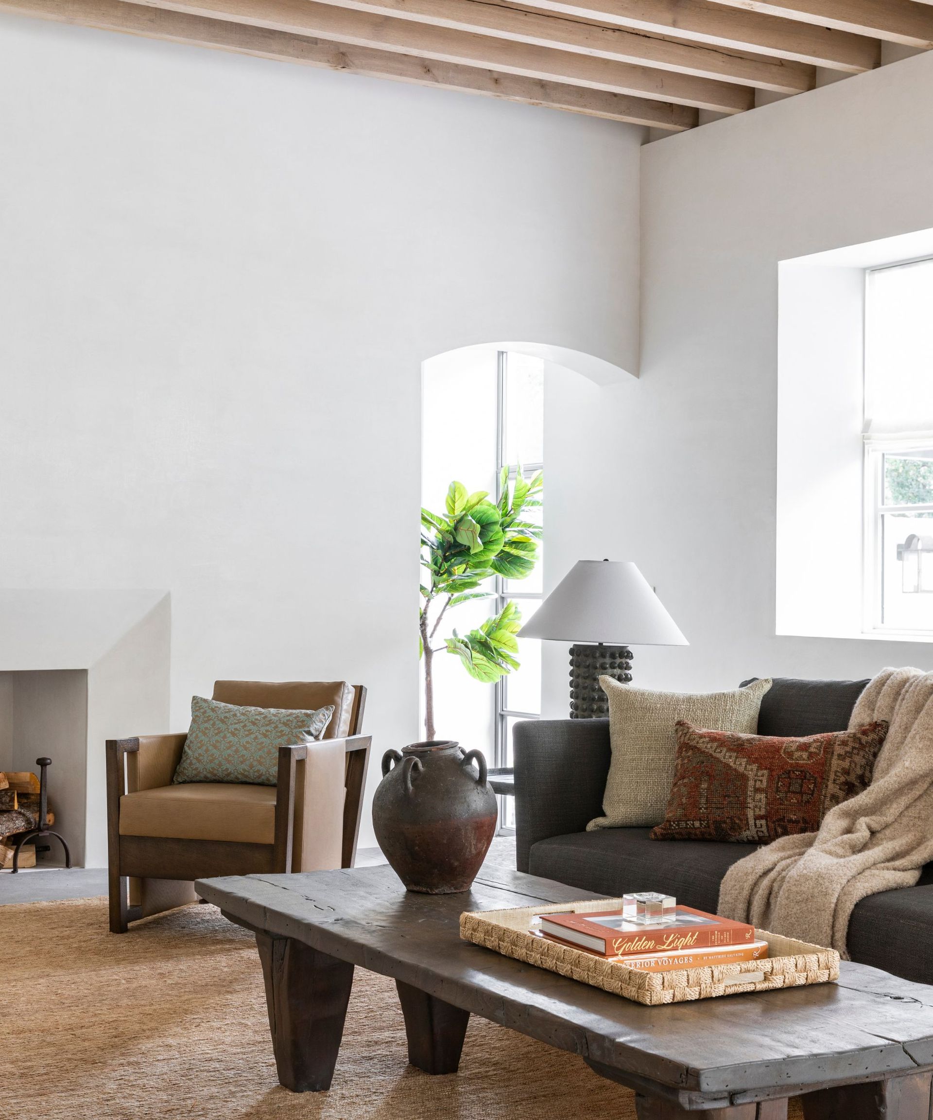
'I love Sherwin Williams Greek Villa,' says designer Marie Flanigan. 'The warmth that this creamy white adds to a space makes it beautifully luminescent and intimate. The undertones of Greek Villa create a perfect canvas for layering muted gem tones, which together feel elevated and welcoming. Creamy white tones are often wonderful choices for a wall color as they keep the space from feeling sterile or cold.'
If you are after a cream paint that's as fresh and bright as a white, but still has warm undertones, Greek Villa is perfect. As you can see in this cream living room, it's really soft, which gives it the appearance of being slightly warmer than it perhaps is, and it's one of those neutrals that comes to life when it's used in a light-filled room. It's super brightening but has none of the harshness of a brilliant white and all the warmth of a cream.
2. Swiss Coffee, Benjamin Moore
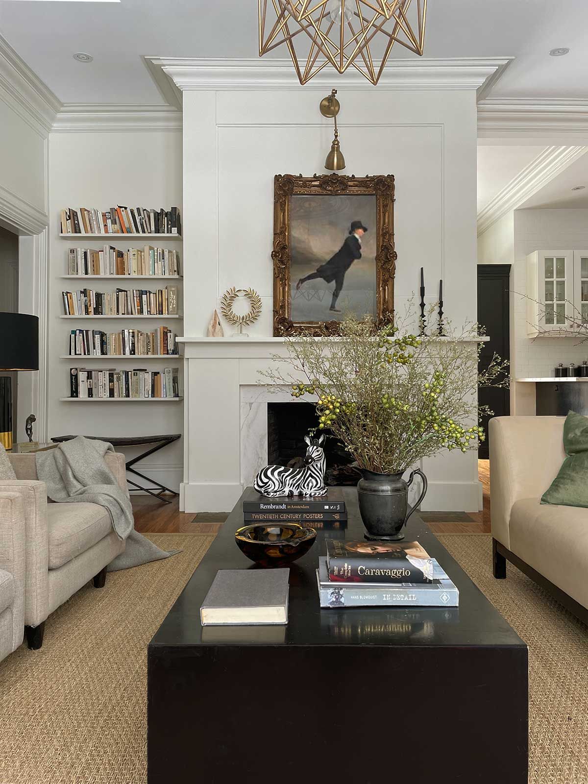
'I love Benjamin Moore's Swiss Coffee whenever I need a really warm and inviting cream tone,' says designer Kathy Kuo. 'It's bright and cheerful without being too stark, and it features just the slightest of green undertones so it pairs wonderfully with natural materials like light-colored wood, terracotta, rattan, and natural stone.'
This versatile cream paint has a bit of a cult following, in fact, it might be one of the most popular cream paints out there. It's because it's the perfect cream, it's that ideal balance between not too yellow so it still feels fresh and modern, but there's enough yellow in there that it's a super soft and inviting shade.
It's cream for sure, but it's also a really versatile backdrop shade that can work with any color you pair it with. Something that you have to often be wary of with cream paints is that if they are too warm they don't pair well with cooler-toned shades like grey or blue, Swiss Coffee however works wonderfully with these shades too. It also looks amazing with darker accents like a soft matte charcoal.
3. Skimming Stone, Farrow & Ball
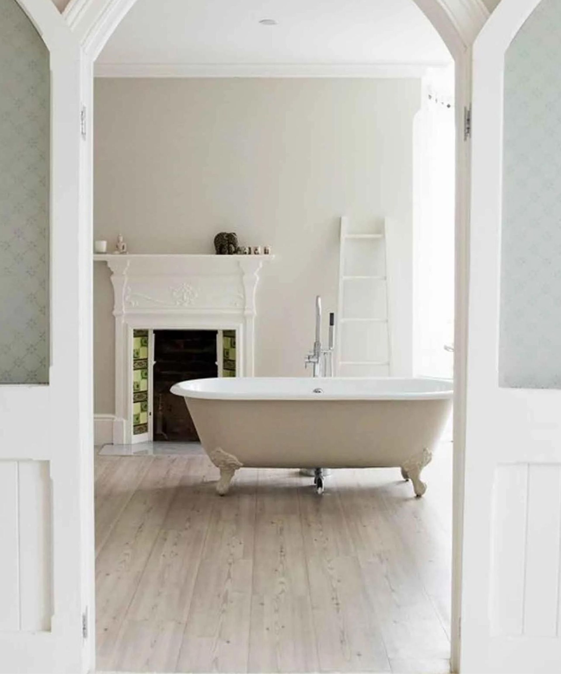
This is a classic cream paint, it's got grey undertones so zero risk of appearing too yellow, and in a cool-toned room appears pretty much like a grey in fact, just slightly warmer. It is one of those chameleon shades that can look very different under different lights so be sure to order swatches and see how it shifts in your space.
If you are after a contemporary cream, this is undoubtedly one of the best Farrow & Ball paint colors. Just be sure to bring out those warmer tones with soft, warm lighting and use it in a room that gets plenty of light, if you want to appear more creamy than warm grey.
'I love to use Farrow & Ball's Skimming Stone, in the dead flat finish for a chalky, moody feel,' explains designer Kati Curtis. 'Due to the great quality of pigment in Farrow and Ball paint, we’re able to achieve a matte finish that’s still durable and easy to clean.'
4. China White, Benjamin Moore

'I sometimes think white is a misunderstood color. To my eye and decorating sensibility, white is not a single color, but a glorious – albeit subtle! – spectrum of hues,' explains designer Lisa Sherry.
'The best white paints lean toward the warm side, that is a bit creamier. These creamy whites are so pleasing to the eye and they also are amazingly adaptable in different decors. Light changes everything, so I always sample and test a variety of hues before I specify a final choice.'
'To get a creamy white that doesn’t go yellow, I gravitate toward paint colors with warm grey and taupe undertones,' she adds. 'Cool whites typically go blue. I love Benjamin Moore’s China White. It's a fresh creamy white hue, warm but not yellowed. It’s what makes these colors special in my interior design practice.'
'If a mean-spirited genie came out of a bottle and told me I could have only ONE warm white paint color in my life, I would probably pick Benjamin Moore’s China White. I love China White for its versatility. It’s a true chameleon, working well in rooms bathed in natural light, as well as northern exposure spaces, where sunlight’s at a premium.'
5. White 05, Lick

'Magnolia almost put people off the idea of a cream paint because it was this yellowy color that, it looked cheap and naff,' says explains Tash Bradley, head over interiors at Lick Home. 'So we all got very nervous about using magnolia and so everyone turned to grey.'
'It's now done a full 180 this year, and my prediction for next year, is cream paints, warm based neutrals will be massively in in the world of color trends, for any and every style. Lick's equivalent of a cream-based paint is White 05, which is a white with a yellow and grey undertone and super versatile, it can work in any room with any aspect.'
'What's nice about this warm-based neutral with that lovely soft cream tone to it is that it's incredibly welcoming, it's very soft on the eye, it doesn't ask much from you. But the key to decorating with White 05 is to paint everything in it. So paint the walls the same color as the ceiling, plus the woodwork and any radiators. would color-drench the room in cream for a more contemporary look.' she adds.
6. Joa's White, Farrow & Ball,
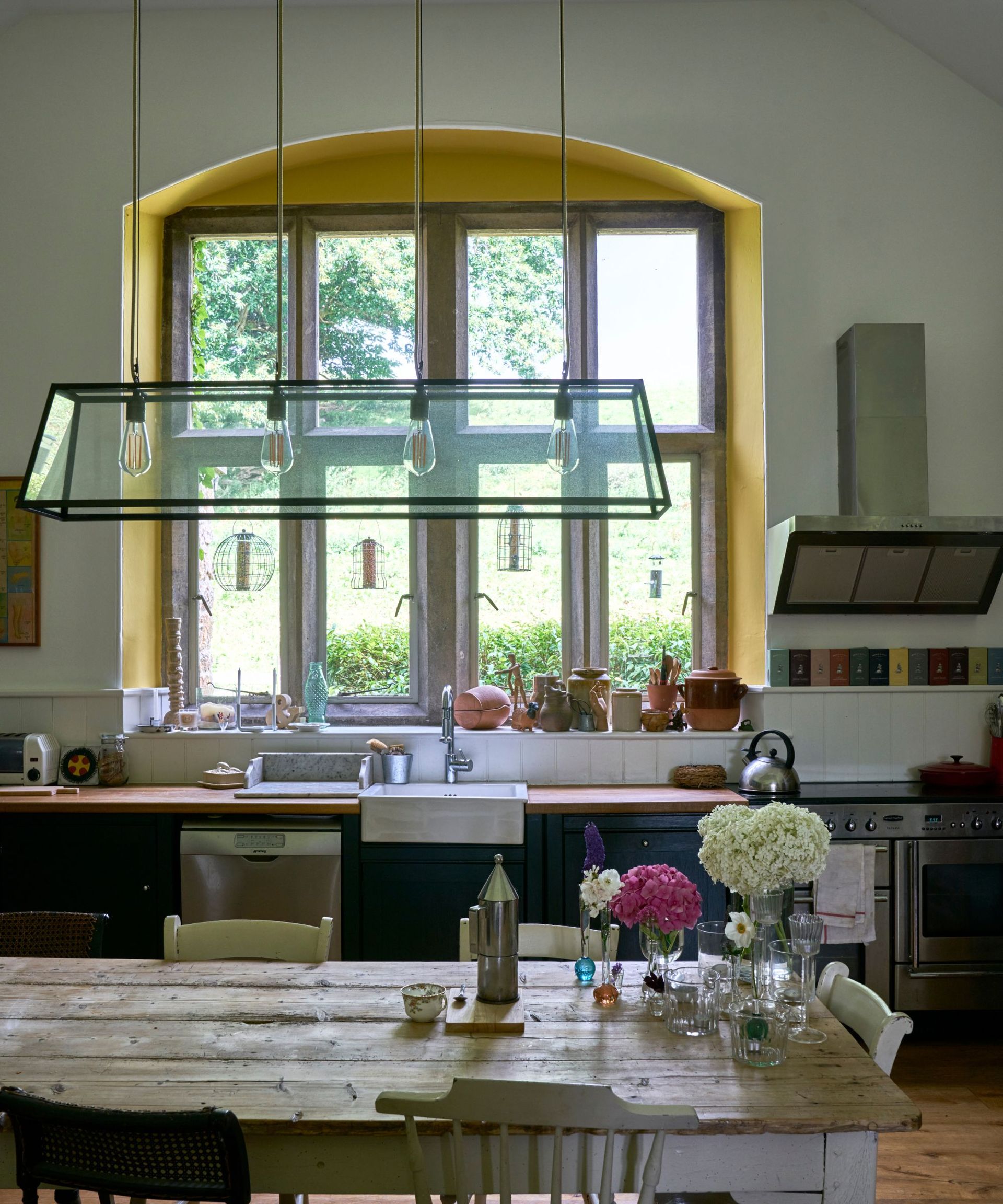
'The right cream shade creates softness over generic whites, and as a wall color can deliver gentle warmth if a clean, light room is what you’re after. Cream shades with a hint of yellow or red pigment like Farrow & Ball's Joa’s White are extremely versatile and can be paired with a wide palette of shades for a soft combination.' explains Patrick O'Donnell of Farrow & Ball.
Again, this is quite a contemporary cream, Farrow & Ball describe it as so too, designed to go with the cooler colors and textures found in a modern style, hence why it pairs well with greys and darker shades. If you are after a cream kitchen color that's not going to feel too farmhouse-like this is a good option, just ground it with a deep grey or even black to keep it feeling contemporary.
It teeters on the brink of being beige, but it's not as muddied as a beige and has a far brighter, and light-reflecting quality. It's the perfect warm shade if you are decorating with neutrals and want to layer up with shades to create a tonal look, bring in some paler warmer whites, and deeper true beige shades and you've got the look easily.
7. Soft Chamois, Benjamin Moore

'Creams have a warm undertone so are ideal for those looking to avoid the clinical feel of a pure brilliant white, while still creating a clean and understated look,' explains Helen Shaw, a color expert at Benjamin Moore. 'The lack of any grey pigments helps to keep the room feeling fresh and is perfect for north-facing rooms or spaces without too much light.'
'Benjamin Moore's Soft Chamois is a soothing shade with a warm, delicately shaded case. It’s incredibly versatile and has a beautiful ability to pick up on what’s being reflected in the light, so if, for example, you have plants placed next to the window of a room, the color will pick up on this and start looking green inside too,' she adds.
Soft Chamois is one to go for if you want a more yellowy, but of course not too yellowy, cream. Pair it with a white and you'll really see the contrast with those warmer tones, and in fact, this combo works really well to keep this more traditional cream looking fresh. It looks gorgeous paired with a sage green too, or a warm taupey almost lilac grey, actually, all these shades together would create a perfect, not quite neutral but almost color scheme.
Be The First To Know
The Livingetc newsletter is your shortcut to the now and the next in home design. Subscribe today to receive a stunning free 200-page book of the best homes from around the world.
Hebe is the Digital Editor of Livingetc; she has a background in lifestyle and interior journalism and a passion for renovating small spaces. You'll usually find her attempting DIY, whether it's spray painting her whole kitchen, don't try that at home, or ever changing the wallpaper in her hallway. Livingetc has been such a huge inspiration and has influenced Hebe's style since she moved into her first rental and finally had a small amount of control over the decor and now loves being able to help others make decisions when decorating their own homes. Last year she moved from renting to owning her first teeny tiny Edwardian flat in London with her whippet Willow (who yes she chose to match her interiors...) and is already on the lookout for her next project.
-
 How to Thaw a Frozen Pipe — Learn Everything You Need to Know in 5 Minutes With This Guide
Winter storm caught you off guard? We asked an expert — just how do you thaw a frozen pipe?
By Hugh Metcalf Published
-
 The 12 Very Best Silk Bedding Pieces — As Our Style Editor Says: 'It's What Dreams Are Made Of!'
Slumber in lustrous luxury with the very best silk bedding sheets, duvets, pillowcases, and more — your sleep score will thank us later
By Julia Demer Published

