The best Farrow & Ball paint colors – 11 interior designers pick their favorite shades
Get inspired and pick the best Farrow & Ball paint colors from this vibrant, designer-approved selection


Trying to pick the best Farrow & Ball paint colors is a tough job – after all, we're spoilt for choice. A favorite brand of interior designers, Farrow & Ball has a kaleidoscope of colors available with all the shades and undertones you can think of.
Adding a new lick of paint to walls is one of the quickest and most cost-effective ways to transform a room, but the problem comes when trying to narrow down your paint ideas, even once you've decided on a Farrow & Ball palette.
'Our use of color has transitioned so much in the last two years, moving away from anything too cool to empathetic neutrals, earth tones, and colors that spark optimism and joy,' says Patrick O’Donnell, brand ambassador and color consultant for Farrow & Ball.
'If it's neutrals you love, consider School House White which will sit happily against many colors. From the mid-century aesthetic of Bancha to the warming mustard tones of India yellow, through to wonderful earthy mid neutrals of Jitney, we have a large selection in place,' says Patrick. 'Otherwise, one of the top colors of 2022, Breakfast Room Green has a slight blue base and will make a welcome addition to any room from kitchen cabinetry to living room walls, bathrooms, and dining rooms.'
So that's Patrick's top picks, but what paint colors are interior designers enjoying right now? Scroll down to take a look at a selection of Farrow & Ball colors, picked by designers and color experts, to appeal to your inner aesthete.
11 Farrow & Ball paint colors chosen by interior designers
Before you jump right into our paint edit, do take a moment to consider the best way to choose a color that suits you, your lifestyle, and your interiors. Take for instance that you want to color your room blue. How do you narrow down which shade of blue is perfect?
One way to select paint shades is to think about the vibe you want to create in your room. If you want a cozier feel, pick a blue on the darker end; perhaps one with a grey undertone. For a more serene vibe, a lighter shade, say, a sea blue may be better. You could choose to paint an accent wall or drench the entire room in the color.
There may be a chance that you may fall in love with a paint color, or two, that you've seen online ( maybe the ones listed in the article!). But we must caution that before jumping on the color, order a swatch of all the colors you love. Paint a small portion of the wall with the swatches, and live with the tones for a day or two. This will help you narrow down your options.
You'll also notice that paint colors look different in artificial light, in the sunlight, and even during different times of the day. Having a swatch will help you decide if this truly is the paint for you.
1. Calamine

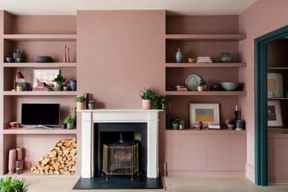
Those who don't fear pink can jump onto the bandwagon of Calamine; a beautiful, milky pink with a grey undertone. The presence of grey prevents the pink from looking too sugary and gives it a deeper grounding. The tone is easy on the eyes and can be used sparingly or even painted on walls across rooms for a perfect pink living room.
'My favorite is Calamine by Farrow & Ball; I've used it in dining rooms, bathrooms, bedrooms, sunrooms, and even closets,' says interior designer Mary Patton. 'It is the perfect soft pink neutral.'
2. Treron

Treron is a soft, yet dark green hue perfect for modern homes that receive plenty of natural light. The color can be used in large amounts as it has a muted vibe and plays well in any space.
'When selecting paints, we find it's important to get the mineral balance right, to give a tone that is natural and has a calm, muted quality,' says Tom Cox, principal designer, HÁM Interiors. 'In this project, the custom-made HÁM kitchen is painted in deep green Treron.'
3. All White

Colors play an imperative role in interior design, and our minds. A room's entire mood can be enhanced or completely ruined by one paint decision. Usually, neutrals are the safest bet. But even neutrals need some consideration.
When it comes to the best white paint for walls, remember that this color has associated temperature, mood, light reflectivity, and style. If you don't consider that, your seemingly fresh, crisp white paint will make your room look flat and cold. Usually, warmer whites can look welcoming. When painted in a room that has lots of sunlight, a clear white will optimize the light and keep things cool.
White works especially well in small rooms. Consider painting the trim to match, as eliminating the lines between the walls and woodwork will allow the space to remain frameless, expanding the proportions of the room.
To that end, Farrow and Ball's All White is a good choice. It isn't stark like Brilliant White but it contains no other pigment except for creamy white, creating the softest interior.
'Farrow & Ball colors respond so beautifully to the north-eastern light in our region – they have the kind of luminosity that our clients love,' says Maria Viola-Kuttruff, principal designer at Viola Interior Design. 'All White #2005 has also been a winner for walls and woodwork as it reads as a pure white, no grey tones, no yellow tones.. just gorgeous.'
4. Pitch Blue

Sometimes a single blast of color can refresh a tired space. Most people are used to playing it safe with whites, greys, and even going as far as sky blues but nothing gives a better boost of energy and personality to a space than this dreamy cobalt hue.
The paint color has an inherent glam side to it and looks especially great against other jewel tones or metallics. In fact, several colors go with blue and can lift a space. It's a color of nature, a trusted hue that manages to be fresh and sophisticated all at once.
Pitch Blue by Farrow & Ball has a small dose of black pigment, and gives the paint an almost purple feel at times, especially in south-facing rooms. It looks deeper and soberer in dimly-lit areas or spaces lit by candles.
'We loved using Pitch Blue No. 220 in this client’s otherwise white kitchen,' says Georgia Zikas of Georgia Zikas Design. 'The vibrancy of the island reflects the spirit of their young family. This color is youthful but has depth and agelessness. We prefer using Farrow & Ball paints because of its color saturation, and the luster of its finishes feels special and bespoke.'
5. Berrington Blue

This mid-tone Berrington Blue has a gorgeous black undertone and is a strong alternative to Farrow & Ball's Oval Room Blue. The color is great for painting the ceiling, soft blue living room walls, or any space you'd retire to at the end of the day.
'The Berrington Blue paint color by Farrow & Ball makes for a great neutral blue that is not too dark nor too pastel-ish,' says Amy Youngblood, principal designer, Amy Youngblood Interiors. 'It is especially great for an entryway or even a library where you want a little drama but not drabness. Unlike a lot of blue shades which are starting to become overused, Berrington Blue has a very classic look that I feel is timeless.'
6. Cromarty

A combination of grey and green can look very refreshing and modern, resulting in a serene and unexpectedly beautiful look. Think of lush green fields and smooth pebbles – it's a pairing made in nature.
This paint with its deep, silken tones is ideal for layering with texture-rich materials, soft furnishings, and artworks. Even contrasting colors can creep in, to punctuate the color scheme. If you're wondering how to paint a room using this tone, you could consider a fully drenched space in Cromarty or even go half-and-half with another color like pink.
This neutral tone is neither too grey nor too green; it's just right and can add muted softness to any room. Cromarty from Farrow & Ball works especially well when grouped with Blue-Grey or Pigeon.
'We chose the Farrow & Ball Cromarty shade of green for its beautiful muted quality,' says Stephanie Waskins, interior designer at LARK+PALM. 'Working well into the diamond pattern on the floor, we designed for this custom kitchen space. We love using shades of green in many of our designs. We see green being just as much a neutral as the shades of white.'
7. Hague Blue

Whether it comes to painting the walls or painting furniture, the right blue can set a dramatic tone. Blues remind one of the East Coast peppiness, antiques, and the deep blue sea. Blues also offer crisp contrast to neutrals and are friends with metallic tones.
A nice, saturated blue like Hague Blue can inspire the ideal home decor. It looks fantastic on woodwork, skirtings, or as an accent color on the walls. With its slight green undertone, the paint color has a beautiful, natural finish.
It's a perfect living and dining room color idea for this vibrant design, for example.
'We love Hague Blue by Farrow and Ball because it’s moody, dark, and saturated,' says Jeanne Schultz, interior designer and founder of Jeanne Schultz Design Studio. 'We painted the chest in the dining room the same color to blend in, and have blue velvet chairs in the living room that blend in as well. The goal was to create a loungey feel, reminiscent of the client’s time in Berlin.'

'At times it reads teal and at others navy, but either way, it ensures full-on drama and I’m here for it,' interior designer Cindy McKay says. 'This dining room I designed in Toronto features Hague Blue on the walls. I love how it adds such richness to the space and highlights the incredible wall molding.'
8. De Nimes

Deep blues make a great background for a mix of antiques, and vintage and modern pieces. You can use this color to even design a wall mural if it's that artsy touch you're looking for. Blue can anchor elements and create a unifying surrounding.
The elegant De Nimes by Farrow & Ball has an earthy quality to it and can be used in a kitchen island to an airy drawing-room. 'The layered blues in this Indianola living room are beautiful – the Farrow and Ball De Nimes built-ins mirror the color of the nearby armchairs nicely,' says interior designer Julia Miller of Yond Interiors.
9. Clunch

Even though it's a light tone, off-white has a warm glow, looks cozy, and unlike stark white, it creates the most comfortable neutral setting for unlimited color possibilities. Off-white is a classic and has always been an on-trend hue.
Clunch by Farrow & Ball has a wonderful yellow undertone, warming the white as it goes. The paint finish is versatile, has a fresh look, and can be used in both modern and traditional settings.
'Clunch is used on the ceiling of this bedroom and the wall color is Setting Plaster. The color combination here is the definition of a warm hug,' says Lauren L Caron, principal designer at Studio Laloc.
10. Brinjal

Aubergine or purple can invoke a visceral reaction – you either love it or you don't. But let's not forget, this color has been related to royalty for eons and has an inherent rich appeal.
If used in the right proportions, purple can fill a space with style that very few other colors can achieve. It is a good alternative to brighter colors and, in the right shade, can even play the role of a neutral.
With it comes colors that go with purple, deep brown wood tones and creams make a happy pairing. Orange can play off well with purple too; a classically playful theme. To have a more royal theme, consider adding silvery tones for elegance.
Brinjal looks great in full Gloss and is ideal for feature walls. The paint color is the best contrast to neutral tones like grey or white.
'The best Farrow & Ball color is Brinjal,' says Chad Dorsey, principal designer and founder of Chad Dorsey Design. 'In this space we turned a secondary kitchenette into an adult lounge inspired by the color of Cabernet,'
11. Parma Gray

While this color has grey undertones, Parma Gray from Farrow & Ballusually reads as a cool, crisp blue. The hue can create a period feel, especially when paired with neutrals. Because this color is so easy on the eyes, there are lots of colors that go with blue on the color wheel.
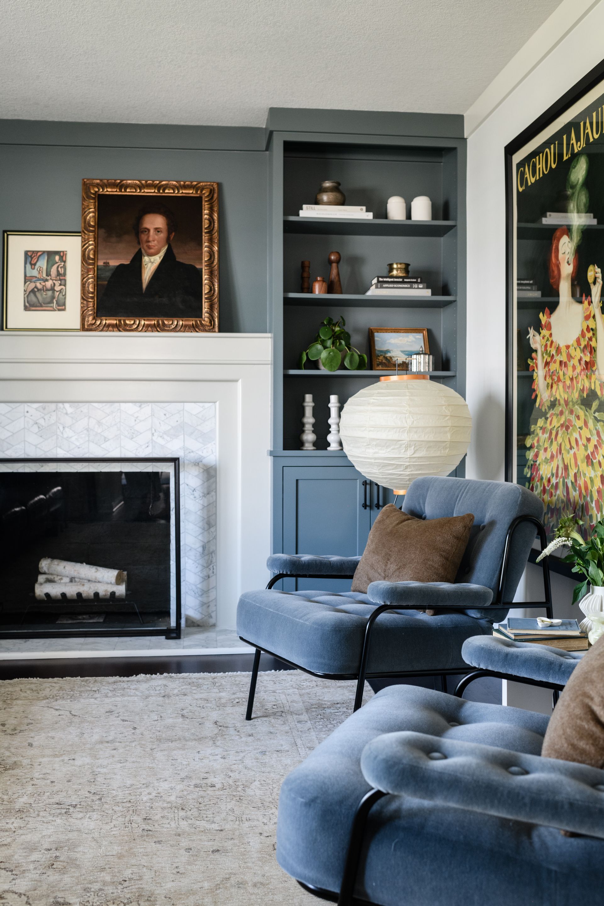
'The walls of this living room are painted Farrow & Ball Parma Gray,' says Lauren Stern, principal at Lauren Stern Design. 'We love this blue-grey because it feels rich and complex, without being too strong. It provides a perfect backdrop, without distracting or overwhelming the other elements in a room. Parma can feel playful and sophisticated at the same time it complements both cool tones and warm tones like vermillion and brass.'

Farrow & Ball
British paint manufacturer Farrow & Ball creates heritage paint colours inspired by historic colour archives. Now a stalwart of the decorating landscape, its paints are notable for their memorable product names, such as Elephant's Breath and Mouse's Back.
Be The First To Know
The Livingetc newsletter is your shortcut to the now and the next in home design. Subscribe today to receive a stunning free 200-page book of the best homes from around the world.
Aditi Sharma Maheshwari is an architecture and design journalist with over 10 years of experience. She's worked at some of the leading media houses in India such as Elle Decor, Houzz and Architectural Digest (Condé Nast). Till recently, she was a freelance writer for publications such as Architectural Digest US, House Beautiful, Stir World, Beautiful Homes India among others. In her spare time, she volunteers at animal shelters and other rescue organizations.
-
 How to Thaw a Frozen Pipe — Learn Everything You Need to Know in 5 Minutes With This Guide
Winter storm caught you off guard? We asked an expert — just how do you thaw a frozen pipe?
By Hugh Metcalf Published
-
 The 12 Very Best Silk Bedding Pieces — As Our Style Editor Says: 'It's What Dreams Are Made Of!'
Slumber in lustrous luxury with the very best silk bedding sheets, duvets, pillowcases, and more — your sleep score will thank us later
By Julia Demer Published

