New elegance #28

THE PROPERTY
The main wing of a 20th-century manor housein the Northumberland countryside, near Hadrian’s Wall. On the ground floor is a grand entrance hall, which leads to the kitchenand living room, anda cloakroom. The first-floor comprises Susi’s office, the master suite and a guest suite. On the second floorare two more bedrooms and a bathroom.
ENTRANCEHALL
Given the grand entrance of this Edwardian manor house, two things are immediately surprising. One, despite its noble proportions and classic Britisharchitectural features, first impressions are modern and light. And two, for the property’s owner, designer Susi Bellamy, colour and pattern know no bounds.
Eye-catching pieces, such as a lime-green velvet sofa, a dark-oak antique chest and a gesso cast bust of Michelangelo’s David, are set off by the bold colours and patterns of Susi’s stacks of cushions.

The house, which was built in 1900, is structurally magnificent, but after returning to it from the heat of Florence – where Susi and her family lived for six years – its dark-oak panelling felt cold and the layout needed a rethink.

Susi painted its original beautiful Wedgwood-style mouldings to appear in relief, and all its dark wood an off-white.

Enlisting the help of her friend Ike Isenhour, an architect and fellow colour appreciator, Susi devised a pathway between the kitchen and living room to create a circular flow. The corridor bisects the utility room to give direct access from the kitchen to the living room. Before this, the two rooms weren’t connected.

CLOAKROOM
Susi painted this space in a fiery orange shade as she wanted a jewel-like colour to emanate from the neutral passageway.

LIVING ROOM
A magazine stylist-turned-artist-and-designer, Susi has made a career out of her pattern-tastic style, and a colourful, intuitive aesthetic runs throughout her work. She applies the same principles and design ideas to whatever she is doing, whether it’s creating a collection or renovating the family home. She explains that reworking the house felt like an extension of her day job.
Her favourite shop is RE in Corbridge – a treasure trove of both decorative and utilitarian products that she uses throughout her home.
KITCHEN-DINER
With its white-painted woodwork and plain walls, Susi kept the ground level to a neutral palette.


The floors above are a different story and where colour and pattern run riot.
OFFICE
The fuchsia artwork gives impact to this area of the landing, which Susi uses as her office. The modernity of various artwork contrasts with the Corinthian column tops.

GUEST BEDROOM
The bold palette and gallery of framed artwork dominate this space.
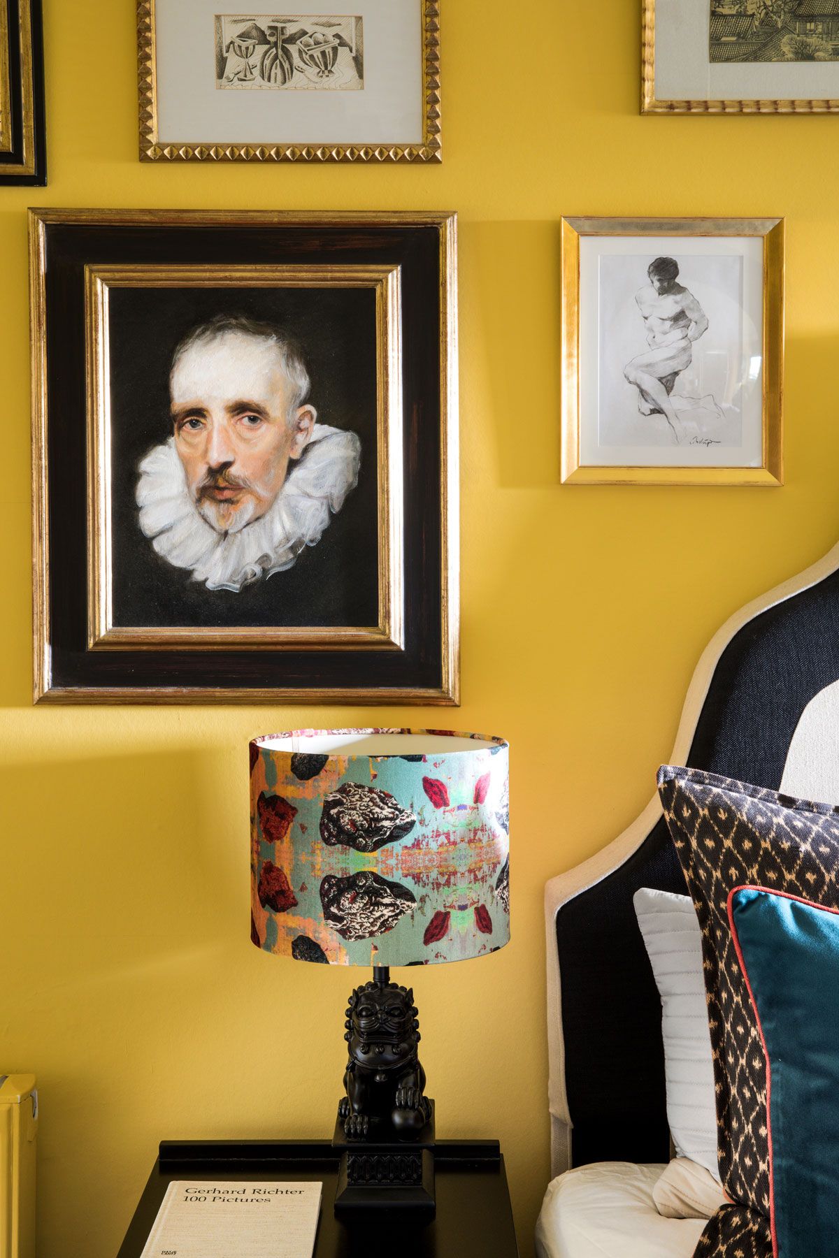
In the attic bedrooms, Susi’s own wallpapers envelop the walls and ceilings.
BOY'S BEDROOM
When the decorator asked Susi where she wanted to stop the wallpaper and paint the ceiling white, she asked them why she'd want to do that. Instead, the wallpaper continues onto the ceiling in this attic bedroom.

GIRL'S BEDROOM
The older daughter’s room is a heady mix of matchy-matchy patterns.

LANDING
In the top-floor corridor, a folksy gold stencil lifts the space with a display of climbing florals. The stencil patterns are based on one of Jeanne Lanvin’s designs for her daughter Marguerite.

Susi says that people have an idea of stencilling as a sheaf of corn above a window in a cottage, but she considers it a craft. She advises that it's all about the scale rather than being twiddly little stencils.

See Susi’s work and collections at susi-bellamy.com
Photography /Paul Raeside
Be The First To Know
The Livingetc newsletter is your shortcut to the now and the next in home design. Subscribe today to receive a stunning free 200-page book of the best homes from around the world.
The homes media brand for early adopters, Livingetc shines a spotlight on the now and the next in design, obsessively covering interior trends, color advice, stylish homeware and modern homes. Celebrating the intersection between fashion and interiors. it's the brand that makes and breaks trends and it draws on its network on leading international luminaries to bring you the very best insight and ideas.
-
 These 12 Best Table Lamps for Your Desk — Perfect Glows for a Creative Home Office
The best table lamps for your desk is have a soft, targeted glow. Elevate your WFH set-up with these stylish picks endorsed by Style Editor Brigid Kennedy
By Brigid Kennedy Published
-
 The Nespresso VertuoPlus is 30% Off for President's Day, and it's Kim Kardashian's Coffee Maker of Choice
This sleek and stylish coffee maker was spotted in Kim's home bar, and you can currently save $60 if you buy yours from Amazon
By Lilith Hudson Published
-
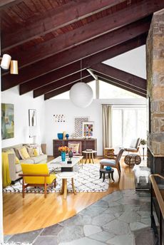
 Tour a mid-century house in Philadelphia with a modern take on Mad Men style
This mid-century house in Philadelphia is a modern take on mid-century design and the perfect backdrop for this enviable collection of art and objects
By Livingetc Last updated
-
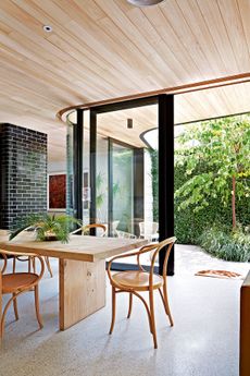
 This modern Edwardian house in Melbourne is small but mighty
It may be small, but thanks to its ingenious design, this Edwardian house in Melbourne makes family living a breeze
By Livingetc Last updated
-
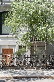
 Old meets new in this apartment in New York's East Village - a former community centre built in 1860
The owner of this loft-style apartment in New York's East Village mixes ancient and modern with timeworn pieces, design classics and his own abstract art...
By Livingetc Last updated
-
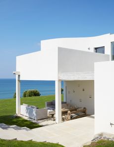
 Explore this super-contemporary coastal house in Cornwall
This coastal house in Cornwall is all about drinking in the uninterrupted views of nature at its most raw, most pure…
By Livingetc Last updated
-
 Explore this spacious detached 1900s house in southeast London with stylish modern interiors
Edgy textures, luxe materials and a mix of vintage and bargain buys transformed a blank detached 1900s house in southeast London into a home full of personality.
By Livingetc Last updated
-
 This large house in west London is minimal yet playful
A firefighter’s pole in the kitchen and a slide down the stairs? This house in west London proves minimalism can also be fun.
By Livingetc Last updated
-
 Inside A Clever Garden Room That Doubles As A Chic Guest House
This striking garden room design incorporates a sleeping area, kitchenette, loo and shower, as well as plenty of storage space, making it ideal as both a self-contained guest house or a restful retreat to escape to.
By Lotte Brouwer Published
-
 This light and bright Victorian terrace in west London is relaxed yet stylish
This chic Victorian terrace in west London is full of clever ideas that allow it to evolve.
By Livingetc Last updated


