Urban Glamour #39

THE PROPERTY
A double-fronted Thirties house in northwest London. The ground floor has a large hallway, a sitting room, a library/cinema room and a large open-plan kitchen/dining/living space. There is also a utility room, WC and an office. On the first floor there’s a large landing, the master suite with dressing room, a childrens' bedroom with en suite, a guest bedroom, a shower room and a sitting room. The top floor has two further childrens' bedrooms and a bathroom.
ENTRANCE HALL
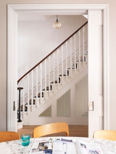
This superbly glam Thirties home has proportions, details and a central staircase that oozes screen-star glamour. Think Odeon-style Deco touches from the days before multiplexes: decorative leaded glass, a foyer-sized hallway (pictured top) and a central staircase that leads up to a landing complete with plush velvet seating.
LIBRARY
The home always had ata-dah! scale, but before the renovation thedécor was outdated and upstairs had a cramped feel, thanks to a long, gloomy corridor across the width of the house. Back then, the cinematic mood was more The Shining than Hotel Budapest.
A four-metre double-floor extension at the back, a wall of steel-framed windows downstairs and a generous landing above changed all that, helping to reinstate the house’s original grandeur.

CINEMA ROOM
The owners wanted to put the Thirties features back into the house, but with a modern take. So wood panel detailing replaced Seventies Artex, parquet flooring was reinstated and the house was reunited with a full set of handsome fireplaces.
The cinema room – an atmospheric, indulgent den between the living room and the library – has double doors at each end.
Luxe paneling and flashes of red keep this room feeling grown-up.

LIVING ROOM
The wall panelling mirrors the shape of the steel-framed windows for a cosy-cool backdrop, while wicker warms up the greys.

DINING AREA
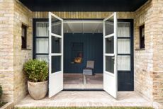
Steel-framed windows extend across the back wall of the house in a grid that’s softened by gentle greys, candlelight and mellow timbers.

KITCHEN
The steel windows started out as a grid of landscape-shaped panes, but it looked too hard-edged so the builders were asked to do the maths all over again as vertical windows.

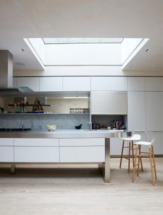
Along marble-topped kitchen island is the house’s centre point for socialising.

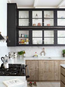
Tongue-and-groove cladding helps make the kitchen end of this open-plan space a bit cosier.

The kitchen units are also topped with marble, matching the kitchen island.

LANDING
A supersized first-floor landing is a room in its own right. It feels quite decadent to leave this space as a “ breathing space” at the top of the stairs – but it makes a huge difference to the feel of the house. The original leaded windows were kept intact, while new panelling was added in a sympathetic style.

GIRLS' ROOM
There are hints of pink, pastels and even a floral pattern on the wall texture, but you have to look for them – it’s not an obviously “girlie” feel.

GIRLS' EN SUITE
The shade on the bath strikes just the right note for a bathing space that’s feminine but not flashy.

BOYS' ROOM
The rebuild completely reconfigured the upstairs floorplan and a loft extension was added. This is now two boys bedrooms with pitched walls and Shaker panelling in a style that flows seamlessly down to rest of the house.
The loft extension keeps the shape of the pitched roof for a cabin feel. Shaker-style pegs are great for a teenager – minimum effort required.

MASTER BEDROOM
Beading was added to the walls for extra detailing that emphasises the room’s proportions.

Teal, green and gleam set a richly elegant backdrop for art with impact.

DRESSING ROOM
This strip of a room leading off the en suite is all about practical glamour. ‘The carpenter was asked to add the mirrored door panels – it’s an inexpensive way to break up the run of storage and make the space feel more interesting.

MASTER EN SUITE
Black and white photography against a backdrop of greys feels sophisticated and mature.

A pair of mermaid sconces hit just the right escapist glam note.

This home is available as a location through 1st-option.com.
Photography / Paul Massey
Be The First To Know
The Livingetc newsletter is your shortcut to the now and the next in home design. Subscribe today to receive a stunning free 200-page book of the best homes from around the world.
The homes media brand for early adopters, Livingetc shines a spotlight on the now and the next in design, obsessively covering interior trends, color advice, stylish homeware and modern homes. Celebrating the intersection between fashion and interiors. it's the brand that makes and breaks trends and it draws on its network on leading international luminaries to bring you the very best insight and ideas.
-
 The 12 Best Table Lamps for Reading —I'm a Certified Bookworm (and Shopping Expert)
When it comes to table lamps for reading, I don't mess around. If you're the same, this edit is for YOU (and your books, or course — and good recommendations?)
By Brigid Kennedy Published
-
 "It's Scandi Meets Californian-Cool" — The New Anthro Collab With Katie Hodges Hits Just the Right Style Note
The LA-based interior designer merges coastal cool with Scandinavian simplicity for a delightfully lived-in collection of elevated home furnishings
By Julia Demer Published
-
 Tour a mid-century house in Philadelphia with a modern take on Mad Men style
This mid-century house in Philadelphia is a modern take on mid-century design and the perfect backdrop for this enviable collection of art and objects
By Livingetc Last updated
-
 This modern Edwardian house in Melbourne is small but mighty
It may be small, but thanks to its ingenious design, this Edwardian house in Melbourne makes family living a breeze
By Livingetc Last updated
-
 Old meets new in this apartment in New York's East Village - a former community centre built in 1860
The owner of this loft-style apartment in New York's East Village mixes ancient and modern with timeworn pieces, design classics and his own abstract art...
By Livingetc Last updated
-
 Explore this super-contemporary coastal house in Cornwall
This coastal house in Cornwall is all about drinking in the uninterrupted views of nature at its most raw, most pure…
By Livingetc Last updated
-
 Explore this spacious detached 1900s house in southeast London with stylish modern interiors
Edgy textures, luxe materials and a mix of vintage and bargain buys transformed a blank detached 1900s house in southeast London into a home full of personality.
By Livingetc Last updated
-
 This large house in west London is minimal yet playful
A firefighter’s pole in the kitchen and a slide down the stairs? This house in west London proves minimalism can also be fun.
By Livingetc Last updated
-
 Inside A Clever Garden Room That Doubles As A Chic Guest House
This striking garden room design incorporates a sleeping area, kitchenette, loo and shower, as well as plenty of storage space, making it ideal as both a self-contained guest house or a restful retreat to escape to.
By Lotte Brouwer Published
-
 This light and bright Victorian terrace in west London is relaxed yet stylish
This chic Victorian terrace in west London is full of clever ideas that allow it to evolve.
By Livingetc Last updated
