Urban Glamour #38

THE PROPERTY
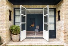
A four-storey Georgian-style house in north London built in 2001. There is a cloakroom, large kitchen-diner and family living room on the ground floor and a dining room/library and formal reception room on the first floor. On the floor above is the master suite and a further two bedrooms and a bathroom, while the top floor is used by guests and has three bedrooms and a bathroom.
LIVING ROOM
This Georgian style house has beautiful architectural bones. Looks can be deceiving, though, because despite its period elegance, their home was built in 2001 (based on the footprint of an original Georgian house that stood here previously).
Vast, sink-into sofas from Caravane and a pair of circular coffee tables, which were a bargain from French store Petite Friture, give the living room a cosier feel.The interiors are owed tointerior designers Bunny Turner and Emma Pocock of Turner Pocock.

KITCHEN-DINER
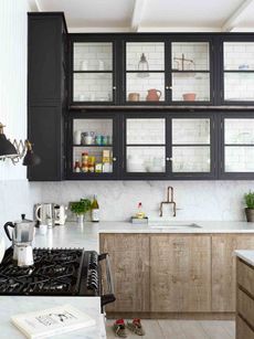
In the kitchen, simple Ikea units were restyled for a decidedly upmarket feel. New side panels were cut, bespoke kickboards added, while beautiful mouldings completed the look.

The bench was built bespoke and covered in what looks like expensive leather, but is actually plastic. You can spill jam on it and it’s fine.

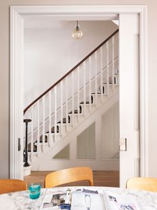
DINING ROOM/LIBRARY
Inside, generous rooms and four floors provide ample space, but pose something of a design challenge too. When it comes to big properties,how do you lose that rattling-around feeling?
One trick was to give each level a clear identity. The ground floor, with its kitchen-diner and living room, is dedicated to family life, above are the grown-up reception rooms, the second storey contains bedrooms and the master suite, while the top is reserved for guests.
The home owners another trick up their sleeve – embracing the dark side.They knew deep colours would create much-needed character. Now, the master suite is a rich blackish-blue, while the dining space rocks a squid-ink shade.

FIRST-FLOOR LANDING
This chaise is an heirloom piece that has been re-covered in bright fabric that’s the same shape as stair spindles.

MASTER BEDROOM
The master suite was three tiny rooms originally, but it was made into something extraordinary that stretches the whole width of the house.

MASTER EN SUITE
The en-suite bathroom is separated from the master bedroom by a window partition. Blinds can be pulled down for privacy.
The bathroom is painted in the same tone as the bedroom. The floor tiles match the carpet too. In this way, the bathroom looks as though it’s part of the bedroom.

To further help the bathroom flow from the bedroom, the vanity unit was designed like a dressing table. It’s mounted on little wood feet to give it the feel of a sideboard.

See more of Turner Pocock’s work at turnerpocock.com. Visit agence-mind.com for info on the architect’s work.
Photography / Paul Massey
Be The First To Know
The Livingetc newsletter is your shortcut to the now and the next in home design. Subscribe today to receive a stunning free 200-page book of the best homes from around the world.
The homes media brand for early adopters, Livingetc shines a spotlight on the now and the next in design, obsessively covering interior trends, color advice, stylish homeware and modern homes. Celebrating the intersection between fashion and interiors. it's the brand that makes and breaks trends and it draws on its network on leading international luminaries to bring you the very best insight and ideas.
-
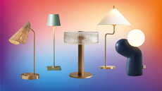
 The 12 Best Table Lamps for Reading —I'm a Certified Bookworm (and Shopping Expert)
When it comes to table lamps for reading, I don't mess around. If you're the same, this edit is for YOU (and your books, or course — and good recommendations?)
By Brigid Kennedy Published
-
 "It's Scandi Meets Californian-Cool" — The New Anthro Collab With Katie Hodges Hits Just the Right Style Note
The LA-based interior designer merges coastal cool with Scandinavian simplicity for a delightfully lived-in collection of elevated home furnishings
By Julia Demer Published
-
 Tour a mid-century house in Philadelphia with a modern take on Mad Men style
This mid-century house in Philadelphia is a modern take on mid-century design and the perfect backdrop for this enviable collection of art and objects
By Livingetc Last updated
-
 This modern Edwardian house in Melbourne is small but mighty
It may be small, but thanks to its ingenious design, this Edwardian house in Melbourne makes family living a breeze
By Livingetc Last updated
-
 Old meets new in this apartment in New York's East Village - a former community centre built in 1860
The owner of this loft-style apartment in New York's East Village mixes ancient and modern with timeworn pieces, design classics and his own abstract art...
By Livingetc Last updated
-
 Explore this super-contemporary coastal house in Cornwall
This coastal house in Cornwall is all about drinking in the uninterrupted views of nature at its most raw, most pure…
By Livingetc Last updated
-
 Explore this spacious detached 1900s house in southeast London with stylish modern interiors
Edgy textures, luxe materials and a mix of vintage and bargain buys transformed a blank detached 1900s house in southeast London into a home full of personality.
By Livingetc Last updated
-
 This large house in west London is minimal yet playful
A firefighter’s pole in the kitchen and a slide down the stairs? This house in west London proves minimalism can also be fun.
By Livingetc Last updated
-
 Inside A Clever Garden Room That Doubles As A Chic Guest House
This striking garden room design incorporates a sleeping area, kitchenette, loo and shower, as well as plenty of storage space, making it ideal as both a self-contained guest house or a restful retreat to escape to.
By Lotte Brouwer Published
-
 This light and bright Victorian terrace in west London is relaxed yet stylish
This chic Victorian terrace in west London is full of clever ideas that allow it to evolve.
By Livingetc Last updated
