Scandi Cool #1

THE PROPERTY
A 17th-century former mill in Gloucestershire, which has been extended over the years to include five bedrooms and four bathrooms upstairs. On the ground floor there is a living room, kitchen, snug, study, utility room and pantry, boot room and cloakroom.
HALLWAY
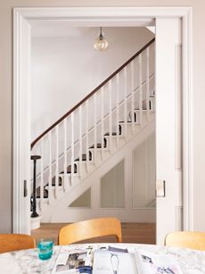
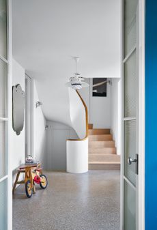
In the hallway, part of the first floor was removed to create the dramatic double-height entrance, designed by architect Richard Parr. Vertical panelling enhances the sense of scale and reflects the mill’s rural heritage.
See more Scandinavian style homes
KITCHEN
Designed to suit the needs of a large family who are all keen cooks, the kitchen includes a range cooker, deep larder and chalkboard for recipe essentials.The simple scaffolding shelving make it easy for to grab utensils when they're needed.

Instead of neutral tones, the large room is punctuated with deep-black doors, which define the white space and lead to the new larder and utility area.
DINING AREA
New windows were installed in the once-dark kitchento bring views of the three-acre garden inside.

The space is defined by the length of the dining table.
LIVING ROOM
In the sitting room, the original fireplace was restored. The old French windows were removed, replaced with smaller frames to enhance the cosy feel of the space.

STUDY
On the ground floor, this set of bookshelves help create a study space and add definition to a once open set of rooms which lead to the kitchen.

The office is tucked in to a corner of the sitting room where a former UN translator’s desk was chosen for practicality and historical appeal.

SNUG
A new log burning stove and partition wall has helped to create a more cosy space.

CLOAKROOM
In the downstairs loo, gloss paint and rustic tiles evoke a Moroccan feel.

BEDROOM
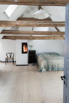
Upstairs, a once-cavernous master bedroom is re-defined with a half wall that screens a dressing room behind while opposite, new windows afford wide views of the quiet countryside.Tucked under the eaves of the house, Farrow & Ball's Wevet white provides just the right hint of pinky undertone for the walls.

BATHROOM
To offset the long, thin shape of the master bathroom, the layout is broken up with a bold mix of tiles and vertical joinery inspired by traditional tongue-and-groove.

Photography ⁄ Paul Massey
Be The First To Know
The Livingetc newsletter is your shortcut to the now and the next in home design. Subscribe today to receive a stunning free 200-page book of the best homes from around the world.
The homes media brand for early adopters, Livingetc shines a spotlight on the now and the next in design, obsessively covering interior trends, color advice, stylish homeware and modern homes. Celebrating the intersection between fashion and interiors. it's the brand that makes and breaks trends and it draws on its network on leading international luminaries to bring you the very best insight and ideas.
-
 The 12 Best Table Lamps for Reading —I'm a Certified Bookworm (and Shopping Expert)
When it comes to table lamps for reading, I don't mess around. If you're the same, this edit is for YOU (and your books, or course — and good recommendations?)
By Brigid Kennedy Published
-
 "It's Scandi Meets Californian-Cool" — The New Anthro Collab With Katie Hodges Hits Just the Right Style Note
The LA-based interior designer merges coastal cool with Scandinavian simplicity for a delightfully lived-in collection of elevated home furnishings
By Julia Demer Published
-
 Tour a mid-century house in Philadelphia with a modern take on Mad Men style
This mid-century house in Philadelphia is a modern take on mid-century design and the perfect backdrop for this enviable collection of art and objects
By Livingetc Last updated
-
 Explore this super-contemporary coastal house in Cornwall
This coastal house in Cornwall is all about drinking in the uninterrupted views of nature at its most raw, most pure…
By Livingetc Last updated
-
 This large house in west London is minimal yet playful
A firefighter’s pole in the kitchen and a slide down the stairs? This house in west London proves minimalism can also be fun.
By Livingetc Last updated
-
 This light and bright Victorian terrace in west London is relaxed yet stylish
This chic Victorian terrace in west London is full of clever ideas that allow it to evolve.
By Livingetc Last updated
-
 SCANDI COOL #23
Founder and chef of Noma, René Redzepi is renowned for using simple ingredients creatively – a recipe that serves just as well for the house he shares with his wife and three children.
By Livingetc Published
-
 Scandi Cool #12
How do you mix cool contemporary design with living in a house full of kids? The secret is in the storage.
By Livingetc Published
-
 Scandi Cool #10
Turning a total wreck into a little gem takes more than dedication – this home renovation took skill, graft and an eye for fine design.
By Livingetc Published
-
 Scandi Cool #9
This fabulous family home is designed as both a fun space for the kids and as a social destination for eating and entertaining.
By Livingetc Published
