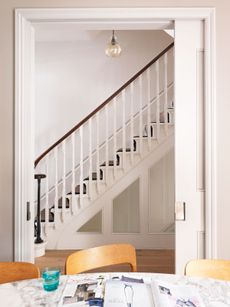
Scandi Cool #8

THE PROPERTY
A Thirties house in southwest London, around 2,500 sq ft, arranged over three floors. On the ground floor is a living room, kitchen-diner, garden room, TV room and office. Upstairs on the first floor is the master bedroom suite, including a walk-in wardrobe, plus two bedrooms and a shower room. On the top floor are two further bedrooms and a bathroom.
GARDEN ROOM
The interiors take their cue from the aesthetics of contemporary Australian minimalism and their trademark inside-out feel.
Thanks to underfloor heating and thermal glass, this modern garden room is toasty even in the middle of winter.

What makes this house so special is its carefree love for colour. Likethe seamless way the interiors are used as a backdrop for an overflowing art collection.
Above the sofa is an eclectic group of pictures, including postcards by artists such as Billy Childish, from the Royal College of Art’s Secret sale. The pouffe and sofa work brilliantly together, but that’s luck as they were bought four or five years apart.

The copper box was a sterilising box for dental tools found in an antiques shop on the Isle of Wight. It was a lucky find and it fitted on that bookshelf perfectly.
SITTING ROOM
The sitting room is restful and relaxing, with a log burner and paired-back, Scandi feel.

KITCHEN
Some works of art were pivotal as starting points for the décor. The blue-green ceramics in the kitchen are by potter Derek Wilson and were given to the architect of this property, so that the Corian work surface could be colour-matched.

More hand-thrown pots were commissioned for a display in the kitchen.

Hanging plants against the wall add to the relaxed, neutral scheme.

DINING AREA
There are quirky touches everywhere, like the roll of paper with a ‘quote of the week’ for children to mull over – like quotes from theDalai Lama or Muhammad Ali. Handy for subliminally teaching kids about values.

The paintings createdusing Post-it notes are by Katie Lips.

BOYS BEDROOM
The roller blinds in the boy’s room (one an Aussie flag and the other a British one) express his dual nationality.

MASTER BEDROOM
The bedroom scheme was designed around a photograph that could only fit in one place in the house, which was above the bed.
The floral blinds might have felt a bit granny-ish, a bit insipid at first, if it wasn't for the cushions – which are the same fabric butin a different colourway – giving them more punch.

BATHROOM
Suspended just behind the bath is a verre églomisé (or gilded glass) mirror; attached on the other side is a functional mirror over a basin unit and a cupboard for all your gubbins.

Learn more about the owner’s art consultancy business at louisawarfieldart.com,or visit louisawarfield_artconsultancy on Instagram
Photography ⁄ Paul Massey
Be The First To Know
The Livingetc newsletter is your shortcut to the now and the next in home design. Subscribe today to receive a stunning free 200-page book of the best homes from around the world.
The homes media brand for early adopters, Livingetc shines a spotlight on the now and the next in design, obsessively covering interior trends, color advice, stylish homeware and modern homes. Celebrating the intersection between fashion and interiors. it's the brand that makes and breaks trends and it draws on its network on leading international luminaries to bring you the very best insight and ideas.
-
 How to Thaw a Frozen Pipe — Learn Everything You Need to Know in 5 Minutes With This Guide
Winter storm caught you off guard? We asked an expert — just how do you thaw a frozen pipe?
By Hugh Metcalf Published
-
 The 12 Very Best Silk Bedding Pieces — As Our Style Editor Says: 'It's What Dreams Are Made Of!'
Slumber in lustrous luxury with the very best silk bedding sheets, duvets, pillowcases, and more — your sleep score will thank us later
By Julia Demer Published
-
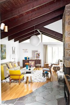
 Tour a mid-century house in Philadelphia with a modern take on Mad Men style
This mid-century house in Philadelphia is a modern take on mid-century design and the perfect backdrop for this enviable collection of art and objects
By Livingetc Last updated
-
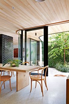
 This modern Edwardian house in Melbourne is small but mighty
It may be small, but thanks to its ingenious design, this Edwardian house in Melbourne makes family living a breeze
By Livingetc Last updated
-
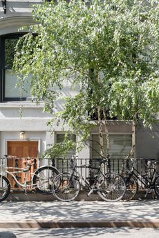
 Old meets new in this apartment in New York's East Village - a former community centre built in 1860
The owner of this loft-style apartment in New York's East Village mixes ancient and modern with timeworn pieces, design classics and his own abstract art...
By Livingetc Last updated
-
 Explore this super-contemporary coastal house in Cornwall
This coastal house in Cornwall is all about drinking in the uninterrupted views of nature at its most raw, most pure…
By Livingetc Last updated
-
 Explore this spacious detached 1900s house in southeast London with stylish modern interiors
Edgy textures, luxe materials and a mix of vintage and bargain buys transformed a blank detached 1900s house in southeast London into a home full of personality.
By Livingetc Last updated
-
 This large house in west London is minimal yet playful
A firefighter’s pole in the kitchen and a slide down the stairs? This house in west London proves minimalism can also be fun.
By Livingetc Last updated
-
 Inside A Clever Garden Room That Doubles As A Chic Guest House
This striking garden room design incorporates a sleeping area, kitchenette, loo and shower, as well as plenty of storage space, making it ideal as both a self-contained guest house or a restful retreat to escape to.
By Lotte Brouwer Published
-
 This light and bright Victorian terrace in west London is relaxed yet stylish
This chic Victorian terrace in west London is full of clever ideas that allow it to evolve.
By Livingetc Last updated

