Scandi Cool #3
THE PROPERTY
A Victorian mews house in north London with a pared-back Scandi feel. On the ground floor is an open-plan kitchen/dining/living area and WC, with a lower-level basement comprising a study and utility room. On the first floor is a nursery, two guest bedrooms, a family bathroom and terrace. The master bedroom suiteis on the second floor.
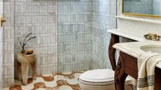
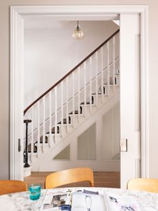
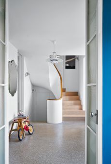
THE HALL

Get the look: The feature wall is painted in Maritime marble emulsion by Mylands. The flooring was custom madeby Mosaic Del Sur.
See more Scandinavian style homes
As soon as anyone arrives at this home, first impressions are of a stylish and calm interior. Soft blues (pictured above) tone everything down.
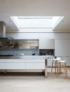
THE KITCHEN
This open-plan layout is perfect for entertaining.The kitchen provides everything a family could want in one space – an eating, relaxing and socialising zone that leads through tothe garden beyond.

The interiors are by Alex and Mathew Orme at Space+Matter, who took care of everything from theplanning and building to the sourcing.Mathew oversaw structural issues, while Alex took charge of decoration. Alex's brief was to steer clear of anything fusty and to inject more life and daring into the house.The result is a calm, relaxing and creative home – from its winter landscape palette of blues, greys and subdued greens down to clever design touches that crank the overall effect up a notch.
DINING AREA
Warm wood, overhead lighting and contemporary furnishings mean the dining zone looks fresh, welcoming and relaxed.
A glass ceiling at the garden end of the extension offers a front-row-seat view of the ever-changing night sky.

LIVING AREA
Painting the far wall in the same soft shade of green used for the rear wall creates a cocooning effect.

Blue-green walls contrast with the oak floor and lime-washed kitchen cabinets.

CLOAKROOM
Trad fittings contrast well with the dado-level panelling and graphic wallpaper.

LANDING
The higher you go in the house, the calmerit feels. The upper landing has a sense of intrigue thanks to bespoke troupe l'oeil panelling that conceals each doorway.

MASTER BEDROOM
Serenity is the key themeat the top of the house.

MASTER ENSUITE
A combo of classic fixtures and cool tiling helps create amodern Victorian vibe.

TERRACE
This specially constructed roof terrace boasts a living wall of cascading foliage. It's very muchthe grown-up area – for drinking a glass of wine and just hanging out.

See more of Alex and Mathew’s portfolio at spaceandmatter.co.uk
Photography ⁄ Paul Massey
Be The First To Know
The Livingetc newsletter is your shortcut to the now and the next in home design. Subscribe today to receive a stunning free 200-page book of the best homes from around the world.
The homes media brand for early adopters, Livingetc shines a spotlight on the now and the next in design, obsessively covering interior trends, color advice, stylish homeware and modern homes. Celebrating the intersection between fashion and interiors. it's the brand that makes and breaks trends and it draws on its network on leading international luminaries to bring you the very best insight and ideas.
-
 What are the Most Comfortable Pillowcases? From Temperature Regulating to the Best for Your Skin
When you're looking for comfort in your pillowcases, material matters. These are the best you can buy
By Faaizah Shah Published
-
 5 Simple, but Genius Bathroom Layout Tricks That Will Make Your Space Work so Much Harder
Small switches to how you lay out your bathroom that help make the most of a small space
By Luke Arthur Wells Published
-
 Tour a mid-century house in Philadelphia with a modern take on Mad Men style
This mid-century house in Philadelphia is a modern take on mid-century design and the perfect backdrop for this enviable collection of art and objects
By Livingetc Last updated
-
 Explore this super-contemporary coastal house in Cornwall
This coastal house in Cornwall is all about drinking in the uninterrupted views of nature at its most raw, most pure…
By Livingetc Last updated
-
 This large house in west London is minimal yet playful
A firefighter’s pole in the kitchen and a slide down the stairs? This house in west London proves minimalism can also be fun.
By Livingetc Last updated
-
 This light and bright Victorian terrace in west London is relaxed yet stylish
This chic Victorian terrace in west London is full of clever ideas that allow it to evolve.
By Livingetc Last updated
-
 SCANDI COOL #23
Founder and chef of Noma, René Redzepi is renowned for using simple ingredients creatively – a recipe that serves just as well for the house he shares with his wife and three children.
By Livingetc Published
-
 Scandi Cool #12
How do you mix cool contemporary design with living in a house full of kids? The secret is in the storage.
By Livingetc Published
-
 Scandi Cool #10
Turning a total wreck into a little gem takes more than dedication – this home renovation took skill, graft and an eye for fine design.
By Livingetc Published
-
 Scandi Cool #9
This fabulous family home is designed as both a fun space for the kids and as a social destination for eating and entertaining.
By Livingetc Published
