New Elegance 33

THE PROPERTY
Set in a 1960s block in central London, the two-bedroom space has an open-plan kitchen and living room, a terrace and two bathrooms.
Interior designers can find inspiration in the most unlikely objects and places. It might be a swoop of paintbox-bright metro tiles framing the arch of an underground station. Or the shadows of elaborate metalwork thrown, like darkened lace, across a pavement on a late summer afternoon. But nothing is guaranteed to fire a designer’s imagination more than the sight of a featureless interior devoid of personality and detail.
Or, in other words, the proverbial blank canvas. It’s a description that fits interior designer Hazel Collins’ first sighting of this two-bedroom apartment. Set on the first floor of an undistinguished 1960s block, it is one of those secret addresses: a peaceful cobbled mews tucked into London’s teeming West End. The previous owner, a developer, had refurbished the flat with an eye for space: ‘They’d rejigged the layoutin a sensible way, opening up the kitchen and adding a glass wall to screen the guest bedroom. This made it feel light and added to the flow,’ says Hazel, whose London practice specialises in high-end residential and commercial interiors in the UK and abroad.
LIVING ROOM


Part of Hazel's design brief was to avoid bold hues, so she decided on a palette of 'off colours' - nearly blacks, mineral greys, browns and tomato. It's the shapely furnishings that add glam.
Coffee table, Nic Parnell. Small gold Dante drink table, Julian Chichester. Lamp, Ecart Paris at Gotham
Character, however, was in short supply. ‘The only embellishments were a touch of coving and some black track lighting. The finishes were all very hard and “developer white”.’ For most of us amateurs, layers of colour, print and pattern might be the default solution. But the owners, who live in New York part of the time, had other ideas for their London bolthole. ‘They wanted somewhere elegant for entertaining, but also calming after coming off the red-eye,’ says Hazel, who met them in New York when they visited one of her recent projects. Colour, however, was off the clients’ list. ‘So we used off colours: nearly-blacks, mineral greys, browns,’ says Hazel, who is swift to credit her ‘amazing, collaborative’ team of four with the scheme. Look more closely and you’ll detect dashes of brighter hues – turquoise, teal and tomato, stealthily woven into textured finishes. ‘They add a subtle crescendo to each room,’ says Hazel.
LIVING ROOM - TV AREA

To house the TV and create a focal point, Hazel and her team designed this shelving, featuring movable slabs of marble.
Marble, Cipollino Apuano at The Invisible Collection
And so, to every designer’s conundrum, what to do with the TV? For inspiration, Hazel turned to the great 20th-century French designer Charlotte Perriand to design the dark oak shelving in the living room. Bright with pottery, mid-century glassware, sculpture (and an almost undetectable TV) the asymmetrical shelving, punctured by slabs of colourful marble, has transformed a featureless wall into a vignette of design. The antithesis, in short, of bland.
KITCHEN

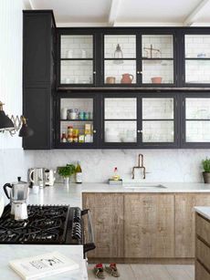
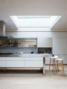
A mix of vintage and new furnishings including the mid-century pendant, were introduced to zhush the units put in by the developer.
Chairs, Japser Morrison. Facile bench, Mattiazzi at Twentytwentyone. Vintage pendant, Bentply. Similar kitchen, Obume
In the kitchen, it is the pair of mid-century teal pendants that divert your attention from the glossy white joinery installed by the last owner. ‘I’d almost given up looking but there they were, waiting for me at a north London dealer.’ In the master bedroom, the striking, bespoke bedside table is a mix of dark, honeyed oak with a marble top and replete with charger.
GUEST BEDROOM
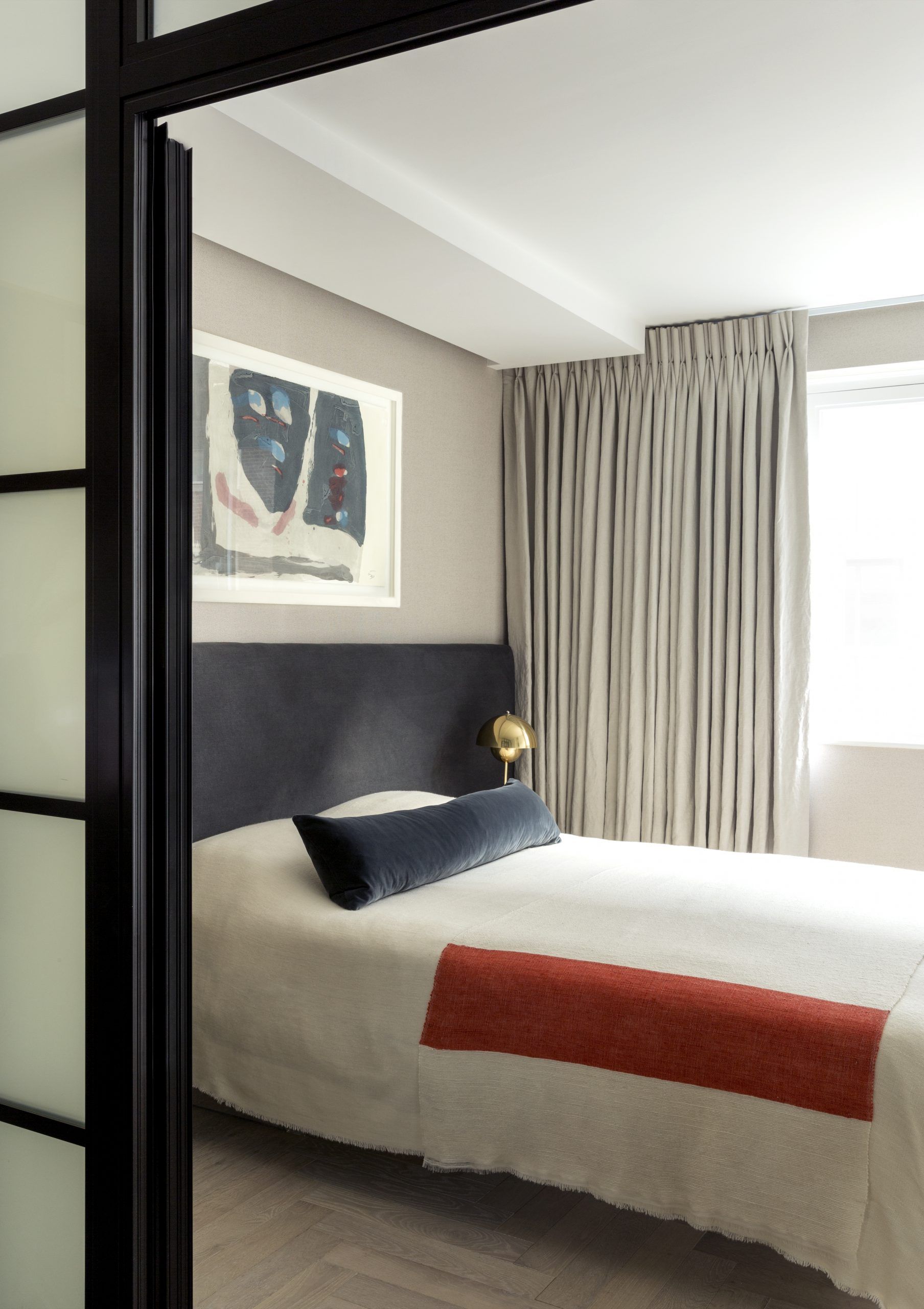
The colour-block throw and black-framed doorway have a Mondrian look.
Throw, Rose Uniacke. Headboard in Chelsea Charcoal, Kirkby Design. Flowerpot lamp by Verner Panton at Twentytwentyone
No structural changes were made to the 112 square metres, where the large living space leads to a bright terrace. Instead, it’s the textures – velvets, bouclés and linens – combined with unusual art and antiques that have reinvigorated the space.
MASTER BEDROOM

Silk, leather and velvet surfaces bring the requisite luxury.
Nuvol 2 wall light, Contain. Headboard in leather at Dani
‘As a decorator, you’re exposed to so many things – in painting, textiles, architecture, furniture – every project is a chance to draw on those influences,’ says Hazel, who used to run a successful wedding list company before setting up her practice in 2006. ‘I’ve always enjoyed curating people’s homes, finding unusual things to match their taste,’ she says.
See more of Hazel’s work at hazelcollins.com
Photography Ben Sage
Be The First To Know
The Livingetc newsletter is your shortcut to the now and the next in home design. Subscribe today to receive a stunning free 200-page book of the best homes from around the world.
The homes media brand for early adopters, Livingetc shines a spotlight on the now and the next in design, obsessively covering interior trends, color advice, stylish homeware and modern homes. Celebrating the intersection between fashion and interiors. it's the brand that makes and breaks trends and it draws on its network on leading international luminaries to bring you the very best insight and ideas.
-
 How to Thaw a Frozen Pipe — Learn Everything You Need to Know in 5 Minutes With This Guide
Winter storm caught you off guard? We asked an expert — just how do you thaw a frozen pipe?
By Hugh Metcalf Published
-
 The 12 Very Best Silk Bedding Pieces — As Our Style Editor Says: 'It's What Dreams Are Made Of!'
Slumber in lustrous luxury with the very best silk bedding sheets, duvets, pillowcases, and more — your sleep score will thank us later
By Julia Demer Published
-
 Tour a mid-century house in Philadelphia with a modern take on Mad Men style
This mid-century house in Philadelphia is a modern take on mid-century design and the perfect backdrop for this enviable collection of art and objects
By Livingetc Last updated
-
 This modern Edwardian house in Melbourne is small but mighty
It may be small, but thanks to its ingenious design, this Edwardian house in Melbourne makes family living a breeze
By Livingetc Last updated
-
 Old meets new in this apartment in New York's East Village - a former community centre built in 1860
The owner of this loft-style apartment in New York's East Village mixes ancient and modern with timeworn pieces, design classics and his own abstract art...
By Livingetc Last updated
-
 Explore this super-contemporary coastal house in Cornwall
This coastal house in Cornwall is all about drinking in the uninterrupted views of nature at its most raw, most pure…
By Livingetc Last updated
-
 Explore this spacious detached 1900s house in southeast London with stylish modern interiors
Edgy textures, luxe materials and a mix of vintage and bargain buys transformed a blank detached 1900s house in southeast London into a home full of personality.
By Livingetc Last updated
-
 This large house in west London is minimal yet playful
A firefighter’s pole in the kitchen and a slide down the stairs? This house in west London proves minimalism can also be fun.
By Livingetc Last updated
-
 Inside A Clever Garden Room That Doubles As A Chic Guest House
This striking garden room design incorporates a sleeping area, kitchenette, loo and shower, as well as plenty of storage space, making it ideal as both a self-contained guest house or a restful retreat to escape to.
By Lotte Brouwer Published
-
 This light and bright Victorian terrace in west London is relaxed yet stylish
This chic Victorian terrace in west London is full of clever ideas that allow it to evolve.
By Livingetc Last updated

