Industrial vibe #29
Surprising contrasts and the connection between inside and out are key in this cleverly reimagined family abode
THE PROPERTY
A four-bedroom, three-bathroom house in the grounds of a stately home just outside Dublin. On the ground floor is an entrance hall, an open-plan kitchen and dining area, two living rooms, a nook, plus a tiled indoor/outdoor area and a WC. Upstairs there are four bedrooms, two ensuite and a family bathroom.

'Even before we started work, this house was totally spellbinding,’ says interior designer Roisin Lafferty. ‘You don’t normally find vaulted spaces in residential buildings and this had so much character. The owners knew straight away that they wanted to live here.’
Four years ago, when the couple bought it as part of a larger estate, the 18th-century coach house/paper mill was derelict. That’s when Roisin and the Kingston Lafferty team were brought on board to reimagine the property’s historic structure and transform it into a contemporary home.
DINING AREA
Dilapidated archways were all that was left of the original building. The mismatch of granite and yellow brick was stripped of flaking render, restored and sealed, while architects were enlisted to create a new footprint, extending the property and adding much of the current first floor.
‘The extension is a modern design,’ says Roisin. ‘We could easily have made the interior industrial, but what we wanted was yin and yang, masculine and feminine, so it’s very much old meets new.’

Designed to complement as well as connect with the older structure, the multi-level ground floor incorporates hidden nooks and pockets, while key to its layout is the smooth sense of flow, which gives a feeling of energy and movement.
‘I like the idea of flexibility, to be able to fully circulate and have different experiences as you walk through the space,’ says Roisin. ‘As you enter the hall there are three options of which way to go, and each one takes you on a separate journey.’
KITCHEN
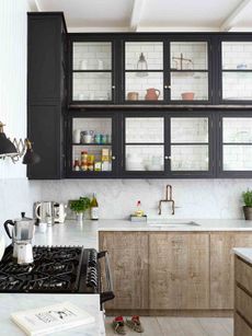
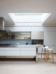
A sense of calm permeates the open-plan kitchen and dining area. Here, monolithic cabinetry of sprayed ash and ebony topped with black-veined marble sits against polished-plaster walls and views between the zones are framed with glazed steel screens.

‘We wanted to create a feeling of separation,’ says Roisin. ‘The partitions fit inside the arches to visually define each area.’ Leading off this ample space is a sunken nook, complete with pleasingly textured brickwork, striking pink upholstery and a playful pendant light.
‘It was going to be a bathroom, but it has such lovely natural light that we decided to use it in a different way. The seating is almost like a bed and it’s a great place for the kids to hang out,’ says Roisin.
LIVING ROOM
On the opposite side of the kitchen, concrete steps lead down to a relaxed contemporary living room, which can be sectioned off using a large oak sliding door if so desired.
Generous glazing ushers in maximum daylight and offers views of the garden, while planters filled with verdant foliage create a link between inside and out.

This space is an odd shape, so the sofa wasc ustom-made. The limed oak chevron flooring is modern yet cosy, while the white sculptural lights create a canopy effect and help to soften the hard finishes.
STTING ROOM
The ground floor also accommodates a second living room, which was part of the old building. Plaster render was applied to the walls and ceiling and painted in a high-gloss petrol blue.
‘The proportions are quite strange as the ceiling is high, but the footprint is small,’ says Roisin. ‘Rather than trying to make it something it’s not, we kept it as an intimate space and went for a moody hue.’

In here, vintage pieces and well-chosen high-street findssit perfectly together. The roughly plastered walls have been painted in a glossy deep bluefor a sophisticated ambience.
TERRACE
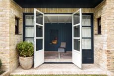
The most unexpected addition is an expansive indoor/outdoor space that leads on to the garden and allows fresh air and light to flood in. Clad in zellige tiles, it focuses on a cantilevered table that continues through the bifold window to the terrace outside.
‘It’s a lovely spot for breakfast or to work, plus it’s super-durable for the kids,’ says Roisin.

Cleverly connected to the ‘quite masculine’ kitchen via a large bifold window, this outdoor space contrasts in both style and feel. The zellige tiles are a bit of fun and contrast with the matt surfaces.’
MASTER BEDROOM
Tiles also feature upstairs, and not just in the bathrooms. Taking pride of place in the master bedroom is a headboard covered in vintage-style tiles. It functions as a dividing wall, behind which sits a bank of wardrobes, and there’s a separate walk-in wardrobe too. Black-and-white tiles line a single wall in the children’s bedroom, while the family bathroom is given a stylish twist with a bold monochrome design.

The other bedrooms are lighter, but this one has a more intimate design. It also has an en suite and wardrobes that fit as much storage as possible
Remarkably, it took just nine months to transform this space from an admittedly charming wreck to this refined and calming yet uplifting family home.
‘The owners knew this was a special building and they wanted to create something beautiful and unusual,’ says Roisin. ‘The great thing was they gave us free rein, so we had lots of fun.’
PHOTOGRAPHY /Barbara Corsico INTERIOR DESIGN / Roisin at Kingston Lafferty Design
Be The First To Know
The Livingetc newsletter is your shortcut to the now and the next in home design. Subscribe today to receive a stunning free 200-page book of the best homes from around the world.
The homes media brand for early adopters, Livingetc shines a spotlight on the now and the next in design, obsessively covering interior trends, color advice, stylish homeware and modern homes. Celebrating the intersection between fashion and interiors. it's the brand that makes and breaks trends and it draws on its network on leading international luminaries to bring you the very best insight and ideas.
-
 These 12 Best Table Lamps for Your Desk — Perfect Glows for a Creative Home Office
The best table lamps for your desk is have a soft, targeted glow. Elevate your WFH set-up with these stylish picks endorsed by Style Editor Brigid Kennedy
By Brigid Kennedy Published
-
 The Nespresso VertuoPlus is 30% Off for President's Day, and it's Kim Kardashian's Coffee Maker of Choice
This sleek and stylish coffee maker was spotted in Kim's home bar, and you can currently save $60 if you buy yours from Amazon
By Lilith Hudson Published
-
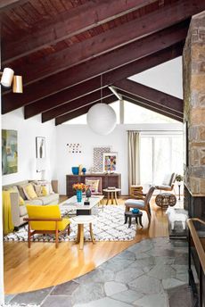
 Tour a mid-century house in Philadelphia with a modern take on Mad Men style
This mid-century house in Philadelphia is a modern take on mid-century design and the perfect backdrop for this enviable collection of art and objects
By Livingetc Last updated
-
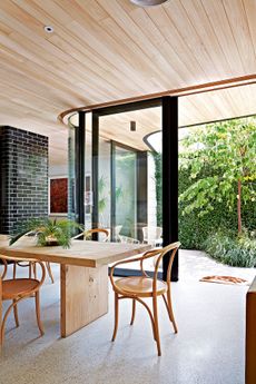
 This modern Edwardian house in Melbourne is small but mighty
It may be small, but thanks to its ingenious design, this Edwardian house in Melbourne makes family living a breeze
By Livingetc Last updated
-
 Old meets new in this apartment in New York's East Village - a former community centre built in 1860
The owner of this loft-style apartment in New York's East Village mixes ancient and modern with timeworn pieces, design classics and his own abstract art...
By Livingetc Last updated
-
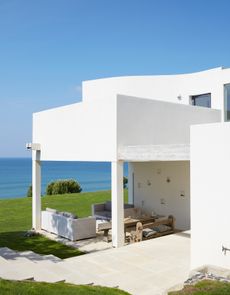
 Explore this super-contemporary coastal house in Cornwall
This coastal house in Cornwall is all about drinking in the uninterrupted views of nature at its most raw, most pure…
By Livingetc Last updated
-
 Explore this spacious detached 1900s house in southeast London with stylish modern interiors
Edgy textures, luxe materials and a mix of vintage and bargain buys transformed a blank detached 1900s house in southeast London into a home full of personality.
By Livingetc Last updated
-
 This large house in west London is minimal yet playful
A firefighter’s pole in the kitchen and a slide down the stairs? This house in west London proves minimalism can also be fun.
By Livingetc Last updated
-
 Inside A Clever Garden Room That Doubles As A Chic Guest House
This striking garden room design incorporates a sleeping area, kitchenette, loo and shower, as well as plenty of storage space, making it ideal as both a self-contained guest house or a restful retreat to escape to.
By Lotte Brouwer Published
-
 This light and bright Victorian terrace in west London is relaxed yet stylish
This chic Victorian terrace in west London is full of clever ideas that allow it to evolve.
By Livingetc Last updated


