A Colourful West London Townhouse Designed by Beata Heuman
This West London townhouse was Beata Heuman's first solo project, and it made her press debut for its stand-out use of colour and specialty paint finishes, a signature of Heuman’s.


PROPERTY
A five-bedroom, three-storey townhouse and modern home in West London with colourful interiors designed by Beata Heuman.
HALLWAY
Bespoke pieces throughout include an entry hall table (pictured top) with cabriole legs and metal studs. A wooden mirror hangs above an ornate sideboard with two bird lamps.
LIVING ROOM
The artist owners of this London house called on interior designer Beata Heuman to create a family home full of fun, distinctive design and strong colours. She worked together with Groves Natcheva Architects to reinvent this London home, built in the late 1800s.
The attractive yellow-brick, villa-style façade, with its handsome sash windows and arched front door, was left completely untouched. But inside, Beuta Heuman created a highly original space, unapologetically theatrical and oozing energy.

The owners love strong colours and different themes, which Beata honoured, creating different schemes and moods in each room. The result is a home that is fun and uplifting, without being overboard or difficult to live with.
Warm pink walls in Dulux 90RR 52214 are the perfect backdrop for the Walton Ford prints. They appear to be naturalist illustrations, but if you look closely, they are trippy and quite naughty.
Beata concealed the television in a red-lacquer cabinet with glazed doors framing maps. The ottoman serves as a coffee table, so the top is upholstered in 'Asphalte' by Métaphores, a double-sided linen/cotton cloth with a rubber coating that makes it wipeable. It also provides storage.

The pink living room, which features Dorothy Draper mirrors from Talisman, is made more approachable by classic armchairs covered unexpectedly in blue denim.
The owners didn't want it to be obvious they had used an interior designer, so Beata Heuman created a layered look that appears to have been built over time. The owners' large and varied collection of art added an important visual texture to the decoration.
Artworks aside, the scheme is created with pieces from a wide variety of sources. It was important to Beata that it didn't look as if everything was bought from the same place, so she designed many of the wonderful bespoke items herself.

This style of decoration could look cluttered, so Beata put storage everywhere to streamline it. The armchairs are from the owners' old at, reupholstered in cotton denim from I Want Fabric.
LIBRARY
Instead of a traditional desk, the library is furnished with a round table and chairs so that it can also function as a dining space for intimate suppers. Panelling in 'Lichen' linseed oil paint by Allbäck, together with an eighteenth-century portrait, gives the room a traditional and atmospheric look, which is tempered with whimsical touches, such as the bone china 'Felix Original Shell' lights from Felix Lighting.

KITCHEN
Beata avoided wall cupboards in the kitchen as she didn't want the kitchen to read like a traditional kitchen or look too boxy. Beata had the wood floorboards painted to mimic marble.
The colour palette, which includes a Swedish green marble worktop and a bespoke copper cooker hood and island by Premier Building & Design, complements the garden beyond.

The copper hood will acquire a greenish patina over time.
The kitchen area flows into various informal living areas, housed in a new part of the house. Although the right side of the house was built in the late 1800s, the left was added much later.

This side of the house is quite an awkward shape, so Beata's solution to this was a cosy spot with a chimneypiece and an extra-deep sofa ideal for reading or chatting to whoever is cooking.

She also created a play area with a blackboard on the wall for the owners' one-year-old daughter.

DINING ROOM
New floor-to-ceiling windows offer views of the rear garden. A bespoke sofa is covered in 'Havana' (32) velvet by Gastón y Daniela at Abbott & Boyd, with its back in a smart contrasting stripe. Beata designed the dining table and partnered it with the 'Bayonne' chandelier from Vaughan. On the walls, a bright blue paint was applied, then overlaid with five coats of glaze in varied tones of cream.

STAIRCASE
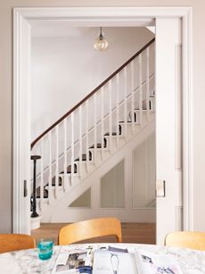
Over the years, the house had suffered a number of ill-considered adaptations, which left the internal layout compromised. A single move was needed in order to unlock the house's potential. The answer was relocating the staircase to the centre of the house. This gave architects Groves Natcheva an anchor around which they were able to arrange the rest of the house with more freedom.
The staircase was conceived as a sculpture to be looked at and a stage to be seen on. The overall appearance alludes to the fantastical in infinity Penrose stairs made famous by the lithographs of Escher. Beata has added to the effect with simple 'Pernell' pendant lights from Arteriors that mimic the balustrades without competing with its visual impact.

MASTER BEDROOM
The master bedroom has a bespoke sofa upholstered in Beata's signature marbleised fabric and lion claw feet.

Other notable features include a pair of breglass dance-hall mirrors from French Loft and the ceiling painted in 'Lulworth Blue' by Farrow & Ball, adding a feeling of height.

MASTER BATHROOM
The opulent, free-standing bath in the master bathroom is actually made from wood, a design which was copied from a Twenties design that Beata spotted in an old magazine.

It was quite difficult to work out how to make it, but, fortunately, Beata had a very good joiner and discovered a specialist timber from the Netherlands that is used in boat building and can be submerged in water for 10 years without any ill effect.

The curved bathroom cabinets are decorated with Fornasetti 'Nuvole' wallpaper, which Beata has customised with sky-blue paint.

GUEST BEDROOMS
A small bedroom was transformed when Beata Heuman added this clever partition frame, creating a cosy red nook for a single bed (with built-in shelving alcove for reading) on one side, with a desk area painted in blue on the other.

Meanwhile, a larger guest room that's paintedin different shades of blue is given a lift by a mustard throw.

ENSUITE
An en suite bathroom is painted in an emerald green.

CLOAKROOM
Bright red everything and the zebra wallpaper by Scalamandré create a striking cloakroom.

Photography by Simon Brown
Be The First To Know
The Livingetc newsletter is your shortcut to the now and the next in home design. Subscribe today to receive a stunning free 200-page book of the best homes from around the world.
Lotte is the Digital Editor for Livingetc, and has been with the website since its launch. She has a background in online journalism and writing for SEO, with previous editor roles at Good Living, Good Housekeeping, Country & Townhouse, and BBC Good Food among others, as well as her own successful interiors blog. When she's not busy writing or tracking analytics, she's doing up houses, two of which have features in interior design magazines. She's just finished doing up her house in Wimbledon, and is eyeing up Bath for her next project.
-
 How to Thaw a Frozen Pipe — Learn Everything You Need to Know in 5 Minutes With This Guide
Winter storm caught you off guard? We asked an expert — just how do you thaw a frozen pipe?
By Hugh Metcalf Published
-
 The 12 Very Best Silk Bedding Pieces — As Our Style Editor Says: 'It's What Dreams Are Made Of!'
Slumber in lustrous luxury with the very best silk bedding sheets, duvets, pillowcases, and more — your sleep score will thank us later
By Julia Demer Published
-
 Tour a mid-century house in Philadelphia with a modern take on Mad Men style
This mid-century house in Philadelphia is a modern take on mid-century design and the perfect backdrop for this enviable collection of art and objects
By Livingetc Last updated
-
 This modern Edwardian house in Melbourne is small but mighty
It may be small, but thanks to its ingenious design, this Edwardian house in Melbourne makes family living a breeze
By Livingetc Last updated
-
 Old meets new in this apartment in New York's East Village - a former community centre built in 1860
The owner of this loft-style apartment in New York's East Village mixes ancient and modern with timeworn pieces, design classics and his own abstract art...
By Livingetc Last updated
-
 Explore this super-contemporary coastal house in Cornwall
This coastal house in Cornwall is all about drinking in the uninterrupted views of nature at its most raw, most pure…
By Livingetc Last updated
-
 Explore this spacious detached 1900s house in southeast London with stylish modern interiors
Edgy textures, luxe materials and a mix of vintage and bargain buys transformed a blank detached 1900s house in southeast London into a home full of personality.
By Livingetc Last updated
-
 This large house in west London is minimal yet playful
A firefighter’s pole in the kitchen and a slide down the stairs? This house in west London proves minimalism can also be fun.
By Livingetc Last updated
-
 Inside A Clever Garden Room That Doubles As A Chic Guest House
This striking garden room design incorporates a sleeping area, kitchenette, loo and shower, as well as plenty of storage space, making it ideal as both a self-contained guest house or a restful retreat to escape to.
By Lotte Brouwer Published
-
 This light and bright Victorian terrace in west London is relaxed yet stylish
This chic Victorian terrace in west London is full of clever ideas that allow it to evolve.
By Livingetc Last updated
