Are wallpaper borders really making a comeback? These modern examples have us convinced
Wallpaper borders are in again, this time with a modern edge. These designers explain how to use them to embrace pattern
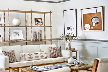

If you were looking for evidence of the cyclical nature of trends, wallpaper borders are a prime example. That's right, the passé design statement of the eighties and nineties is making a comeback, complete with a modern uplift - and it's understandable why. In a year that saw us embrace more color and pattern than we've seen in a decade, it's no surprise that this quirky wallpaper idea is set to dominate our interiors in 2023.
Whether you're looking to add a gentle pop of color to your neutral space or you want to make a full blown design statement, wallpaper borders might just be the way to go. A simple and inexpensive design idea, they're a brilliant way to add visual interest to a room without the commitment - or effort - of floor to ceiling wallpaper. What's more, with the variety of positionings and paint color combinations, they allow for greater creative freedom, too.
Thinking of giving borders a go? We've asked some trusty designers for their advice on embracing this trend to inject a subtle use of pattern into your home, all while keeping a contemporary twist in mind. We're sure you'll be itching to redecorate in no time...

Lilith is an expert at following news and trends across the world of interior design. She's committed to sharing articles that help readers embrace emerging trends and keep up-to-date with changing styles, including those on our walls. For this piece, she spoke with leading designers to learn all about the return of wallpaper borders and how to add modern edge to this classic design.
What are wallpaper borders?

Lick x Kelly Hoppen Weave 01 Wallpaper Border
'They're playful and a bit irreverent as let’s be honest – they’ve never had the best reputation!'
Kate Hawkins, founder of CommonRoom
This wallpaper trend pretty much does what it says on the tin. Wallpaper borders are strips of wallpaper typically used as a perimeter border on the wall of a room - be it around the cornices, skirting boards or wainscoting - but can border a door or other feature too.
'Borders have been used for many years to elevate the simplest of rooms, adding detail and delight in an easy, affordable way,' says Susie Atkinson, wallpaper border designer and owner of Studio Atkinson. 'The possibilities with borders, are endless: I tend to use them around skirting boards and doorways for a more classical feel, or even under the tread of a staircase for something more contemporary and dimensional.'
While borders have been absent from the design lookbooks for some time, they have a long history that dates back to the 1800s. 'They were historically used to hide imperfections in a room, to complement the design, or, as is often thought in recent years, as a sometimes not-so-stylish addition to a scheme,' says Kate Hawkins, founder and creative director of CommonRoom. 'They were used at the top of the wall where the wallpaper meets the ceiling, but there are many different, creative ways to use them.'
Why are they trending now?

Since you probably associate borders with being an unfashionable fad, you might have been happy to never see them crop up in designs ever again. So why the sudden return?
'In the post-lockdown era, people have had more time to experiment with their homes,' says Susie. 'If you still want to play around with your interiors, but don’t want to commit to decorating a room top-to-toe in wallpaper, then borders are an impactful and hassle-free way of adding a visual accent to your space.' The idea is all about making traditional patterns feel modern.
Tash Bradley, Director of Interior Design at Lick, is particularly excited about borders' modern revival. 'They're now being used to inject a bit of personality and character into your room,' she says. 'Wallpapering can be quite a big commitment and can be quite expensive, so wallpaper borders are a great entry level to bring a bit of design to your room, and it’s super fun.'
In some cases, the return of borders is also a little tongue-in-cheek. As Kate notes: 'They're playful and a bit irreverent as let’s be honest – they’ve never had the best reputation! They add interest and a sense of fun to a room without being a huge investment, financially or emotionally.' That said, done properly, they can also add a cozy yet sophisticated feel to your space when you give special thought to your pairing of color and pattern.
How to style wallpaper borders
1. Choose a simple pattern
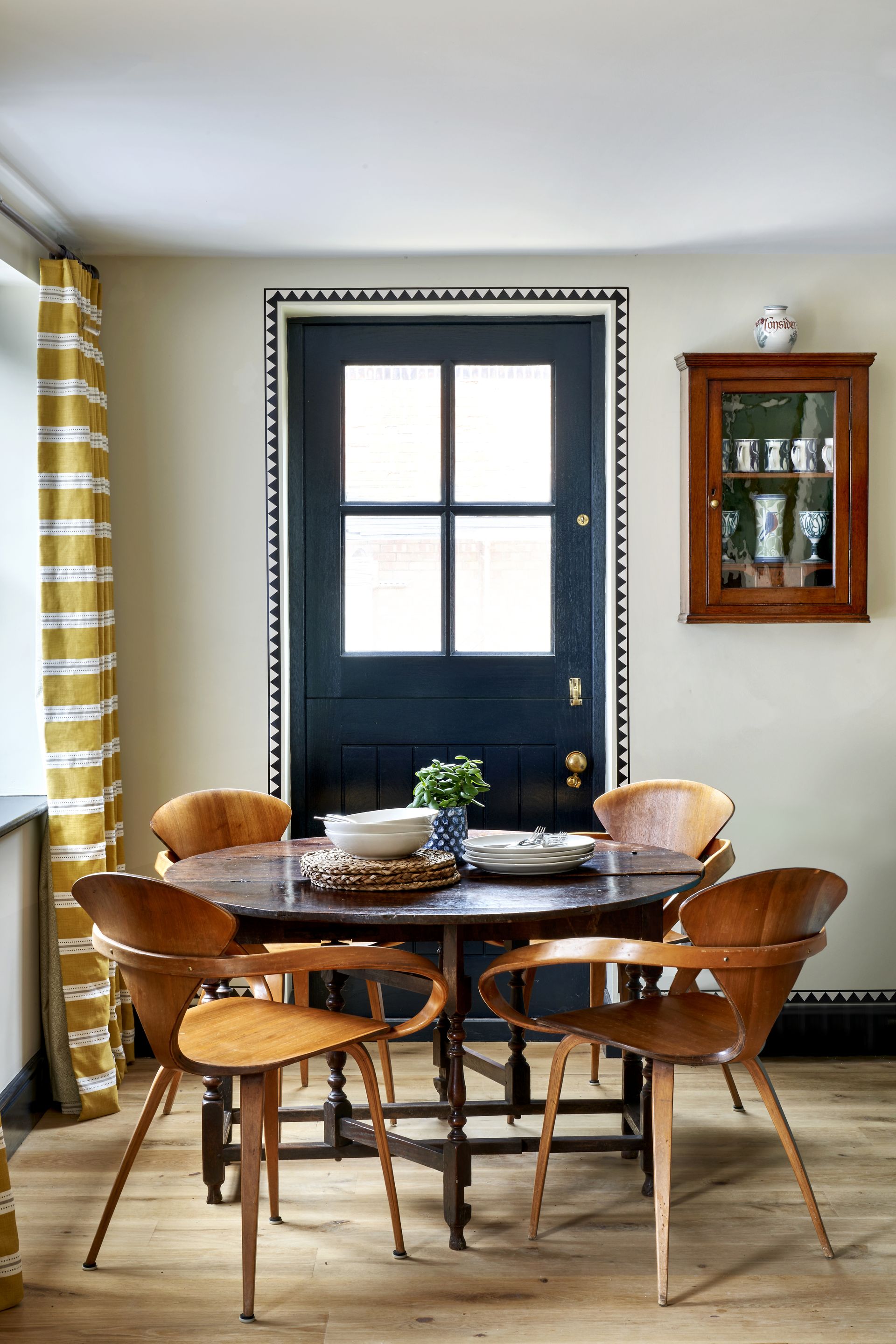
Studio Atkinson Vivien Border
If you've decided to give wallpaper borders a go, the pattern should be your first thought. While a busy floral design might suit your eclectic style, Susie suggests opting for a more simple, understated design if you want to play things safe.
'I find patterns that aren’t overly complicated but come in bright colorways the most striking,' she explains. Think geometric triangle motifs or classic Grecian designs if you want a timeless wallpaper that's sure to grab the eye and avoids looking dated.
'Go for checked, dashes or a weave effect patterns and try to stay away from old-fashioned, floral designs which are now a little bit old school,' Tash adds. 'What you want to do is turn the borders on their head and make them modern so they don’t overwhelm a room and bring something chic instead.'
As Kate points out: 'Wallpaper borders are essentially framing mechanisms so any repeating design that incorporates or is encased by framing devices such as bands or stripes work especially well.'
2. Experiment with positioning for a more modern edge

Studio Atkinson Adonis Border
Traditional wallpaper borders would be found around skirting boards or as dado rails along the bottom third of a room, but contemporary designs encourage bolder experimentation.
'Borders can be given a modern edge in a variety of ways. Firstly, you can make them feel fresh by installing them without any accompanying wallpaper,' says Kate. Be it a bedroom or living room wallpaper idea, using bold designs in an otherwise neutral room with plain walls can really help to introduce an emphasis on color to a space.
'Less conventionally we have experimented with installing them directly above skirtings and around doorways to add a bit more interest,' adds Kate. 'They can basically be used to highlight any joinery detail or any other aspect of a room that you want to draw attention to.'
She thinks of wallpaper borders as highlights you find in paintings, where the tricks of dimension and lighting tend to be added toward the end to give the illusion of shape and form. 'It’s the same with a room,' she says. 'A border has the potential to create real light and shade in a space.'
3. Think outside the box
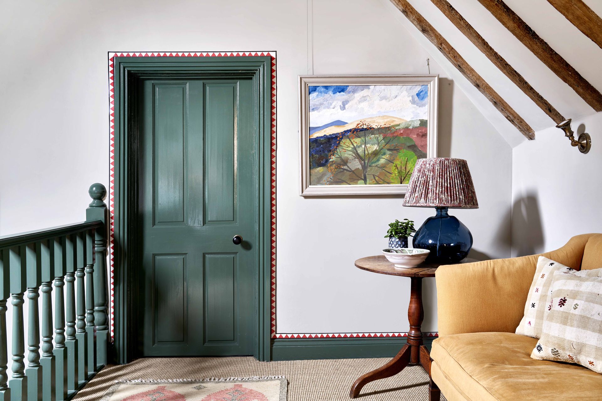
Studio Atkinson Vivien Border
Although we've generally been discussing borders as room perimeters, you should think outside the box (literally). Wallpaper borders are by no means limited to our walls.
'There are no rules when it comes to borders,' Susie says. 'They're so versatile that you don’t even have to confine them to a room – they can go on staircases, furniture or even around window frames.' She encourages using borders in a more multidimensional way, too. Use them to create the illusion of panel frames on the bottom third of your wall, or apply them to intersect and overlap with other border patterns.
The only thing Tash thinks we should be wary of is using borders in smaller spaces. 'Bear in mind that your eye will be drawn to wherever the border is placed,' she says. 'Larger rooms lend themselves to wallpaper borders slightly better than smaller rooms. You’re drawing a border around the edges of a room so you'll notice the size of the space. You want to optimize the space and not make smaller rooms feel even smaller.'
Be The First To Know
The Livingetc newsletter is your shortcut to the now and the next in home design. Subscribe today to receive a stunning free 200-page book of the best homes from around the world.

Lilith Hudson is the News Editor at Livingetc, and an expert at decoding trends and reporting on them as they happen. Writing news, features, and explainers for our digital platform, she's the go-to person for all the latest micro-trends, interior hacks, and color inspiration you need in your home. Lilith discovered a love for lifestyle journalism during her BA in English and Philosophy at the University of Nottingham where she spent more time writing for her student magazine than she did studying. After graduating, she decided to take things a step further and now holds an MA in Magazine Journalism from City, University of London, with previous experience at the Saturday Times Magazine, Evening Standard, DJ Mag, and The Simple Things Magazine. At weekends you'll find her renovating a tiny one-up, one-down annex next to her Dad's holiday cottage in the Derbyshire dales where she applies all the latest design ideas she's picked up through the week.
-
 The 12 Best Table Lamps for Reading —I'm a Certified Bookworm (and Shopping Expert)
When it comes to table lamps for reading, I don't mess around. If you're the same, this edit is for YOU (and your books, or course — and good recommendations?)
By Brigid Kennedy Published
-
 "It's Scandi Meets Californian-Cool" — The New Anthro Collab With Katie Hodges Hits Just the Right Style Note
The LA-based interior designer merges coastal cool with Scandinavian simplicity for a delightfully lived-in collection of elevated home furnishings
By Julia Demer Published
