How to make traditional patterns feel modern
Yes, chintz is back, and we aren't mad about it. So we asked the experts how to make these on-trend traditional patterns feel modern
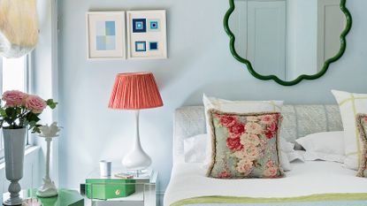

When it comes to the big interior trends of 2021 and going into 2022, there is something key that seems to run throughout them all, and that's comfort. Gone are clean lines, and sleek modern pieces, instead all the trends are leaning towards creating spaces that are a joy to spend time in, spaces that reflect our personalities rather than a specific style.
And perhaps because of this shift towards our homes becoming cozy sanctuaries rather than just a reflection of what's 'trending', classic motifs, nostalgic vintage prints, and traditional patterns are making a comeback in a big way.
But before you start envisioning chintz on every surface, the way these patterns are being used in 2022 is a world away from their 80s heyday. They are now being expertly blended into contemporary spaces to add character and warmth.
So how do you get this blending of styles right? How can you stylishly decorate with paisley prints? How can you make traditional patterns feel modern? We asked designer Brooke Copp-Barton, who's all about mixing modern and vintage in her projects, to spill the beans on how to use heritage prints in modern interior design.
1. Use selected accessories to add a traditional tone

Bringing more traditional prints into modern spaces is really all about the accessories. It's about adding pattern and softness via lampshades, frames, and soft furnishings in all those lovely heritage tones.
Brooke suggests to 'start with the smaller, easier entry points such as lampshades, cushions, and throws - they won’t cost a fortune, but they will help you get a feel for what you like and how the modern heritage look could work in your home.'
'I love beautiful lampshades made from vintage saris - not only unique but often pieces of art in their own right - and you can easily match with modern colorful ceramic bases for a contemporary feel. Samarkand Design is a great place to look. Artwork in general plays a really important part in setting the tone, and keeping an interior modern and edgy.'
But what makes it feel more decidedly modern is to pair all this softness with clean crisp lines and a pared-back color palette. And not to go overboard! A couple of selected prints in one space will give a more intentional feel, rather than tipping over into eclectic. See how in this living room idea there's plenty of traditional patterns and accessories Brooke talks of, but it doesn't feel too busy. The block colors ground the room, and the fact the patterned cushions pick up on the red of the sofa keeps the overall look cohesive.
2. Artfully mix prints and patterns

What we love about mixing old and new, and bringing more traditional designs into modern spaces, is that you really do get to pick the best of both worlds. You can combine the classic patterns you love with contemporary prints that reflect the more modern side of your style. Take this space, not only is it filled with inspiring living room color ideas (loving the pink and coral combo) but it subtly blends both traditional and modern prints. The floral cushions nod to the traditional, while the graphic tropical print of the rug adds a contemporary edge.
'Classic prints look stunning with a modern complement - take a traditional floral cushion with a geometric rug or contemporary stripe pouffe and vice versa,' explains Brooke. 'We needn’t limit ourselves to curtains and cushions - a bold heritage print on a headboard can make a real statement and feel very modern. Mixing it up is usually the way it naturally falls together - florals with geometrics, stripes with curvaceous prints, and so on.'
3. Don't shy away from bolder color choices

Classic muted shades have long been the go-to palette for more traditional schemes, but to give this look a modern twist, go bolder with brighter and deeper shades on your accessories and soft furnishings. Thinking about color is usually the bouncing off point for most people planning a new interior look - though looking into an area like current sofa trends can also help - so if you're starting fresh and want to give this vibe a go, Brooke's advice is to be brave, stick to your favorite color combo and build from there.
'I think it's always a good idea to mix and match different styles and eras as it makes an interior feel collected and lived in,' explains Brooke. 'At the start of a project the clients and I go through a process of looking at different pictures they have torn from magazines or pinned to boards and usually these images paint a pretty clear picture of the colors they gravitate towards.'
'There are colors that I’m naturally drawn to (I’m a sucker for reds, blues, greens, and mustards - ideally all together!) but really, color schemes are generally determined by the client; it’s their home so I like to work with colors that make their hearts sing.' Brooke adds. 'That said, I have certainly noticed a movement towards embracing bold hues in interiors - clients are becoming much braver with their color choices.'
4. Play with size and scale

When it comes to decorating with pattern of any kind, scale is key. 'As a general rule, I tend to mix scale - if you have a bold pattern, I tend to complement it with something calmer, such as a plain or small scale print to blur the edges a bit,' says Brooke. 'See how that looks and then start to layer it up further, adding different textures as well as patterns, as texture is pattern in itself.'
So take Brooke's advice and work in layers and be sure to always check your patterns are balanced. What you want to avoid are two very busy prints or patterns that have a similar scale next to one another. They'll compete for attention and the eye just won't know where to focus. In this fabulous London flat owned by designer Cath Beckett, the layering is spot on. Bold stripes sit with more hectic zig-zags to create a balanced look that's got personality but doesn't overwhelm.
5. Stick to three colors but choose multiple patterns
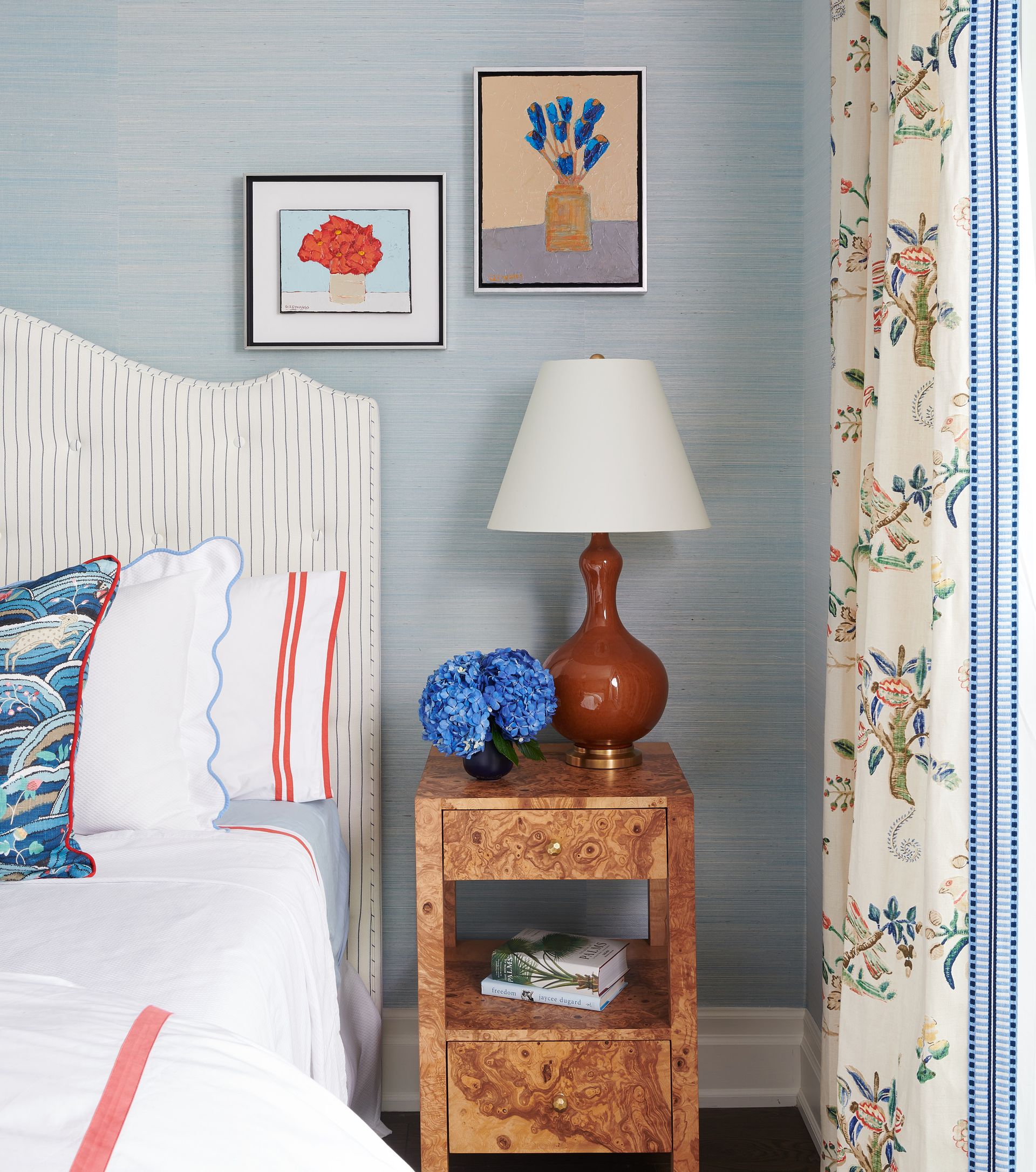
What's key to making a chintzy, pattern-filled space feel modern is by sticking to roughly three colors. This helps ground a look and gives all the different patterns room to breathe. In this bedroom idea, ticking stripes are teamed with scallop trims, pretty florals, and abstract prints, which sounds chaotic, but in fact, the elegant combination of blue, red and white/cream makes it feel fresh and stylish. The crisp white linen, retro bedside table, and graphic lamp stop this room from feeling too twee.
'Inspiration comes from everywhere,' adds Brooke. 'Soak up visual cues all around you, whether going to restaurants and hotels with friends and family, spending time outside, be it town or country - or simply just leafing through magazines.'
What house style suits traditional patterns?
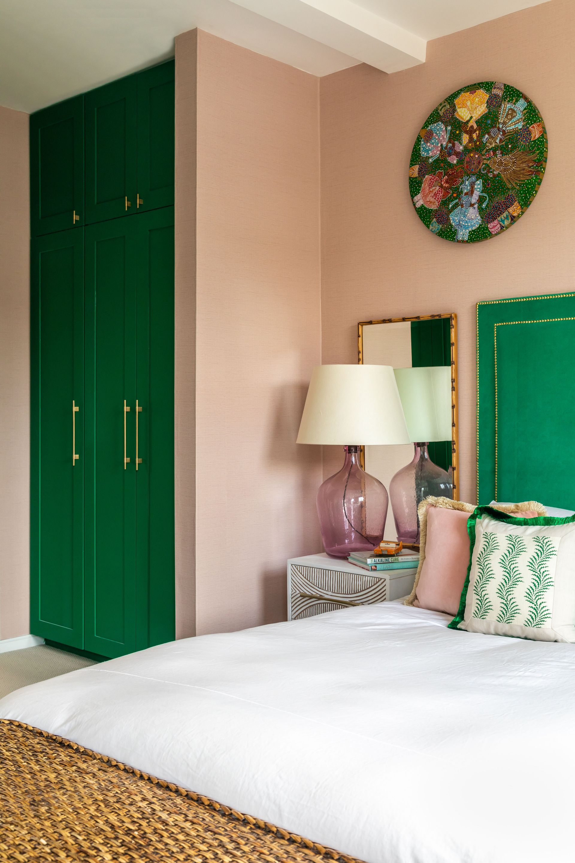
It doesn't matter whether your house is a traditional townhouse or a modern, new build apartment, the beauty with blending old and new is that it's the color palette and patterns that create the look. You can make it as modern or traditional to suit your taste and style.
'Your property doesn’t need to be period to work a heritage print. You just have to look at some of the recently launched William Morris prints in wonderfully fresh joyful colors to see how these could easily lighten up a modern home,' explains Brooke.
'Traditional homes still need modern technology and improvements to live in so it is rare to find a space that is not able to accommodate the modern alongside the heritage - it’s not a question of either or.'
Where can you buy traditional prints and decor?
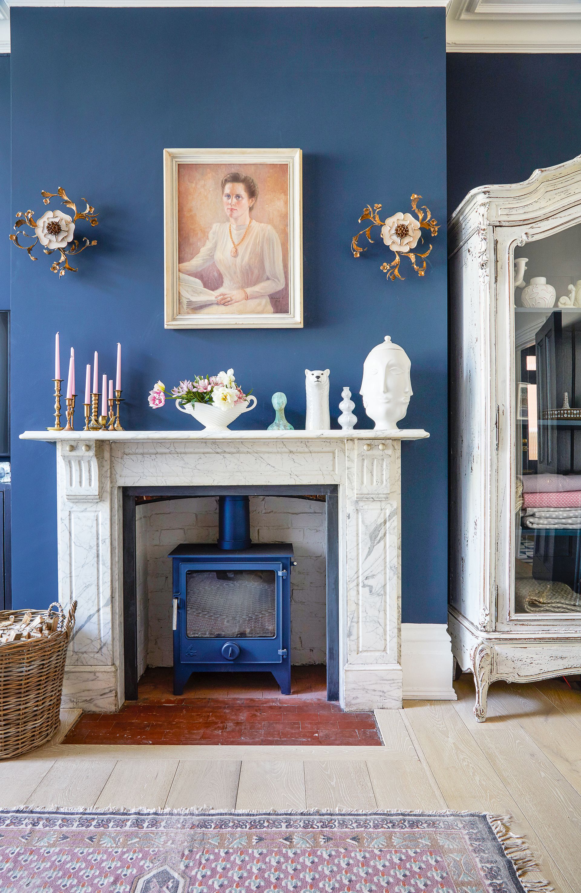
Before you hit the shops and buy new, consider hunting for vintage pieces in your attic or at your parent's house as you never know what treasures you might find for free! Then head to charity shops, antique markets, and scour second-hand sites to find some pre-loved, perfectly intact accessories and soft furnishings to help set off your modern vintage styling.
And if you are after a new piece as a starting point to embrace this style, Brooke advises, 'There are some wonderful furniture and lighting designers that work with shape and form - the Anders pendant from Pinch is a favorite of mine as I love its curves and organic feel, and likewise, I love the artisan nature of Naomi Paul’s lighting with her almost architectural pendants,' she says. 'Browse The New Craftsmen website to find a whole host of talented designers creating wonderfully high quality and timeless pieces that will cross the heritage divide.'
What colors work best with traditional prints?
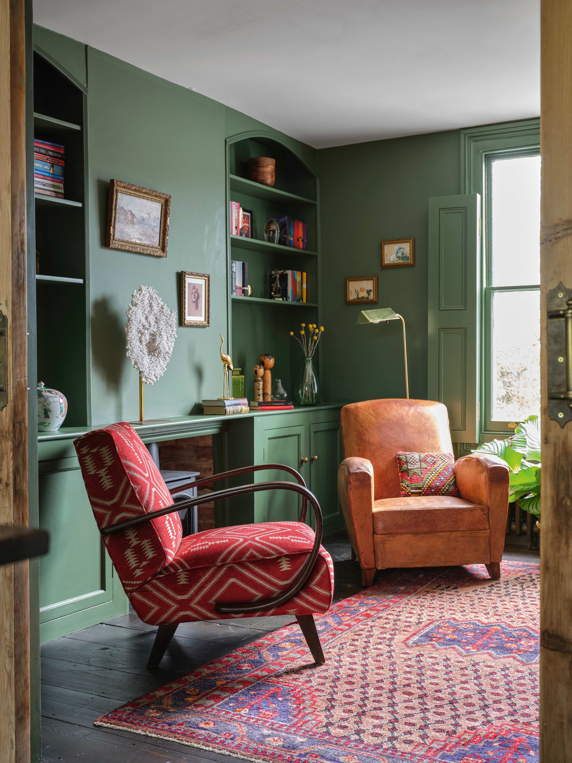
Essentially, heritage colors draw on palettes from the past to evoke the feel of a bygone era. Many big paint brands offer a heritage collection, often focusing on classic, beautiful design eras like Georgian England. The palette tends to be muted, atmospheric and timeless; perfect paint color inspiration if you're after a heritage feel.
Little Greene's Colors of England collection is the result of their ongoing decorative research program; which presents an eclectic mix of the most timeless and best-loved Little Greene colors and it features important colors from the last 300 years of interior decoration.
Be The First To Know
The Livingetc newsletter is your shortcut to the now and the next in home design. Subscribe today to receive a stunning free 200-page book of the best homes from around the world.
As the Houses Editor on Livingetc, Rachel has been obsessed with property ever since she was a kid. With a diploma in interior design and more than a decade working on interior magazines under her belt, she feels very at home sourcing the best contemporary houses the world has to offer for Livingetc. It's not just the day job either, she admits she's spent a scary amount of her own time researching schemes for her own renovations - scrolling Instagram, stalking Rightmove and Modern House, flicking through magazines and snooping in other peoples' windows - so she really does live and breathe houses on a daily, if not hourly, basis. Before Livingetc, Rachel had a stint finding homes for Ikea Family magazine where she was lucky enough to gallivant around the world on shoots meeting and interviewing interesting people, all with a very keen eye for blending high-end design with everyday items from Ikea. It inspired her to not be afraid of mixing new and old, expensive and affordable, vintage and modern and so Rachel's current Victorian terrace in north London is very much an updated, contemporary take on a period property; think open-plan modern kitchen with concrete floors, feature fireplaces and her grandmother’s paintings on the walls. Rachel is currently crushing on reeded glass, large gingham prints, squishy curved furniture; like Buchanan Studio’s Studio chair, and vintage wall sconces; she especially adores Retrouvius for sourcing antique finds and feels inspired by Lonika Chande, Beata Heuman and Matilda Goad and already can’t wait to start planning her next home, wherever that might be.
-
 These 12 Best Table Lamps for Your Desk — Perfect Glows for a Creative Home Office
The best table lamps for your desk is have a soft, targeted glow. Elevate your WFH set-up with these stylish picks endorsed by Style Editor Brigid Kennedy
By Brigid Kennedy Published
-
 The Nespresso VertuoPlus is 30% Off for President's Day, and it's Kim Kardashian's Coffee Maker of Choice
This sleek and stylish coffee maker was spotted in Kim's home bar, and you can currently save $60 if you buy yours from Amazon
By Lilith Hudson Published
