Discover this Victorian townhouse in west London with refined yet industrial decor
Gritty urban décor that's both funky and family friendly. Check out this edgy Victorian townhouse in west London...

THE PROPERTY
A late Victorian townhouse in west London. The modern home's ground floor has a drawing room, kitchen-diner, library and WC. The lower-ground floor houses a bathroom and living room. The first floor has a guest bedroom, bathroom and two children's bedrooms. The master suite is on the top floor.
See more modern homes.
KITCHEN
Open-plan is a dirty word in Sebastian Mann’s home. He gets more excited when a house retains a bit of traditional modesty, with private, individual spaces that slowly reveal themselves and tell a story as you walk around it.
Sebastian and his wife Patrina aren’t ones to settle for a cosy lifestyle. With previous home countries including Cambodia, Australia, Fiji and Dubai, their west London family pad was never going to be a cutesy Nappy Valley number.
So when Sebastian, managing partner of design firm Minale + Mann, reworked this townhouse, he decided to honour its late Victorian roots – while stirring in a generous handful of industrial grit for good measure. Warehouse lighting, stark tones, brass, free-flowing art and roughed-up textures lighten charcoal-grey rooms – it’s a compelling remix.
This kitchen is designed to work hard – with loads of storage and a fierce gas hob for stir-fries – but it can play hard too. There is ample room for the children's toys at the garden end of the room.
Glam materials such as quilted leather and brass could sit easily in a subterranean nightclub, but in the dining area (shown above), they’re blasted with sunlight to create a family-friendly space.

When the couple bought the property, it was merely a bedraggled two-storey house with rotten windows and a half-hearted loft extension. Reviving it began with gutting the building, during which time the family rented nearby. But rather than create a standard, knocked-through double reception room, Sebastian’s impulse was to preserve the separate identity of each space.
The front room was returned to its traditional use as a drawing room – the public face of the house – while the more personalised library and kitchen-diner are to the rear.

See Also: Cool Black Kitchen Ideas
DRAWING ROOM
From the hallway, you can see into the drawing room. Hallways are often neglected, so Sebastian decided to let the two spaces speak to each other. A glazed wall links them without losing their sense of separateness.

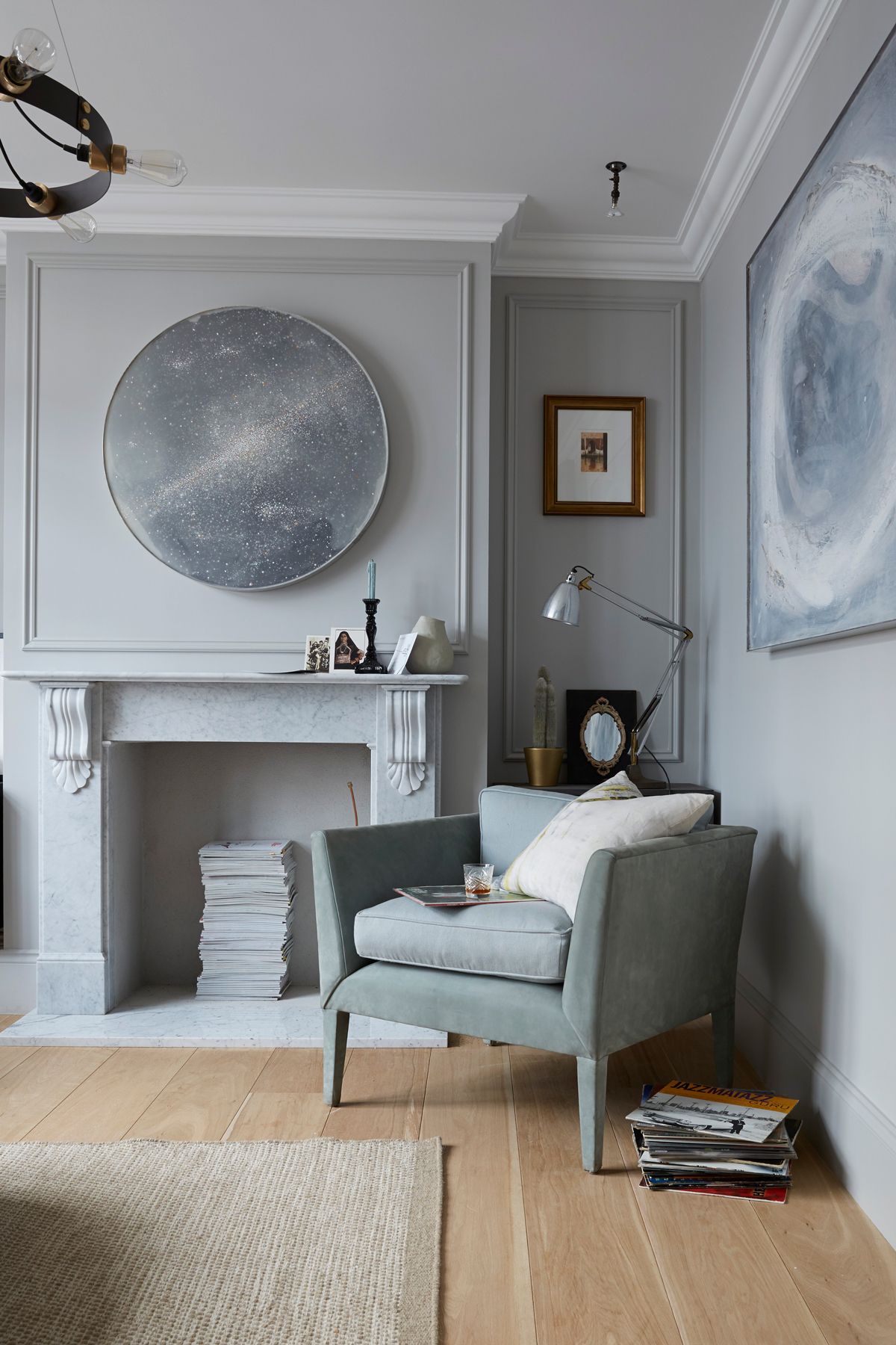
In this grown-up scheme, designed as a formal meet-and-greet space, bold features are softened by ethereal marble tones.
Refined yet industrial is how Sebastian describes the house. This aesthetic runs through all the rooms, with their elegantly urban, grey backdrops.

Artwork by John O’Carroll in layers of wax, resin, aluminium and steel shine out from the graphite-coloured walls, while untreated oak flooring adds natural warmth.

Master bedrooM
The built-in storage, made in black MDF, with a library-style ladder, incorporates a clever display area.

An elevated mezzanine section above the bed adds an extra dimension to the loft for a hotel-suite feel. Family photos and mementos line the shelves.

Master en suite
Slate flooring sets a dark and moody backdrop for hip hotel-style additions in this modern bathroom.
Surfaces in slate, lava stone, wood, brass and marble hone the rough, custom-made theme and link textures throughout the house. For Sebastian it’s a more sophisticated way to create a feeling of unity and flow than just knocking down walls.

To see more of Minale + Mann’s work, visit minaleandmann.com
Photography / Paul Massey
See Also: Master bathroom ideas - 19 stunning design ideas for a dreamy master bathroom
Be The First To Know
The Livingetc newsletter is your shortcut to the now and the next in home design. Subscribe today to receive a stunning free 200-page book of the best homes from around the world.
The homes media brand for early adopters, Livingetc shines a spotlight on the now and the next in design, obsessively covering interior trends, color advice, stylish homeware and modern homes. Celebrating the intersection between fashion and interiors. it's the brand that makes and breaks trends and it draws on its network on leading international luminaries to bring you the very best insight and ideas.
-
 The 12 Very Best Silk Bedding Pieces — As Our Style Editor Says: 'It's What Dreams Are Made Of!'
Slumber in lustrous luxury with the very best silk bedding sheets, duvets, pillowcases, and more — your sleep score will thank us later
By Julia Demer Published
-
 The 12 Best Wayfair Table Lamps Are All Under $200 — And Our Style Editor Wants The Lot
These 12 best Wayfair table lamps are the perfect excuse to get a head start on your President's Day sale shopping. With discounts up to 78% off
By Julia Demer Published

