Colors that go with brown - how to get this tricky shade right
Interior design experts explain the best colors that go with brown, and how to use it artfully in your decor


Brown has long been considered as a - and we’re using this word in the kindest sense - dull choice, and colors that go with brown have often been looked over in favor of other shades. But brown is now a trend, beloved for its richness and warmth, and colors that go with brown are a stylist's secret weapon in bringing it to life.
It’s an unthinkably rich color - one that has no limits in terms of bringing depth and a sense of quality to a decor scheme. Experts in color theory like using it because of its inherent links to the natural world (think about all the varieties of lustrous woods available). Brown furniture, which has recently been experiencing a revival, brings a timeless appeal to an interior, and one that’s often associated with the height of good everlasting and unchanged taste.
We’ve honed in on this overlooked shade to understand its advantages, helping to make it become as versatile as colors that go with grey. You see, like grey, brown can be a warm neutral too, and it can be applied and worked successfully into a decor scheme, with a difference.
Colors that go with brown
What colors go well with brown?

Wall painted in Tobacco by Bauwerk
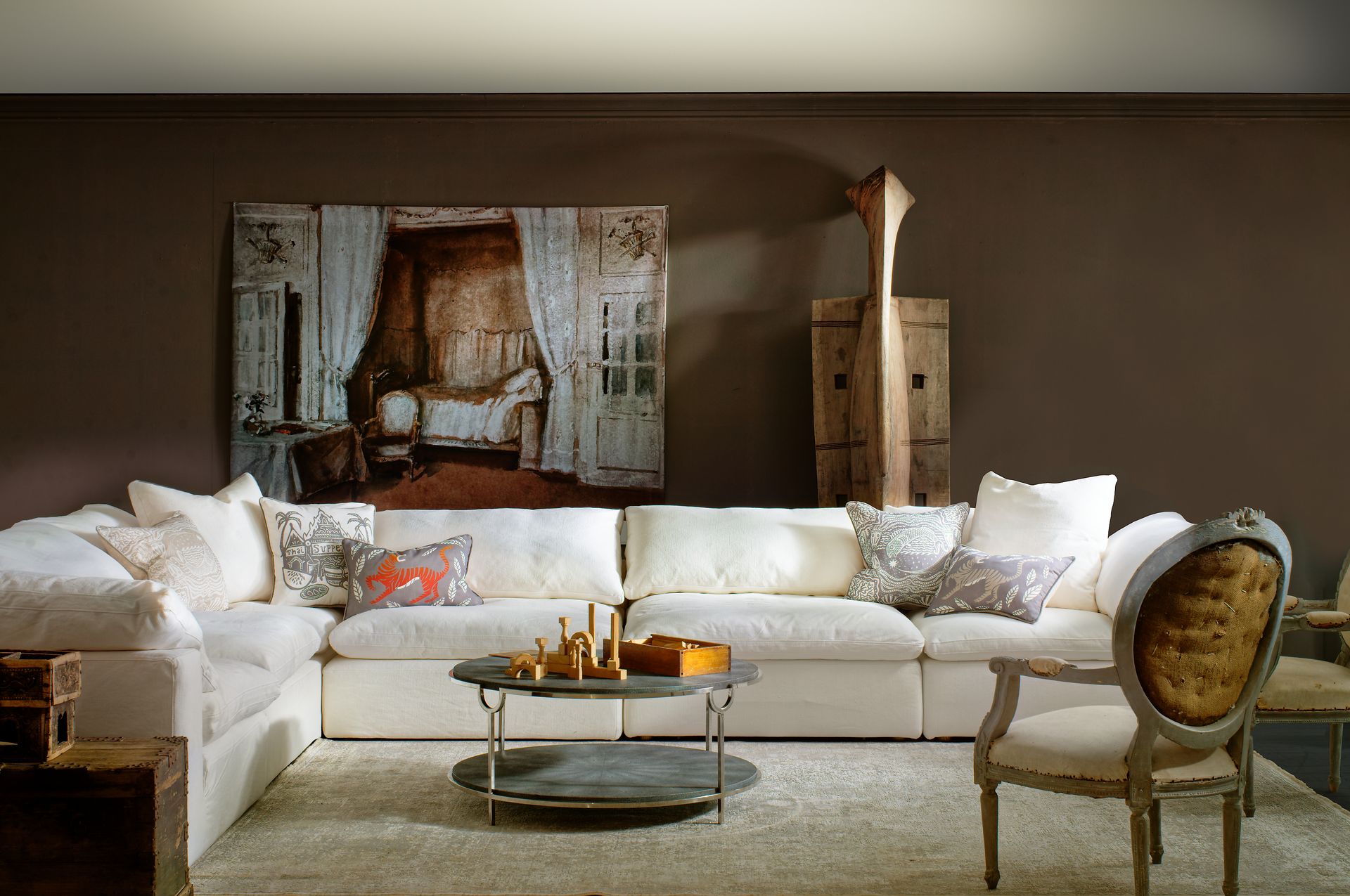
The best colors that go with brown tend to be natural tones - creams, other browns, and a hint of black.
Founder of Bauwerk - a specialist limewash paint company - Bronwyn Reidel points to natural elements, colors, and tones, as being those that pair best when decorating with a brown shade. Apparently, there’s no such thing as too many shades of brown together, and indeed, layering different tones and shades can create the ultimate sophisticated decor - an approach you might not previously have been considering amongst your modern living room ideas.
However, too much of one brown tone (particularly dark brown) isn’t necessarily a good thing. The richness, especially of a darker brown, can be overwhelming. So it’s important to note Bronwyn’s point about complimenting brown with a variety of other varieties of brown shades. That’s where the beauty of brown lies.
Better still, Bauwerk’s limewash has many inherent health benefits (it has natural antibacterial qualities). “Opt for layering different tonal-brown colors which will harmoniously blend in. Everything natural - like linen, jute, plywood, and other woody type tones, will all work beautifully and effortlessly with brown paint and decor shades”, says Bronwyn.
Pops of black really enrich a brown color palette too, as Bronwyn notes, “The addition of black also help to create interest and build a bridge between the darkness of the walls and the lightness of the wood- bringing these two elements together. The addition of a birch table (demonstrated in the image above) makes for a perfect dining setup as it creates a modern and moody brown room, but the feeling is light and somewhat Scandi. It ultimately creates a balance in the color palette."

Superfront’s sideboard with Harlequin fronts in Silent Greige
You can even layer brown tones through the use of door fronts and hardware, as demonstrated here by Superfront. Superfront founder Monica Born says, “I suggest using a dark brown to create a statement backdrop wall, offset by a lighter tone such as used on our Silent Greige front panels, which can be applied to several of IKEA's most popular storage series as well as IKEA's kitchen series Metod. Warm wooden accessories and handles would complete the look. Our Mini Ball handles come in a Smoked Oak version that would also complement this brown and greige scheme.” As far as IKEA kitchen hacks go, overhauling one in these tones is a simple and stylish way to make a statement.
Camilla Clarke, creative director of interior design firm Albion Nord, similarly says, “Look to mixing in certain ‘greiges’ and fawn colors as they are very good neutrals that will create warmth in a multi-brown toned room. You can also contrast furniture and artwork in front with other, deeper brown tones.” A concept that works well with beige living room ideas.
What color makes brown stand out?

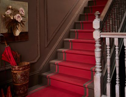
Chalk Paint in Honfleur and Emperor's Silk, Gloss Lacquer on stairs, all from Annie Sloan
It’s seeing red, alongside brown, which can apparently really make a brown color pop! You can contrast brown with bright blue (opposites on the color spectrum) and it looks fabulous as the combination contrasts so well, but “to create a harmonizing and liveable brown interior - and one where the brown is at its strongest - match the brown with a bold and bright red instead”, says chalk paint specialist Annie Sloan, responsible for this wonderful modern staircase idea above. It appears more considered, and it’s certainly easier to live with on a day-to-day basis because some of those swoon-worthy contrasting color schemes admittedly can, over time, become a little tiresome.
You can approach this in a straightforward decor fashion, such as placing a red armchair, rug, or even a red cabinet, in front of a brown painted wall or floor type. However, Annie has caught our eye and captured our decor dreams with this unusual approach to a stairway. This is decor, proverbially escalated.
Breaking the look down, painting a bold strip of red in - almost - Trompe L’Oeil fashion, mimicking a red carpet runner by simply painting it onto the stairway. This immediately creates a stairwell that has drama, all the while allowing the rich brown tone to appear bolder and more daring (thanks to its bright red neighbor) than it might normally whilst not fighting or contrasting with its counter color partner.

Botanical Flora Wellington Velvet, Jade £130/m, Wiltshire Blossom wallpaper, Lichen £110/m. Wall painted in Cola, from the new Liberty London and Farrow and Ball collaboration
Does brown match well with green?
It’s the distinctive shade of Cola brown that seems to be pulling through strong in terms of color trends this season and looks super chic alongside jewel shades of emerald green. Green goes well with brown - why? Because both colors resonate with nature, and as such result in a harmonizing color scheme. Green doesn’t so much make brown ‘stand-out’, as with red, see section above, it’s more of a synchronization and harmonized partnership of colors, which is why its one of the lovliest of the colors that go with green.
Liberty Fabrics has just unveiled its latest fabric images, alongside their paint collaboration with Farrow and Ball (above: Cola) and they too have honed in on a mid-shade of brown, matching it with distinctive floral Liberty London prints with clicks of lush green tones.
Genevieve Bennett, head of design at Liberty Fabrics, comments, “I love mixing tonal combinations within the brown family. A great example of this is Farrow & Ball’s Cola – from the recent collaboration with Liberty. We paired this with our Botanical Flora printed cotton velvet in lacquer – which has a lovely soft rich opulent feel. When put with Cola they seem to enrich and bring each other alive.”
To recreate the look, opt for fabrics such as the Botanical Flora Wellington Velvet for upholstery items such as armchairs, seat pads, sofas, and even partition dividing screens, and a Wiltshire Blossom wallpaper (as seen on the screen) against a painted backdrop wall in this of-the-moment tobacco shade.

Zulu Mask, a warm tone of brown, from Andrew Martin
Is brown a warm or cool color?
Brown can be both a warm and cool color, according to the experts. It comes down to pigment and tone. A warm brown will have a hotter color within it; yellow, ochre, pink, or red. This sumptuous living room scenario is set against a war backdrop color of brown, that has a very definite red pigment in it, creating a warm feeling room.
On the other hand, a cool brown will have a greyish or blueish undertone within it, for example, the image below (Wild Truffle, a color from Andrew Martin has an almost mauve tone, indicating the addition of a cooler tone of blue to the pigment!).

Wild Truffle, a cool tone of brown, from Andrew Martin
What is a cool-tone brown?
A cool-tone brown has blue pigments in it. The distinctive shade of Wild Truffle, a paint color by decor and furniture design powerhouse Andrew Martin, is the definition of a cool and calming shade of brown to decorate with. This fawn-esq shade has a dose of a blue undertone to it, and because it’s a paler shade of brown it presents itself as a really useful alternative to shades of grey when decorating in a light, contemporary, and neutral color scheme at home. This is why brown is often seen as one of the colors that go with blue.
If you’re worried about it being too cool, don’t be. Matched with a striking - hot! - color of furniture, such as this Bacall Jnr Chair (also by Andrew Martin) upholstered in an original Andean textile, this cool shade immediately springs to life, resulting in an energetic and rich decor scheme.
David Harris, design director at Andrew Martin, comments, “Wild Truffle is a velvety brown shade but with a unique depth. It’s a versatile hue, it can be used alongside other neutrals for a beautiful tonal scheme or partner with red and ochre for a livelier feel, complementing the cool blue undertones in this paint shade.”
Why you should avoid using dark brown, all over?
Rich brown is a wonderful color, but en masse it can become a little overbearing. It’s different from black, which can look super dramatic and elegant when wrapping a room all over. Instead, because of the warmth in dark brown, it can become a touch suffocating to live with, and instead of enlivening a room, it can actually sap energy from it and runs the risk of being a little gloomy to boot. Take note of the advice above about layering deeper brown shades with paler tones of brown, fawn, and ‘greige’, alongside pops of black, to create a developed and successful brown decor.
Be The First To Know
The Livingetc newsletter is your shortcut to the now and the next in home design. Subscribe today to receive a stunning free 200-page book of the best homes from around the world.
Rory Alastair Robertson has a long-standing history working across the interiors industry. Raised in Morningside, Edinburgh, Rory grew up surrounded by classically grand Scottish Georgian and Victorian architecture.
His first appreciation for interior decoration sparked when his mother hired scaffolding and decorated their three-storey Victorian staircase in Farrow & Ball Picture Gallery Red, by herself. She then painstakingly gold leafed the drawing room - by hand - over a base coat of Sudbury Yellow. This was the era of Jocasta Innes and Kenneth Turner, when paint techniques and maximalist style were the decorating raison d'être.
With this inherited gene of creativity, Rory went on to study Interior Architecture at the University of Edinburgh, and later, Theatre Set Design and Architectural Illustration at The Rhode Island School of Design on America's East Coast.
Rory's foray with the editorial world started a decade ago at Livingetc magazine, a title which he regularly contributes to today. Specialising with a deep-seated appreciation for historical homes and interiors, Rory often travels far and wide to be inspired by unique properties with a fascinating history.
If he’s not uncovering an unusual National Trust property in the UK, then he’s seeking out a Neo-Classical clifftop villa in Capri or a Palazzo in Florence.
Based in London’s Shoreditch, working as a Senior Interiors Editor and Consultant, Rory's portfolio of work is a creative melting pot of residential and commercial interior design projects and a plethora of editorial writing work. Rory is also Guest Interiors Lecturer at the prestigious KLC School of Interior Design in Chelsea, London. His most cosseted possession is a ramshackle Citroen Deux Chevaux, which he has reupholstered in Pierre Frey yellow and turquoise silk fabric.
Discover more at roryrobertson.co.uk and @rory_stylist.
-
 These 12 Best Table Lamps for Your Desk — Perfect Glows for a Creative Home Office
The best table lamps for your desk is have a soft, targeted glow. Elevate your WFH set-up with these stylish picks endorsed by Style Editor Brigid Kennedy
By Brigid Kennedy Published
-
 The Nespresso VertuoPlus is 30% Off for President's Day, and it's Kim Kardashian's Coffee Maker of Choice
This sleek and stylish coffee maker was spotted in Kim's home bar, and you can currently save $60 if you buy yours from Amazon
By Lilith Hudson Published

