These paint color trend predictions for 2023 have us itching to redecorate already
See the fresh colors this trend forecaster predict are likely to speak to the mood of the year ahead
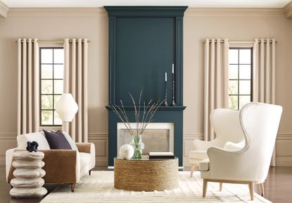
September is a month of change. Not only are the seasons transitioning, but so are our homes as we switch up our designs in preparation for the cooler months. It's an exciting time for designers and color directors too, with new color trends emerging as we get ever closer to 2023.
The colors we use in our homes are always a reflection of the times we're living through. They have the power to set a mood in our homes, and while our personal preferences will always ensure there's variety among our personal styles, we can't help but lean towards tones that speak to now. Post-pandemic, it was all about embracing color and vitality through design. More recently we've seen earthy, warmer hues take center stage. Now, everyone is eager to know what next big interior design trend is in store for the year ahead.
One paint brand with a color forecast we can't get enough of is the Sherwin-Williams Colormix forecast. Named Terra, the collection is composed of 40 colors across four different palettes and is inspired by the connection we share with the natural world and the beauty of the landscapes that surround us. We caught up with their director of color marketing, Sue Wadden, to learn more about each palette.
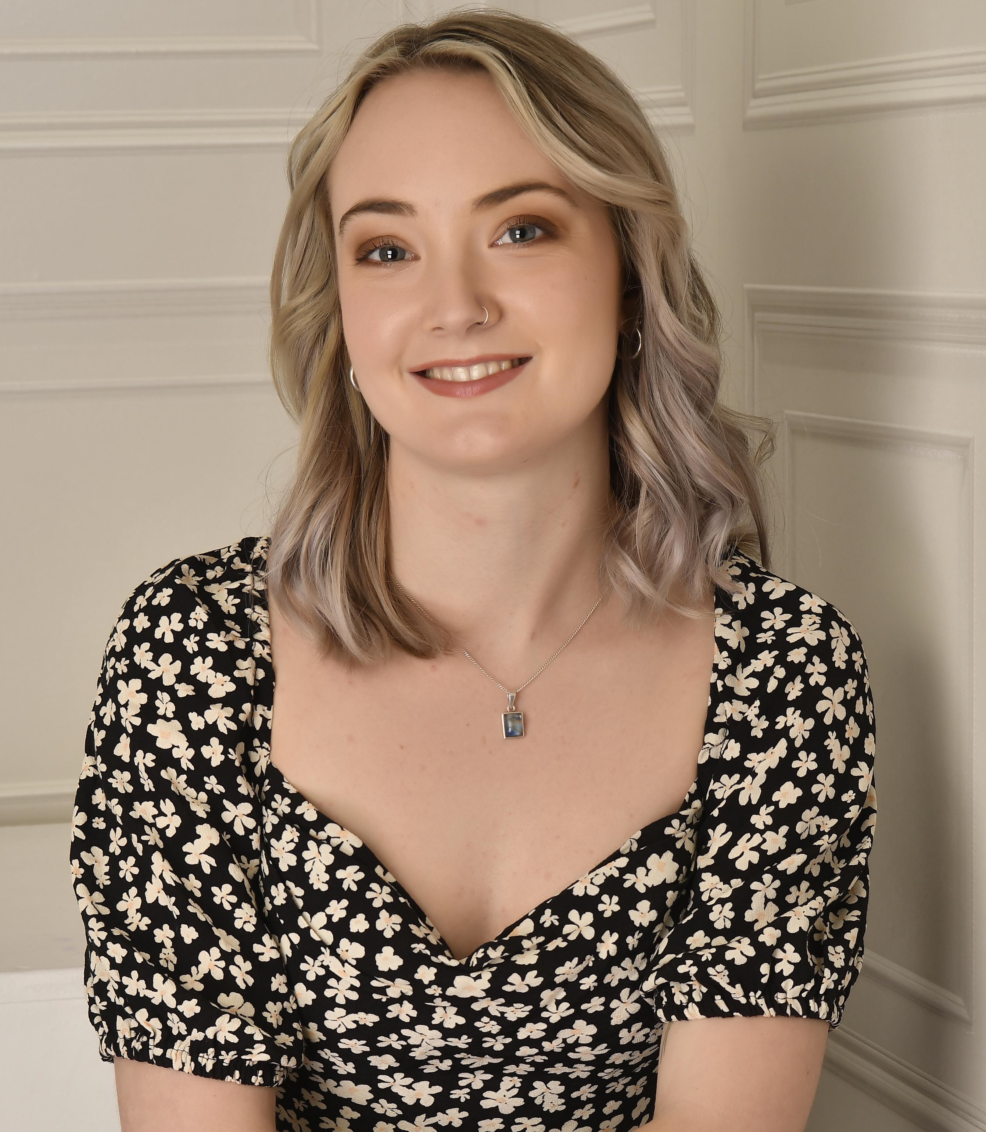
Sue Wadden oversees all things color for leading paint brand, Sherwin-Williams. As such, she dedicates her time to the development of color systems and researching color and industry trends, making her responsible for the brand's annual Colormix forecast, as seen below.
Biome

The first collection in Sherwin-William's Terra palette is called Biome, with the tagline 'our world, our home'. Comprised of earthy neutrals and smoky grey-toned blues, greens and yellows, the calming scheme evokes images of a dense forest floor.
'The Biome palette is all about preserving peace and balance and is a great representation of how interior trends are inviting nature into our homes,' explains Sue. 'What I love about forecasting is capturing the continuum of color trends, and our 2020 and 2021 Colors of the Year – Urbane Bronze SW 7048 and Evergreen Fog SW 9130 – are both included in this palette.'
According to Sue, the decision to include these colors is due to their enduring relevance. 'Our 2023 forecast builds on the direction that design’s been moving in, providing continuity as trends continue to evolve.' With this in mind, the Biome palette embraces a darker version of these natural colors, 'bringing added moodiness to themes like regeneration and sustainability.'
Some of the best rooms for earth tones are those associated with relaxation - such as the living room or bedroom - thanks to their calming, restorative qualities. 'They also pair beautifully with warmer wood tones and other nature-inspired materials like stone and natural tile,' says Sue, who recommends using them in a mudroom or entryway to make use of that balance.
Lore

Inspired by the history of craft and creativity, the Lore palette is a color trend all about reconnecting with traditional tones of ancient reds and understated neutrals. Like the Biome scheme, Lore's jewel-toned purples, oranges and greens symbolize the connection to the earth but in a slightly bolder way.
'These colors work especially well in communal home spaces like family rooms or dining rooms, as well as any space you want to feel energized in, like a home office,' says Sue. 'A deep hue like Carnelian SW 7580 envelopes you and is perfect for adding drama to a cozy dining nook, while a brighter jewel tone like Blue Peacock SW 0064 brings a touch of sophistication to a kitchen or family room.'
Throughout all elements of design, the past year has seen a move toward curating more convivial spaces that are playful and expressive. The hues in the Lore palette speak exactly to that, offering bright pops of color that are perfect for injecting an element of fun into your home.
As Sue explains: 'We expect to see the unexpected use of color continue to trend in 2023, making the colors in this collection a fun and nostalgic way to transform a room.'
Nexus

In stark contrast to the Lore palette is Nexus, a palette of natural clays, soft pinks and sunbaked desert sands. Ranging from 'Cool Beige' to 'Reddened Earth', the neutral color scheme represents serenity and, although similar, they all have an individual sense to them.
'Monochromatic palettes are trending as people seek out calming and serene color schemes for their homes,' explains Sue. 'The Nexus palette showcases the warmth and depth of neutrals with earthy desert beiges and pink tones while providing inspiration for bringing trending brown tones into a space.'
According to Sue, the collection of ten hues is extremely versatile and works well in any space, especially when layered together. 'For example, you could paint a wall in Redend Point SW 9081 and use a tonal neutral like Kestrel White SW 7516 on the trim to add more dimension to a space.'
These paints needn't be limited to your walls, either. 'A saturated hue like Lei Flower SW 6613 is perfect for furniture and could easily brighten up a room if applied to something like a vanity or dresser,' says Sue. 'You can balance this tonal palette with warm creams and lots of texture through linens and room accents for a restorative feel.'
Origin
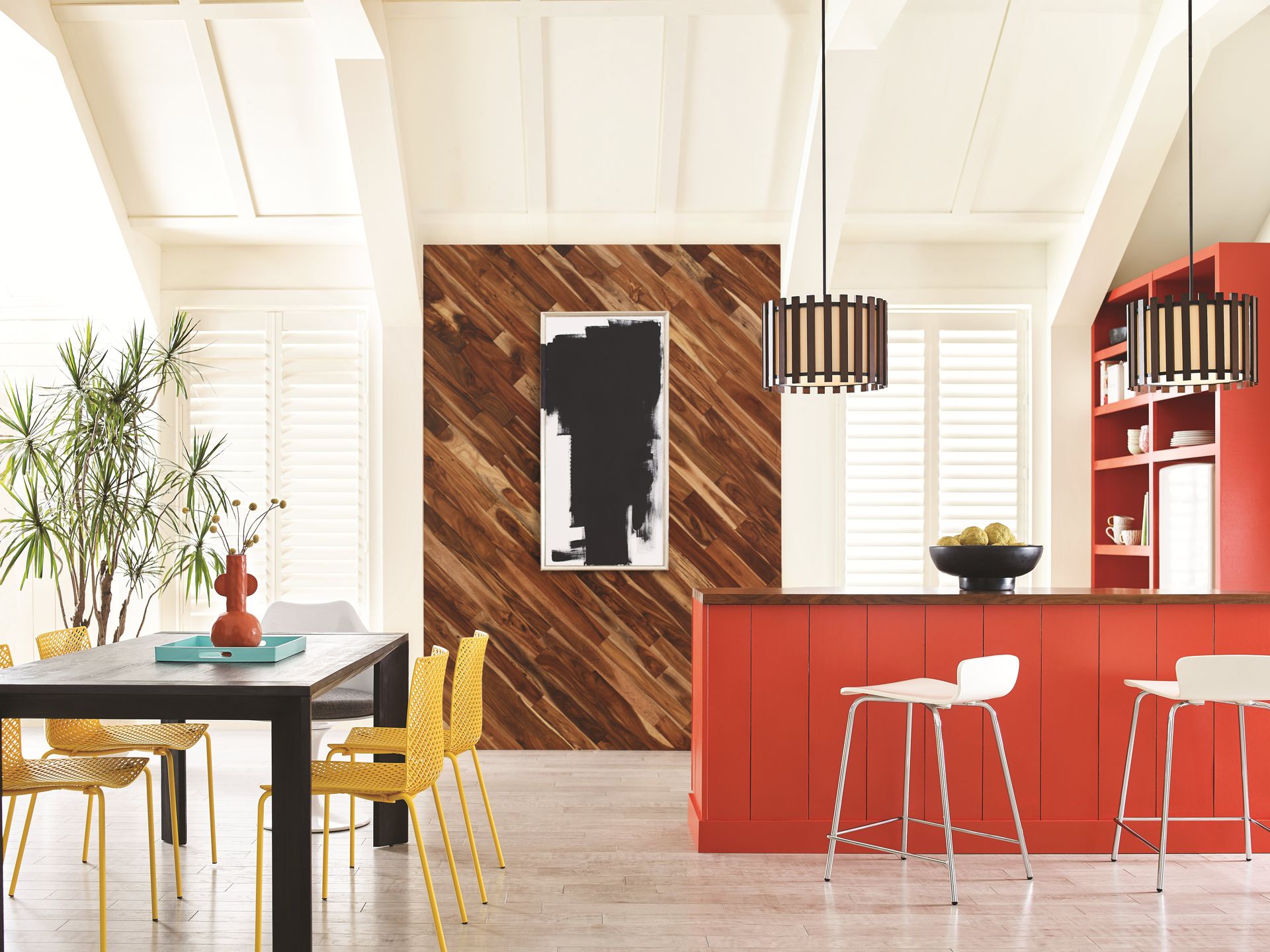
The final palette, Origin, is the brightest of all four of Sherwin-Williams' Colormix palettes. These classic shades, ranging from a charcoal black to a rich purple called 'Fabulous Grape' are free-spirited and enduring colors that feel optimistic.
'Origin is all about creative expression,' says Sue. 'The bright, playful colors in this palette are perfect for reenergizing a space, whether that means painting a kitchen island bright orange or your ceiling a deep green.'
This scheme encourages daring designs. Unusual color combinations of clashing colors, such as the deep purple of 'Fabulous Grape' and the bright orange-yellow of 'Goldfinch' are a great way to embrace experimentation in our homes through color. 'For unexpectedly bright color pairings, try using them in adjacent spaces,' Sue says. 'You could paint one room a certain hue and use the other color in an adjacent one to add visual interest and movement.'
While bright and bold, these colors won't look garish in your home when used properly. The trick is to use small pops of color strategically. 'Accent walls or small spaces are ideal to incorporate these “rainbow” colors without overwhelming a room,' Sue explains. 'For example, Kale Green SW 6460 is a mid tone green that would pop on an office wall or on lower kitchen cabinets while still looking sophisticated.'
Be The First To Know
The Livingetc newsletter is your shortcut to the now and the next in home design. Subscribe today to receive a stunning free 200-page book of the best homes from around the world.

Lilith Hudson is the News Editor at Livingetc, and an expert at decoding trends and reporting on them as they happen. Writing news, features, and explainers for our digital platform, she's the go-to person for all the latest micro-trends, interior hacks, and color inspiration you need in your home. Lilith discovered a love for lifestyle journalism during her BA in English and Philosophy at the University of Nottingham where she spent more time writing for her student magazine than she did studying. After graduating, she decided to take things a step further and now holds an MA in Magazine Journalism from City, University of London, with previous experience at the Saturday Times Magazine, Evening Standard, DJ Mag, and The Simple Things Magazine. At weekends you'll find her renovating a tiny one-up, one-down annex next to her Dad's holiday cottage in the Derbyshire dales where she applies all the latest design ideas she's picked up through the week.
-
 How to Thaw a Frozen Pipe — Learn Everything You Need to Know in 5 Minutes With This Guide
Winter storm caught you off guard? We asked an expert — just how do you thaw a frozen pipe?
By Hugh Metcalf Published
-
 The 12 Very Best Silk Bedding Pieces — As Our Style Editor Says: 'It's What Dreams Are Made Of!'
Slumber in lustrous luxury with the very best silk bedding sheets, duvets, pillowcases, and more — your sleep score will thank us later
By Julia Demer Published

