Sherwin-Williams just announced its Color of the Year for 2024 – it's the uplifting shade you've been looking for
'Upward' is a breezy shade of blue with a convivial quality that makes it perfect for communal spaces
Fall not only marks the return of the pumpkin-spiced latte; for the design-minded, it also signals the start of the long-awaited color forecasting season. Of course, here at Livingetc we've been eagerly anticipating an announcement from our friends at Sherwin-Williams, and we're pleased to say it's finally here. We can always count on the renowned paint brand to deliver an on-trend shade that speaks to the year ahead, and their chosen shade for 2024 is no exception.
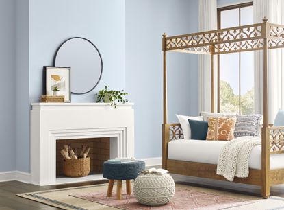
'Upward' (SW 6239) is Sherwin-Williams's 14th official Color of the Year, a breezy and blissful shade of blue that evokes feelings of peace and tranquility. With its muted, almost pastel-like quality, it follows a trend toward more unsaturated hues that we've noticed emerging this year while simultaneously paving the way for a cooler tone than we've seen in recent years. It's at once calming and uplifting, giving it a certain conviviality that makes it perfect for use in communal spaces.
'Upward represents the gentle forward momentum in all of our lives,' says Sue Wadden, director of color marketing at Sherwin-Williams. 'It brings to life that carefree, sunny day energy that elicits a notion of contentment and peace. With this color, we invite our consumers to take a pause and infuse a new sense of ease and possibility into their spaces – one that doesn’t overwhelm, but rather establishes meditation and tranquility.'
It seems Sherwin-Williams is certainly on to something as we look ahead to 2024's color trends. Here we take a closer look at the shade that's set to define our next circle around the sun, alongside some tips on how to incorporate it into your home.
How should we be decorating with Upward?

For some time now we've shied away from blues in the home, based on the belief that they're too cool or too hard to master to even bother to attempt decorating with. Instead, we favor warmer neutral shades or more comforting tones that help promote relaxation and are reasonably 'safe', but blues - especially soft, airy tones like Upwards - are actually easier to use than you might think.
According to Sue Wadden at Sherwin-Williams, Upwards is a shade that brings clarity to communal spaces. 'Used as an accent or all over, on both interiors and exteriors, it clears the way for lightweight open-mindedness,' she says. 'The hue serves as a reminder to pause and ponder limitless possibilities that can be unlocked in our work, dining, educational spaces, and beyond.'
It's certainly not limited to shared spaces in the home, either. Besides its uplifting qualities, the fair-weather blue also has connotations of tranquility. Whether used to boost productivity in a home office or in a calming en-suite bathroom on your cabinets (as shown above), the soothing shade makes for a cool, laid-back feel. The same applies to style, too. Be it a crisp Scandi aesthetic you're after or a classic coastal theme, the airy hue promises to instantly brighten your space.
Why are blues trending?
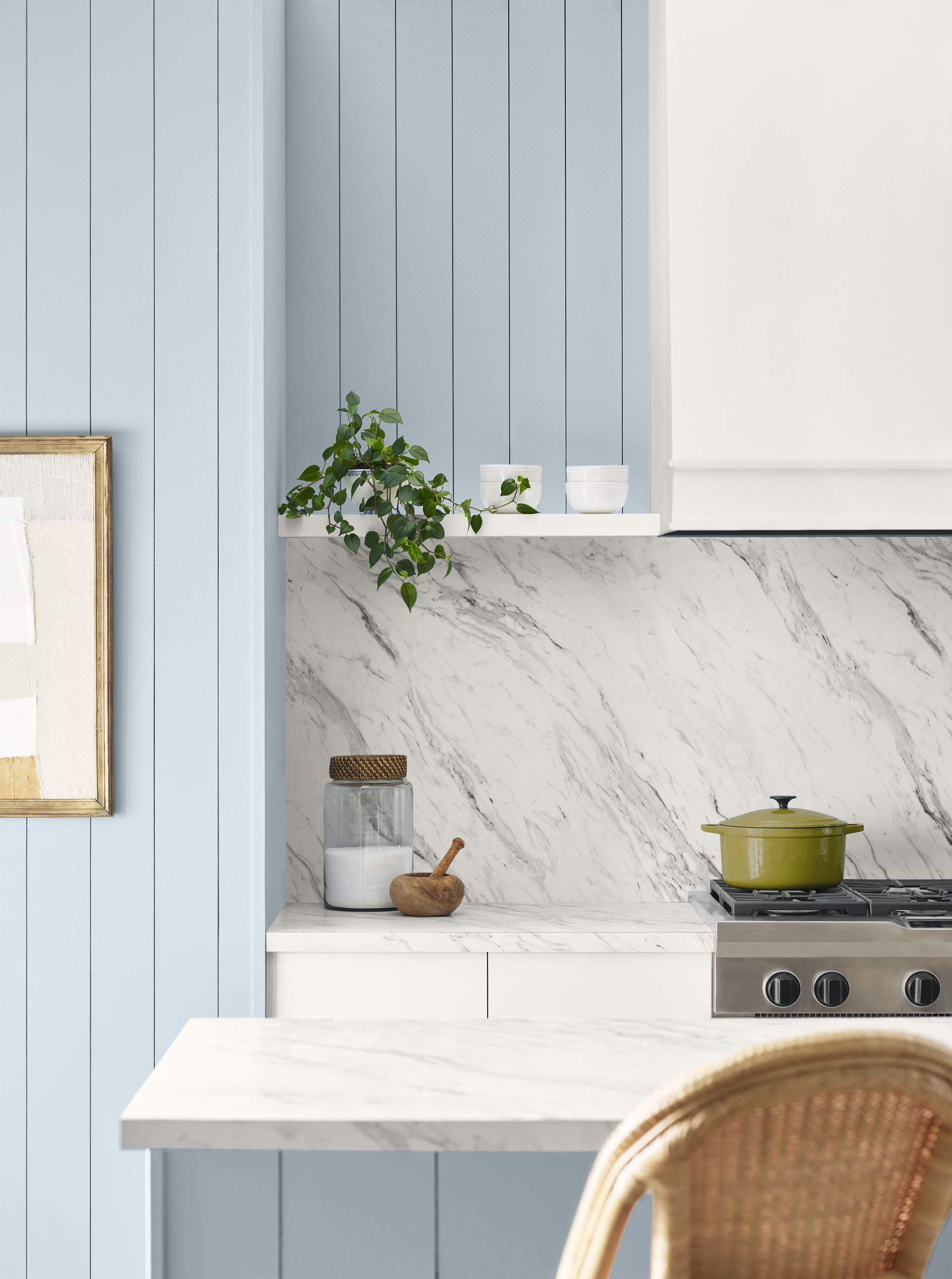
While blues have admittedly been on the perimeter of the design world in recent years (at least when it comes to paint ideas), they've been having a real resurgence of late. This has mainly been in the form of rich jewel tones and dark heritage navy hues, but now we're seeing lighter, cooler, and crisper blues come to the fore.
Back in our trend forecast several months ago, we noticed an emerging trend for steely blues with a hint of grey, and Upward is a shade that embodies just that (just a tinge lighter than we guessed). It's a reactionary move after the warm, earthy tones that made themselves known post-pandemic (Sherwin-Williams's 2023 Color of the Year, Redend Point, being a case in point). These rarefied blues and cooler tones welcome a weightless, buoyant feel into the home instead, an invitation to open minds to a color of ethereal calm that's ever-present - just as long as we remember to keep looking up.
What colors should you pair Upwards with?

However, unlike warmer shades that are more ubiquitous on our walls, getting the right shade of blue will require a little more know-how if you want to avoid it feeling too cool. We'd recommend avoiding this hue all over your walls in north or east facing spaces, instead opting for a few subtle accents. The shades you pair it with will also play a huge role in the overall feel. Sue recommends pairing with other blues and greens such as Honeydew SW 6428, deeps and darks like Gale Force SW 7605, and delicate tints like Snowbound SW 7004. We also think it goes especially well with Dulux's new Color of the Year - a delicate pale pink - if you want to fully embrace a pastel vibe.
'As we play with color, it's essential to consider their interactions thoughtfully,' Sue explains. 'Warmed-up blues might lead to hues that appear muddled and lackluster, which is why preserving the crisp edge and magnetic allure of cool blues is vital. It's these subtle nuances that create timeless spaces.'
If you're looking for a fresh yet comforting shade to introduce to your home, Upwards has our seal of approval.

Price: From $32.09
Quantity: 1 Gallon
Can't get your hands on Sherwin-Williams? Here are 3 similar shades from our other favorite paint brands

Price: $70
Quantity: 1 Gal

Price: $52.99
Quantity: 1 Gallon

Price: $125
Quantity: 1 gallon
Be The First To Know
The Livingetc newsletter is your shortcut to the now and the next in home design. Subscribe today to receive a stunning free 200-page book of the best homes from around the world.

Lilith Hudson is the News Editor at Livingetc, and an expert at decoding trends and reporting on them as they happen. Writing news, features, and explainers for our digital platform, she's the go-to person for all the latest micro-trends, interior hacks, and color inspiration you need in your home. Lilith discovered a love for lifestyle journalism during her BA in English and Philosophy at the University of Nottingham where she spent more time writing for her student magazine than she did studying. After graduating, she decided to take things a step further and now holds an MA in Magazine Journalism from City, University of London, with previous experience at the Saturday Times Magazine, Evening Standard, DJ Mag, and The Simple Things Magazine. At weekends you'll find her renovating a tiny one-up, one-down annex next to her Dad's holiday cottage in the Derbyshire dales where she applies all the latest design ideas she's picked up through the week.
-
 The 12 Best Table Lamps for Reading —I'm a Certified Bookworm (and Shopping Expert)
When it comes to table lamps for reading, I don't mess around. If you're the same, this edit is for YOU (and your books, or course — and good recommendations?)
By Brigid Kennedy Published
-
 "It's Scandi Meets Californian-Cool" — The New Anthro Collab With Katie Hodges Hits Just the Right Style Note
The LA-based interior designer merges coastal cool with Scandinavian simplicity for a delightfully lived-in collection of elevated home furnishings
By Julia Demer Published
