Pantone just announced its Color of the Year for 2023 – I have some thoughts on this 'fearless' choice
Pantone's Color of the Year is one of the biggest trend predictions from forecasters, but it doesn't always translate when it comes to interiors. This year, I think it does...


As another year draws to a close, there's one very important date left in the design calendar we've been patiently awaiting – the announcement of Pantone's Color of the Year for 2023.
Nowadays, there are a lot of Colors of the Year for 2023, with every paint brand announcing its own hue that its experts believe will define our homes for the next 12 months. Pantone's is probably the best known, and usually considered the most definitive of color predictions for fashion, design and interiors thanks to the expertise of its trend forecasters. However, Pantone often makes a bold choice with its choice for Color of the Year, which also means it can be controversial, especially when it comes to decorating our homes.
For 2023, a more typically adventurous color has taken the mantle of Color of the Year from last year's softer, more universally appreciated Very Peri, but it's a color that I think plays into the mood of interiors that some of our favorite designers right now are embracing.
The question is, are you ready to go all in for Viva Magenta?

Hugh is the deputy editor of Livingetc.com, an experienced interiors journalist used to tracking down the latest trends in design and interpreting why they matter right now. Faced with Pantone's latest Color of the Year, he had some thoughts...
What is the Pantone Color of the Year for 2023?

Pantone's Color of the Year for 2023 is Viva Magenta, a shade the color forecasters describe as 'a nuanced crimson tone'. It's not the magenta tone we're necessarily used to, which has heavier blue content, blurring the lines between red, purple and pink. While Viva Magenta has a hint of purplish undertones, it's a far purer red than the name suggests.
'Viva Magenta is brave and fearless, and a pulsating color whose exuberance promotes a joyous and optimistic celebration, writing a new narrative,' Leatrice Eiseman, executive director of the Pantone Color Institute explains. 'It is a new animated red that revels in pure joy, encouraging experimentation and self-expression without restraint, an electrifying, and a boundaryless shade that is manifesting as a stand-out statement.'
'Red is perceived to be a little provocative... so it takes a bit of thought as well as some confidence to use it'
Joa Studholme, Farrow & Ball
It's not, perhaps, a completely unexpected color choice for those who have been following other color predictions. A vibrant tomato red was on our radar when visiting Salone del Mobile in Milan earlier this year, while many of the paint brands have landed on shades of red and pink as their color trends for 2023, though none quite as punchy as Viva Magenta.
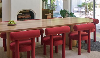
It's a color that we've also seen creeping into recent projects from some of our favorite, most creative interior designers, from the jewel-like accent of this colorful home in Ireland to the color-drenched home office of this Hollywood property.

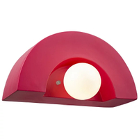
Cerise Crescent wall sconce, Lumens
A combination of the cool, curved shapes that are trending right now and this vibrant color make this wall sconce a design powerhouse.
How can I use Viva Magenta in my home?

A color like Viva Magenta is traditionally approached with caution when decorating our homes. And, for good reason. 'Red raises the blood pressure, increases the heartbeat and muscle movement,' color psychologist and holistic designer Suzy Chiazzari told us, suggesting its a color she'd avoid using in a room like a bedroom.
However, we've seen a move towards using these 'hot' colors like red and orange used liberally in interiors, even embracing the color drenching trend where the ceiling and walls are painted in the same color.
'Red is perceived to be a little provocative,' Farrow & Ball's color curator Joa Studholme told Livingetc . 'Plus, it can dominate spaces so it takes a bit of thought as well as some confidence to use it in the home.'

Her advice for using a color similar to Viva Magenta? Avoiding distractingly strong contrasts with other, equally vibrant shades. And this appears to be Pantone's serving suggestion for its Color of the Year, too. Its curated palette, the so-called Magentaverse, is full of soft, tonal colors that go with red. Sandy beiges, pale khakis and even subdued pinks all help to make this shade feel less of an aggressive presence in your interiors, especially when used on the walls.

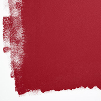
Lipstick on the Mirror, Backdrop
Bright and rich, this paint color from Backdrop offers a modern take on a classic red.

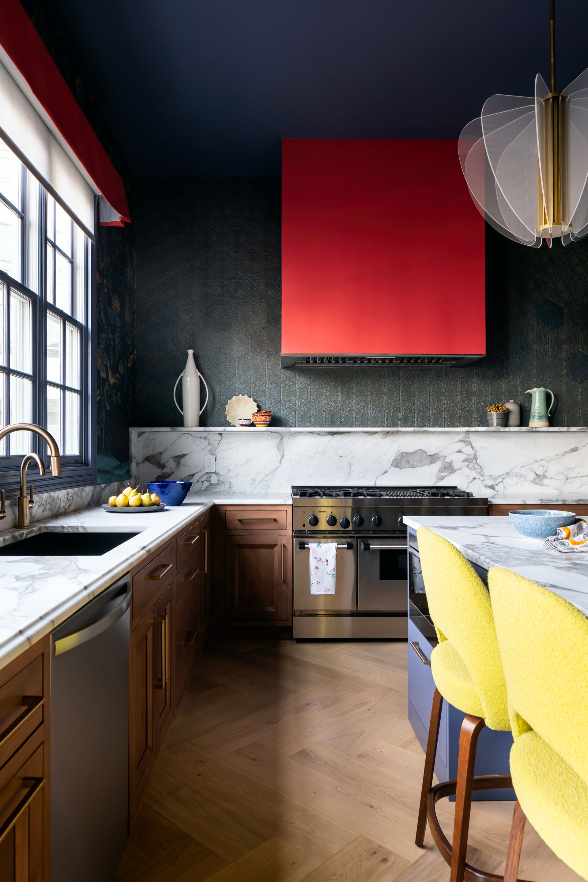
However, used in smaller quantities, it's clear that reds like Viva Magenta can make a modern, graphic statement. In more fearless color combinations, these crimson shades can sit happily alongside primary yellows and blues, as well as richer, deep jewel tones.

With the right piece of furniture (think chunky, curvaceous forms), a crimson red is also fast becoming one of our favorite accent colors for homes looking to make an impact. It's a color that, perhaps surprisingly, has a humor to it. Not as serious as the calmer dusky reds that have infiltrated our homes of late, and not as uptight as the darker, period-inspired maroons.
Plus, it's a color that feels brave, no matter if you're already adventurous with color in your home. 'Viva Magenta welcomes anyone and everyone with the same verve for life and rebellious spirit,' says the Pantone Color Institute's Leatrice Eiseman. 'It is a color that is audacious, full of wit and inclusive of all.'
Be The First To Know
The Livingetc newsletter is your shortcut to the now and the next in home design. Subscribe today to receive a stunning free 200-page book of the best homes from around the world.

Hugh is the Editor of Livingetc.com. From working on a number of home, design and property publications and websites, including Grand Designs, ICON and specialist kitchen and bathroom magazines, Hugh has developed a passion for modern architecture, impactful interiors and green homes. Whether moonlighting as an interior decorator for private clients or renovating the Victorian terrace in Essex where he lives (DIYing as much of the work as possible), you’ll find that Hugh has an overarching fondness for luxurious minimalism, abstract shapes and all things beige. He’s just finished a kitchen and garden renovation, and has eyes set on a bathroom makeover for 2024.
-
 How to Thaw a Frozen Pipe — Learn Everything You Need to Know in 5 Minutes With This Guide
Winter storm caught you off guard? We asked an expert — just how do you thaw a frozen pipe?
By Hugh Metcalf Published
-
 The 12 Very Best Silk Bedding Pieces — As Our Style Editor Says: 'It's What Dreams Are Made Of!'
Slumber in lustrous luxury with the very best silk bedding sheets, duvets, pillowcases, and more — your sleep score will thank us later
By Julia Demer Published

