This easy painting trick can make your home seem happier - even scientists agree
Your color choices impact your wellbeing – this stylish trick may be the secret you've waited for
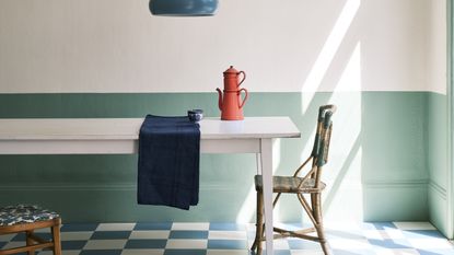

Color blocking is a provocative design decision, but it could be the key to a happier home – and it's backed by designers and science alike.
The method of color blocking involves using complementary shades that sit opposite each other on the color wheel (for example, pairing an organic green with a bold red hue). However, while this paint idea may seem like a bold move, the experts suggest it could be the unexpected key to better wellbeing.
But what makes this tip so sought after in the world of psychology – and which pairing should you choose? Here's what you need to know.
Why color blocking may improve your wellbeing – according to psychology

'Color blocking is often seen as a bold move, but bring these into a space and be less of a clash and more harmonious than you first think,' says Psychologist and Wellbeing Consultant Lee Chambers.
Lee explains that there may be benefits of bringing both sides of the wheel together in one space, as it combines warmer colors (that invigorate and energize us) with cooler colors (that temper out stimulation and offer calmer confidence and stability).
'With both colors balancing each other, it can make a space work well if you've had a good day or a bad day, and its expression can help us to feel more in tune with our equilibrium,' Lee explains. And the psychologist is not alone in his admiration for this technique.

'Whether you are looking to create an air of calmness, optimism, or creativity, the key is to unpick the psychology of color and choose shades and combinations which work together in harmony. Color blocking is a perfect method of bringing this to life,' adds Helen Shaw, the UK Director of Benjamin Moore.
The paint expert adds that this technique is more than a passing interior design trend. Instead, it can have a 'powerful impact on our emotions and wellbeing.' But which hues should you begin with?
Which shades should you pair in your home?

While color trends come and go, Lee suggests that one color pairing is likely to bring out the best in your home. However, it's not one for the faint of heart.
'If I'm looking to take that courageous step, I consider bringing in some warm orange to compliment a rich blue or a soft yellow tempering a vibrant purple,' he says.
If you're not a purple and yellow enthusiast, then fear not. Helen also recommends paying homage to one of the most fashionable shades of the moment, such as sage green and pink, for a similar effect.

'Soft pastel hues such as sage greens and blush pinks pair beautifully and are a perfect entry point for adding a subtle layer of tranquil, calming color into the home,' she explains. 'At the other end of the scale, bright colors are great for delivering a dose of uplifting energy and dynamism into our lives, as we've seen with the dopamine dressing trend in the fashion world.'
Will you go bold in the name of a happier home? If anyone can convince us to play with the color wheel, it is these experts.
Be The First To Know
The Livingetc newsletter is your shortcut to the now and the next in home design. Subscribe today to receive a stunning free 200-page book of the best homes from around the world.
Megan is the News and Trends Editor at Homes & Gardens. She first joined Future Plc as a News Writer across their interiors titles, including Livingetc and Real Homes. As the News Editor, she often focuses on emerging microtrends, well-being stories, and celebrity-focused pieces.
Before joining Future, Megan worked as a News Explainer at The Telegraph, following her MA in International Journalism at the University of Leeds. During her BA in English Literature and Creative Writing, she gained writing experience in the US whilst studying in New York. Megan also focused on travel writing during her time living in Paris, where she produced content for a French travel site.
-
 The 12 Best Table Lamps for Reading —I'm a Certified Bookworm (and Shopping Expert)
When it comes to table lamps for reading, I don't mess around. If you're the same, this edit is for YOU (and your books, or course — and good recommendations?)
By Brigid Kennedy Published
-
 "It's Scandi Meets Californian-Cool" — The New Anthro Collab With Katie Hodges Hits Just the Right Style Note
The LA-based interior designer merges coastal cool with Scandinavian simplicity for a delightfully lived-in collection of elevated home furnishings
By Julia Demer Published
-
 This trend is a staple design feature in the happiest country in the world
Finland is a world a leader in happiness and home decor – Native’s reveal its definitive design tip
By Megan Slack Published
-
 Explore Project Ö: A Scandi-cool cabin on a private island in Finland's Archipelago National Park
Nestled amid an organic paradise in the most joyful nation on the globe – this is the ultimate happy home
By Megan Slack Published
-
 Expert tips for creating a happy gallery wall without sacrificing style
A chic gallery wall doesn't need to lack personality – this is how to spark joy in the most fashionable way possible
By Megan Slack Last updated
-
 Five interior design lessons from Finland – the happiest country in the world
Does a happy country begin with a happy home? These native designers share how to spread joy throughout your decor
By Megan Slack Published
-
 Niksen is the new Hygge - Could this Dutch concept help create a happier home?
A daily dose of niksen will help you combat the stresses of daily life - according to research by Habitat, it's just one way of creating a happy home
By Ginevra Benedetti Last updated
