'It Doesn't Have to be One or the Other!' 5 Wallpaper and Paint Combination Ideas Inspiring us Right Now
The right shade of paint will make your wallpaper pop. Design experts share their thoughts on some of our favorite combinations

With so many stunning designs around today, from supersized florals to intricate murals, falling in love with a particular wallpaper design is easy. Finding the perfect paint color to bring it to life? Sadly, not so straightforward.
‘We are often asked by our clients to recommend paint colors that work with our wallcoverings, especially murals,’ says Jill Steinberg, co-founder of custom wallpaper brand Fine & Dandy Co. ‘Choosing the right paint color can make all the difference and can really shape how a wallcovering inhabits a room.’
A shade of white might feel like the safest choice for paint ideas for walls, but you might miss out on more engaging effects. In fact, Jill sees lots of people going for bold statements at the moment, pairing their wallpaper with darker, moody paint colors. ‘This helps to frame the wallcovering and make it the focus, while creating an immersive and enveloping space,’ she says. ‘It creates a dramatic result that really draws one in and sets a rich and ambient mood.’
And, if you think your wallpaper and paint always have to ‘match’, think again. ‘We also love the idea of unexpected paint color choices with wallcovering—colors that compliment a mural or pattern but don’t match perfectly or aren’t necessarily found in the wallcovering,’ says Steinberg. ‘Contrasting paint colors can add an element of surprise to any room, and often creates an incredibly impactful and unforgettable space.’
To help inspire you to be bolder with your wallpaper and paint combinations, here are five ideas that we’re loving right now.
1. Dark wallpaper with bright paint

This hallway by House of Hackney feels playful and full of character, thanks to the clever use of contrast between your wallpaper ideas and paint. ‘At the moment I am loving darker wallpapers on the wall paired with bright and bold paint colors to offer a nice contrast,’ says Maggie Samson, Design Consultation Executive at House of Hackney’s New York showroom.
‘My favorite wallpaper in our collection right now is our Papavera in Noir which features Art Nouveau drawn poppies with a gothic twist and has the nicest pops of periwinkle and warm amber,' Maggie continues. 'This paired with our Apple paint, which is a light and fresh green shade with yellow undertones, works so well as it brings out the warmth within the print and keeps the space from becoming too dreary.’
2. Contrasting blues

Combining different shades from the same color family can give a space a refreshing energy, as this room for Fine & Dandy Co. by Designer Jewel Marlowe proves. ‘Contrasting shades of blues, lavender and green were used here to perfection and create a cohesive palette that’s moody, yet modern and fresh,’ says Fine & Dandy Co.’s Steinberg.
‘The blue paint color works as it subtly picks up the purple/blue tones of the hydrangeas in the wallcovering, but is still different and unexpected enough that it highlights the colors in the wallcovering,’ she says. ‘This allows the wallpaper—the Paradis Atelier wallcovering in the Orchid with Patina colorway—to shine and be the star of the room.’
Painted ceiling, trims, cabinetry and walls in the same color adds to the cohesive effect. ‘This client was keen on having a navy-blue dining room,’ says Steinberg. ‘They chose Kelly-Moore's Navy Damask paint color to give the entire space a fresh look.’
3. Matching colors with a corresponding room

In this kitchen and hallway design, Barbra Bright of Barbra Bright Interiors creates a sense of peace and fluidity by matching the wallpaper in the hall with the kitchen’s scheme.
‘There wasn’t a window in the kitchen, but I wanted to create a focal point with the illusion of the outdoors,’ says Barbra. ‘I found this mural by Flavor Paper called Enfume in Acid colorway. Crazy, but it matched perfectly to both the lilac and green of the kitchen.’
For the modern kitchen itself, Bright started with the lilac marble. ‘I always tell my clients to start with something they love and build from there,’ she says. ‘So I selected black and white cabinets to complement the marble. Next, came tile—what goes with lilac? Green of course! So I selected green tile embossed with a snakeskin pattern for added texture. I custom matched the green of the tile and had the cabinets painted Ben moore, Waterbury green—HC 136.’
4. Combining rich jewel hues

In this bathroom by Jewel Marlowe, decorating with jewel tones transforms this relatively pokey space into one that feels luxurious.
‘Here, the color choice was not an obvious one, but it completely elevated this small powder room into something spectacular and makes the room feel so much larger than it actually is,’ says Jill. ‘The large-scale pattern of the wallcovering and the rich emerald the client used for the walls and trim shift an ordinary powder room into an extraordinary space.’
5. Monochromatic wallpaper and paint

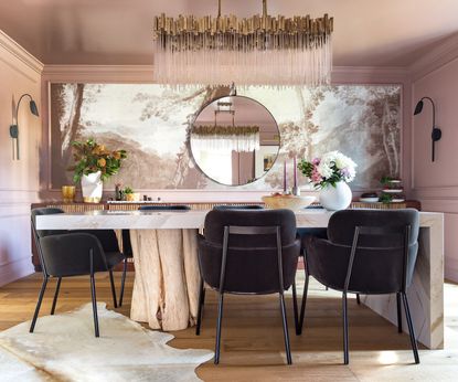
Choosing wallpaper and paint in the same color can create an enveloping, almost color-drenching effect, especially if you paint ceilings and walls the same color. ‘Another very interesting combination is the warm, natural sepia tones in our Imaginarium-Sepia Mural paired with Farrow & Ball’s Sulking Room Pink,’ says Jill. ‘The pink-y earthy color of the paint, which was used throughout the space, including the ceiling, further amplifies and echoes the monochromatic feel of the room with all the natural wood, marble and brass elements found throughout. It’s a beautiful and harmonious pairing.’

Price: $160
Quantity: One roll

Price: $298
Quantity: Covers 52.25 square feet

Price: $60
Quantity: 20' x 27" panel
Be The First To Know
The Livingetc newsletter is your shortcut to the now and the next in home design. Subscribe today to receive a stunning free 200-page book of the best homes from around the world.
Kate Hollowood is a freelance journalist who writes about a range of topics for Marie Claire UK, from current affairs to features on health, careers and relationships. She is a regular contributor to Livingetc, specializing in reporting on American designers and global interiors trends. Based in London, Kate has also written for titles like the i paper, Refinery29, Cosmopolitan and It’s Nice That.
-
 What are the Most Comfortable Pillowcases? From Temperature Regulating to the Best for Your Skin
When you're looking for comfort in your pillowcases, material matters. These are the best you can buy
By Faaizah Shah Published
-
 5 Simple, but Genius Bathroom Layout Tricks That Will Make Your Space Work so Much Harder
Small switches to how you lay out your bathroom that help make the most of a small space
By Luke Arthur Wells Published

