Painted ceiling ideas – 10 of the best ways to give this decorating trend an unexpected twist
Painted ceiling ideas are a huge trend right now. Take them to the next level with these clever design from top interior designers
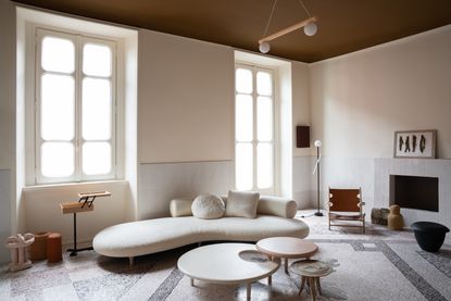

Painted ceiling ideas are everywhere right now. Some might say painted ceilings have even replaced the accent wall as the go-to for introducing color to a room on a easy-to-palate scale.
'We don't really view these elements as trends that replace each other, but more as spaces that evolve,' suggests Kathrine Errboe from Danish design brand File Under Pop. 'Painting a ceiling is actually an old tradition that has been practiced for centuries around the world, so really if something, the accent wall was the modern day trend.'
Just like the accent wall, ceilings aren't just limited to plain, simple paint ideas. There's a whole world of inspiration out there for transforming the 'fifth wall' into a scene-stealing feature. Here are 10 of them.
Painted ceiling ideas for a new twist on this decorating trend
There are other reasons painting ceiling ideas have become a huge trend that go beyond a sudden aversion to accent wall ideas.
'This trend has undoubtedly sprung from the goal of altering the spatial feeling of a room,' says interior designers Beth Dotolo and Carolina V Gentry of Pulp Design Studios. Painting a ceiling, perhaps more than the walls, gives you the ability to change the perspective of a room.
'But, it's also about achieving an overall unique look of grandeur that guests will have a hard time forgetting,' Beth and Carolina add.
We agree, so let's see if these 10 creative painted ceiling ideas leave a lasting impression.
1. Paint crown moldings for a modern interior look
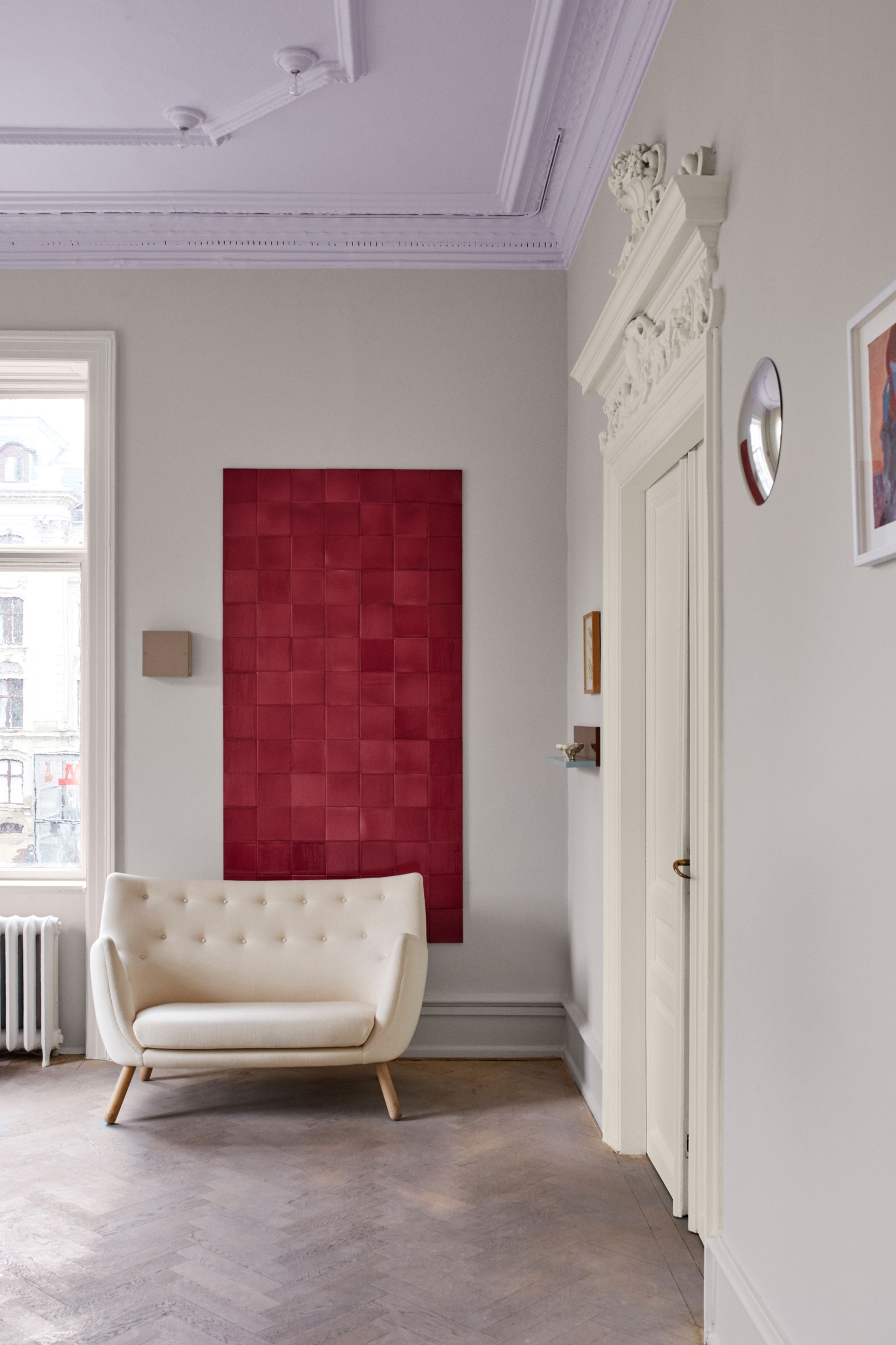
While not every home features architectural details on the ceiling, where they do exist dousing them in paint is a brilliant crown molding idea to give these elements a modern look.
'Painting them ties the room together and creates a calm canvas for other elements,' says File Under Pop's Kathrine Errboe. And why not choose a cool, contemporary color to contrast against this ornate detailing?
'Color quite simply draws the eye upwards,' Katherine explains. 'It lifts the spirit and creates a whole new space that in many cases is left unused. It adds character and definition to a space and simply creates and element of hygge.'
2. Paint the upper half of your room to play with its proportions
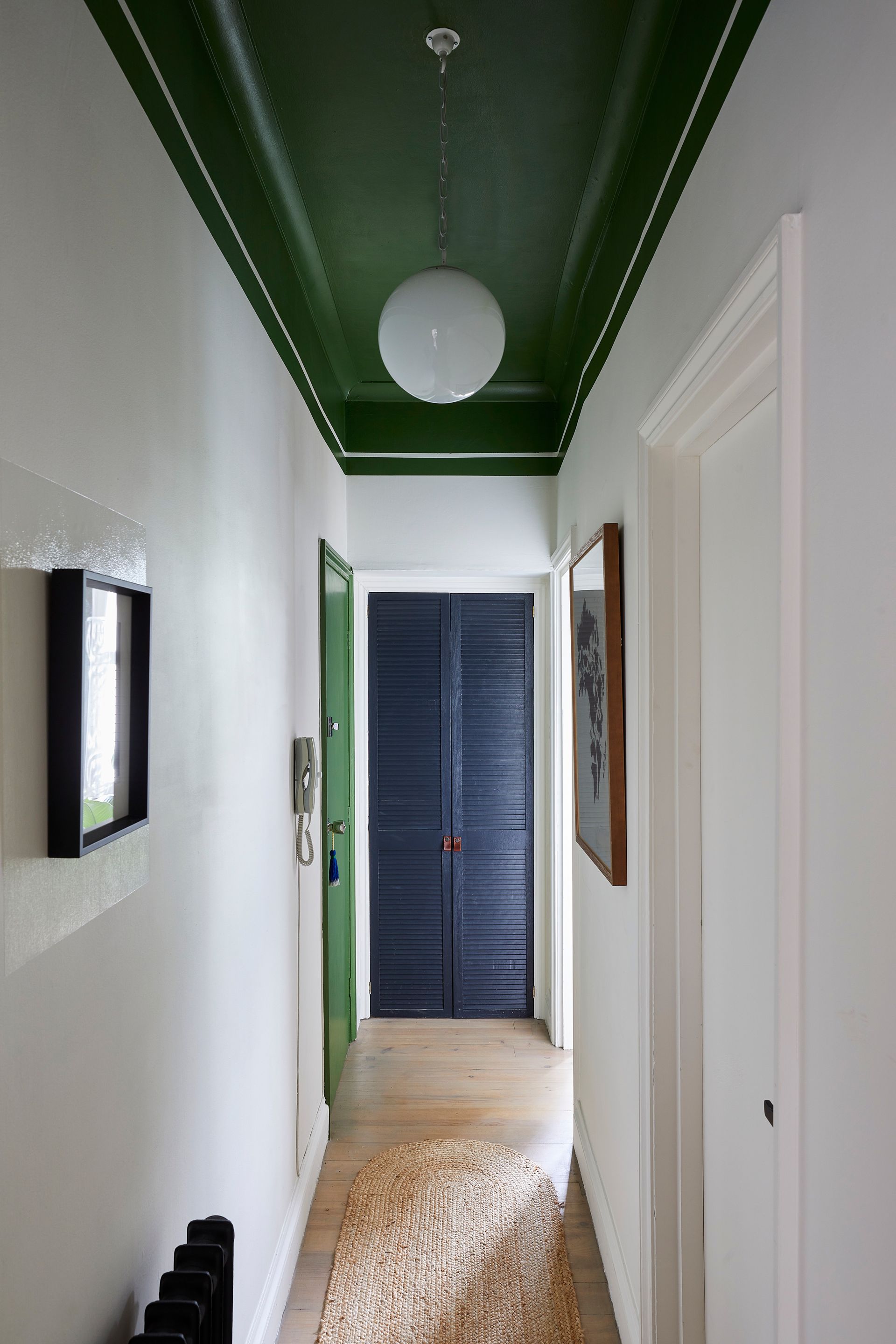
If you have ceilings that feel low and cramped, or too lofty and un-cozy, you can paint your ceiling to adjust the vibe of your room.
Take this hallway paint idea by Andrew Griffiths, founder of interior design studio A New Day, as an example.
'The use of colour in this hallway is all about visual trickery, Andrews tells us. 'A high ceiling is usually a great thing, but less so in a narrow hallway like in this London apartment.'
To bring the ceiling height down, Andrew continued the paint from the ceiling down onto the walls. 'The bold green of the ceiling continues down onto the walls to blur the lines between surfaces and reduce the sense of height,' he explains. 'It also packs a punch and brings interest to a space that's limited in architectural detail while keeping the overall feel quite light and fresh.'
3. Create a decorative ceiling with stripes

When it comes to giving your space a decorative makeover with paint, surely no idea is as popular as striped walls. Well, of course, stripes can be applied to ceilings too, creating a dramatic feature overhead.
In this dark, maximalist lounge created by interior designer Charlotte Lucas, a 1st Dibs 50 designer, a striking black and white stripe painted in gloss sets the tone for the room, creating a base for colorful, playful decor.
Of course, decorating with stripes requires careful planning, as they'll show imperfections starkly, from wobbly lines to uneven proportions.
4. Add a painterly effect with handpainted wallpaper
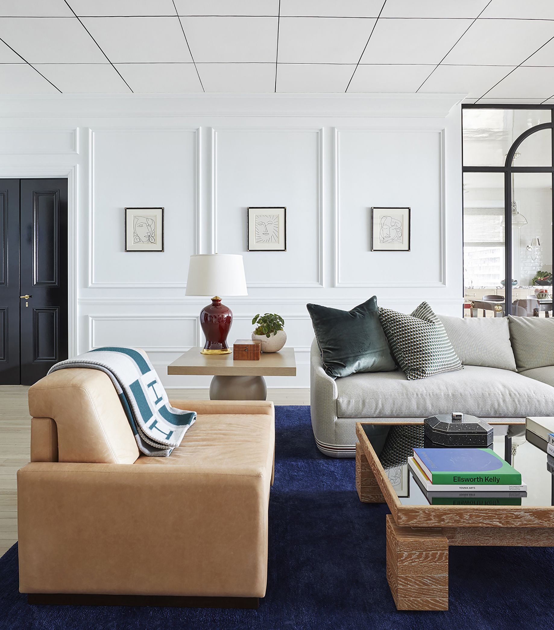
Okay, so technically this idea is wallpaper, but by choosing a design that's hand painted, you can bring a painterly design to your ceiling without attempting to paint the Sistine Chapel yourself.
It doesn't need to be a complicated pattern, either. In this living room designed by Summer Thornton Design, a painted wallpaper idea is used to create this modern grid design.
'The grid is all hand-painted wallpaper,' Chicago-based interior designer Summer Thornton explains. 'When you're in the space you see subtle variations in line thickness, slight bends in the lines..
'This project is set in a traditional building, and we wanted to add more modernity to it, so the grid felt cubist and modern and a little quirky,' Summer adds. 'We wanted the room to feel clean and modern, so we didn't want to add more pattern to the walls or furnishings, but the ceiling in a clean black and white grid worked.'
5. Try interesting decorative patterns on the ceiling

If you've got an artistic streak, or can find an artist to hire in, a ceiling can be a really creative canvas to use paint on. Take the rooms of Portuguese hotel Quinta da Côrte designed by Pierre Yovanovitch as an example of the ceiling decorating possibilities.
In general, the space is neutral, simple and rustic, but overhead, pattern and color is introduced through an intriguing pattern.
'The ceiling patterns are actually hand-painted and are meant to add depth and dimension to the space while also paying homage to traditional Portuguese design elements,' explains interior designer Pierre Yovanovitch, 'such as ceramic tiling patterns and other regional motifs which we wanted to incorporate in this project.'
6. Swap white for a tonal ceiling in your color scheme
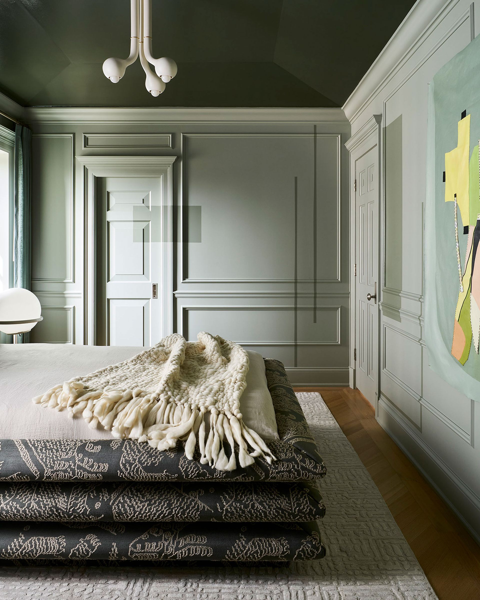
If there's one design trend we've noticed when it comes to paint, it's the demise of the plain white ceiling in a room with color-painted walls. You can choose whether to go all one color (see the color drenching trend), go for a boldly contrasting look, or build a monochromatic color scheme. The latter works well for spaces like bedrooms as it keeps the look softer, ensuring the room feels relaxing – especially when starting up at it from your bed.
This design from interior designer Jen Talbot is a homage to sage green, with lighter shades used on the walls and a tonally darker ceiling, which draws the eye up to the pitched roof. 'Clients are craving spaces that envelope them and the deeper tones meet the need,' Jen explains, 'especially in the bedroom where the majority of their time is spent resting.'
7. Zone a space using the ceiling

When zoning an open plan space, a painted ceiling can help add some visual structure the demarcates one area from another. In this chic Parisian apartment, for example, part of the ceiling has been painted in a rich neutral to zone the open plan kitchen.
'In this project, we wanted to use a sensitive and abstract approach to the space,' explains architect and designer Hélène Pinaud of Heju Studio. 'We treat colors by touches that leads to a new reading of space, especially in this living room.;
'The wooden kitchen is deliberately minimalist, the singularity being brought by the green ceiling which delineates it from the dining area.'
8. Adapt your plans to suit your ceiling type

Just because you already have a feature ceiling, doesn't mean it can't be painted too. Whether domed, coffered, paneled or fitted with tin tiles, introducing color can be a way to further highlight this architectural feature.
In this bedroom design by interior designer Cortney Bishop, a tray ceiling has been fitted has been painted in a sky blue, a perfect calming paint color for bedrooms. It almost creates the effect that a portion of the roof has been removed, with the bed looking up onto the blue Californian sky.
9. Create a striking mural across the entire ceiling

Wall mural ideas can be applied to the ceiling too, often forming a defining feature of the room.
In this townhouse in Stepney, London, a handpainted ceiling mural of dark, swirling clouds was inherited when the new owners bought the house and sets the tone for the sophisticated, neutral decorating scheme.
'The handpainted 'sky' ceiling captivated us on our first viewing,' explains Paul West of @consideredthings, who offers the property as a location house for photoshoots. 'When we moved in, we wanted to work with it by creating a sense of calm across the rest of the room – sanding the floors, creating a monochrome look across walls and woodwork, and taking a tonal and earthy approach to furnishings.'
'Living with it is wonderful – it works perfectly with the trees outside, and it's particularly special when laying on the sofa, looking upwards and daydreaming!'
10. Or try a mural on a smaller scale

The beauty of a mural is that if it has the same base as your overall ceiling color, it doesn't have to extend across the entire plane. In this design by Dallas and Seattle-based Pulp Design Studios, an abstract, black and white design fills only a portion of the ceiling, designed as if the print of a wallpaper used in the room had broke free of the walls and is now trailing across the ceiling.
'The idea behind this ceiling design was actually the solution to a problem,' explains Beth Dotolo of Pulp Design Studios. 'We wanted the whole room to feel enveloped in the pattern we were using on the walls, but couldn’t put the wallcovering on the ceiling because there wasn’t a good stopping point.'
'We decided to create a mural that would appear to be coming from the wallcovering and spread through the space in an artful way to add more dimension and visual interest, along with extra elements of drama and style,' adds Pulp Design Studios' Carolina V. Gentry. A local artist, Haylee Ryan, hand painted the mural based on the inspiration of the wallpaper used elsewhere in the space.
What type of paint should you use for a ceiling?
If you're looking to paint a standard ceiling, your usual wall paint, probably a matt emulsion, is the best bet. This will give the same paint finish as your walls.
Don't discount gloss paint ideas for your ceiling though. 'I love a gloss ceiling,' says interior designer Summer Thornton. 'When done well, it acts as a mirror, reflecting light and creating the illusion of extra ceiling height. We intentionally keep some subtle variations in ours so that it creates a watery effect, a slightly mist-like quality, as that adds some additional moodiness to the space.'
Be The First To Know
The Livingetc newsletter is your shortcut to the now and the next in home design. Subscribe today to receive a stunning free 200-page book of the best homes from around the world.

Luke Arthur Wells is a freelance design writer, award-winning interiors blogger and stylist, known for neutral, textural spaces with a luxury twist. He's worked with some of the UK's top design brands, counting the likes of Tom Dixon Studio as regular collaborators and his work has been featured in print and online in publications ranging from Domino Magazine to The Sunday Times. He's a hands-on type of interiors expert too, contributing practical renovation advice and DIY tutorials to a number of magazines, as well as to his own readers and followers via his blog and social media. He might currently be renovating a small Victorian house in England, but he dreams of light, spacious, neutral homes on the West Coast.
-
 The 12 Best Table Lamps for Reading —I'm a Certified Bookworm (and Shopping Expert)
When it comes to table lamps for reading, I don't mess around. If you're the same, this edit is for YOU (and your books, or course — and good recommendations?)
By Brigid Kennedy Published
-
 "It's Scandi Meets Californian-Cool" — The New Anthro Collab With Katie Hodges Hits Just the Right Style Note
The LA-based interior designer merges coastal cool with Scandinavian simplicity for a delightfully lived-in collection of elevated home furnishings
By Julia Demer Published

