Slat wall ideas – 8 spaces that show how interior designers are elevating this wall paneling trend
With slat wall ideas one of the big interior design trends of the moment, we explore 8 of the best architect and interior designer projects using this wall covering
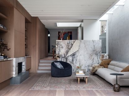

The trend for slat wall ideas almost seems like it came from nowhere. One minute we were paneling our houses with beadboard and Shaker-style panels, then the next this completely new style had arrived on the scene.
But, it's no surprise it's become a popular design choice for living room wall decor ideas and beyond. Unlike traditional paneling, it's effortlessly modern in style. This not only means it can be used to give your standard house a more contemporary feel, but that it finds a home easily in more modern builds.
In the most elevated examples, slat walls also offer a way to bring the warmth and character of timber into a modern space, helping to make these rooms feel cozier, without losing their contemporary appeal.
With this interior design trend showing no sign of abating, we've collected some of the best examples of timber slat paneling from around the world, to showcase just how you can adopt slat wall ideas in your own scheme.
Elevated slat wall ideas for every space
If you like the idea of these modern slat walls, there's an option for most budgets. Slat walls can be cut from relatively inexpensive timber products such as MDF and painted, for example, while bespoke panels using beautiful timbers will certainly put more of a strain on your purse strings.
There are also a growing number of panel products out there, which offer pre-made slatted sheets which are easy to attach to the wall, and even include an acoustic backing for a better-soundproofed property.
1. Use slats for a feature wall
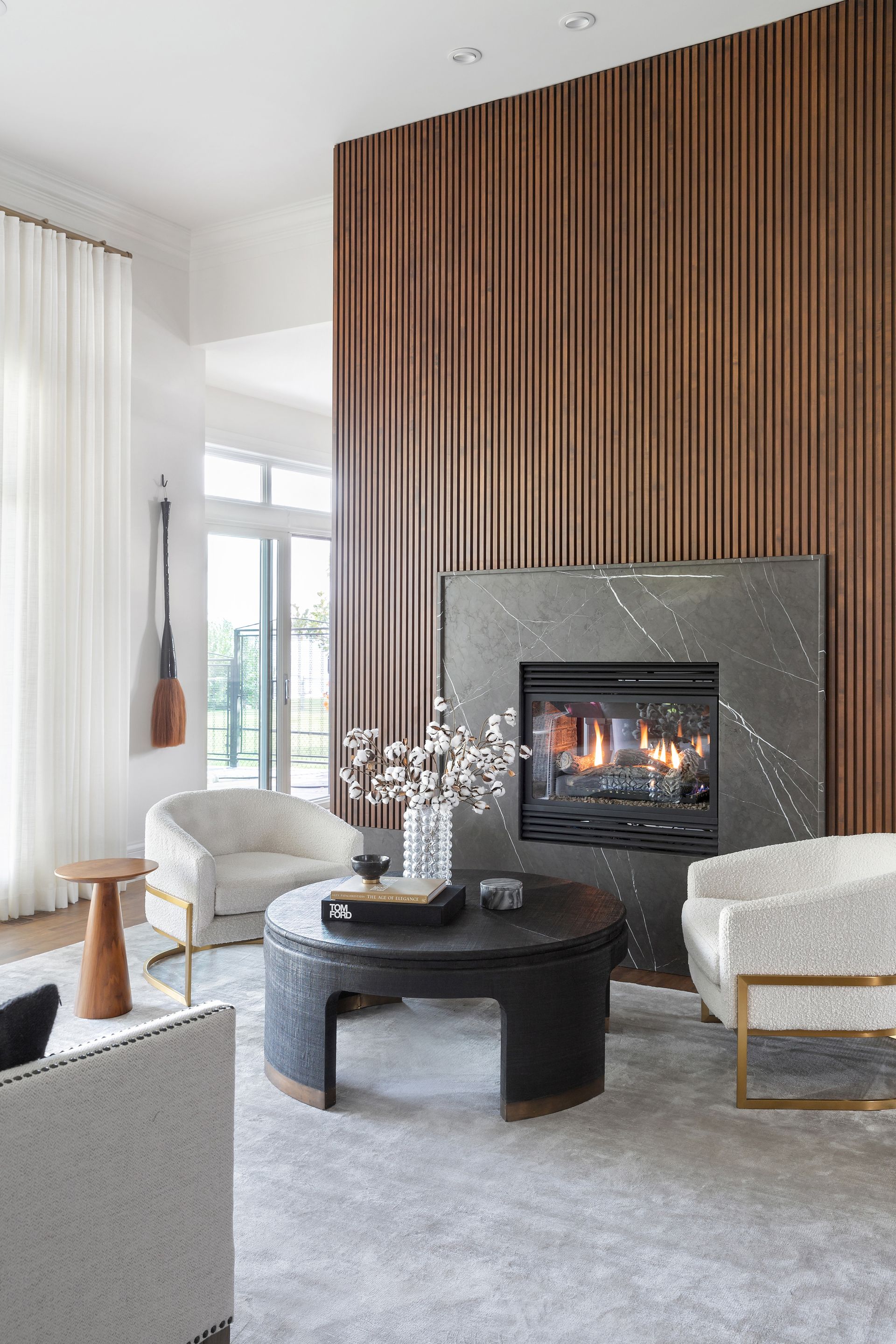
When it comes to more traditional wall paneling ideas like Shaker-style panels, trends have moved away from the accent wall to full room coverage instead. However, the slatted wall look suits a more sparing use.
Too much and the texture and color can be overwhelming, so consider how slats can be used to define, zone and make sense of your home's layout as a feature element.
You might also consider running slats across an entire aspect of your house, helping it to feel less like an individual, separate finish, and instead make it feel like it's part of the fabric of your home. These are the most successful instances of designers using slatted walls.
In this lakehouse residence in Calgary, Canada, for example, slats were used around a central volume incorporating a fireplace in the living room, but also concealed storage in the kitchen.
'The use of vertical slats on all sides of this freestanding fireplace was strategic in concealing two large pantry cabinets on the kitchen side, explains interior designer Reena Sotropa. 'The hinge and openings are completely concealed by the lengths of wood for a clean a seamless look.'
2. Hide a door in slats
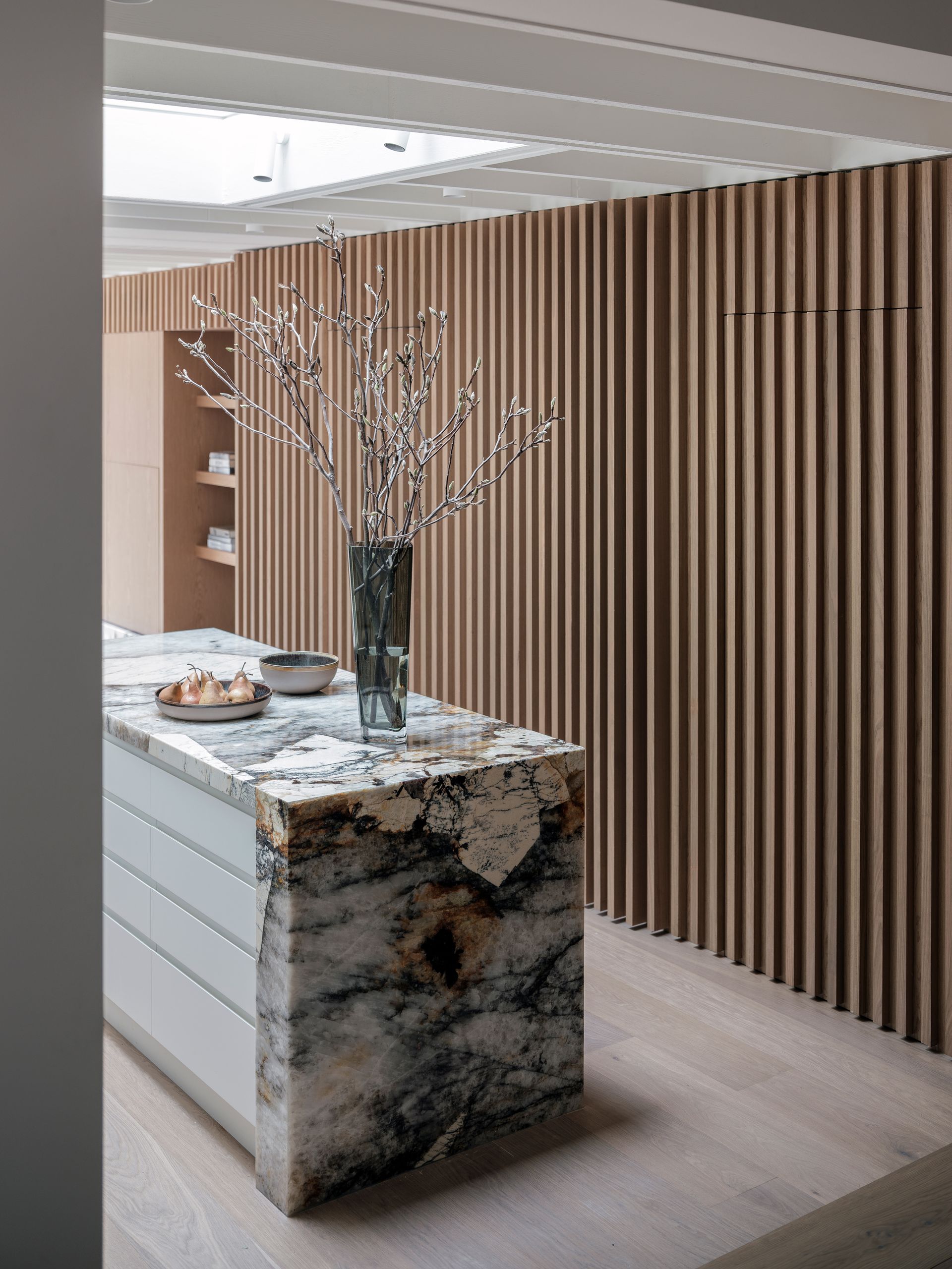
The nature of slatted walls means they work particularly well for hidden door ideas. These are particularly useful in small spaces, where too many doors can make it feel like you're living in a corridor, and where you want to retain a sleek, modern look.
In the best applications, the only tell-tale sign of your camouflaged door is a discreet vertical line above, and it can be used to hide spaces like ensuite bathrooms, cloak rooms, pantries and closets that lead off from larger spaces.
In this small kitchen design by Porebski Architects, these slatted hidden doors have been combined with bifolding mechanisms, ensuring the doors don't block the walkways when open.
3. Or your kitchen appliances

With a little expertise, slatted walls can also be used to hide integrated appliances. This modern kitchen idea has been used in the design of this London extension, Yard Architects used a slatted wall to hide not only the kitchen cabinetry, but an integrated fridge, too.
'We wanted to create a kitchen where the focus was on the island and the run of units which are top-lit with a rooflight running along the length of the cabinetry,' explains architect and director of Yard Architects Simon Graham. 'To achieve this focal point we were keen to ensure the rest of the kitchen appliances were hidden, so it's not obvious there is a fridge or larder.'
'Using a wall of slatted oak meant we could hide each of the doors to create a seamless wall of timber,' he adds, 'which matched the timber lining used in the dining space, tying these two elements together.'
4. Use slats as a room divider

Slat wall ideas aren't only used as wall decor, they can be used as a room divider idea too. Whether small or large, a slatted wall can aid with circulation and flow, while creating pockets of privacy, all while keeping the idea of the space beyond which helps your rooms feel bigger.
In decorating an apartment in London's Notting Hill, Lior Brosh of Brosh Architects chose to remove an internal wall to bring more light into the space, replacing it with a slatted screen.
'We completely removed the stud wall between the living room and the hallway in order to bring more natural lighting into the living room,' explains Lior, 'however, it created an odd circulation space between bedroom two and the living room. This led to the idea of creating a slatted partition which was painted white so that it feels and acts like a wall, creating more modest circulation between the living room and bedroom but not blocking the natural light coming in from the window.'
The beauty of these slats is only highlighted when natural light is at play. 'At a certain time of day or when the lighting is on during night time, the slatted wall creates elegant silhouettes on the floor which adds drama to the lighting,' Lior says.
5. Try slats for a stylish staircase

Slats have also become a popular staircase idea. In this instance, slatted dividers not only partially obscure the stairs from view, but also provide an essential safety role for those using the stairs without requiring less stylish handrail options.
In this home in Ontario, designed by Wanda Ely Architects, slatted dividers are used throughout to introduce flow and texture. 'Upon entering the front door, a wood slat screen redirects the flow of movement into the home, and offers glimpses into the dining room, kitchen, and living room beyond,' explains architect Wanda Ely.
The staircase re-introduces the slatted design, helping the staircase feel open, but definitely separated from the kitchen.
6. Use slats with other types of paneling in your room

Slats don't have to be used as the only paneling or texture idea in a space, and often small sections of slats are introduced to add another layer of texture to a design.
For this bedroom accent wall created by interior design studio U31, a grey slat wall provides a cool relief from the warm, brown walnut used throughout, adding interest through asymmetry, while elsewhere in the scheme, walnut slats are used to contrast against modern matte black finishes. 'Incorporating the slatted paneling adds a layer of warmth to an otherwise high-contrast palette,' explains Christianne Barbuto, design lead at U31. 'Slats are also used on the terrace too to help to define the grill area, while also adding warm and visual interest to the dark brick backgrounds.'
7. Use slats for a feature media wall
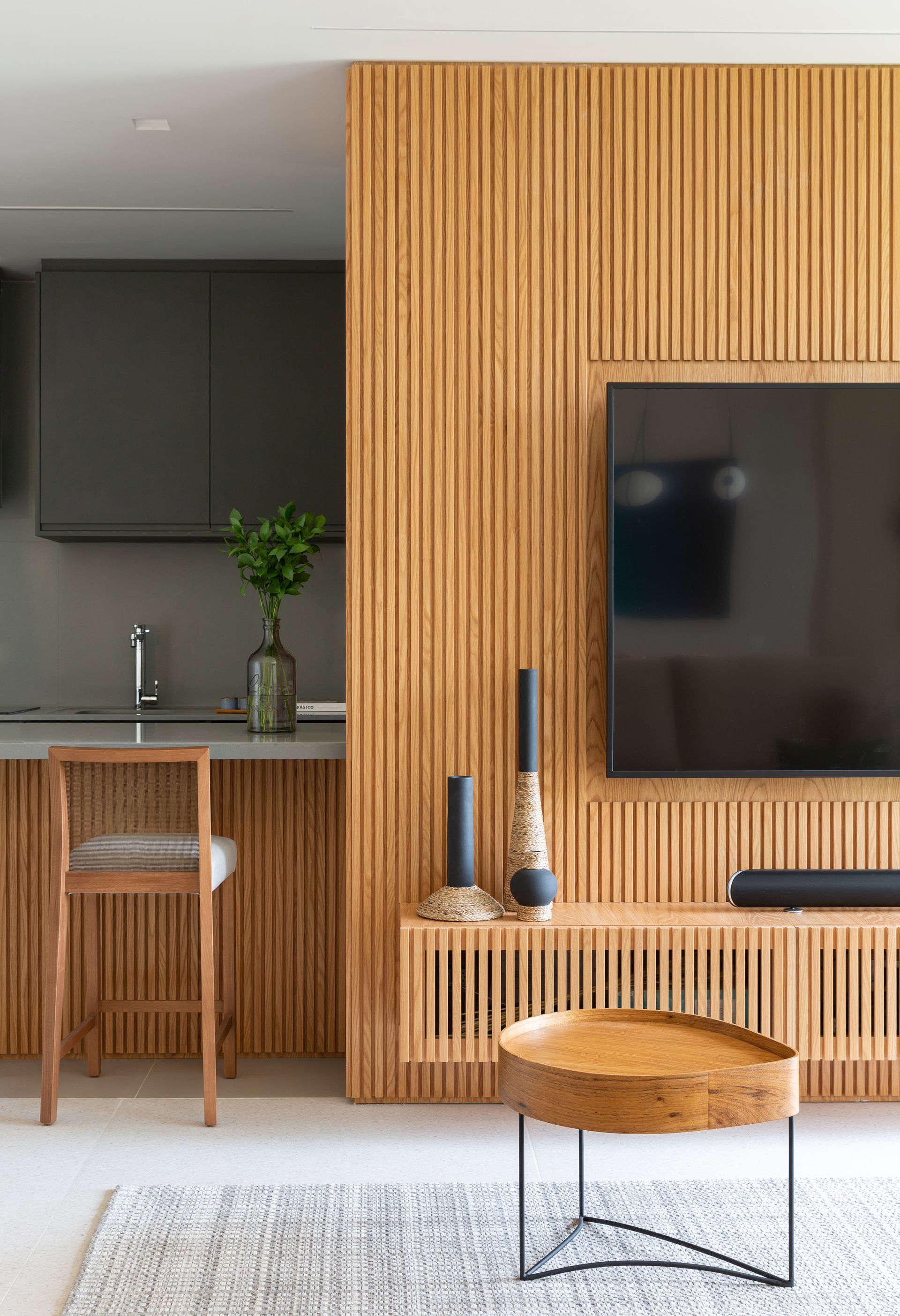
Slat wall ideas work particularly well for streamlining a media wall, creating a stylish TV mounting idea. In this modern apartment in Brazil, slatted millwork not only hides the TV cables, but is used for a sleek floating media unit, as well as encompassing the peninsula in the adjacent kitchen.
'The simplicity permeating the entire project, with straight and minimalist lines, is aligned to the sophistication composed by the slats of the TV panel and cabinet,' says architect Gabriela Casagrande of this apartment design. 'We also created unity and dynamism with the kitchen counter finished in the same slats.'
'The woodwork, finished in American oak in the living room, and in dark gray in the open-concept kitchen, allows for a feeling of coziness and warmth,' she adds.
8. Use slats for the ceiling
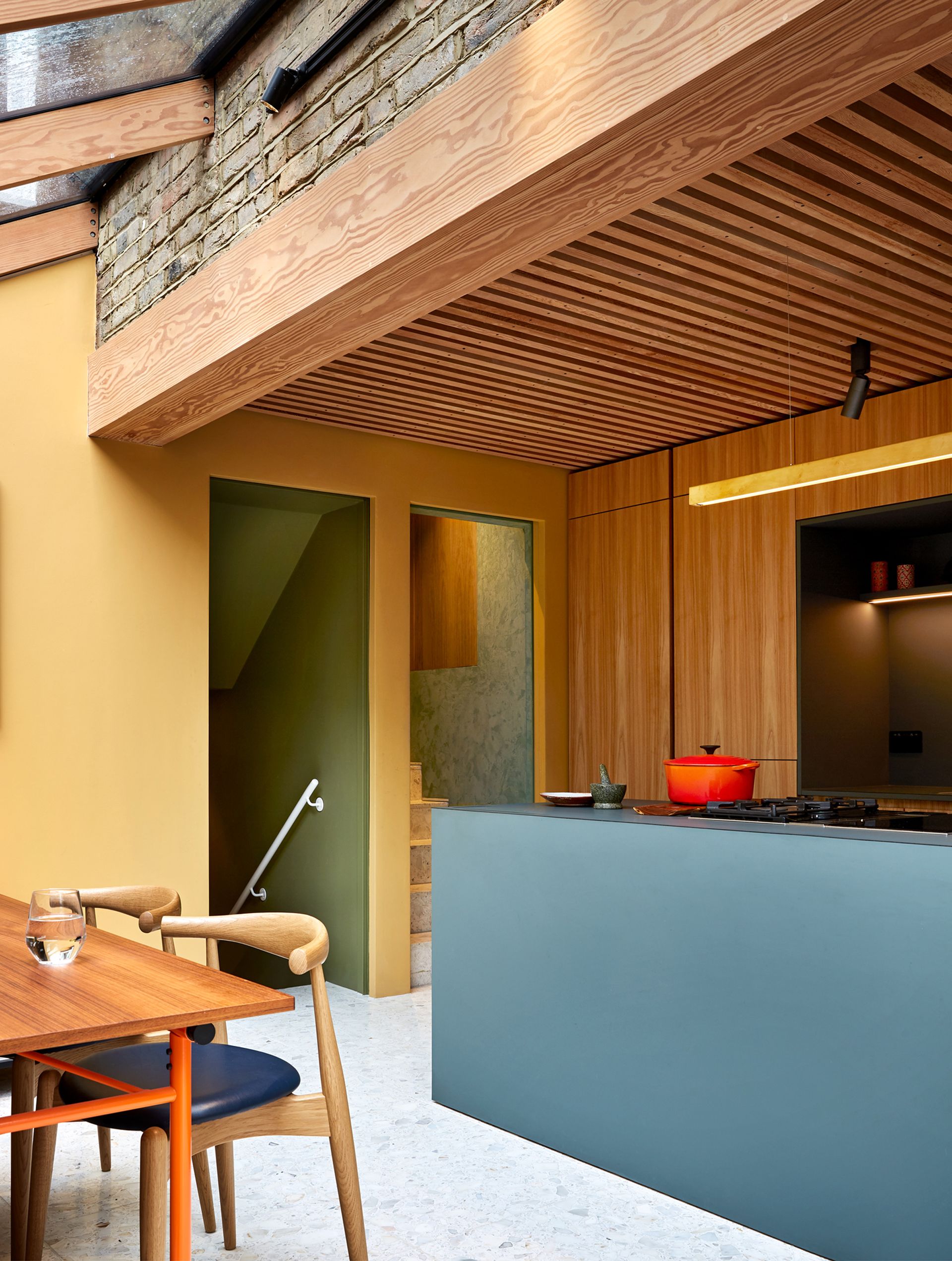
Slats can also be used as a ceiling decorating idea, as showcased by this open plan kitchen design by design studio Collective Works. 'Using different materials, varied ceiling heights, and paint or colour, are ways of zoning a space by treating the ceiling,' explains Siri Zanelli, founder of Collective Works.
In the design of her own kitchen, Siri used timber slats to zone the kitchen from the nearby dining area and snug. 'It's a beautiful way of creating distinctive zones by cladding some of the ceiling in timber, either boards, panels or louvres, giving one area the warmth and coziness that timber creates,' Siri adds.
Are slat walls on trend?
Slat walls have been around for a few years now, but it's really hit its stride as an interior design trend of late. Of course, the more a design trend proliferates the more diluted it becomes, so it's worth experimenting with the slat trend to keep it feeling fresh.
You could do this by choosing a characterful timber choice, or perhaps by choosing to create more spaced-out slats for a different take on this paneling idea.
Be The First To Know
The Livingetc newsletter is your shortcut to the now and the next in home design. Subscribe today to receive a stunning free 200-page book of the best homes from around the world.

Hugh is the Editor of Livingetc.com. From working on a number of home, design and property publications and websites, including Grand Designs, ICON and specialist kitchen and bathroom magazines, Hugh has developed a passion for modern architecture, impactful interiors and green homes. Whether moonlighting as an interior decorator for private clients or renovating the Victorian terrace in Essex where he lives (DIYing as much of the work as possible), you’ll find that Hugh has an overarching fondness for luxurious minimalism, abstract shapes and all things beige. He’s just finished a kitchen and garden renovation, and has eyes set on a bathroom makeover for 2024.
-
 The 12 Best Table Lamps for Reading —I'm a Certified Bookworm (and Shopping Expert)
When it comes to table lamps for reading, I don't mess around. If you're the same, this edit is for YOU (and your books, or course — and good recommendations?)
By Brigid Kennedy Published
-
 "It's Scandi Meets Californian-Cool" — The New Anthro Collab With Katie Hodges Hits Just the Right Style Note
The LA-based interior designer merges coastal cool with Scandinavian simplicity for a delightfully lived-in collection of elevated home furnishings
By Julia Demer Published

