Living room ceiling trends – 5 decorative ways designers are embracing the 'fifth wall'
Cozy, cocooning and downright stylish, these living room ceiling trends make a feature of an underused surface


The living room ceiling trends we've seen used in interior designers' spaces reflects a growing interest in what's sometimes called the 'fifth wall'. After all, the ceiling is a considerable surface space that's often underused (by which we mean, it's always painted white) – and in living rooms in particular, doing something a little different can completely change the feeling of a room.
In fact, some of the best living room ideas we've seen use the ceiling as an accent, thanks to the way it can be used to make a space feel more intimate and cocooning. And after all, isn't that what we all want from this room?
From tonal colors to exposed beams, these are the living room ceiling trends designers are leaning into right now.
1. Rich wood panelling

Living room panelling has been popular for some time, but now the look has spread to the fifth wall – and living rooms in particular can benefit from the cozy feel this creates. Scandi-style designs utilize light woods, but we love the rich, warm tones we’ve seen in the coolest spaces like this room by New York-based interior design firm Bespoke Only.
‘The wide pine planks on the ceiling were repurposed from the wall paneling seen throughout the home,’ explains Melissa Lee, founder and principal of the firm. ‘While we really enjoyed the continuity, we had to maximize the wall space to accommodate more custom storage for additional functionality. As a detail often used in many ancient architecture styles, wood ceiling to us has an unique sensibility that brings nature in with a time-honored appeal. Here, we thought it was a subtle yet textural nod to give this home office some much desired character.’
2. Two-tone color

White has long been the default paint color for a ceiling, unless you’re a designer – in which case, it’s definitely not an essential. ‘It's very easy to default to white for a ceiling, but it's rarely the right thing to do,’ says Andrew Griffiths, founder of London boutique design studio A New Day. While a cocooning all-over dark paint color has its place as a painted ceiling idea, designers are turning to a two-tone effect – carrying a lighter shade of the wall color to the ceiling – for a similar cozy feel with a lighter lift.
‘We used a rich blue limewash paint on the walls of this snug to create a cocooning feel in a space that gets limited natural light,’ says Andrew of the space pictured above. ‘The beautifully organic and uneven texture gives a real sense of depth and character to the space, and it was important to continue that onto the ceiling rather than create a high contrast of finishes. A warm greige adds lightness overhead, but in a way that feels tonal with the walls rather than introducing a stark transition.’

Color: Skylight
Finish: Limewash
3. Exposed beams

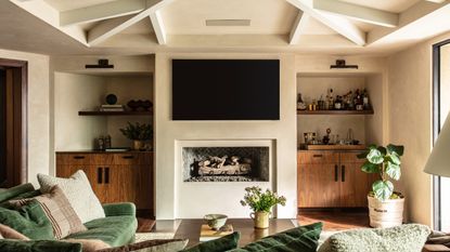
Wood rafters have long been a staple of some styles of home – modern farmhouse, anyone? – but we’ve noticed exposed beams being used in fresher, more contemporary ways for modern schemes. Keeping the beams light is key – darker woods and paints can make this architectural feature feel even heavier. Combining beams with wood panelling still feels fresh with a lick of warm white paint, but we’ve also spotted designers using them in conjunction with more interesting ceiling finishes: in this project by Laguna Beach interior design firm Studio Gutow, for example, painted beams are combined with a plaster effect brought up from the walls.
4. Decorative moldings

Likewise, molding is a common occurrence in period homes, if you’re lucky enough to inherit one with all its features intact – but we’ve seen designers increasingly embracing this beautiful ceiling decor and using it as a point of contrast with more contemporary color choices and furnishings.
Modern homes are absolutely fair game for adding moldings, providing you do it sensitively – they can even make a space look more expensive. ‘In a more modern space I’ve added layers of molding into no-frills designs by stacking on additional layers,’ explains Jenna Chused, founder of Brooklyn-based interior design firm Chused & Co. ‘You can add another stick piece and quarter round to the top of the base moulding to give it a little bit more interest. In a contemporary scheme, just remember to keep the shapes more square and linear with just a few rounds so it won’t look out of place for the history of the space.’
5. Ceiling murals

Wall murals and frescoes are having something of a moment in interiors – and employing them as a living room ceiling idea is a particularly uplifting way to decorate with these artistic features. It references classical uses of frescoes, of course – but designers are also using murals to add the pattern and color that wallpaper usually brings, especially where wall space is at a premium.
In this open-plan apartment living room by Chicago interior design firm Studio Sven, for example, wall-to-wall glazing means there's little opportunity for wallcoverings. Instead, an abstract pattern adorns the ceiling, countering the shapely furniture pieces in the space.

Colour: Blue/pink/yellow
Price: $7.50 per square foot
Be The First To Know
The Livingetc newsletter is your shortcut to the now and the next in home design. Subscribe today to receive a stunning free 200-page book of the best homes from around the world.

Ellen is deputy editor of Livingetc magazine. She cut her teeth working for sister publication Real Homes, starting as features editor before becoming deputy editor. There, she enjoyed taking a peek inside beautiful homes and discovered a love for design and architecture that eventually led her here. She has also written for other titles including Homes & Gardens and Gardeningetc. While she gets ready to buy a house of her own, she takes inspiration from the works of some of her favourite architects and tastemakers. She has a particular passion for green design and enjoys shopping small, local and second-hand where she can.
-
 The 12 Best Table Lamps for Reading —I'm a Certified Bookworm (and Shopping Expert)
When it comes to table lamps for reading, I don't mess around. If you're the same, this edit is for YOU (and your books, or course — and good recommendations?)
By Brigid Kennedy Published
-
 "It's Scandi Meets Californian-Cool" — The New Anthro Collab With Katie Hodges Hits Just the Right Style Note
The LA-based interior designer merges coastal cool with Scandinavian simplicity for a delightfully lived-in collection of elevated home furnishings
By Julia Demer Published

