Kitchen wall tile ideas - designer ways to add extra depth and style to your scheme
The most beautiful kitchen wall tile ideas allow you to be as bold as you like, with these decor tips offering the perfect finishing touch

When it comes to kitchen wall tile ideas, this finishing touch is where you can make the biggest statement. The question is, how do you marry style and function, as wall tiles need to be able to withstand splatters of food and splashes of water. Or, if they're being placed behind above an oven, potentially high temperatures. So we’ve enlisted the help of experts and designers who all know a thing or two about kitchen tiling, to get your creativity flowing.
A hugely popular choice in kitchen design, tiles are beloved for their decorative possibilities and practical capabilities. But which should you choose? And where should you lay them? The sheer scale of options can be a little overwhelming. Thankfully, our experts are on hand with inspiring kitchen tile ideas and insider know-how to help you decide what will work best in your kitchen.
'Kitchen wall tiles are a way to really add some flair to this functional space,' says Livingetc editor Pip Rich. 'I've seen some exciting new interpretations recently. From irregular color placement - think mostly green, with a splattering of blue above the sink - to counter-to-ceiling finger tiles, imaginations are running wild.'
Kitchen wall tile ideas
1. Tile up to the ceiling

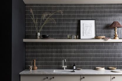
Design by HAM Interiors
Tiles are typically used to be functional, confined to modern kitchen backsplash ideas. But this is by no means the extent of their potential. They can be a beautiful way to create interest across the entire wall, and this kitchen designed by HÁM Interiors is a perfect example.
‘The tiled wall was inspired by prep kitchens, and chosen for its utilitarian feel,’ says Tom Cox, co-founder of HÁM Interiors. ‘This home features a lot of painted walls, so having a fully tiled wall makes for a striking architectural break and bold juxtaposition to other more traditional rooms in the house.’
Visually, tiling up to the ceiling can help to make a room feel taller and more spacious too. ‘It has the visual effect of drawing the eye up,’ explains Tom.
2. Tile around a backsplash

If you already have backsplash that you love but also want to incorporate tiling into your kitchen, then this idea may be for you. ‘In this project, we had extremely high ceilings and slanted walls,’ says Hayley Robson, Creative Director and Co-Founder of Day True, ‘so we decided in addition to the backsplash, we’d also include tiles to fill the space and add layers of texture and colour.’
With every design decision comes the opportunity to enhance the feel of a room. If you’re opting to tile your kitchen wall, it’s worth taking time to consider the shape of tile and laying pattern that will work best for your space. ‘Good design is always about making things feel bigger,’ says Hayley. This option would work particularly well as part of your galley kitchen ideas. ‘In this instance, the room had high ceilings which we wanted to exaggerate. Stacking the subway tiles vertically encourages the eye to draw up to the ceiling and elongates the look of the kitchen.’
3. Experiment with laying patterns

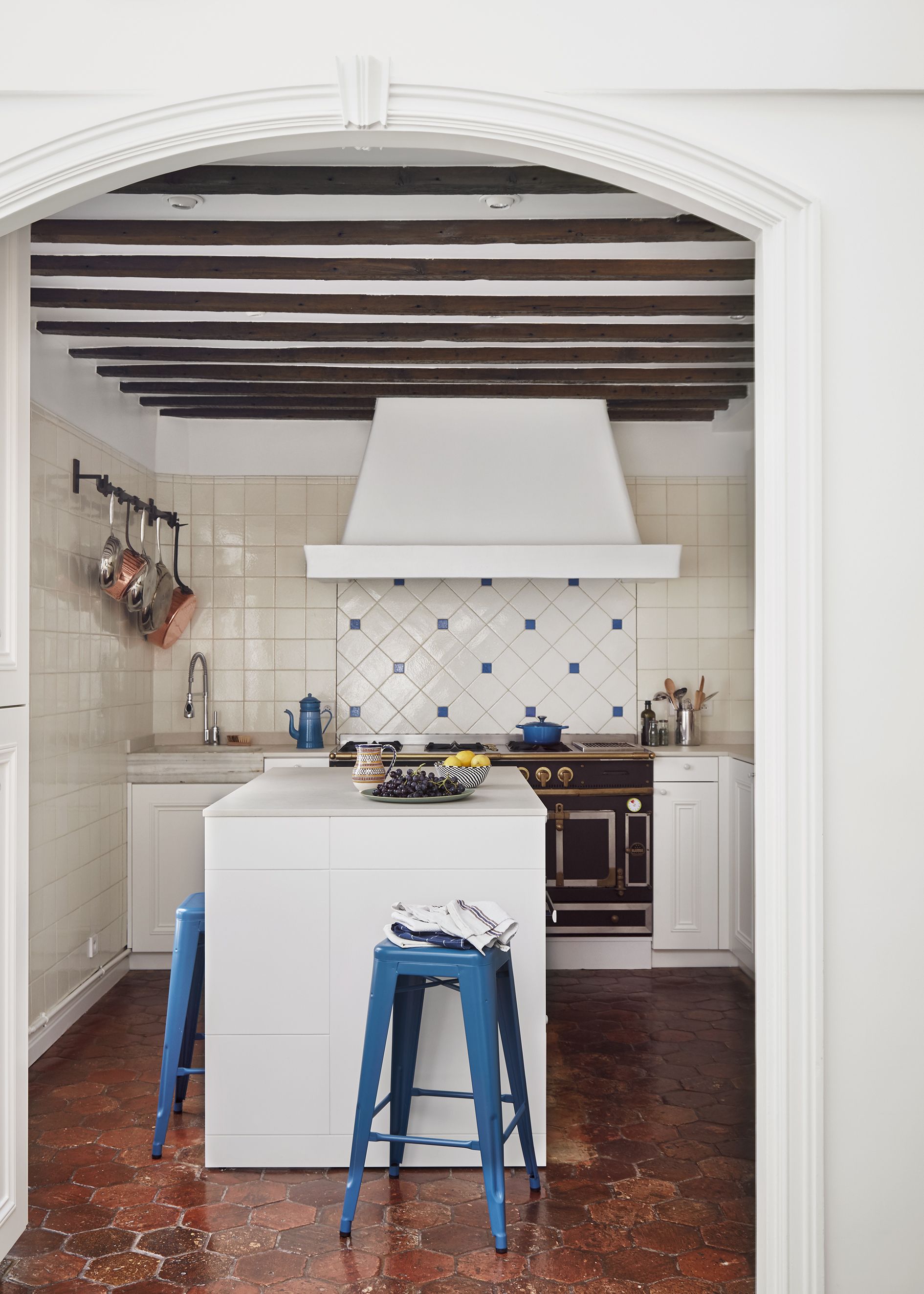
Design by Kasha Paris
The color, pattern and material of a tile are not the only things that will impact the overall look - the laying pattern too will have a huge impact on the final result’s visual appeal. Jazzing up white kitchen ideas, tiles can be laid vertically, horizontally and even diagonally to achieve different aesthetic effects. This can be a great way of drawing attention towards favourite features or the strengths of a room.
For this project by Kasha Paris, tiling was used to accentuate the kitchen’s focal point. ‘Our client was passionate about cooking,’ explains Betsy Kasha, Co-Founder of Kasha Paris. ‘They inherited a beautiful old La Cornue oven from a chef friend, and we wanted to make a feature of it. By changing the direction of the white tiles behind the oven and adding cobalt blue accent squares,’ she says, ‘the oven takes center stage in this otherwise simple kitchen.’
4. Play with scale

With so many tiles out there to choose from, beginning your search can be daunting. One way to narrow the parameters is to consider the size of tile you want to go for. This can be steered by the effect you wish to create.
‘Both small and large tiles have their benefits,’ says Louisa Morgan, Creative Director at Mandarin Stone. ‘Larger tiles can trick the eye into making the space feel larger, while smaller tiles are great for adding interesting texture and character.’
In this kitchen, narrow dainty tiles marry black and white kitchen ideas perfectly. They serve to add visual interest to an architecturally simple room. Louisa notes, ‘The linear, grid-like appearance oozes contemporary style, yet also draws the eye into the kitchen area to create a cosy and homely feel. The dark tones help to further attract the eye,’ she says, ‘while the reflective surface bounces light around the space.’
5. Combine two different tile styles

You needn’t have to limit yourself to one design - in fact getting creative with combinations is actively encouraged! Being first and foremost practical spaces, kitchens can sometimes feel a little sterile or cold, but introducing color and pattern is a surefire way to make the space feel more inviting.
Rob Whitaker, Creative Director and Co-Founder at Claybrook agrees. ‘Kitchens are an ideal room to try mixing up pattern and scale,' he says. 'One idea to begin playing around with is having one design on the lower wall and a contrasting one above with a display shelf in between,’ he says. ‘This creates a smart, tailored look that adds a fun visual twist but is still super practical.’
When it comes to adding tiles to kitchen shelving ideas, Rob advises what works best visually. ‘Choose a larger format tile for the lower wall, with a smaller one above for balance and equilibrium,' he says. 'To avoid it looking chaotic, it’s also advisable to keep colours within a similar palette so that the only subtle contrast is in the pattern.’
6. Incorporate paint into your tiling design

As with any room, every element of your kitchen should work cohesively and harmoniously - and your tiling is no exception. Simply pick a paint shade that works tonally with your kitchen color scheme, or for something a little more ambitious, why not play around with using paint to extend your tiling design?
A recent collaboration between Bert & May and Little Greene makes it incredibly easy to combine tiles and paint together. Eight of Little Greene’s classic paint colors are now available across two types of tiles from Bert & May, so you can not only colour match your tiles to your wall colour, but you can also be assured that every shade works together beautifully.
This kitchen combines aquamarine tones with a contrasting chocolatey brown to gorgeous effect. ‘A classic blue-green brings gentle coolness and tranquility to the room,’ says Lee Thornley, Founder of Bert & May. ‘A vertical line of Purple Brown tiles on the wall is also continued in the corresponding paint colour by Little Greene to create a surprising architectural detail.’
7. Include pops of color

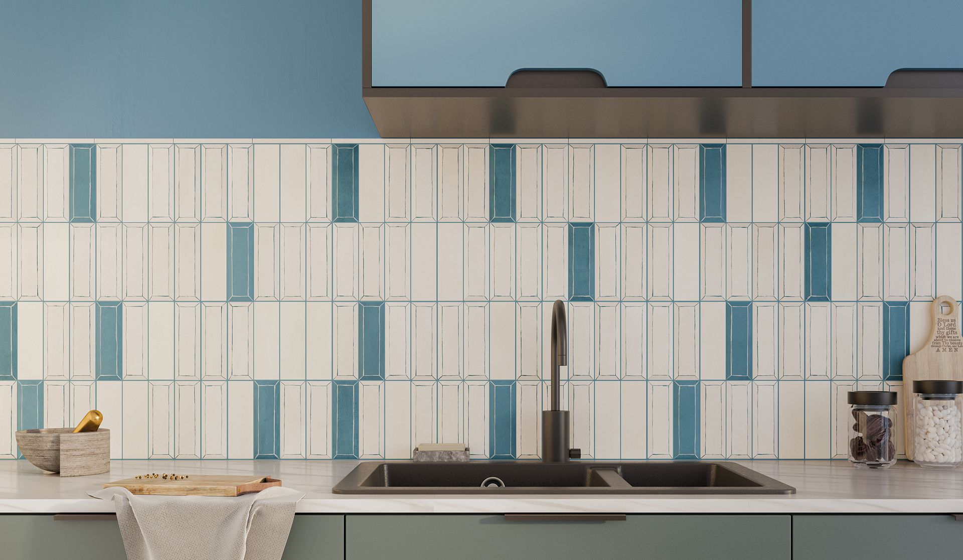
This is for if you favor a neutral and pared back look, but are wanting to inject just a touch of personality into your kitchen tiles. Almost every tile company offers one design of tile in multiple colorways, so why not mix and match a couple of different shades across the wall? In this kitchen, neutral white tiling is interspersed with beautiful blue tiles in the same design for a dose of subtle, yet intriguing interest.
Take time to play around with the configuration and frequency of the pops of colour to achieve the perfect balance - random spacing encourages an informal and relaxed feel, while a more regimented design will offer a structure and pleasing symmetry.
'This approach to decor feels slightly out of the norm and haphazard, so you need to be a little brave,' says Livingetc editor Pip Rich. 'But be bold enough to be a little irregular and it will pay huge dividends.'
8. Go for gradated color

The simple approach to stopping wall tiles feel too flat is to break up their color. But you don't have to be too daring to do this - different tones of the same shade create a beautiful effect.
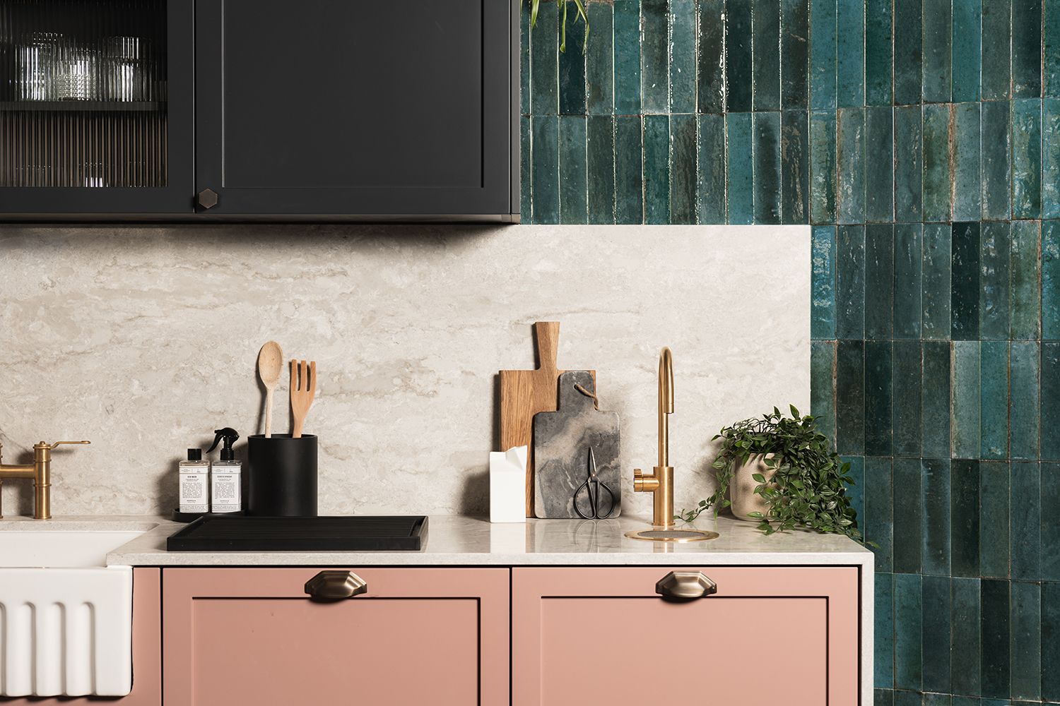
Taking green kitchen ideas to their most elevated, this space by deVOL plays around with greens of every hue. And the result is both calming and powerful.
'You want to avoid a too obvious ombre effect, which can feel as contrived as a wall of single color tiles,' says Livingetc's editorial director Sarah Spiteri. 'Dot the different shades at seemingly random for a much more modern approach.'
What tile finish should you use in a kitchen?
Kitchen tiles need to be able to cope with being splattered by both food and water, so anything that is easy to wipe clean is best. You will find that glossy tiles tend to cope with being in a kitchen better than matte, looking newer for longer.
Glossy tiles also have the benefit of reflecting light, helping to make the space seem bigger. This is particularly useful in galley kitchens or spaces with limited windows. ‘Slightly glossy tiles create a subtly reflective surface that makes the most of the natural light,' says Tom Cox, co-founder of HÁM Interiors.
What tiles are best for kitchen walls?
When it comes to choosing the type of tile to use on a kitchen wall, practicality is a top priority. ‘It’s good to use tiles that are easy to maintain and clean, in case of spills and splashes from cooking or washing up,’ advises Hayley Robson, Creative Director and Co-Founder of Day True.
Typically, ceramic or porcelain tiles are recommended for kitchen wall tiles thanks to their durability and ease of maintenance. ‘Porcelain works well in kitchens on the wall as it’s brilliant at repelling stains with an inherent ability to cope with water and food debris,’ says Rob Whitaker, Creative Director and Co-Founder of Claybrook. ‘Glazed tiles or glass mosaics are equally ideal and can be easily wiped clean.’
In terms of pattern and color, it’s best to follow your heart. What designs instantly appeal to you? What shades are you drawn to? What will complement your kitchen units? ‘There’s no hard and fast rules when it comes to choosing kitchen wall tiles,’ reassures Louisa Morgan, Creative Director at Mandarin Stone. ‘It’s very much a personal preference, so opt for the tiles you love and work with the style and colours within your kitchen.’
What size tiles are best for a small kitchen?
Large tiles are better for small kitchens - they create a feeling of expansiveness. Tiling has the ability to not only transform the look of your kitchen, but it can alter how the space feels too - if used cleverly. Laying patterns that draw your eye up to the ceiling enhance the sense of height. Meanwhile long horizontal tiles can have the effect of widening your kitchen - great for small kitchen ideas.
In terms of pattern, it may be best to err on the side of simple as not to overwhelm the room if space is tight. ‘If you don’t have much space, I’d suggest keeping your tiles a plain color throughout,’ says Lee Thornley, Founder of Bert & May. ‘You could add a patterned tile for the backsplash, or to create a focal point.’
Be The First To Know
The Livingetc newsletter is your shortcut to the now and the next in home design. Subscribe today to receive a stunning free 200-page book of the best homes from around the world.
Interiors stylist and journalist Amy Neason was the Deputy Style and Interiors editor at House Beautiful for years. She is now a freelance props and set stylist, creating work for a range of national publications and brands such as Imogen Heath. She has previously worked at Established & Sons, and her skills include styling still life and interiors shots for editorial features and sourcing unique products to create inspirational imagery.
She is particularly respected for interpreting seasonal trends into feature ideas and style stories.
-
 These 12 Best Table Lamps for Your Desk — Perfect Glows for a Creative Home Office
The best table lamps for your desk is have a soft, targeted glow. Elevate your WFH set-up with these stylish picks endorsed by Style Editor Brigid Kennedy
By Brigid Kennedy Published
-
 The Nespresso VertuoPlus is 30% Off for President's Day, and it's Kim Kardashian's Coffee Maker of Choice
This sleek and stylish coffee maker was spotted in Kim's home bar, and you can currently save $60 if you buy yours from Amazon
By Lilith Hudson Published

