'It can soothe your soul' - 5 earthy paint colors designers say are big trends for 2024
Designers share the top five earthy paint tones they think will be big trends for 2024, the colors that can make your calmer, happier and more rested
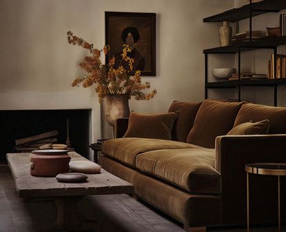

This time of year, our interiors need to work a little harder to provide warmth and coziness. But the move towards earthy, warm colors is so much more than a reflection of the change of the seasons. According to interior designer, Christiane Lemieux of Lemieux et Cie, these cocooning, earthy paint colors are a reaction to years of cold, stark-feeling interiors.
‘The new warmer, earthy colors are in reaction to the years of white and marble we have had,’ explains Christiane. I've spoken to the designers to find out exactly what earthy paint colors will be trending in the new year.
1. This clay-like ochre shade
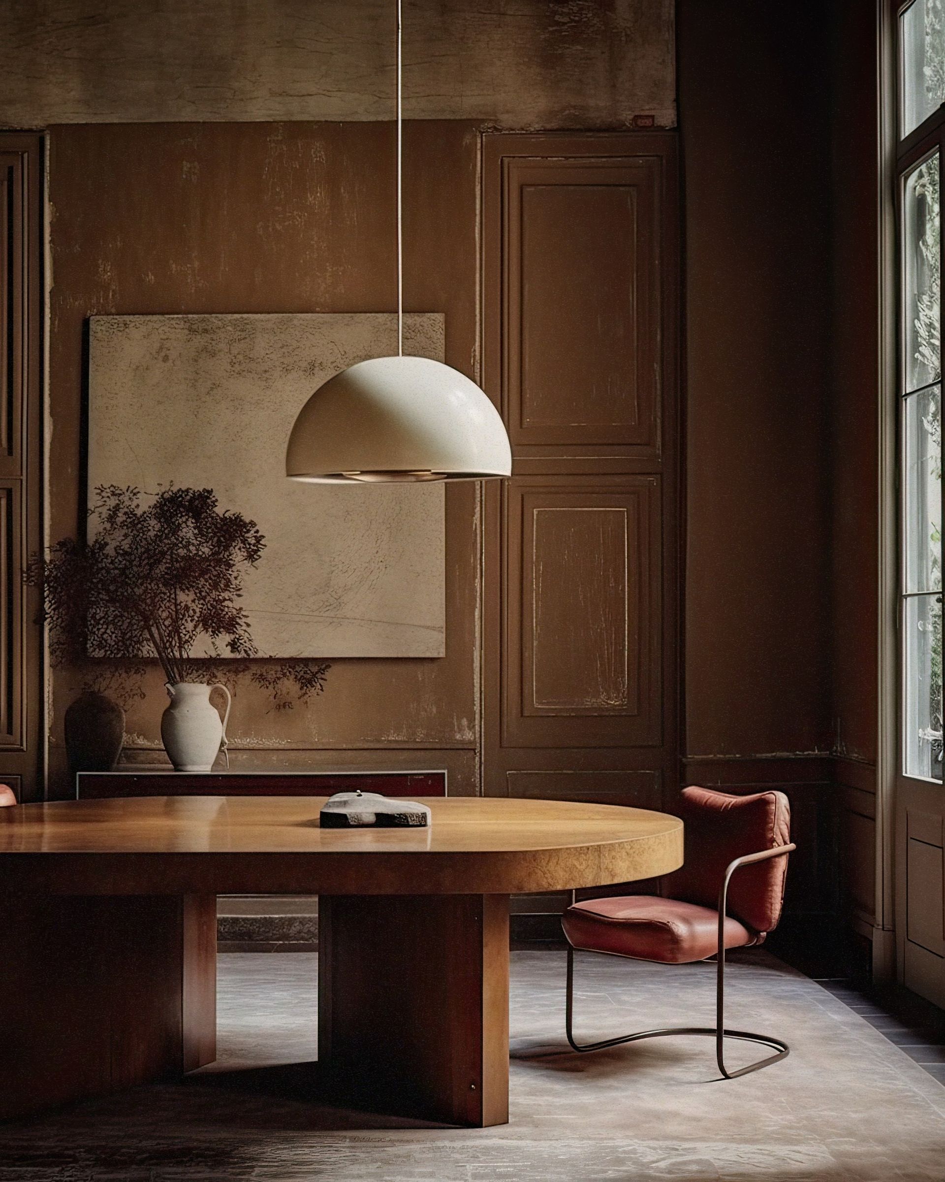
This tone of yellow has almost a clay-like quality to it that grounds your room to nature and brings that coveted earthy feel. It's not too bright and sunny and has a natural dullness to it, making it the perfect balance between energetic and earthy and ideal for an earth-tone living room.
'This room is painted in India Yellow by Farrow & Ball,' says Christiane Lemieux of New York-based Lemieux et Cie. 'This warm color has been making its way into interiors for the last six months. Designers and clients are looking for livable color and this warm tones provide an update to the totally white and neutral interiors that have trended as of late.'
Layer this shade of yellow with brown hues to add a plushness to the space, and don't forget to add texture for added coziness - the ultimate accompaniment. 'Adding this warm shade also ushers in the ability to mix in woods and warm accents like burnished brown, brass, and bronze with ease,' says Christiane.
2. This elegant and earthy taupe
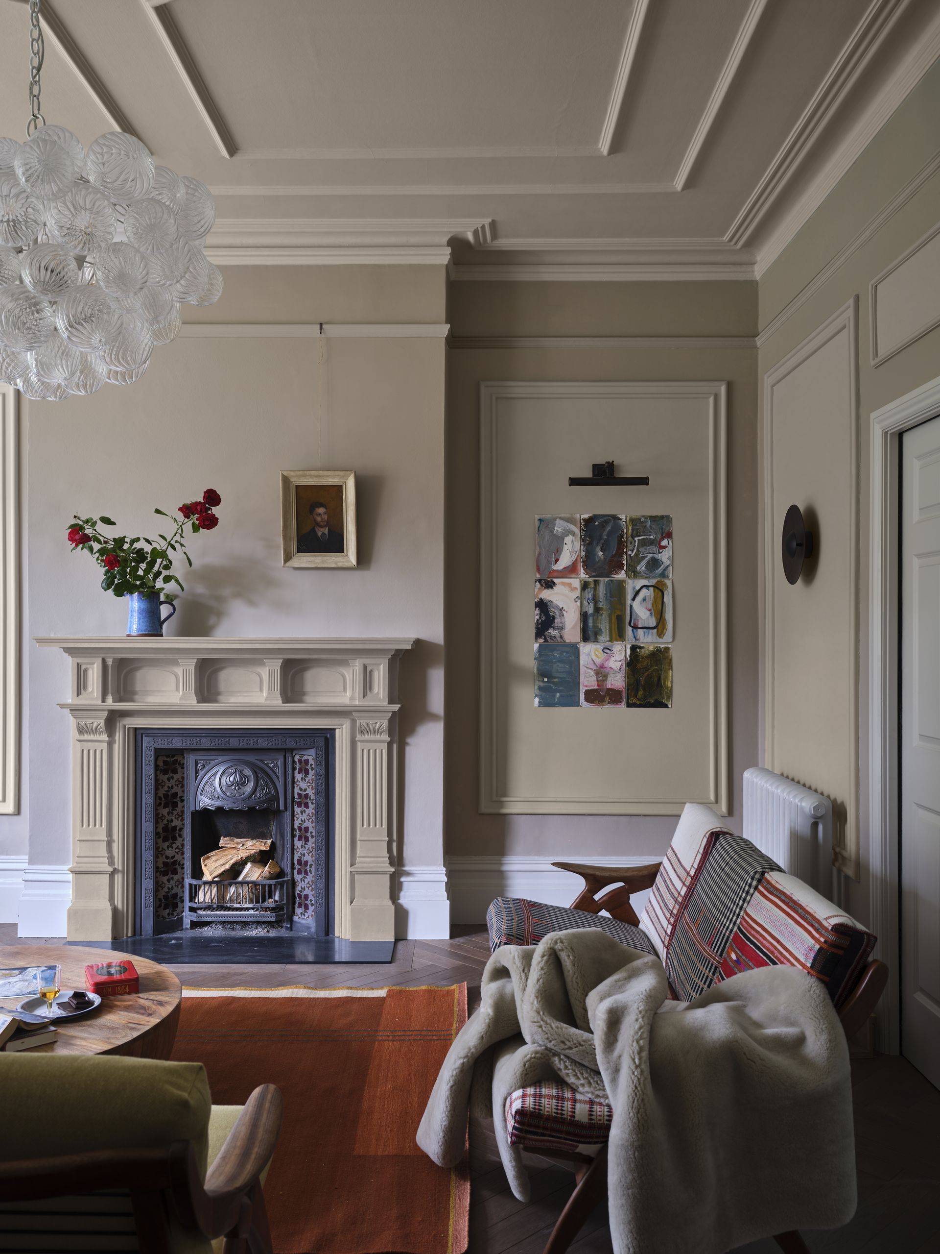
The annual interior trends prediction pannel for Farrow & Ball, (headed by color curator, Joa Studholme) has predicted that their Oxford Stone version of taupe will be an earthy tone we'll continue to love well in the new year. And it's a great neutral living room color, defined as a slightly warmer and darker beige, bringing complexity and depth to your scheme.
It's earthy yet has a neutral appeal meaning you can use it throughout the home and build up the palette with layers, decor, and texture. 'Many of us are drawn to clay tones, however, we also want to make our homes feel as bright and spacious as possible,' says Joa. 'Using a lighter tone like Oxford Stone on the walls instantly makes the walls feel lighter and the room feel bigger.'
Oxford Stone is a Farrow & Ball shade inspired by the cottages of the Cotswolds. It is a dark red-based neutral and is brimming with warmth.
3. This earthy green
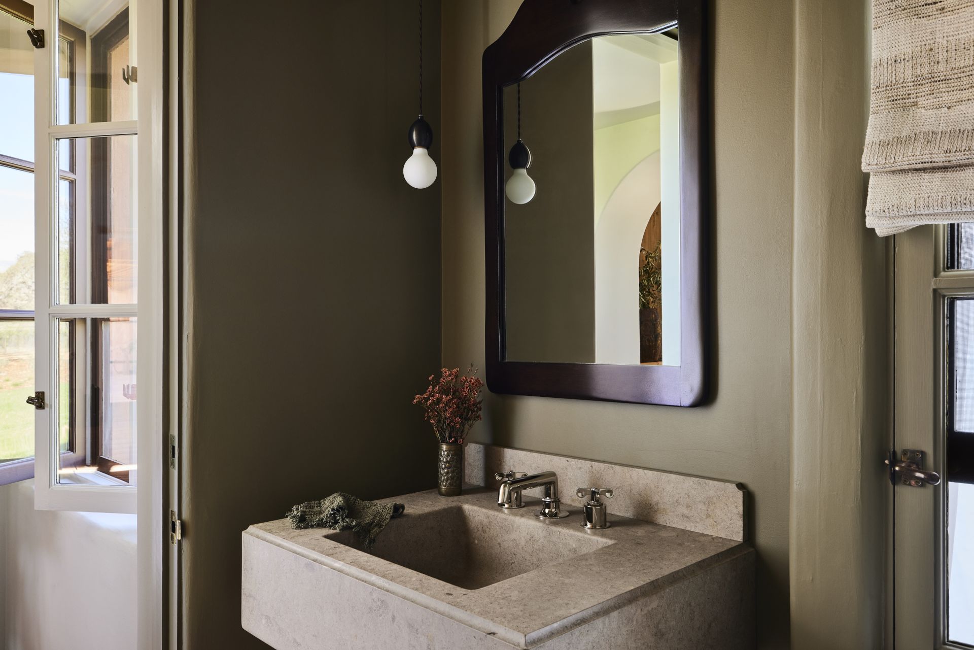
Green is a timeless shade that shows no sign of slowing down in terms of popularity. But we're seeing a shift away from pale and muted greens like pistachios and sages, towards more earthy versions. 'As a reflection of nature, green can literally soothe the soul,' says Aimee Wertepny of PROjECT. Interiors. 'The right shade of green can be earthy and dramatic and play nicely with nearly every color.'
This beautiful blend of green and brown works well in this bathroom designed by Corinne Mathern, from the Santa Barbara-based interior design studio and we can see in action how it's one of the paint colors that will make you calmer. 'I love Benjamin Moore’s Majestic Sage for a neutral with a touch of color. It’s a soothing, warm, earthy color that comes alive when the room is richly layered.’ says Corinne.
4. This moody mushroom grey
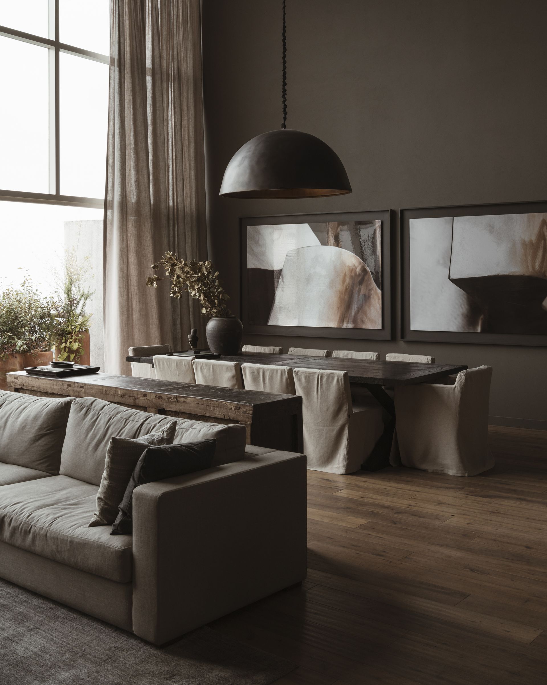
I've been obsessed with mushroom grey for a while, and it's a color that looks to continue to be popular as we approach the new year. With trends for grey coming and going, there is still room for this shade of grey that incorporates undercurrents of brown for that coveted earthy feel.
'I personally love mushroom grey for its simplicity, versatility, timelessness, ability to create a serene atmosphere, and its capacity to enhance textures and forms within a space,' says architect and designer, Alina Sulina.
'Mushroom grey offers a subtle depth and richness that adds visual interest and a great cozy color for minimalists. It can enhance the textures and details of furniture, creating a visually appealing and sophisticated look without being overly flashy. Furthermore, it can create a harmonious and cohesive look when combined with both warm and cool tones, making it suitable for different minimalist spaces.
'Mushroom grey is a classic and enduring color that withstands changing trends and remains relevant for years to come. Its timeless appeal aligns with the minimalist philosophy.'
For a reliable mushroom grey shade, I'm drawn time and time again back to this Mexico City home, designed by direccion. The Sherwin Williams' Gauntlet G 7019 is used throughout the house and when layered with texture creates an exquisite earthy look.
5. This earthy off-white
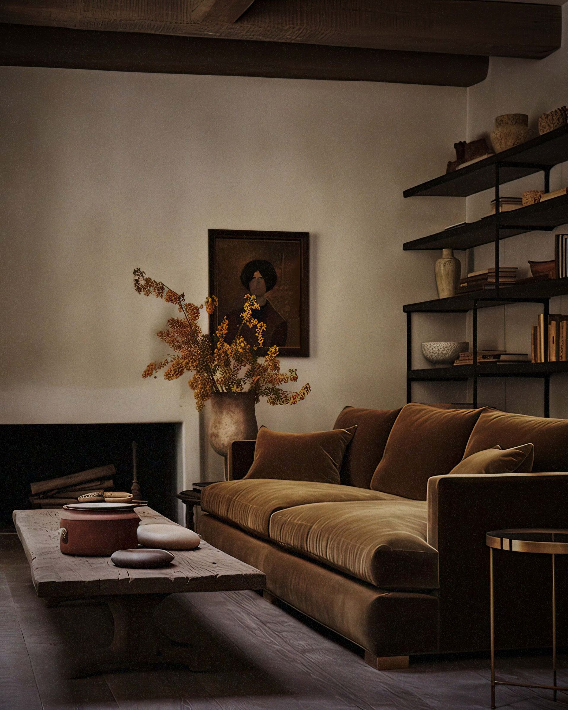
Finally, sometimes, earthiness and warmth can radiate from a simple and super subtle off-white lick of paint. Off-white has become a default paint color used in interior design and this doesn't look to be changing as we enter 2024. Earthy off-whites have yellow, green, or red undertones and it's these slight nuances that help to warm up the space, favored by designers instead of stark, bright white.
This Christiane Lemieux-designed living room uses Farrow & Ball's String - an earthy off-white with yellow undertones that keeps the space warm. String also has a note of green that helps it feel connected to nature, and means it works well in rooms that have a connection to the outside, like a conservatory or entryway mudroom.
3 earthy paints to buy now

Price: From $140 per gallon

Price: From $44.49 per gallon

Price: From $53.99 per gallon
Be The First To Know
The Livingetc newsletter is your shortcut to the now and the next in home design. Subscribe today to receive a stunning free 200-page book of the best homes from around the world.

Oonagh is a content editor at Livingetc.com and an expert at spotting the interior trends that are making waves in the design world. Writing a mix of everything and everything from home tours to news, long-form features to design idea pieces on the website, as well as frequently featured in the monthly print magazine, she's the go-to for design advice in the home. Previously, she worked on a London property title, producing long-read interiors features, style pages and conducting interviews with a range of famous faces from the UK interiors scene, from Kit Kemp to Robert Kime. In doing so, she has developed a keen interest in London's historical architecture and the city's distinct tastemakers paving the way in the world of interiors.
-
 The 12 Best Table Lamps for Reading —I'm a Certified Bookworm (and Shopping Expert)
When it comes to table lamps for reading, I don't mess around. If you're the same, this edit is for YOU (and your books, or course — and good recommendations?)
By Brigid Kennedy Published
-
 "It's Scandi Meets Californian-Cool" — The New Anthro Collab With Katie Hodges Hits Just the Right Style Note
The LA-based interior designer merges coastal cool with Scandinavian simplicity for a delightfully lived-in collection of elevated home furnishings
By Julia Demer Published
