Explore a tiny London flat that's filled with color, eclectic vintage furniture, and bold patterns
Interior design's Cath Beckett small apartment might be small but it definitely proves limited square footage need;t hold you back from going big on style


Do you ever find you are looking for small room inspiration or small apartment inspiration, only to be met with lots of perfectly lovely spaces that, while stunning, are mansions in comparison to the space you are working with? So when we find a modern home, that's actually small but equally fabulous we of course have to share.
Interior design Cath Beckett's home is a small two-bedroom apartment in London's Notting Hill. And yep, it's small. But for what it lacks in square footage it more than makes up for in style, and it also proves that with small spaces you don't always have to take the minimalist, neutral approach that is so often the default.
Cath, along with Liv Wallers founded the interior design studio Yellow London, and all you need do is look at one of their projects to see that color and pattern are their thing. So of course Cath's apartment was going to be an expression of her love of layering bold hues, quirky patterns, vintage finds, and her unique collection of family heirlooms...
Living room
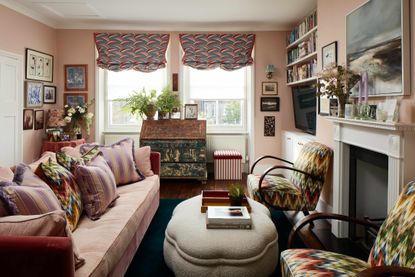
The living room/kitchen might be on the small side, but it crams in so much color and pattern and quirky shapes and styles that just totally distracted from the smaller proportions of the room.

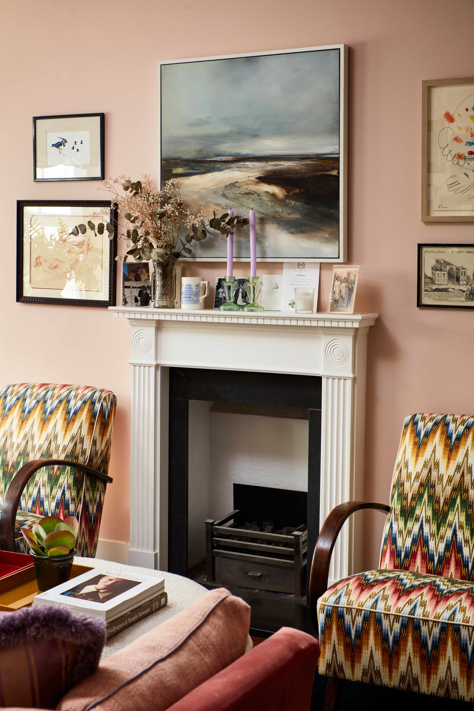
Salmon pink walls complement the darker, more muted pink of the velvet sofa. The pops of lilac add another layer of color, Cath incorporated piping for the cushions in a lilac silk, and added even more texture with fringe trims to fit with that eclectic layered look that can be found throughout the rest of the home.

Pink and red blinds add more rosy hues to the space, and the Ottoline de Vries fan print adds a fun and quirky vintage feel. Throughout the room are unusual family heirlooms, including a pair of horse lamps that have been passed down to Cath from her grandmother. The room is filled with personality and intriguing pieces that you just know have a story behind them.

The two 1950 bentwood armchairs that have been reupholstered in a striking zig-zag fabric by Teyssier Hawskwood, sit on either side of the fireplace and create a focal point for the room. The semi-symmetrical layout of the sofa facing the armchairs is usually one reserved for larger living rooms, so opting for this setup rather than everything pushed against walls gives this space a much loftier more elegant feel.

- Find more small living room ideas in our gallery.
Kitchen

The L-shaped kitchen sits along one wall of the living room – which may sound odd in such a busy space but the simple white cabinetry and the layout of the living room means it totally works. The chairs break up the space and give the kitchen a separate feeling.

Of course, Cath had to add a quirky touch and replace the handles with amber knobs for the top cabinets and lilac agate on the bottom. The mirrored splashback really helps to make the kitchen feel less boxy, tricking the eye into thinking the room continues beyond.

- Be inspired by more of our small kitchen ideas.
Dining room

Leading on from the living room is a small but incredibly striking dining room. It's the standout room in the apartment, with all four walls and the ceiling covered in a bold Pierre Fray’s Plein Eté wallpaper. The choice might seem bold for a small space, but this cocoon of color in fact seems much bigger than it is, as the print blurs the edges of the room.

The dining furniture are antique market finds. The bold hues work perfectly with the wallpaper and some solid color into the mix. An old pulley maid, repurposed as lighting adds an unexpected feature, that's perfect for the narrow space.
Hallway

The bold wallpaper theme continues in the hallway with a 50s inspired print from Whiteworks/Jet fabrics. The colors are softer and more muted than in the dining room but there's still that space-expanding effect. All the rooms lead off this small hallway, so from every room you get a glimpse of the print and it mixing wonderfully with the colors used in all the adjoining rooms.

- Explore more gorgeous hallway ideas.
Main bedroom

After a visit to the Svenskt Tenn showroom when Cath was working on a project in Stockholm, she fell for this cheery tulip print used on the headboard and that became the starting point for the bedroom.

The mix of the bold color of the headboard and bespoke red lacquer tables and the backdrop of the softer pinks and blues gives the space a contemporary edge, despite all the vintage pieces. The combination of styles gives the room a lift so it's hard to pinpoint an exact style, much like the apartment on the whole.

A lot of the bedroom furniture is sourced from vintage fairs or passed on from family, including the fabulous skirted dressing table and oak chest of drawers.

- Discover all our bedroom ideas for more inspiration.
Guest bedroom

The second bedroom has the most neutral color scheme of all the rooms, because of its small size Cath wanted to stick with a lighter palette to keep the room feeling fresh and bright.

There are still plenty of fun colors going on though, no white or grey here. Instead, the walls are painted in the palest of mint greens, which perfectly contrast the yellows of the headboard, blind and the pop in the lampshade.

Due to the small size, Cath decided to forgo bedside tables and instead add two narrow chairs, on top of each is a glass globe light from Oliver Bonas which adds some bolder hues to the color scheme as well as a touch of modernity.
Bathroom

The bathroom is actually the one that came with the property when Cath moved in, however, she has of course given it a colorful makeover, painting the walls in Farrow & Ball’s Lulworth Blue and replacing the tiles with these high impact rainbow stripes.

The internal doors are painted a mint green to match the wallpaper in the hallway which adds an extra pop of color to the bathroom. And you can see here Cath's vision to have every room sit comfortably with either other and how the color schemes of each room make them feel individual but also like they are all part of one color palette.

Be The First To Know
The Livingetc newsletter is your shortcut to the now and the next in home design. Subscribe today to receive a stunning free 200-page book of the best homes from around the world.
Hebe is the Digital Editor of Livingetc; she has a background in lifestyle and interior journalism and a passion for renovating small spaces. You'll usually find her attempting DIY, whether it's spray painting her whole kitchen, don't try that at home, or ever changing the wallpaper in her hallway. Livingetc has been such a huge inspiration and has influenced Hebe's style since she moved into her first rental and finally had a small amount of control over the decor and now loves being able to help others make decisions when decorating their own homes. Last year she moved from renting to owning her first teeny tiny Edwardian flat in London with her whippet Willow (who yes she chose to match her interiors...) and is already on the lookout for her next project.
-
 These 12 Best Table Lamps for Your Desk — Perfect Glows for a Creative Home Office
The best table lamps for your desk is have a soft, targeted glow. Elevate your WFH set-up with these stylish picks endorsed by Style Editor Brigid Kennedy
By Brigid Kennedy Published
-
 The Nespresso VertuoPlus is 30% Off for President's Day, and it's Kim Kardashian's Coffee Maker of Choice
This sleek and stylish coffee maker was spotted in Kim's home bar, and you can currently save $60 if you buy yours from Amazon
By Lilith Hudson Published

