How do you decorate walls in a minimalist way? Experts explain the secrets to adding personality, but calmly
Leading designers explain how to add artwork, color and interest to walls in minimalist interiors

There’s no doubt that a degree of restraint is required in order to decorate walls in a minimalist way. But nailing the ‘less is more’ interior design trend does not mean living in a blank white box.
“We look at a space as a total,” says Joachim Kornbek Hansen, Design Director at furniture brand MENU. “It’s not only the color, trim or choice of furniture that make the space a good example of minimalism. It’s the overall impression when you enter a room; created by the choice of colors, furniture, materials and the way you decorate.”
Echoing his words, Kathleen Glossa, Principal Designer at Seattle-based Swivel Interiors says: “It’s not so much about the color of the wall but how the walls (and their color) relate and work with the greater space. Minimalism is all about a disciplined focus of what matters and removing the rest. If a color matters, then go with it on the wall (and elsewhere). If the wall color is competing for attention in the room, then it isn’t needed.”
So it’s more important to create a sense of cohesion in a minimalist space than one of emptiness. As Jerome Buttrick, Principal at Buttrick Projects puts it: "Minimalism is about establishing a single theme and running with it." With that in mind, we asked leading designers for their tips on how to decorate walls in a cohesive, minimalist way.
10 tips on decorating walls in a minimalist way
1. Choose white paint, or a calming neutral tone

The majority of designers we spoke to agreed that white is the obvious choice when it comes to painting walls in a minimalist way. “White walls are the ultimate neutral background, they let the architecture speak first,” says Lindsey Theobald, Director of Interiors at San Francisco-based Feldman Architecture. “We tend to use a lot of stained wood in our interiors, whether it’s wood floors, wood millwork, and/or wood ceilings, and white walls give cooling relief to the wood’s warmth.
According to Theobald, you can determine the best shade of white based on the “color and tone of the lighting in the house, the landscaping, and other materials in the home’s color palette”. She continues: “Our studio usually paints large swaths of a few different whites on the walls to evaluate on site before making a decision. I think it’s important to paint samples in different spaces, as levels of natural light and color can vary dramatically. We then look at the color next to the rest of the material palette (flooring, millwork, window and door finishes, tile, etc).”
That’s not to say white is the only option. Shades of taupe, beige and even terracotta can work beautifully in minimalist spaces too. The key is to make sure the vibe is calming. “We love a soft off-white or light taupe to add some warmth to a space without creating high contrast,” says Sara Cukerbaum, Principal Designer at SLIC Design in Austin who was behind this minimalist bedroom, above. “A few of our favorite paint colors are Shoji White by Sherwin Williams and Collingwood by Benjamin Moore.”
Cukerbaum adds: “Do not feel pressure to fill your walls with large pieces. A small subtle piece of artwork in a space can be just as powerful.”
2. Opt for a simple wall base and ceiling trim

When it comes to the architectural details of a minimalist space, the cleaner and simpler the better. “Be judicious – if wall base or ceiling trim is needed, be selective in choosing a design that is fundamental (and not additive) to the design goals for the space,” says Kathleen Glossa, Principal Designer at Swivel Interiors in Seattle, who was behind this minimalist dining room.
“It’s not that you can’t have a little curve or detail, but these features need to be foundational to the minimalist design concept and in alignment with the interior architecture of the home. If you are renovating or building a new home, ask yourself whether the wall base can have a more minimal presence? Is the ceiling cove really needed?”
3. Paint the ceiling, walls and trim the same color

Minimalism – especially its latest iteration, ‘soft minimalism’ – is designed to bring a sense of comfort as well as tranquility. By painting ceilings, walls and trim the same shade, you can create a cocooning feel. The absence of contrast becomes soothing - another reason why minimalism is a better way of life. It calms you.
“The core concept is to treat each plane (i.e. wall, ceiling, floor), as one cohesive component,” says Faith Swickard, Project Manager at Wittman Estes in Seattle. “So the wall and the trim are best as the same color so that you don’t break these planes. This creates a minimalistic space that blends the environment together without punctuating with jarring, differentiated pieces.”
Swickard adds: “It’s a misconception that minimalism means limited objects, really minimalism is developing a single idea for and allowing that idea to determine its supporting voices.”
4. Consider textured wall and ceiling coverings

While wallpaper is a hard no for decorating walls in a minimalist way, you can introduce pattern and texture by cladding your walls and ceiling in a natural material. “We love to add warmth to our material palettes to balance out white walls,” says Feldman Architecture’s Theobald. “It’s important to find coherence throughout the material palette for a minimalist aesthetic. If you use stained wood in the kitchen, consider using the same species and stain in other spaces. There should be a common material palette throughout the home, with a few special exceptions or variations”.
Brett Moyer, Principal Designer at Richard Beard Architects in San Francisco, agrees: "We like cladding rooms in any single material, whether rough or smooth, light or dark, a single material can bring a warm austerity to a space.”
5. Focus on one large piece of art that ties in with your scheme

When it comes to artwork, large statement pieces work brilliantly in minimalist spaces. In the above design by Richard Beard Architects, the apricot wall hanging chimes with the rug and statuettes, which also contain orange hues. This creates that feeling of cohesion that’s essential to a minimalist space.
“My eye tends towards a lower number of larger pieces,” says Theobald. “The art needs to flow, even if the pieces are in different rooms. Lastly, the art and the furniture need to work together; the art can pull colors from the furniture or vice versa.”
6. Make sure you include negative space

It’s important not to stuff your walls with art in minimalist spaces. Deliberately chosen areas of negative space are essential in order to create a calming vibe.
“Regardless of the kind of work on display, one hard and fast rule would be to avoid overcrowding,” says Ben Waechter, Principal Designer at Portland-based Waechter Architecture. “Whether large or small, choose your pieces carefully, give them access to natural light by day and thoughtful lighting in the evening, and most importantly give them space to breathe and assert their own value and individuality.”
According to Brett Moyer of Richard Beard Architects, negative space is a critical element in the design process. Richard Beard: “The practice of Ichibana (Japanese flower arranging) is based on three core principles: line, color, and mass – but a keen understanding of negative space between these elements is the secret to arranging objects on a wall. One perfectly placed object or work of art on a large wall will have a big impact in a space.”
7. Hang matching frames

You can reinforce a minimalist look via your choice of frames. The key is consistency. Swickard from Wittman Estes explains: “For a minimalistic look, frame the prints or artwork in the same color as the wall or keep each frame to a consistent thickness and material. When placing them on the wall, you can try and line them up with a common line that carries around the space (a fireplace mantel, a window sill, a door frame) and keep either the top or bottom of the frame consistent with that line.”
The following measurements are a great rule of thumb when it comes to deciding on the position and height of your frames: “Art experts and interior designers agree: the vertical center (the middle of the frame) should sit 57” above the floor,” says Hailey Ellsworth, Senior Manager at online framing service Framebridge. “Why? That's eye-level for a person of average height (art is meant to be looked at!). Hanging art above a couch, bed, or desk? The bottom of the frames should sit 7–10" above the top of the furniture. Get an art gallery aesthetic by hanging the same sleek frame style, horizontally, along a wall or hallway.”

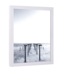
Wood picture frame, Walmart
There is a pleasing simplicity to this wood picture frame, its chunky edge providing a quiet level of detail that won't intrude on a minimalist scheme. Pair with a white wall.
8. Treat landscape views as wall art

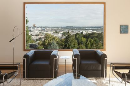
If you’re lucky enough to have views out into nature or your local landscape, make the most of it. Do away with any curtains or blinds (if practical, of course) and add wooden paneling around your window frame to make artwork of the outside world.
“An approach we often take is to use landscape as art, and as a primary organizer of the entire design concept,” says Ben Waechter of Waechter Architecture. “This could be a courtyard or private garden, or a punched window or framed view that brings the distant landscape into dialogue with the architecture and interior space. Our main minimalist living room in the Tower House [pictured] has just such a window.”
9. Display books on architectural shelves

Decorating with books can bring warmth to a minimalist space, allowing you to add texture, color and character without being decorative. Rather than keep your library hidden away, build a fitted bookcase that's sympathetic to the architecture of the room.
In the design above by Feldman Architecture, the wall plane remains one cohesive component by stacking the shelves from floor to ceiling.
10. Make a feature of wall lights

Building bookshelves is one way to decorate your walls in a functional way, and installing wall lighting is another. “Let the wall serve a necessary purpose, like lighting the space,” says Swivel Interiors' Kathleen Glossa. "Consider incorporating minimalist wall fixtures or by installing runs of flush LED lighting strips (like in the minimalist powder room, pictured).
Note that repetition is a helpful tool when it comes to adding lighting to minimalist walls. “Repetition of a wall lamp or pendant somehow creates a more tranquil look in the space,” says MENU’s Joachim Kornbek Hansen.
Be The First To Know
The Livingetc newsletter is your shortcut to the now and the next in home design. Subscribe today to receive a stunning free 200-page book of the best homes from around the world.
Kate Hollowood is a freelance journalist who writes about a range of topics for Marie Claire UK, from current affairs to features on health, careers and relationships. She is a regular contributor to Livingetc, specializing in reporting on American designers and global interiors trends. Based in London, Kate has also written for titles like the i paper, Refinery29, Cosmopolitan and It’s Nice That.
-
 What are the Most Comfortable Pillowcases? From Temperature Regulating to the Best for Your Skin
When you're looking for comfort in your pillowcases, material matters. These are the best you can buy
By Faaizah Shah Published
-
 5 Simple, but Genius Bathroom Layout Tricks That Will Make Your Space Work so Much Harder
Small switches to how you lay out your bathroom that help make the most of a small space
By Luke Arthur Wells Published

