Farrow & Ball Setting Plaster ideas – how to use this muted pink paint color
Take a look at these Farrow & Ball Setting Plaster ideas for inspiring ways to use this popular paint color in your home


If you're looking for Farrow & Ball Setting Plaster ideas, this collection will show you how to use this gentlest of pinks in the right way. A favorite among designers, its lime-washed look matches the appearance of freshly applied and dried plaster; something that isn't altogether easy to mimic.
This dusty pink has an inherent softness and features a beautiful yellow pigment. When it comes to paint ideas, this color is a wonderful backdrop for antique furniture, walls, ceilings, and even joinery. The shade does not overwhelm nor does it disappear in space. Its textural quality envelopes a room in a welcoming embrace.
'If you are after something utterly soft and forgiving, look to the eminently flattering Setting Plaster,' says Patrick O’Donnell, brand ambassador and color consultant for Farrow & Ball. 'Think of this shade as neutral – the gentle brown notes will flatter your complexion and make you positively glow with good health. It will also add warmth to those trickier spaces that feel starved of natural light.'
We spoke to leading designers about different ways this tone can be used in interiors and they did not disappoint with suggestions. Here's how to use Setting Plaster, in, well several settings.
Farrow & Ball Setting Plaster ideas to inspire your scheme
'Setting Plaster is the perfect shade of pink. Not too sweet, just a little blush - it looks good everywhere.'
Jessica Lagrange, interior designer
1. Paint a ceiling in Setting Plaster

Ceiling decorating can seem like a daring move, but a bright ceiling can add a layer of personality to a space that just can’t be achieved by painted walls alone. The usual approach to any space is to add color to the upholstery, furniture, and accessories but by focusing on the fifth wall, you open up the space below to less visual clutter.
Using Setting Plaster on the ceiling will help cocoon rather than encroach the room, and drench the space in soft radiance. Interestingly, pink is a color that can make you look good. 'The color pink hints at retro but also continues to be modern. Lights reflecting off pink walls or furniture make pale skin look brighter and more luscious,' says Jennifer Morris, interior designer and founder of JMorris Design.
Soft colors painted on the ceiling can also work to boost the room's perceived proportions. The hue forces the eyes to look upwards, thereby taking in the entire volume of the space.
'Setting Plaster continues to be a go-to for our projects. Here, it hits the feminine mark so well, but a little dirty – not too sweet. I've used it in so many different rooms with different lights and it's always perfection,' says Anne McDonald, founder of Anne McDonald Design.
2. Bathe the room in this neutral pink

Think pink morning sky, market-fresh rhubarb, and French breakfast radishes – pink has a mood-lifting quality. Gone are the days of pink being regaled to images of candy and princess ponies. The timeless color is packed with style and personality and is an interesting and richly varied hue.
If pink calls out to you, perhaps start by painting an accent wall in this hue and if all goes well, an entire small room can be the perfect canvas for this powerful hue. Setting Plaster, being a more subdued tone can fill in as a neutral in the space, yet give it all the vibrancy it needs.
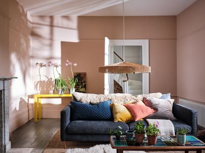
In this room, the color appears paler and more peachy, and pairs well with the neutral sofa and rug.
'For a subtle touch of blush we have a few firm favorites, like Setting Plaster or Peignoir by Farrow & Ball; this pink evokes a feeling of calm and has a versatile neutral base, making it easy to pair with other colors,' say Jen & Mar, principal designers, Interior Fox.
3. Use it to color match actual plaster walls

Setting Plaster is a paint color idea that is actually very close to the color of actual plastered walls. And with the trend for textural wall finishes not looking like they're abating any time soon, it can be used in interesting ways with raw skimmed walls.
'We have effectively used Setting Plaster on joinery and doors in some of our projects, often to match the pink skim finish to the walls,' says Jean Dumas, principal designer at Trellik Design Studio. 'In this project, which shows exposed skimmed wall, the access panel door (on the extreme left) couldn’t be plastered so we used Setting Plaster to match the overall plastered walls.'
4. Take this color outside

Painting exterior walls can require some consideration. That's because, unlike the interiors, the exterior hues can affect the entire street. Usually, it's a good idea to look for undertones in nature or in your exteriors that could inform your palette. It's worth considering paint colors that tie fixed elements together in a harmonious way.
Many paint manufacturers have a collection of historically accurate colors, that can be the perfect springboard for your palette. Or, when looking for paint color inspiration, you could take the braver route. Setting Plaster is a muted tone that serves as a lovely backdrop to dark browns and greens – colors found aplenty outside. The hue draws the natural tones of the earth and can create a smart, picture-perfect look outside.
'It is a versatile shade that can be used both indoors and outdoors. I've used it twice in my residence both in the living room and the exterior of my pool house folly,' says Jessica Lagrange, principal designer and founder of Jessica Lagrange Interiors. 'It looks good everywhere.'
5. Layer the pink paint with prints and organic tones

While pink may be a bold choice when it comes to design, a color like Setting Plaster can work for everyone. Not too powerful, not too stark and neither barely there, this tone can infuse a modern vibe in a room and bring the space to life.
When it comes to colors that go with pink, the soft pink of Setting Ball looks good when layered with prints and other natural tones such as green. The patterns counteract any potential sugariness and together the beautiful layering gives depth to the interior.
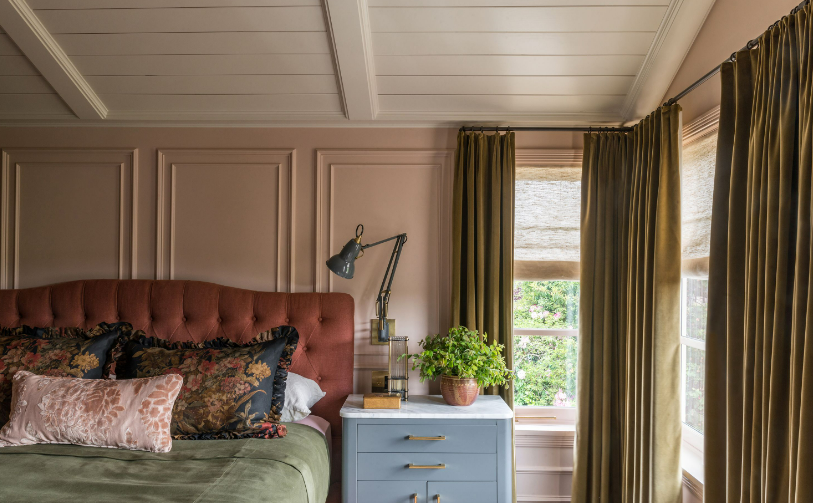
'Setting Plaster is my go-to warm dusty pink. I’ve used it in bedrooms time and time again. It is the definition of a warm hug,' says Lauren L Caron, principal designer, Studio Laloc. 'In this bedroom, while we used Clunch by Farrow & Ball on the ceiling, the wall color is Setting Plaster.'
6. Use Setting Plaster to highlight architectural features

In our minds, there's no doubt that Setting Plaster is one of the best Farrow & Ball paint colors. It is a beautiful backdrop color that works exceptionally well in older, larger houses and rooms. It is also a wonderful hue to highlight specific details in a room without creating too much drama.
In this room, the color is offset against white, and as the dweller looks up to admire this lovely discreet paint, the eyes rest on intricately detailed crown molding. The effect is both luxurious and restrained. A combination like this can be a great conversation starter too.
Is Setting Plaster a warm color?
Farrow & Ball's Setting Plaster is a welcoming, soft, subtle shade of pink. The color works wonderfully well on walls, ceilings, trims, joinery, and even on the exteriors and gives the space warmth and a feeling of a light embrace.
Of course, how Setting Plaster looks in your space will depend on factors such as the facing, and the amount of natural light your room gets. Consider how the other colors you choose for your room, including flooring, large furniture, ceilings and trims will also affect the look.

What colors go best with Setting Plaster?
Setting Plaster being a muted tone pretty much goes with most hues. Pink and blue are a great combination – against a Setting Plaster wall, blue furniture easily stands out. A light shade of green along with the pink paint can create a beautiful, natural combination that reminds you of the outdoors.
The color looks particularly nice against other Farrow & Ball colors such as Pink Ground for color layering and Blue Grey for a nice color blocking effect. With Mahogany it can give a more contemporary look. If you want to add further warmth to your setting, use Setting Plaster along with a dusty background color for a feature wall.
Setting Plaster also looks lovely against brown, where both colors together ground the interior and give it warmth. Orange and pink can seem like a stark combination but a lively one. The pairing is bold and can add dynamic energy to any room of the house, indoors or out.
For the perfect light and shadow combo, consider pairing this paint color with black. While the latter is impactful and dramatic, the lushness and depth of pink can help keep the space restrained.
Be The First To Know
The Livingetc newsletter is your shortcut to the now and the next in home design. Subscribe today to receive a stunning free 200-page book of the best homes from around the world.
Aditi Sharma Maheshwari is an architecture and design journalist with over 10 years of experience. She's worked at some of the leading media houses in India such as Elle Decor, Houzz and Architectural Digest (Condé Nast). Till recently, she was a freelance writer for publications such as Architectural Digest US, House Beautiful, Stir World, Beautiful Homes India among others. In her spare time, she volunteers at animal shelters and other rescue organizations.
-
 How to Thaw a Frozen Pipe — Learn Everything You Need to Know in 5 Minutes With This Guide
Winter storm caught you off guard? We asked an expert — just how do you thaw a frozen pipe?
By Hugh Metcalf Published
-
 The 12 Very Best Silk Bedding Pieces — As Our Style Editor Says: 'It's What Dreams Are Made Of!'
Slumber in lustrous luxury with the very best silk bedding sheets, duvets, pillowcases, and more — your sleep score will thank us later
By Julia Demer Published

