8 dark trim paint color schemes from interior designers that nail the look - 'they're cozy, cocooning and dramatic'
These dark trim paint color schemes demonstrate just how versatile this decorating trick is – it’s perfect for making any room feel cozy and grand
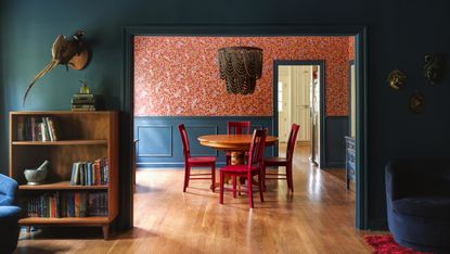

Decorating with a dark trim paint color scheme is a fast and easy way to a room with depth and interest. Using deep hues on your coving and woodwork can make an architectural feature out of something that might otherwise fade into the background – plus, these details offer an extra way to have fun with color. And who doesn’t want to do that?
As well as being a playful way to experiment with tone, this paint idea is a versatile tool for changing the way a space feels – helping to give the impression of height, make a room feel more sophisticated, or add a graphic quality to an otherwise flat scheme.
If you’ve previously kept your interior trim white, let these dark trim paint color schemes inspire you to think outside the box – and have a little fun with going dark.
1. Burgundy and neutrals
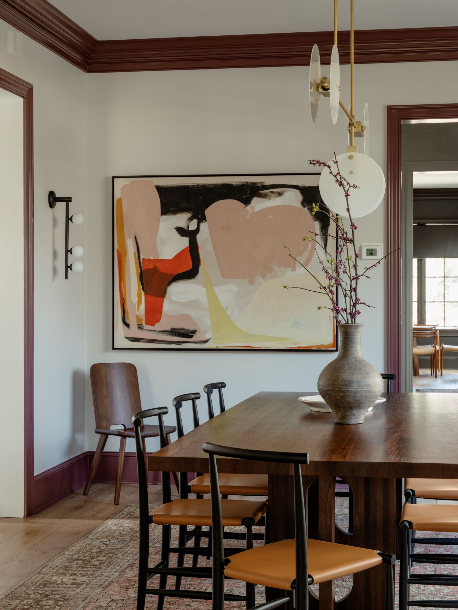
A dark burgundy-brown painted trim complements the deep wood tones of this dining room scheme, drawing them to the fore and bringing the walls to life, rather than letting them sit in the background. It also helps make this otherwise light and bright paint scheme feel more cocooning. ‘Painting the trim a contrasting color was an easy way to make the spaces feel more bespoke, and also added a sense of coziness,’ says Zoe Feldman, the Washington, DC-based interior designer who designed the scheme.

Finish: ADVANCE® Interior Paint
Price: $79.99 / gallon
2. Burgundy and blue
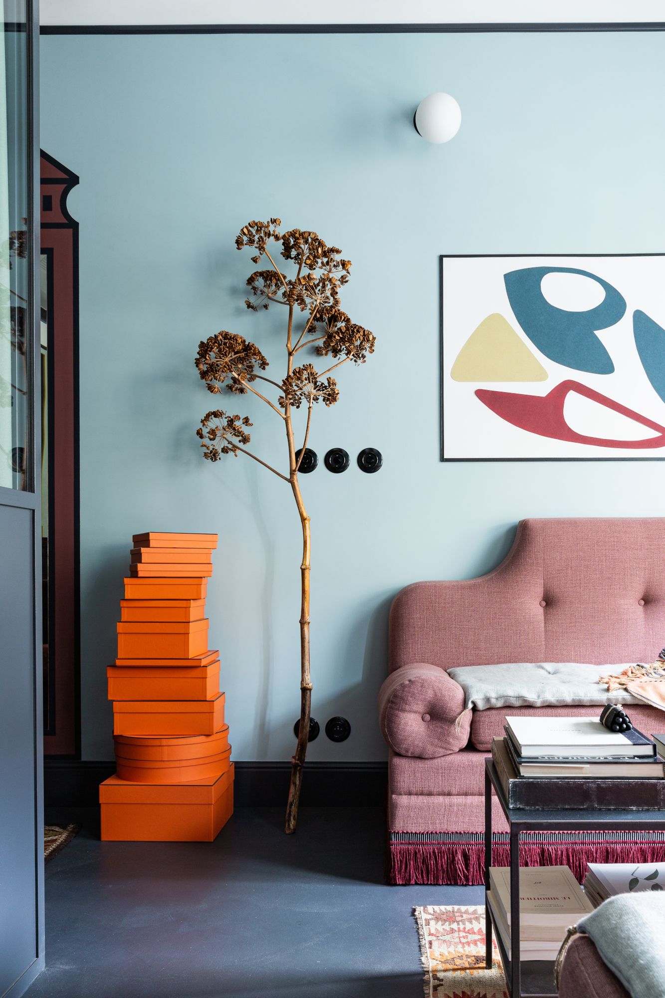
While burgundy and brown work well in a neutral scheme, they take a fun turn when they’re using as part of a more colorful palette. Green sits well as a complementary hue to this look – but blue provides a playful contrast, as this pale blue living room design by Parisian interior designer Marianne Evenou shows. The skirting and door frame are painted in the warm red hue, while a slim black trim up towards the ceiling, and around the door, add a graphic, almost cartoonish quality that offsets the grown-up pieces in the space.
3. Olive green and white
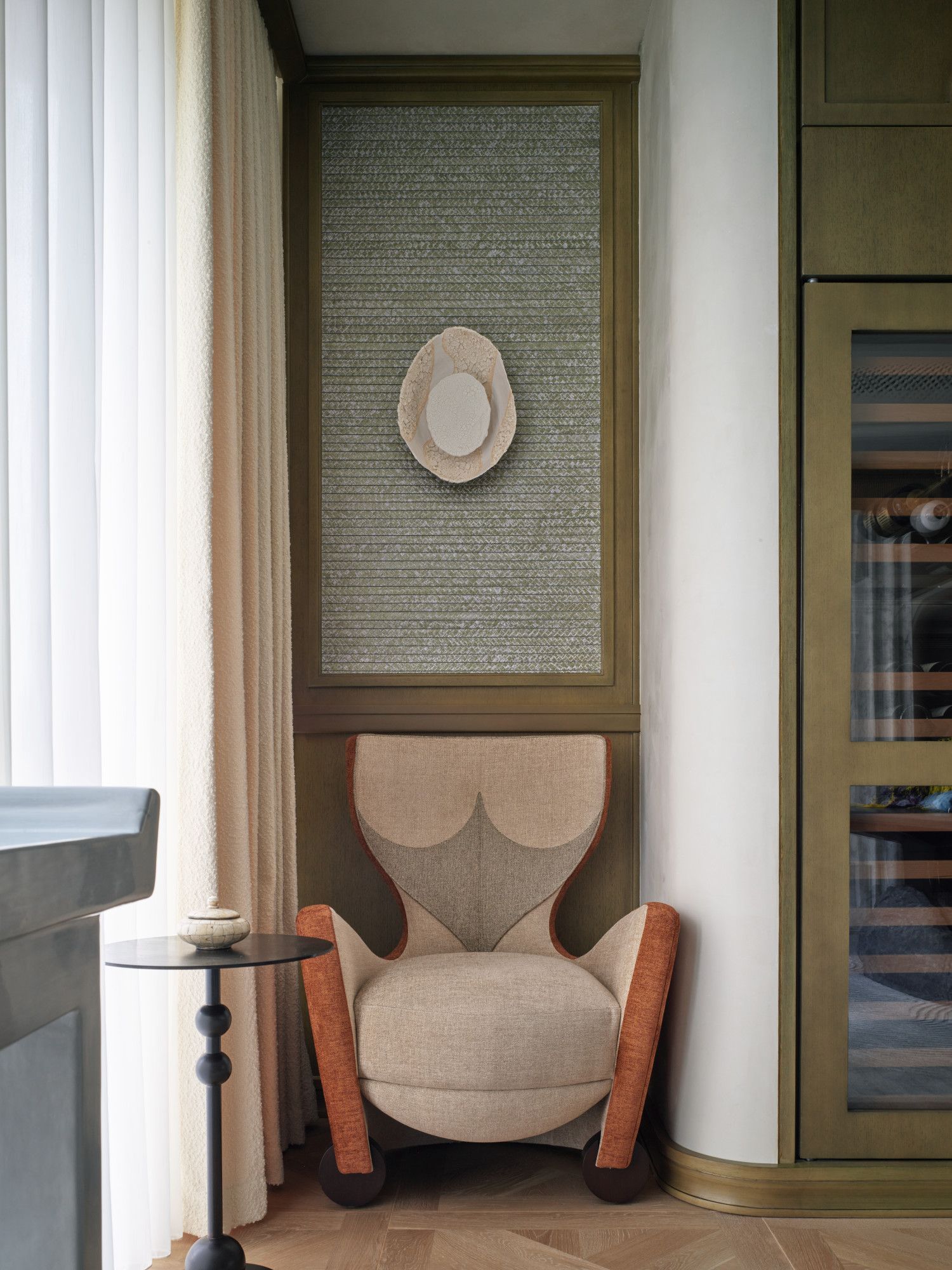
Olive green makes a play for the focal point of this space, thanks to its use on panelling and built-in living room storage as well as along the skirting. Nevertheless, this still manages to feel like a calm, neutral scheme. ‘Regarding our choice of trim color, we joke that it is “Chris Shao Studio Green,”’ says James C Mifflin, designer and project manager at New York and Shanghai-based Chris Shao Studio. ‘It’s one of our signatures that we tend to use among our projects. What’s special about this shade of green is that while, yes, it is a color, it still feels like a timeless neutral in the palette.’

Finish: Modern eggshell
Suitable for: Interior wood, metal and concrete
4. Black and white
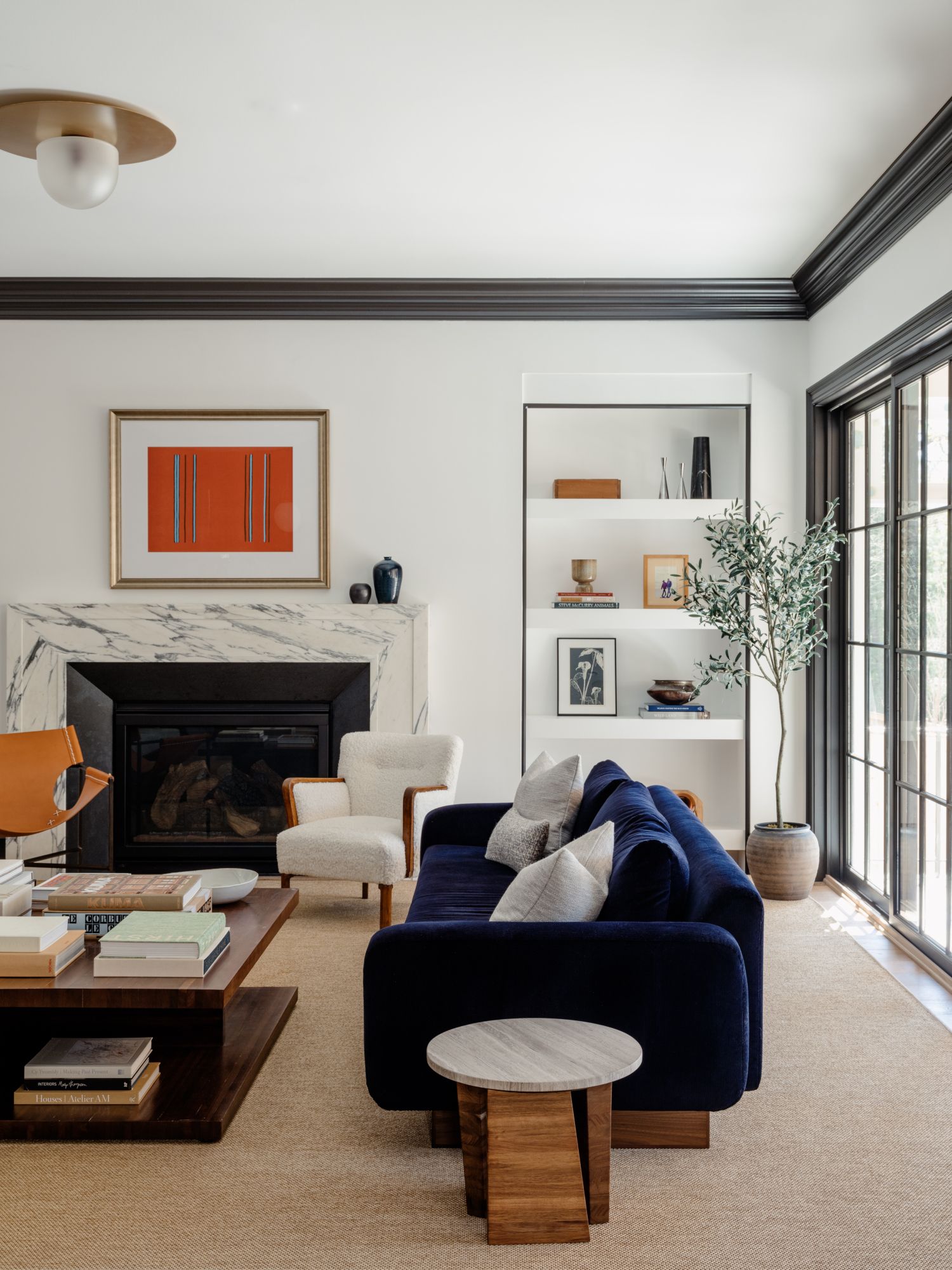
Another scheme by Zoe Feldman illustrates a classic palette for a black and white living room. In an otherwise light and bright scheme, the addition of black coving and door frames, painted in a silky satin-esque finish – as well as a slimmer trim around the in-built shelves – adds a depth that grounds the scheme.
The key to making black trim in a white scheme feel soft and sophisticated, rather than bold and graphic, is to use it to highlight existing architectural features, and tie them in with small accessories dotted throughout the space.
5. Green on green
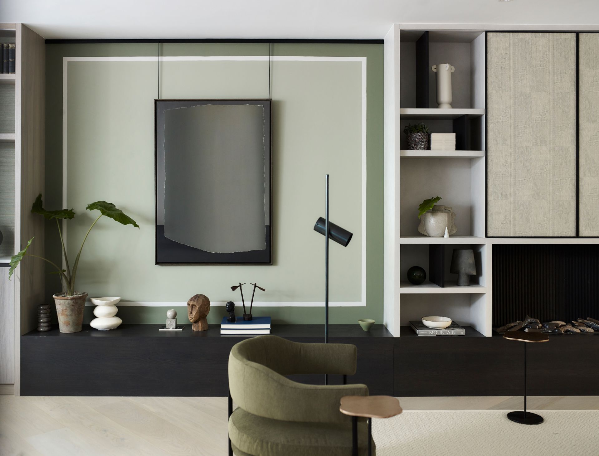
If decorative plaster features are somewhat lacking in your room, but you want a little more punch than just painted woodwork, you can easily add in a trim with paint to help add interest to plain walls. ‘To make this wall a focal point, we decided to paint it, which is an affordable way to make a bold statement,’ says Irene Gunter, founder and creative director of London-based interior design studio Gunter & Co, of this space. ‘We chose Botanist, a classic green with a hint of red from Paint & Paper Library, for the outer trim. To create an elegant contrast, we added a delicate border of Slate II from the same brand, which separates the darker shade of Botanist from the lighter shade of Normandy Grey from Little Greene. The end result? A fabulous picture frame effect that really catches the eye!’
6. Emerald green and white
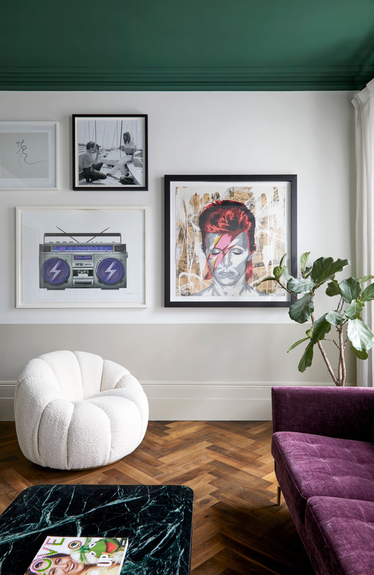
We’ve already argued the case for a painted ceiling that’s anything but white – and this scheme showcases the power of a darker hue up top. Deep green paint envelopes not just the ceiling but the coving around the room for a look that’s comforting and cocooning. A dark herringbone wood floor balances out the deeper hue, while a pale grey taken up the skirting and a third of the wall creates further harmony.
7. Blue on blue

This dining room paint idea makes the case for dark, bold navy as a dramatic addition to formal and cozy spaces alike – but there’s also a careful sense of balance to be found here.
‘We found it important to color match the crown and moulding to the color used in the wallpaper to create a cozy yet sophisticated look,’ says Caroline Finnegan, owner and principal designer at Philadelphia, Pennsylvania interior design firm Hendren House. ‘The ceilings are only 7’-6” in this room, so to make the space feel larger and taller we used a thicker crown moulding to trick the eye and elongate the room. The darker moulding choice created a contrast to the lighter wallpaper that we knew would make for a special space for our clients.’

Finish: Emerald Urethane Trim Enamel
Price: $109.49 / gallon
8. Green and wood tones

What better way to celebrate the drama of a wood-panelled wall than this? Deep, dark green coving in this space by Barcelona-based practice Jeanne Schultz Design Studio highlights the height of this living room and extends the sense of grandeur brought in by the panelling, the parquet floor and the chandelier. We love the way the green fireplace tiles match the trim – it’s a subtle addition that ties the scheme together.
Be The First To Know
The Livingetc newsletter is your shortcut to the now and the next in home design. Subscribe today to receive a stunning free 200-page book of the best homes from around the world.

Ellen is deputy editor of Livingetc magazine. She cut her teeth working for sister publication Real Homes, starting as features editor before becoming deputy editor. There, she enjoyed taking a peek inside beautiful homes and discovered a love for design and architecture that eventually led her here. She has also written for other titles including Homes & Gardens and Gardeningetc. While she gets ready to buy a house of her own, she takes inspiration from the works of some of her favourite architects and tastemakers. She has a particular passion for green design and enjoys shopping small, local and second-hand where she can.
-
 These 12 Best Table Lamps for Your Desk — Perfect Glows for a Creative Home Office
The best table lamps for your desk is have a soft, targeted glow. Elevate your WFH set-up with these stylish picks endorsed by Style Editor Brigid Kennedy
By Brigid Kennedy Published
-
 The Nespresso VertuoPlus is 30% Off for President's Day, and it's Kim Kardashian's Coffee Maker of Choice
This sleek and stylish coffee maker was spotted in Kim's home bar, and you can currently save $60 if you buy yours from Amazon
By Lilith Hudson Published
