'They're divisive!' How an unexpected take on Brutalist interiors has us convinced these spaces can be soft and welcoming
A new approach to this architectural trend introduces surprising colors and textures into the mix – say hello to the softer side of Brutalist interiors
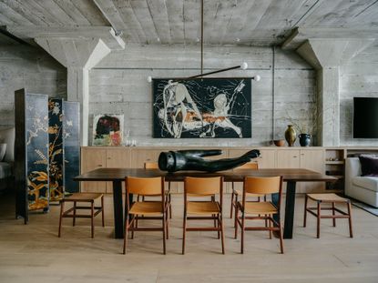

Brutalist interiors are, it's fair to say, not everyone's cup of tea. Brutalism is an exploration of materials and textures in design, but its expressive forms and focus on how buildings are constructed mean that the resulting homes, and their interiors, are divisive.
They're spaces often defined by exposed brick, steel beams and, of course, concrete – all materials that undoubtedly have a beauty to them, but while some people adore the stark minimalist aesthetic of traditional Brutalism, others may feel that the elements of this interior design style are too harsh and too 'brutal' for creating a cozy interior space.
And some others fall somewhere in the middle. The allure of beautiful buildings with Brutalist-style architecture or materials can be great, but there's still this desire to create a home that feels, well, homely.
Tasked with these challenges, interior designers are turning to a softer Brutalist style, introducing unexpected contrasts in colors and materials to create cozy havens from stark, industrial spaces – all the while honoring and emphasizing what makes them special in the first place.
A soft Brutalist color palette
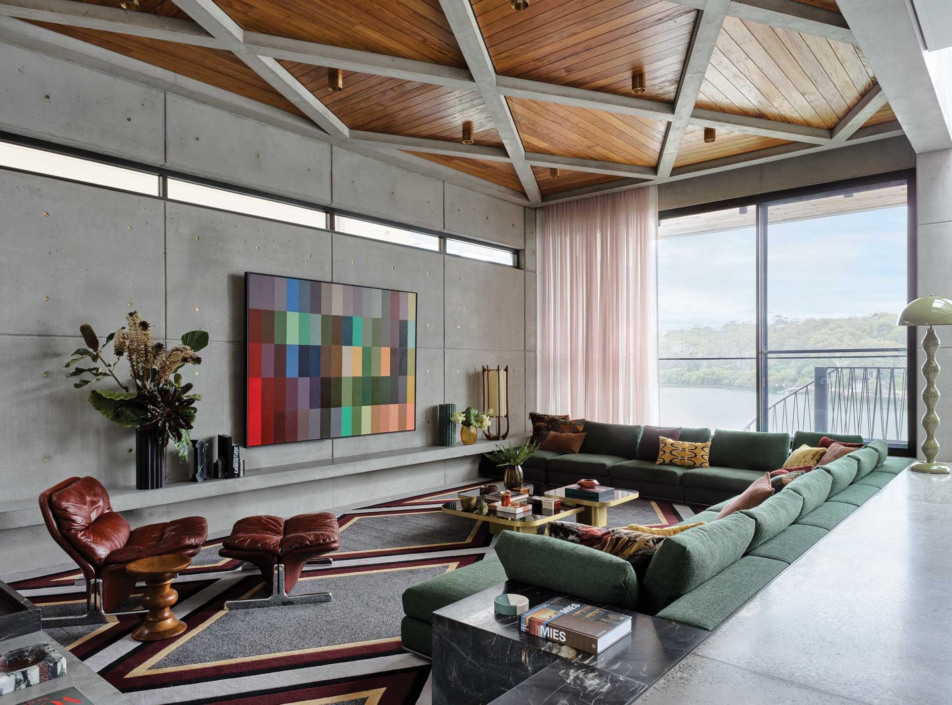
You might think you know what a Brutalist color palette looks like – and it's undoubtedly defined by the overall greyness of concrete. And it's true, traditional Brutalist interiors tend to stick closely to a monochrome palette – pure blacks and whites are common contrasts, while you're sure to see an introduction of wood tones to bring a much-needed warmth. But who's to say that Brutalist spaces shouldn't be colorful?
'There’s the cliché of minimalism in interior design where it’s cold, spare and severe; devoid of art, colour, buoyancy and texture – the elements you actually want to live with,' interior designer Greg Natale tells us, 'but minimalist architecture can be an amazing canvas for expression.'
It's an idea that Greg bought to the design of this property in Kyle Bay, a suburb of Sydney. 'The home’s architectural language is quite hard-edged and brutalist, with clean lines and copious use of exposed concrete,' Greg explains.
Inspired by Brazilian modernist architects, Greg sought to introduce layers to the home to 'take a minimalist canvas and thinking about how to layer it with new textures so it would be liveable and in sync with the client’s individual style.'
'I had been friends with Michelle, the client, for many decades, so it was a very personal project for me and a true collaboration,' Greg says. 'Michelle requested clashing colours throughout the home, leading to an unexpected yet vibrant blend that includes green, burgundy, teal and citrus tones, with her favourite pastel pink on walls and curtains to balance the harder finishes.'
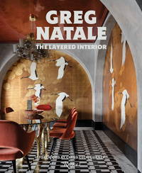
The Layered Interior by Greg Natale, Amazon
See more of Greg Natale's work in his new coffee table book The Layered Interior, a beautiful exploration of his modern maximalist schemes.

For architect Bram Van Cauter of Belgium-based Studio Okami, this color contrast played out in radical pastel interventions within a Brutalist riverside apartment in Antwerp. 'The character of the building is so strong, due to its Brutalist style, and the spaces so well designed, almost everybody who visits the building falls in love with it,' Bram tells us, 'and by stripping the apartment to its bare form, you present the basic structure as the definition of the space.'
Studio Okami's take on this colorful Brutalism is much more minimalist, but it plays much more on the sense of contrast by decorating with pastels unapologetically. 'The aim was to balance out the rough concrete by adding colorful elements to the space, the peach floor, blue staircase, even the artworks, furniture and plants all add to create a homely atmosphere,' Bram explains. 'The idea is that the rough concrete is the fixed pallet and all other elements can change in the future allowing the apartment to evolve.'
Rough meets refined

So how do you bring softness to a space that's so defined by its Brutalist features? 'By not ignoring it,' says California-based interior designer Lane McNab, 'but rather embracing it and letting the opposites play off each other. I love the juxtaposition of the rough with the refined to give a design depth.'
For Lane, an industrial loft apartment in the historic Jack London neighborhood of Oakland was such a challenge - a space that had a 'very rustic industrial aesthetic, more appropriate for a college dorm or bachelor pad,' Lane explains. 'Rather than approach it from a typical industrial loft vibe that was so predominant in the early 2000s, I wanted to juxtapose it with really elegant high-end finishes to elevate it and add the femininity and softness that would really highlight the rough impact of the utilitarian architecture.'
'We proposed high-end, luxurious finishes with custom millwork to play against the rustic architectural envelope,' Lane continues. 'A layering of authentic materials such as solid wood and solid bronze hardware and velvet and linen upholstery gives elegance and authenticity to this historic space.'
In this contrast, there's the risk of these two styles not gelling somewhere along the way, but the devil is in the detail when it comes to tying luxury and industrial interior design together. 'Allowing a little natural patina and warmth to the metals ensures everything felt cohesive,' says Lane.
An unexpected style

There's often a sense when looking at Brutalist homes that the furniture is secondary – somehow deferring to the often scene-stealing concrete forms of the building. However, a good interior design scheme in a Brutalist home can enhance, without necessarily having to prescribe to a minimalist style.
'I think this contrast is evident in a lot of the great Brazilian modernist homes,' interior designer Greg Natale says. 'An eclectic collection of furniture, art and objects, patterned encaustic tiles and an openness to the fecund tropical landscape all work to enliven, soften or juxtapose with the building’s clean, rectilinear sweeps of concrete and glass.'
In Kyle Bay, this meant embracing playfully retro design elements. 'Since we were already referencing modernist architecture, and because I had known my client’s joie de vivre firsthand, it made sense to introduce some elements that playfully call back to the swinging heyday of the 1960s and 70s jet set,' Greg explains. 'Materials such as rosewood and the smattering of retro pieces are in keeping with a mid-century vibe, but these moments of playful nostalgia still feel fresh, not overly referential.'
In the main living room, the diamond timber trusses are echoed by the pattern of the custom carpet – 'they're a perfect encapsulation of the home’s structural and decorative elements speaking to one another, creating a synergy between the hard and soft, minimal and patterned, smooth and tactile dimensions,' Greg says.
Be The First To Know
The Livingetc newsletter is your shortcut to the now and the next in home design. Subscribe today to receive a stunning free 200-page book of the best homes from around the world.

Hugh is the Editor of Livingetc.com. From working on a number of home, design and property publications and websites, including Grand Designs, ICON and specialist kitchen and bathroom magazines, Hugh has developed a passion for modern architecture, impactful interiors and green homes. Whether moonlighting as an interior decorator for private clients or renovating the Victorian terrace in Essex where he lives (DIYing as much of the work as possible), you’ll find that Hugh has an overarching fondness for luxurious minimalism, abstract shapes and all things beige. He’s just finished a kitchen and garden renovation, and has eyes set on a bathroom makeover for 2024.
-
 The 12 Best Table Lamps for Reading —I'm a Certified Bookworm (and Shopping Expert)
When it comes to table lamps for reading, I don't mess around. If you're the same, this edit is for YOU (and your books, or course — and good recommendations?)
By Brigid Kennedy Published
-
 "It's Scandi Meets Californian-Cool" — The New Anthro Collab With Katie Hodges Hits Just the Right Style Note
The LA-based interior designer merges coastal cool with Scandinavian simplicity for a delightfully lived-in collection of elevated home furnishings
By Julia Demer Published
