5 Foolproof Kitchen Color Combinations Designers Love for 2024 - You Simply Can't Go Wrong
These foolproof kitchen palettes range from bright and bold to soft and subtle, but having been devised by top interior designers and architects you can't go wrong with them

When choosing a foolproof color combination for a kitchen, it's best to go with your gut rather than simply playing it safe. It might be tempting to settle for a tried-and-tested neutral scheme or emulate a current trend, but in truth, the safest option is to choose shades that you know you'll never tire of looking at.
Moodboarding can be really helpful at this point in the design process: arrange samples and revisit them regularly, or stick pictures and paint swatches on a wall where you're sure to walk by them every day. This will help you get a feel for whether your color choices are something you want to live with longterm, and how your paint selections look as the light changes throughout the day.
But where to begin? Consider the colors you're drawn to first and foremost. You might struggle to find visual references that showcase them in a modern kitchen setting, but trust your instincts: just because it hasn't been done to death, it doesn't mean it won't work. When it comes to picking your palette, Rus Mehta, founding partner at New York practice GRT Architects, is a strong advocate for thinking outside the box. 'You need to shed any notions that a color or material has a fixed reading or meaning; I think that takes an open mind,' he says.
To kickstart the inspiration process, we've gathered together a few expertly chosen kitchen color combinations, ranging from the unexpectedly harmonious to the unequivocally classic.
1. SALMON PINK AND STONY BEIGE

Whether clay, salmon or terracotta, an earthy shade of pink creates an atmosphere that's overtly warm and welcoming, which is exactly the kind of mood a kitchen should have. Here, this pink kitchen has been paired with a grounding greige on the walls, alongside accents of blue and deep red for a distinctly Scandinavian take on color that draws inspiration from historical painted kitchens.
'When selecting the colors for the A. Colori kitchens, our aim was to create a palette that spans the entire spectrum while also allowing for limitless combinations,' says Christian Duivenvoorden, co-founder Artilleriet, the Swedish brand behind this beautifully crafted space.

Price: $19.99

Price: $150
2. DEEP BLUE AND BRIGHT WHITE

'We are big fans of using color strategically,' says Keren Richter, co-founder and principal designer at White Arrow, who updated a this Brooklyn rowhouse kitchen using Ikea base cabinets with custom Shaker door painted in dramatic Hague Blue by Farrow and Ball.
'The rich, saturated and bold color elevates the cost-effective cabinetry and the space as a whole,' she continues, referencing the inky shade that contrasts so effectively with the fresh white walls and contributes to the kitchen's crisp, classic scheme. 'The contrasting palette continues throughout the home with dark accents and Shibori textiles, which have been paired with bleached wood and reflective surfaces, such as copper and white lacquer.'
3. WARM WOOD AND RICH RED

Situated in an iconic early 1900s East Village building known as Onyx Court, this New York apartment was sympathetically renovated by GRT Architects, who aimed to preserve some of its turn-of-the century identity.
In the semi-open, white-oak wood kitchen, a central island is clad in burgundy mosaic: a nod to the exuberant original tilework that embellishes the building’s public spaces. 'We take an empirical approach to color,' says Rus Mehta, founding partner at GRT Architects. 'If it looks good; if it feels like an interesting combination; if the sum is more than the parts; it works.'
4. STRONG GREEN AND SUNNY YELLOW

Designed by Tobias Vernon, this vibrant Plain English kitchen is situated in Bath's 8 Holland Street: an elegant Georgian townhouse that doubles as a hotel and exhibition space. 'The design brief was ‘simple yet striking’,' says Plain English creative director Katie Fontana. 'We achieved this with a row of perfectly proportioned cupboards painted in our Pretty Pickle shade.'
'Time-honored antique brass knobs complement the worktable, which is hand painted in dusky Nicotine and topped with an oiled-oak worktop,' Katie says. The result is a zesty, energizing scheme that effortlessly bridges the gap between modern and traditional.
5. SOFT PEACH AND GRAPHIC BLACK

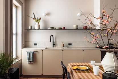
This apartment, situated on the top floor of a Brooklyn townhouse, was renovated for a young family by architecture and interiors practice Shapeless Studio. The designers chose a soft, subtle palette with walls in Benjamin Moore's Featherstone and cabinets in Brandy Cream by the same brand. The terrazzo-style countertops are made from Durat: a hardwearing material created from recycled plastic bottles.
'We love this color combination, because the tones are extremely warm and cozy, almost nude, without looking like a true color,' says the studio's principal Andrea Fisk. 'It still feels neutral in a nice way, so you can mix objects of different shades in the space without worrying too much about coordinating.'
Be The First To Know
The Livingetc newsletter is your shortcut to the now and the next in home design. Subscribe today to receive a stunning free 200-page book of the best homes from around the world.
Tessa Pearson is an interiors and architecture journalist, formerly Homes Director at ELLE Decoration and Editor of ELLE Decoration Country. When she's not covering design and decorative trends for Livingetc, Tessa contributes to publications such as The Observer and Table Magazine, and has recently written a book on forest architecture. Based in Sussex, Tessa has a keen interest in rural and coastal life, and spends as much time as possible by the sea.
-
 10 Rules For Decorating Small Spaces - How Designers Create A Cozy Room That Also Boosts The Square Footage
Experts reveal their tips and tricks on how to combine a welcoming vibe with space-stretching interior design techniques...
By Ruth Doherty Published
-
 'Subtle Gray' Is The New Color Trend Designers Are Using to Replace White — It's So Much Warmer and More Luxe
It’s the new shade grabbing designers’ attention and you should know about it. But what is ‘subtle gray’, and how can you use it?
By Raluca Racasan Published

