Inside a Williamsburg apartment where Art Deco meets mid-century style
Cool shapes and artistic influences create a stylish backdrop inside this Williamsburg apartment

THE PROPERTY
The top floor of a former schoolhouse in Williamsburg, New York. The living room, main suite and dressing room are on one side of this modern home, while the kitchen, dining area, pantry/utility room and family bathroom are on the other side.
See Also: Explore A Woodland Holiday Home In New York's Catskills
LIVING ROOM
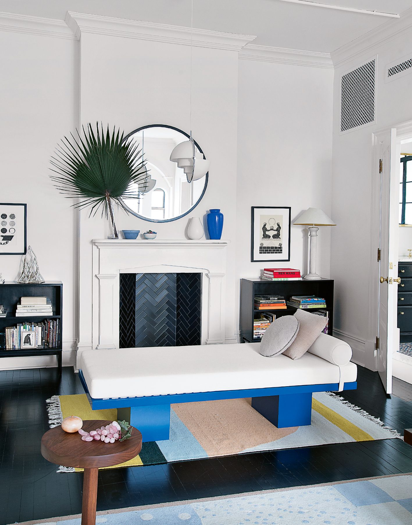
The design of this apartment was approached like an exercise in geometry. Shapes are perfectly balanced, so that the angles of an Yves Klein coffee table are softened by the fronded curves of a palm tree and the hard white lines of a Tobia Scarpa sofa contrast with curvaceous powder-pink chairs.
In fact, balance is the byword for this reworked Williamsburg apartment. It’s shown in the way Art Deco meets Moorish decoration in the bathrooms, mid-century design works with modern lighting in the dining room and Brooklyn tin tiles meet space-age gold wallpaper in the baby's bedroom. But, most of all, it’s displayed in the way the contemporary furniture sits comfortably inside such a historic frame.
The rug, pictured above, dances with patterns that remind us of Henri Matisse’s Jazz motifs, while a potted tree adds a dose of Seventies Palm Springs.The fireplace, below, is inset with black tiles in a herringbone pattern, giving the space a traditional focal point with a twist.

This apartment is on the top floor of what was once a schoolhouse, built in the 19th century, later taken over by a business college and, in the Eighties, used as light and lofty artists’ studios. Instead of the apartment’s legacy dictate its style, the property was entirely redesigned in a way that pays homage to its roots, but also works as a backdrop for a more personal look. It acts as a great historic envelope that personal pieces can slot into.
Skirting boards and cornicing were replicated and after some deliberation, a fire surround was added in the living room as a low-key focal point that helps counterbalance the more playful furniture shapes.

The collection of furniture definitely dips into the Seventies, but also goes further back in time, with mid-century chairs by Børge Mogensen and the Josef Frank rug, which, unbelievably, was designed in 1938 despite looking modern.
The limited edition Klein coffee table, found through eBay, is a coveted centrepiece, with grains of the artist’s signature pigment spread out beneath Plexiglas.
DINING AREA
Three boxy windows were redrawn as a trio of arches, echoed by an architectural archway between the kitchen and dining area. A chandelier by an LA designer emphasises the proportions of this simple, elegant space.

See Also: The 15 best modern kitchen ideas - stylish, smart and chic
KITCHEN
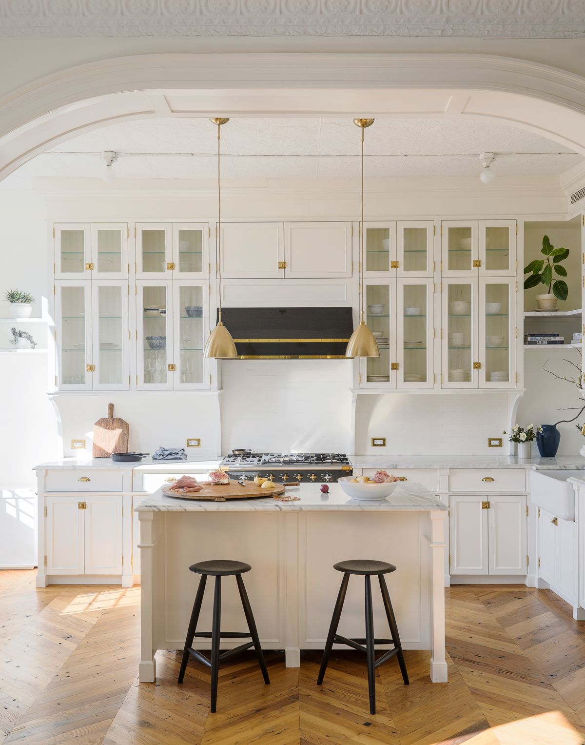
A sequence of architectural arches, which echo the decoration on the exterior of the building, were created by architect Kevin Greenberg, most notably between the kitchen and the dining room.

The inspiration for the kitchen came from old French bakery cabinets, but the execution is pure Brooklyn.The symmetry is simple, but so striking.

BABY'S BEDROOM
This nursery bedroom has the most glamorous bedroom wallpaper going. The wallpaper was already in place before it became a baby's room, but it’s pretty cool for a nursery too.

The wallpaper uses satellite imagery from Nasa.

MASTER BEDROOM
A deep blue wraps around this bedroom, while the glossy verticals of a four-poster bed draw the eye upwards.

DRESSING ROOM
Salvaged doors divide the main bedroom from this slim storage room, with bespoke cabinets. The design makes the best use of the high ceilings here.

See more dressing room ideas...
BATHROOM
A bedroom was sacrificed to create this luxe, spacious modern bathroom, with the wet room separated from it by a glazed steel divide. Metal-framed glazing in the bathroom feels rooted in New York design traditions, but other details, such as tiles from Morocco and Portugal, were inspired by the owner’s travels. Majolica tiles always have the power to put you in a holiday mood.

The glass has a slightly wavy finish, emulating the look of period glass. Moroccan floor tiles continue the thread of blue that pervades the apartment.

See more of the designer's work at thewhitearrow.com
Photography ⁄ Matthew Williams
Be The First To Know
The Livingetc newsletter is your shortcut to the now and the next in home design. Subscribe today to receive a stunning free 200-page book of the best homes from around the world.
The homes media brand for early adopters, Livingetc shines a spotlight on the now and the next in design, obsessively covering interior trends, color advice, stylish homeware and modern homes. Celebrating the intersection between fashion and interiors. it's the brand that makes and breaks trends and it draws on its network on leading international luminaries to bring you the very best insight and ideas.
-
 What are the Most Comfortable Pillowcases? From Temperature Regulating to the Best for Your Skin
When you're looking for comfort in your pillowcases, material matters. These are the best you can buy
By Faaizah Shah Published
-
 5 Simple, but Genius Bathroom Layout Tricks That Will Make Your Space Work so Much Harder
Small switches to how you lay out your bathroom that help make the most of a small space
By Luke Arthur Wells Published

