Tour an elegant Victorian semi in London with a statement kitchen
This Victorian semi in London strikes the perfect balance with its light and airy kitchen, bold study, a playful cloakroom and an utterly calming bedroom.

THE PROPERTY
A semi-detached Victorian house in southwest London. The modern home has a basement, with a media den/playroom, a guest bedroom with an en-suite bathroom, a utility room, kitchen and wine room. On the ground floor, there’s a living room, kitchen-diner, coat room and WC. The first floor has the master bedroom with an en-suite bathroom, plus a study and another bathroom. A loft conversion houses three more bedrooms, plus a family bathroom.
See Also: This Victorian semi in west London oozes a distinct Parisian flair
LIVING ROOM
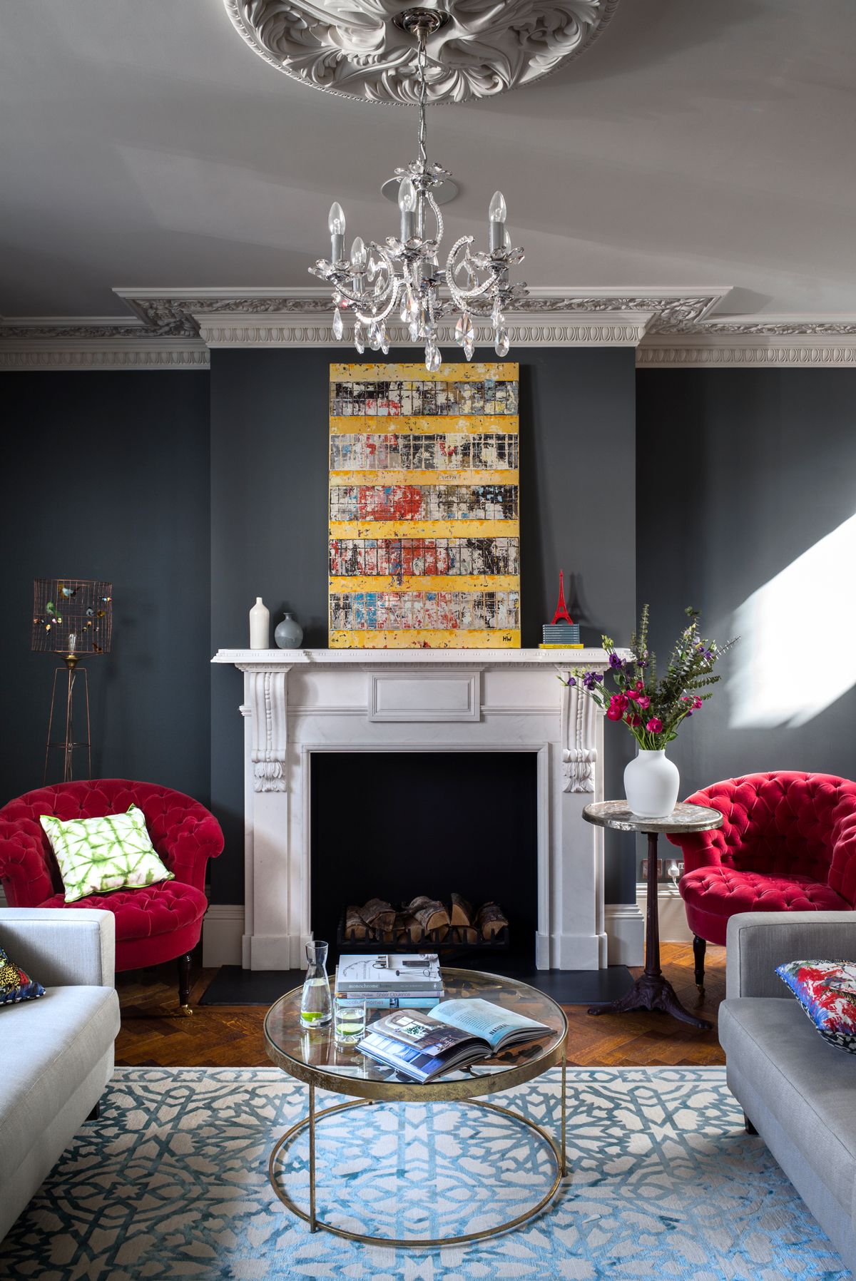
The fireplace and ornate plasterwork is offset with Down Pipe grey walls (pictured above). What makes it pop? Cherry-red chairs and a graphic turquoise rug.
STUDY
Bespoke floor-to-ceiling black cabinetry – the top shelf reached by a library ladder – creates smart storage for books and precious objets.

DINING AREA
Everything about the kitchen extension, from the full-width glazing to the additional windows in the pitched roof, is designed to bring in as much light as possible.
Sitting at the dining table beneath the Ingo Maurer paper chandelier is like having tea in a storybook; you half expect Alice and the Mad Hatter to sit down next to you.

A chunky chandelier would have been too heavy above the table. The Ingo Maurer paper light gives the size without the weight.

See Also: Statement dining room lighting ideas to chew over
KITCHEN
The kitchen was given its own transformation with an extension into the side return and pitched-roof add-on at the rear bringing both height and light. The shape of the glazed rear wall – like a child’s drawing of a house – gives this impressive room an appealing intimacy.
Working with Smallbone’s planners, the owners created a design that’s deceptive in its simplicity; every decision the result of careful thought, from the position of the extractor fan to the look of the island unit.

There are lots of details that make this kitchen special, from the beaten silver cabinet handles to the mirror-back glazed units. A special shade of slate blue from Paint & Paper Library was chosen because it adds a softness that black or grey units couldn’t achieve.
Tom Dixon lights over the island are a stylish alternative to a cooker hood. A zinc breakfast bar was created as somewhere to eat and as a way to extend the scale of the unit to fit the size of the room.

HALLWAY
A series of cartoons by Terence ‘Larry’ Parkes – framed in neon – greets visitors in the hallway. The Victorian-style floor tiles were laid after the staircase was moved from the centre of the hall to the side.

The Victorian layout has been revamped, replaced with a more contemporary configuration. The central staircase was removed and repositioned against the side wall. It means that instead of a narrow corridor leading down to the kitchen, there's now a wide hall that makes an impactful entrance.
CLOAKROOM
The newspaper wallpaper adds fun to the cloakroom.

MASTER BEDROOM
Soft grey walls and low-slung lighting in the calming master bedroom invite you to curl up with a book.

BATHROOM
Look for a shirt and you could find yourself in this ‘snazzy but hidden’ en-suite master bathroom which is concealedbehind a row of fitted wardrobes in the master bedroom. This room is all about the materials – the Arabescato marble contrasting with the dark walls, parquet flooring and nickel fittings.

For more Smallbone kitchens, check out smallbone.co.uk
Photography ⁄ Paul Raeside
See Also: Master bathroom ideas - 19 stunning design ideas for a dreamy master bathroom
Be The First To Know
The Livingetc newsletter is your shortcut to the now and the next in home design. Subscribe today to receive a stunning free 200-page book of the best homes from around the world.
The homes media brand for early adopters, Livingetc shines a spotlight on the now and the next in design, obsessively covering interior trends, color advice, stylish homeware and modern homes. Celebrating the intersection between fashion and interiors. it's the brand that makes and breaks trends and it draws on its network on leading international luminaries to bring you the very best insight and ideas.
-
 The 12 Best Table Lamps for Reading —I'm a Certified Bookworm (and Shopping Expert)
When it comes to table lamps for reading, I don't mess around. If you're the same, this edit is for YOU (and your books, or course — and good recommendations?)
By Brigid Kennedy Published
-
 "It's Scandi Meets Californian-Cool" — The New Anthro Collab With Katie Hodges Hits Just the Right Style Note
The LA-based interior designer merges coastal cool with Scandinavian simplicity for a delightfully lived-in collection of elevated home furnishings
By Julia Demer Published

