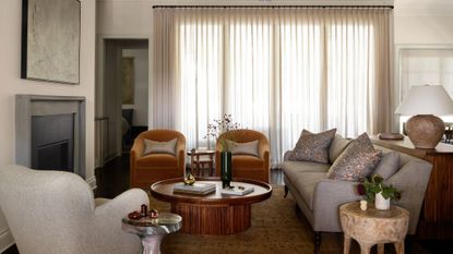
This once-stark new build is now filled with warm, cozy neutrals – bar its brilliantly bold powder room
The designer of this modern home shows us how to create the perfect balance mixing warm whites with carefully chosen pops of dark color


It’s one of the biggest interior trends at the moment to create homes that have depth and richness to them, moving away from the very bright spaces that we’ve been used to seeing with the rise of minimalism. It’s a move towards the more cozy, more inviting, and more intimate. However, there is a balance to be had between an interior that looks moody in an elegant way and one that crosses the line into ‘a bit too dark’ territory.
Getting the balance just right is not an easy feat but this interior design studio has managed to use the best of both worlds. Mixing warm whites that keep the feeling of lightness but in a calming, not harsh, way, with deep colors such as greens and blues, natural materials such as wood and stone, and warm metals like brass is the recipe for achieving the moody yet light look that is sought after in modern homes at the moment.
A recently decorated home for a family moving from New York to Austin is a beautiful case study in design that is simultaneously luxurious and down to earth, moody but light, inviting yet intimate. It’s a pretty impressive list of what seem like contradicting concepts, but here’s how it was achieved to perfection.
A typically modern home gets a traditional makeover

A contemporary property located in Austin’s older neighborhoods, Tarrytown, became the new home for a family moving from busy New York City. Going through a considerable change in scenery, the owners were looking for an interior that reflected their personality and also was a nod to the quaint neighborhood made up of classic homes with traditional architecture and design. Austin design firm Ashby Collective was brought on board and the renovation began.
‘The home initially was all bright white,' explains Cori Pfaff, designer for Ashby Collective, who brought the new scheme to life. 'A typical new design spec home, it had very little character. It did have some great architectural elements and finishes, but it just needed a bit of a wow factor.’
All the matching chrome hardware was replaced with a softer finish, all light fixtures were changed, and every inch of the house was painted in much warmer, softer tones to take away that hard edge of the crisp builder’s white paint. As for the furniture, natural colors, and materials were brought in to further complete the elegant look - a take on transitional style decor. ‘We played with a lot of textures and reupholstered retail pieces with luxe fabrics to make them feel more custom and one-of-a-kind,’ adds Cori.
From stark to warm

When aiming to create a cozy, moody feel to a home, it’s tempting to think the way forward is using dark color schemes. But that doesn’t always have to be the case. The secret, and in this home it is showcased beautifully, is in the balance of light vs dark, of neutral vs color. ‘I tend to lean toward the warmer, more moodier tones, but it's all about balance,’ explains the designer.

‘I wanted to add personality and character,' Cori says. 'It already had great bones and trim details so we painted everything a warmer white to be more inviting which instantly gave the house more life. Then I added pops of color for some drama in specific areas like the kitchen island, the kids’ playroom, and the main bedroom.’ The design team also gave the powder room a real punch of character with a calming blue plaster treatment.
Paint was not the only ones considered to bring a change to the space. The hardware in the property was all switched from chrome to warm brass tones, to create a more comfortable feel.
How to create a moody, cozy look while keeping it light

I wanted to know, in practical terms, how this moody, cozy, intimate feel was achieved, without losing any of the light, and without going full-out with dark color scheme.
‘The client and I chose big swathes of color in warm rusts and different tones of sage greens with smaller doses of muted, less defined patterns. In the main bedroom, I painted all the walls, trim, and ceiling a smokey green color for added drama without feeling too dark. They have a young family so we needed it to be practical, but not without style.’
While most walls and trims were warm white, mindfully chosen areas of the home, furniture, and layered fabrics brought in moodier color tones giving the home charm and character. The kitchen structure had to remain intact, and so changing the kitchen cabinet color was an easy update, that had a huge impact.

‘Even just changing the stark white walls and cabinets to a warmer neutral color, made a huge difference and really changed the soul of the kitchen and the entire house. Breaking up the island with a fun pop of color makes the kitchen more inviting. It is a huge space so keeping it all white felt boring,’ Cori tells me.
If you’re looking to recreate that moody feel to your home without losing the lightness, take inspiration from Ashby Collective and work with white, but make it warm. Look at your hardware and swap chrome for brass. Last but not least, bring in those darker tones in a few areas of your home, and for chosen furniture and fabrics for an interior that is perfectly balanced.
Recreate the look of this beautiful Austin home by using these paints

Price: $98.99/ 1 gallon of Aura Interior Paint
This warm white has a subtle pink-gray undertone, making it a perfect base to layer on darker color accents for a moodier interior.

Price: $98.99/ 1 gallon of Aura Interior Paint
This deep green is suggestive of a dark forest, and it's easy to live in when used as an accent due to its resemblance to colors found in nature.

Price: $27/ 1kg
This calm marine blue comes in a smooth plaster finish, and will give depth and interest to a room's color scheme.
Be The First To Know
The Livingetc newsletter is your shortcut to the now and the next in home design. Subscribe today to receive a stunning free 200-page book of the best homes from around the world.

Raluca is Digital News Writer for Livingetc.com and passionate about all things interior and living beautifully. Coming from a background writing and styling shoots for fashion magazines such as Marie Claire Raluca’s love for design started at a very young age when her family’s favourite weekend activity was moving the furniture around the house ‘for fun’. Always happiest in creative environments in her spare time she loves designing mindful spaces and doing colour consultations. She finds the best inspiration in art, nature, and the way we live, and thinks that a home should serve our mental and emotional wellbeing as well as our lifestyle.
-
 The 12 Best Table Lamps for Reading —I'm a Certified Bookworm (and Shopping Expert)
When it comes to table lamps for reading, I don't mess around. If you're the same, this edit is for YOU (and your books, or course — and good recommendations?)
By Brigid Kennedy Published
-
 "It's Scandi Meets Californian-Cool" — The New Anthro Collab With Katie Hodges Hits Just the Right Style Note
The LA-based interior designer merges coastal cool with Scandinavian simplicity for a delightfully lived-in collection of elevated home furnishings
By Julia Demer Published

