This Seattle home's alternative to Shaker cabinets might be my new favorite way to add soul to a simple kitchen
I love interior designer Lisa Staton's idea for adding charm to kitchen cabinets, perfectly executed in this dreamy light pink space
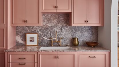

Designed by Lisa Staton, this 1930s Tudor in the heart of Seattle was in need of a new lease of life. For a busy family of five, the decision was either to trade in their small home for a bigger house in the suburbs, or refurb. Choosing the latter, they came to Lisa with a brief to restore and respect the bones of the house while infusing it with unexpected and stylish layers.
This mission was accomplished throughout the home, but nowhere better than in the home's new pink kitchen. The perfect balance of timeless and contemporary design, the kitchen represents the family's playfulness, brings a much-needed pop of color, creates a cozy and inviting vibe, all the while being grounded in traditional design.
For this modern home, Lisa wanted to shake things up by opting for something a little different than a traditional Shaker-style door. 'The Shaker is very pleasing classic look, but can be a bit boring,' says Lisa. 'Thus custom applied molding and detailing help dress it up.' An impressive contemporary facelift, we speak to the designer to find out more about how she pulled the scheme together.

Oonagh is a homes and interior design editor and writer. She spoke to interior designer Lisa Staton about this property remodel to find out the secrets of the design.
The kitchen

Lisa kept the kitchen open and airy with open shelves and wall lights flanking the oven. A textured tile backsplash works 'to throw around and bounce natural light around the room' on one side, while kitchen cabinets line the sink side. In the middle stands a simple marble-topped work table. 'I'm noticing people using furniture in place of islands,' says the Bellingham-based designer.
While a Shaker style - known for its cabinet panel style - is a popular choice for kitchens in this vein, the designer took a more bespoke approach to this project. 'Our client has a background in fashion and we wanted to have tailored and custom dressy details in finishes,' explains Lisa. 'The special cabinet applied moldings are akin to a couture garment and specially made just for this house.'
As well as this unusual molding design, it's the pop of pink that makes a real impact, introducing the color as neutral and keeping the space calm, yet full of character - something that extends throughout the house. 'Our client wanted this house to have color and also a sense of warmth and richness which the chosen color helps achieve. Additionally, the kitchen does not have any windows. And so the pink kitchen casts a pleasing warm glow around the room, especially on grey Seattle days.'
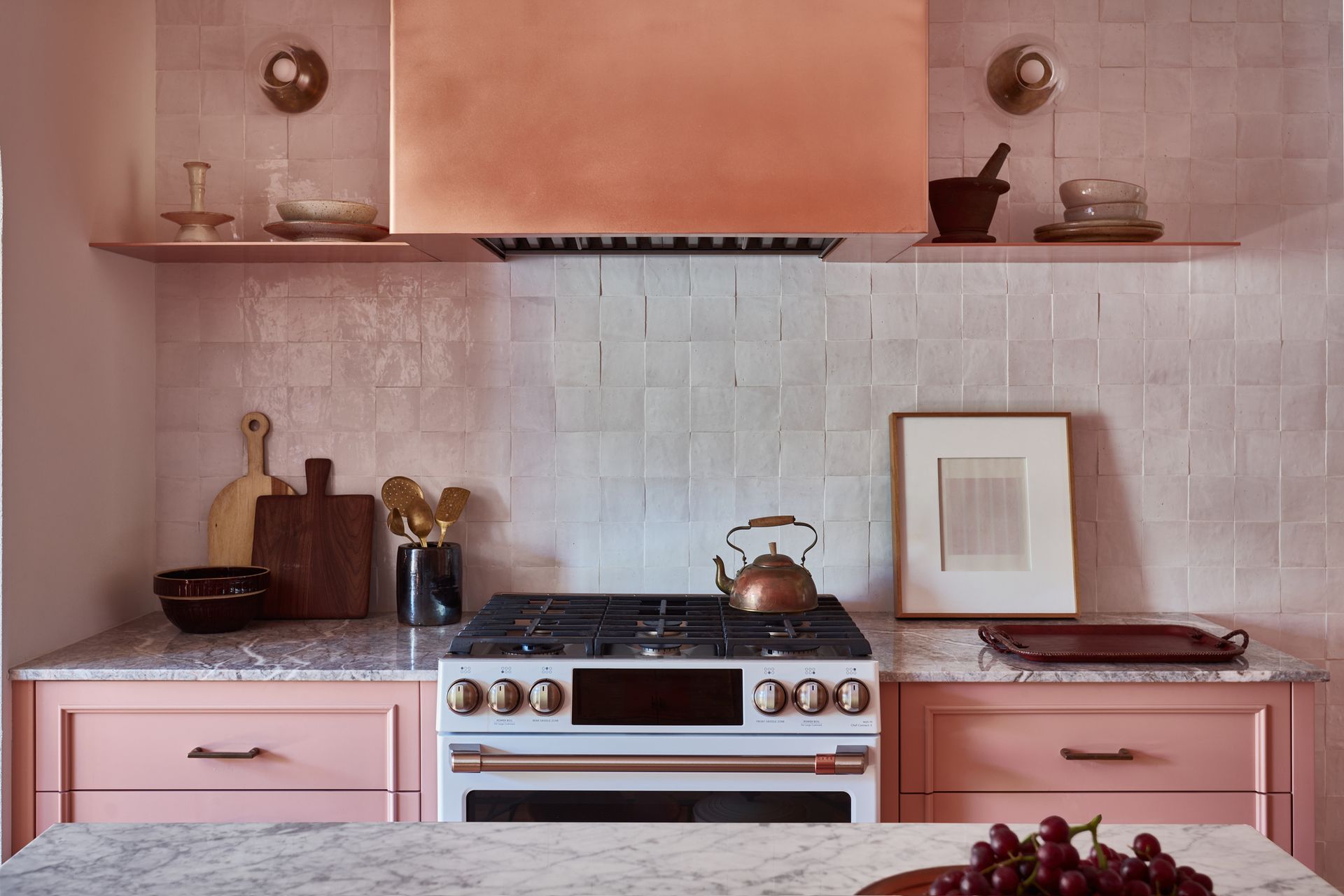
The space is accessorized with brass fittings, including a beautiful brass faucet that works alongside the handles on the cabinets. Kitchen decor such as chopping boards and wall art, coupled with ceramics and aesthetic kitchen utensils such as the pestle and mortar keep the space feeling homely and warm. Large windows in the dining room help keep light flowing through into the kitchen, setting the golden touches aglow.
'The kitchen was about creating smart space planning to hold everything, keeping things easily at hand while visually tucked away when not being used,' says Lisa. 'The client wanted a stylish kitchen unique and special to the house, and a room that wasn’t dark or crammed.'
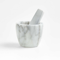
French kitchen mini marble pestle and mortar, Crate & Barrel
Looking for a way to decorate kitchen countertops? A pestle and mortar in marble can bring the elegance of the marble, while being a practical and functional tool for your kitchen.
The dining room

Leading on from the kitchen is the dining room. Lisa introduced an enormous French 1890s antique case piece to fill the dining room's east wall. It acts as storage for both the kitchen and dining room, throwing light with its generous original glass panes.
The dining room was finished off with vintage lighting, an old farm table and Brutalist French antique chairs that have a modern sculptural slant but a time-worn warmth to them. Millwork and window treatment was redone to be appropriate to the home's period, and underfoot, wood kitchen floors were replaced and re-done.
The living room
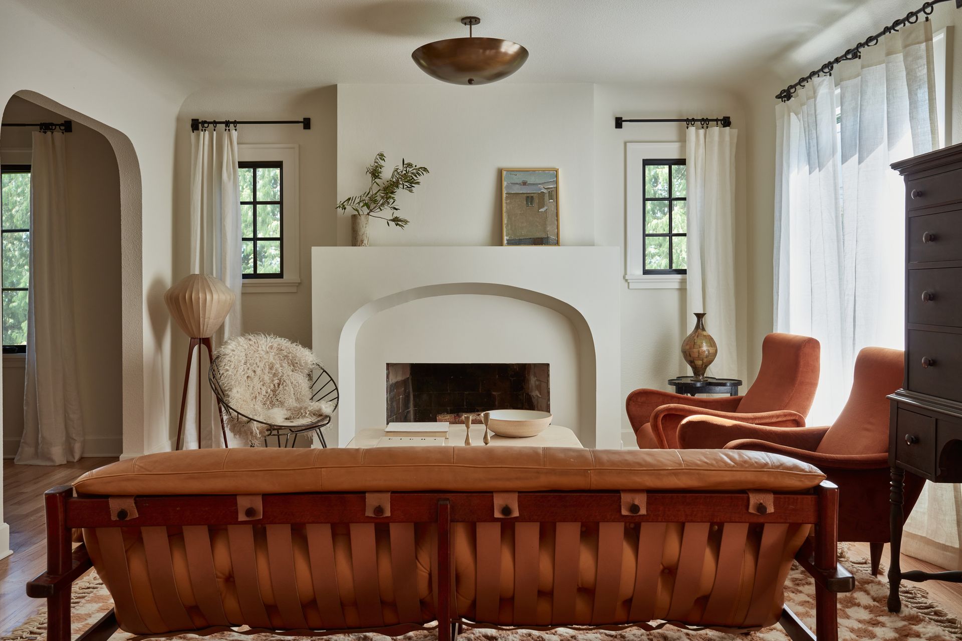
In the living room, the fireplace surround and hearth are brand new. The new shape is a 'cleaned-up Tudor arch with a wink of modernity,' Lisa says. In this space, every item shown is either vintage, hand made, or small batch hand-crafted. It is a stylish mix of high and low, with elements that are both glamorous and classic in a warm and earthy color palette.
The living room paint color is a relaxing off-white tone and helps make the small space feel brighter and airier. 'The living room is painted in Sherwin Williams' Alabaster,' says Lisa. 'It’s the color of old English plaster. A bit chalky but not pink or yellow. It feels warm without being heavy in any way.'
The primary suite

Head upstairs, and the entire floor is loft-like and dedicated to the master bedroom. This space was fully gutted and reconfigured. At the top of the stairs sits a copper tub in an open-concept bathroom area. The spout appears out of a chimney that has been clad in thin bricks. The sink and vanity area sit open as well with a closed-off shower and toilet room divided by a wall of custom steel and glass doors. 'It's a real showstopper,' says Lisa.
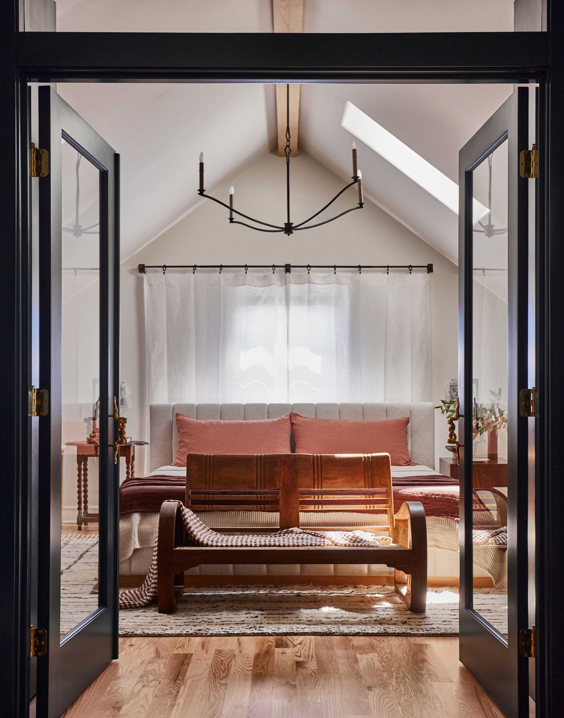
Inky blue bookshelves flank the wall leading into the bedroom and help create a pampering feel. The side of the cabinetry that is inside the bedroom holds bedroom storage, and clothes and more drawers are set into the eaves and integrated into the paneling - a clever use of small city living.
Be The First To Know
The Livingetc newsletter is your shortcut to the now and the next in home design. Subscribe today to receive a stunning free 200-page book of the best homes from around the world.

Oonagh is a content editor at Livingetc.com and an expert at spotting the interior trends that are making waves in the design world. Writing a mix of everything and everything from home tours to news, long-form features to design idea pieces on the website, as well as frequently featured in the monthly print magazine, she's the go-to for design advice in the home. Previously, she worked on a London property title, producing long-read interiors features, style pages and conducting interviews with a range of famous faces from the UK interiors scene, from Kit Kemp to Robert Kime. In doing so, she has developed a keen interest in London's historical architecture and the city's distinct tastemakers paving the way in the world of interiors.
-
 How to Thaw a Frozen Pipe — Learn Everything You Need to Know in 5 Minutes With This Guide
Winter storm caught you off guard? We asked an expert — just how do you thaw a frozen pipe?
By Hugh Metcalf Published
-
 The 12 Very Best Silk Bedding Pieces — As Our Style Editor Says: 'It's What Dreams Are Made Of!'
Slumber in lustrous luxury with the very best silk bedding sheets, duvets, pillowcases, and more — your sleep score will thank us later
By Julia Demer Published

