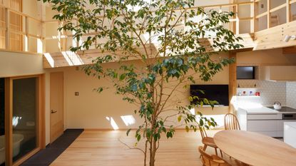
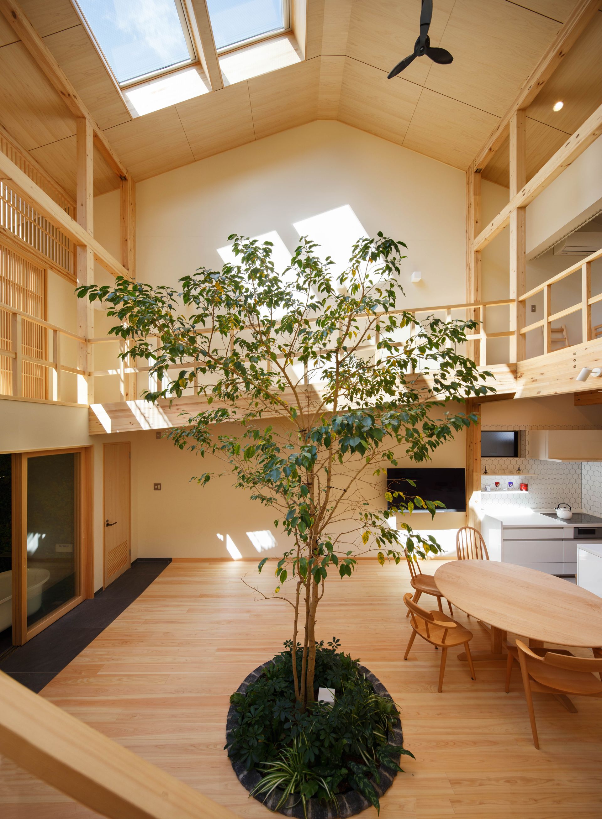
This Kyoto home has an indoor tree at its center and not a door in sight
Designed with family life in mind, this beautifully simple Japanese home takes open plan to the next level


The property
Designed by Japanese-based architect firm, 07Beach, this minimalist modern home, situated in a quiet area of Koyoto, Japan, might seem like a serene, totally zen-like space, but it's actually a family home at heart. An open-plan design was essential to the homeowners, not only because they liked the style, but because they always wanted to feel close to their three children. So you'll find very few doors in this property.
'The couple preferred simple and open so they can keep watching their three children are constantly moving. The house was designed as one big space, placing the double-height living room at the center so that they can see where and who does what.' explained the architect Joe Chikamori.
Even the bathroom is glass-fronted so the family can still enjoy the open-plan space while they bathe...

Living space and kitchen
The small site on which the house is built meant that there wasn't much option when it came to window placement, and there was no room for a garden either. Hence why the central living space feels almost like a courtyard, with all the rooms arranged around the light-filled space, and of course the indoor tree.

The kitchen itself is very minimalist, tucked away so the central space feels interrupted by anything but the tree and the family dining table. The simple, sleek white cabinetry keeps it feeling light and airy, and the hexagonal tiles add some texture and interest to the room.
- See also: 15 modern kitchen ideas - stylish, smart and chic

You can really see here the openness of the house, and understand how it works with family life. Being able to cook in the kitchen whilst being able to hear the children playing upstairs, it gives the sense that the family are always close, almost like the house is one single room.

Bathroom
The bathroom sits opposite the living space, with a glazed door separating it from the rest of the house. The idea was that you could bathe while still looking up at the tree and the light and feel almost like you are in an open-air bath.

'Although a curtain-rail was set in the bathroom just in case, even after a few months of living there, it seems the family got used to the exposed bathroom as they are still using it without a curtain.' says Joe Chikamori.
And yes, there is a private toilet, with a door, next to the bathroom.

The walls, that were designed to mimic the light coming through the trees, are made up of an intricate mosaic. While the rest of the bathroom is kept minimal, with just a freestanding bath and built-in cabinetry to match the wood used throughout the rest of the house.
- Find more: 34 modern bathroom ideas to try for an up to date scheme
First floor
A wrap-around veranda provides access to the rooms on the first floor, a tatami mat room and the children's bedroom. Wood is still the dominant material up here, with the structure of the home being mostly left exposed and minimal furnishings so the wood and light and the tree are always the focus.

The children's room is situated directly above the kitchen and, as seems to be a reoccurring theme in this home, has no doors so light just flows in from the main living space.
'The route for the children is from their room, down the slope, pass in front of the tatami room, down the stairs, and get in the living room. With this structure, the children experience the full expanse of the house and the parents can always feel the movement of their children.' explains Chikamori.

Tatami mat room
Opposite the children's room is a tatami mat room – a traditional Japanese room that can be used to study, sit or even sleep. It's separated from the rest of the home with a sliding wooden screen, so natural light can still flow into the space.


Be The First To Know
The Livingetc newsletter is your shortcut to the now and the next in home design. Subscribe today to receive a stunning free 200-page book of the best homes from around the world.
Hebe is the Digital Editor of Livingetc; she has a background in lifestyle and interior journalism and a passion for renovating small spaces. You'll usually find her attempting DIY, whether it's spray painting her whole kitchen, don't try that at home, or ever changing the wallpaper in her hallway. Livingetc has been such a huge inspiration and has influenced Hebe's style since she moved into her first rental and finally had a small amount of control over the decor and now loves being able to help others make decisions when decorating their own homes. Last year she moved from renting to owning her first teeny tiny Edwardian flat in London with her whippet Willow (who yes she chose to match her interiors...) and is already on the lookout for her next project.
-
 How to Thaw a Frozen Pipe — Learn Everything You Need to Know in 5 Minutes With This Guide
Winter storm caught you off guard? We asked an expert — just how do you thaw a frozen pipe?
By Hugh Metcalf Published
-
 The 12 Very Best Silk Bedding Pieces — As Our Style Editor Says: 'It's What Dreams Are Made Of!'
Slumber in lustrous luxury with the very best silk bedding sheets, duvets, pillowcases, and more — your sleep score will thank us later
By Julia Demer Published

