Deliberate holes are the only decorative feature in this minimalist Amsterdam home
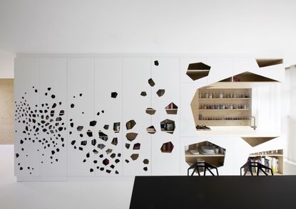
Laser-cut holes help to open up the space, and double up as little windows and hand grips / handles for opening cupboard doors. The arrangement of holes also cleverly conceals an iron column which replaced the supporting wall which used to be there...


The Property
This minimalist, modern home in Amsterdam is full of holes – and deliberately so.
Designed by i29 interior architects, the modern apartment sits in a listed, stately building in the south of Amsterdam and features surfaces with laser-cut holes, doubling as windows and handles.
It's quite a transformation; the original 1930's layout felt dark and cramped. A lot of space was lost on long, wide hallways with doors that used to lead to small rooms. With a brand new open-plan layout and the addition of sky lights, the new interior feels like a brand new property.
Open-plan living area
The owners bought this typical Amsterdam 1930’s apartment in its original state. It used to be a dark apartment, full of corridors and small rooms. They brought on i29 architects to open up the space and completely reconfigure the layout. Spanning 1,722 square feet (160 m2) and featuring a predominantly white colour scheme, it's now become the most light and spacious home on the block.


The focal point of this ground floor space is undoubtedly the multi functional cabinet, featuring a pattern of laser cut holes. The cabinet is part storage, part kitchen, and part disguise for an iron column that replaces the supporting wall which used to be there.


The holes help to open up the space, and double up as little windows and hand grips / handles for opening the cabinet doors.

Kitchen
A modern kitchen features white kitchen cabinetry that's warmed up by a raw, wood kitchen storage wall.
The laser-cut cupboard doors result in a dynamic mix of open and closed cabinets, with the holes also functioning as integrated handgrips.

A kitchen peninsula island divides the kitchen from the dining space, while keeping open sight-lines.

Dining area
Black 'chair one' stacking chairs by Grcic complement the modern, minimalistic and monochrome space.

Staircase
Before the renovation, the attic rooms could only be reached through a corridor which had public access.
So the architects created this atrium with a modern staircase, linking the two floors together as a private apartment. A skylight above the stairs brings in natural light. The window also leads to a roof terrace with views over Amsterdam.

A double-height pine wall lines the staircase and links the two floors.

Ensuite
Upstairs is a master bedroom with an ensuite bathroom. Across the landing is a door that leads through to the kids' rooms – the door is disguised as part of the double-height pine wall.


The grey bathroom features structured tiles from Patricia Urquola.

Glass shower screens complement wooden cabinets.

Be The First To Know
The Livingetc newsletter is your shortcut to the now and the next in home design. Subscribe today to receive a stunning free 200-page book of the best homes from around the world.
Lotte is the Digital Editor for Livingetc, and has been with the website since its launch. She has a background in online journalism and writing for SEO, with previous editor roles at Good Living, Good Housekeeping, Country & Townhouse, and BBC Good Food among others, as well as her own successful interiors blog. When she's not busy writing or tracking analytics, she's doing up houses, two of which have features in interior design magazines. She's just finished doing up her house in Wimbledon, and is eyeing up Bath for her next project.
-
 Kitchen Utensils Worth Keeping vs the Ones Just Taking up Space — 'It's the Secret to Decluttering Drawers'
Declutter and organize your kitchen cabinets and drawers with these expert-approved tips
By Ottilie Blackhall Published
-
 Things People With Low Maintenance Kitchens Never Have — 5 Decisions To Stay Away From
You may be aiming for a low-maintenance kitchen that is easy to work in but have you chosen the right materials for it? Designers point out the most common errors in decisions
By Aditi Sharma Maheshwari Published

