So much more than all-white - interior designer Sheena Murphy's home shows how to do a neutral palette to perfection
Layering neutral colors creates a home that is cool, calm and cosy too. Sheena Murphy of nune perfects the pared-back palette
Interior designer Sheena Murphy, founder of the design studio nune, is a regular in the pages of Livingetc. We go to her for her understanding of how to take a pared back palette and make it warm. For how to take cool hues and elevate them to cosy new levels. For understanding that texture is as important as color.
Yes, she creates beautifully calm modern homes, and with offices in New York and London is fast becoming one of the most sought after names on the international design scene.
A prime example of why is her own home, a post-war, modernist, utilitarian-style house, built in 1958 in a leafy part of north-west London. The house has three storeys. On the ground floor is a double living room space with a study area, a kitchen-dining room and a cloakroom. The first floor comprises the main bedroom, walk-in wardrobe and ensuite bathroom, plus a laundry room. On the second floor is the child’s bedroom, a spare bedroom and a bathroom.
For the decor, Sheena chose a soft and soothing color palette, which she describes as ‘quiet’, to unify the space. ‘The tones are all related throughout the house,' she says. 'The only slight departure being in our daughter’s bedroom, but the sandy-mustard color we used in there still reads as a neutral,’ she explains.
Living room

In the open plan living space, the living room sits at the front of the house. The richly colored sofa is in rather striking contrast with the lighter shades used in the rest of the room.
‘There is a tonal shift of color as you enter each space, so the transitions are felt but never jarring or dramatic,’ Sheena says.

Of the way the open plan space becomes the living room area, Sheena says ‘The curved arch adds character in keeping with the provenance of the house. We didn’t want to add period details that weren’t authentic.’
The vintage Travertine table is from 1st Dibs, the Little Petra armchair by &Tradition is from Made in Design.
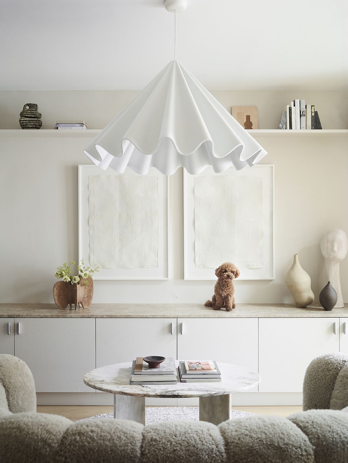
On the middle of this floor, between the main living room and modern kitchen/dining space, this is both a seating area and a thoroughfare, made dramatic by the oversized ceiling lamp. Sid the dog just couldn't resist getting in shot (and we couldn't resist shooting him!).
Home office

‘We carved out part of the living area to make this niche-like home office,' Sheena says. 'The cabinetry is made from sustainable plywood and hides a multitude of electronic uglies!’
Kitchen/dining area
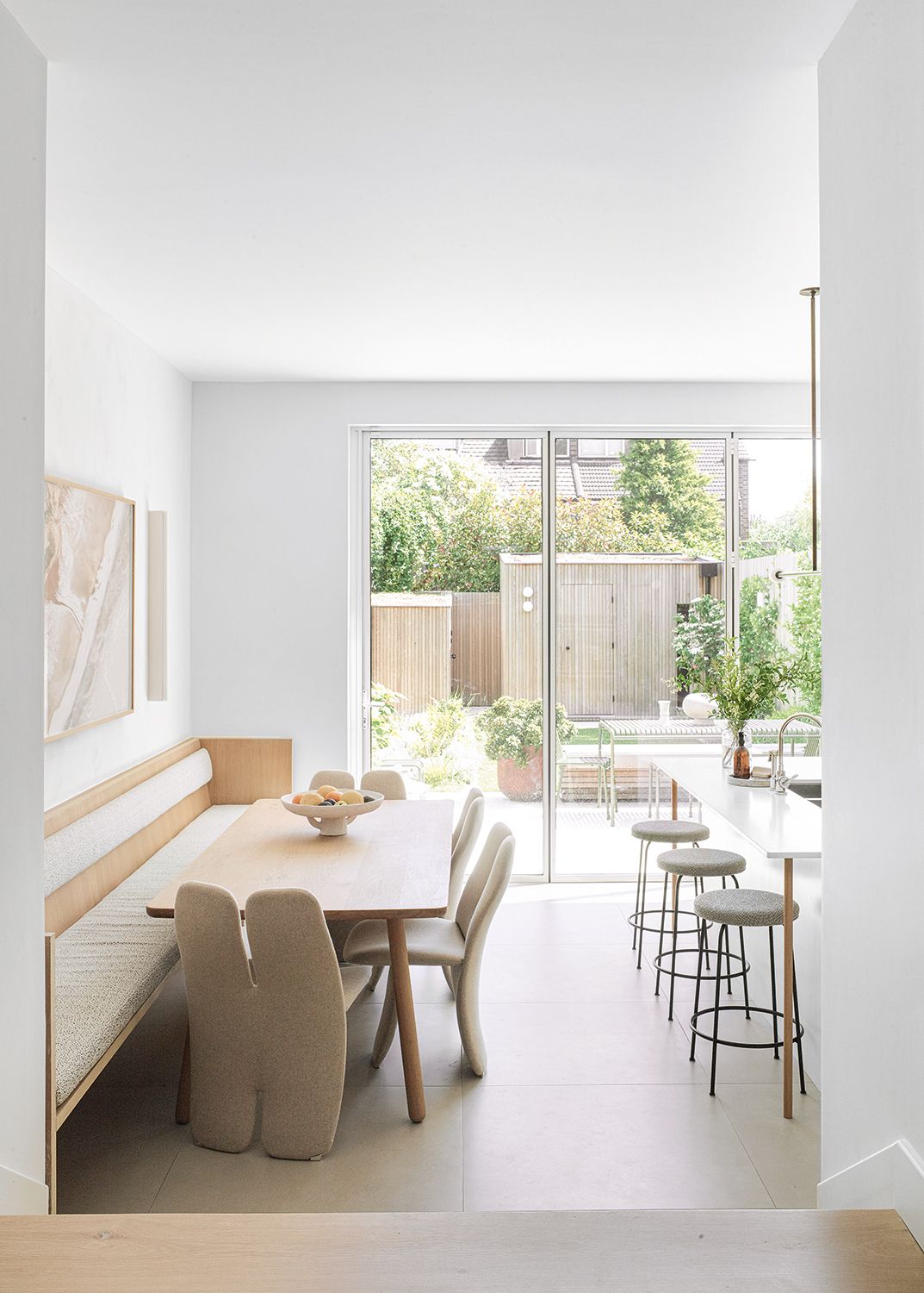
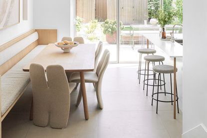
Taking on a massive renovation, Sheena didn't change much about the layout, but she did switch the kitchen to the south-facing back of the house and dug down 16 inches to increase its height and light. ‘This had a huge impact on the overall feeling of the ground floor,’ says Sheena of the space which flows from the living area at the front, through to a working niche in the middle and on to the open-plan kitchen at the rear.
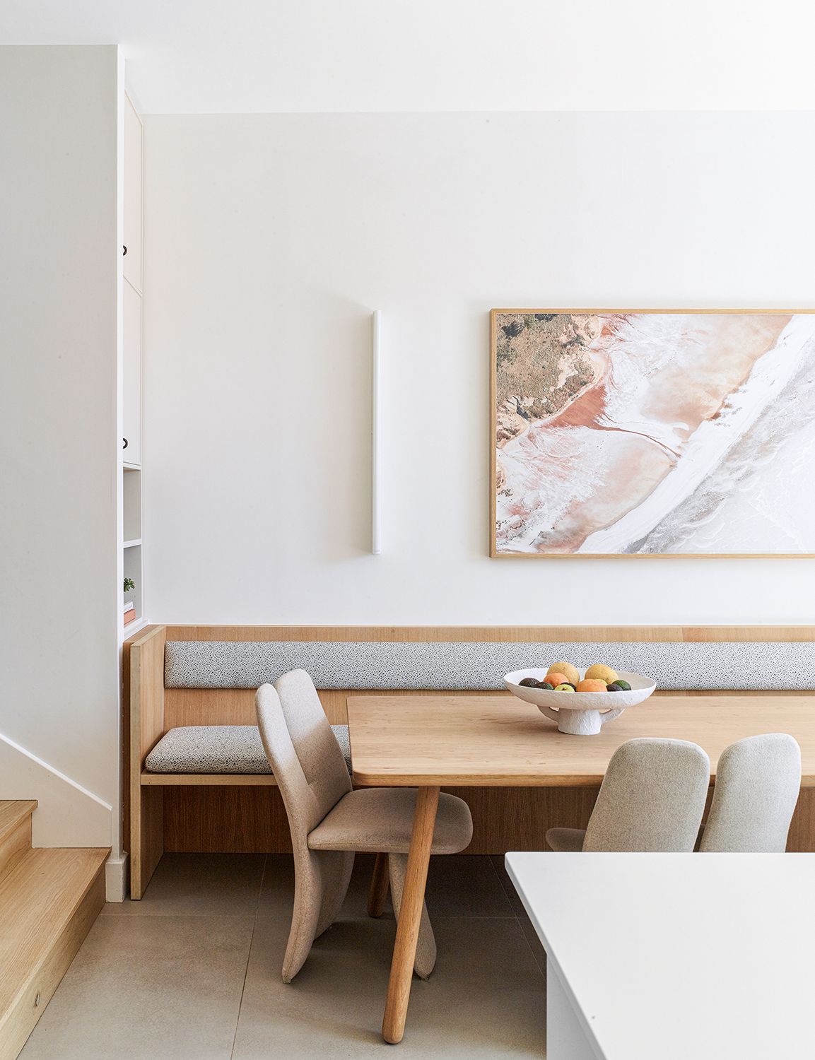
Sheena introduced built-in seating around half of the dining table. ‘The long linear bench was a space-saving idea, as the width of the room didn’t allow for chairs all round the table. We now prefer it,’ she says.

‘I specifically sought out a light-mid-toned mottled marble, rather than something with dramatic veining,' Sheena says of her kitchen island. 'This was in an effort to create a more timeless but still interesting backdrop to the space.’
Bedroom

‘As with most bedrooms I design, this was to feel like the ultimate sanctuary - filled with soothing tones and textures,’ Sheena says. What she has created here is the ultimate modern bedroom - layered and rich but soothing and cool. The trick is to use plenty of materials but keep the color palette to a minimum of shades.
Bathroom

‘We wanted this space to feel almost spa-like,' Sheena says of this modern bathroom. 'Although the palette is very restrained, it was important that there was texture in the stone to prevent it feeling too flat.’
Be The First To Know
The Livingetc newsletter is your shortcut to the now and the next in home design. Subscribe today to receive a stunning free 200-page book of the best homes from around the world.
A legendary houses editor, Mary Weaver held the job of Homes Editor on Livingetc for over a decade. She set the aesthetic for which the brand has become known. She is now a freelance stylist, art director and writer, regularly contributing to Livingetc and overseeing the brand's successful House Tours franchises of live and webinar events.
-
 These 12 Best Table Lamps for Your Desk — Perfect Glows for a Creative Home Office
The best table lamps for your desk is have a soft, targeted glow. Elevate your WFH set-up with these stylish picks endorsed by Style Editor Brigid Kennedy
By Brigid Kennedy Published
-
 The Nespresso VertuoPlus is 30% Off for President's Day, and it's Kim Kardashian's Coffee Maker of Choice
This sleek and stylish coffee maker was spotted in Kim's home bar, and you can currently save $60 if you buy yours from Amazon
By Lilith Hudson Published
