This interior designer's apartment is a masterclass in filling a characterless new-build with personality
Designer Omar Bhatti's own apartment is a wonderful mix of concrete, marble and clever design ideas

‘Did I push myself out of my comfort zone?’ Interior designer Omar Bhatti considers this question about the revamp of his own industrial-meets-chic home and replies: ‘It’s difficult to say, as this is what I do for a living and I’m always looking to push boundaries. But it was actually more challenging making decisions for myself, so I guess the answer is ‘yes’! He gave himself extra pressure, he says, to make bold decisions to bring it out of the ordinary. Like creating a focal point curved feature wall in the living room of this modern home, flipping the shower room to make a larger main bedroom and replacing the wooden kitchen table with a show-stopping marble.
For that can be the hard part when decorating an apartment in a new build block. faced with a new build apartment. How to add character, how to create moments that catch the eye when all what you're working with is a - very smart, very chic, admittedly - modern box. Although a new build, the apartment's lofty vibe, tall ceilings and metal windows was ripe for welcoming a new personality.
Omar's home is a loft-style new build apartment on an island near Docklands, east London. There is an open plan kitchen/living area, a main bedroom with an ensuite plus a guest bedroom and bathroom.
Kitchen
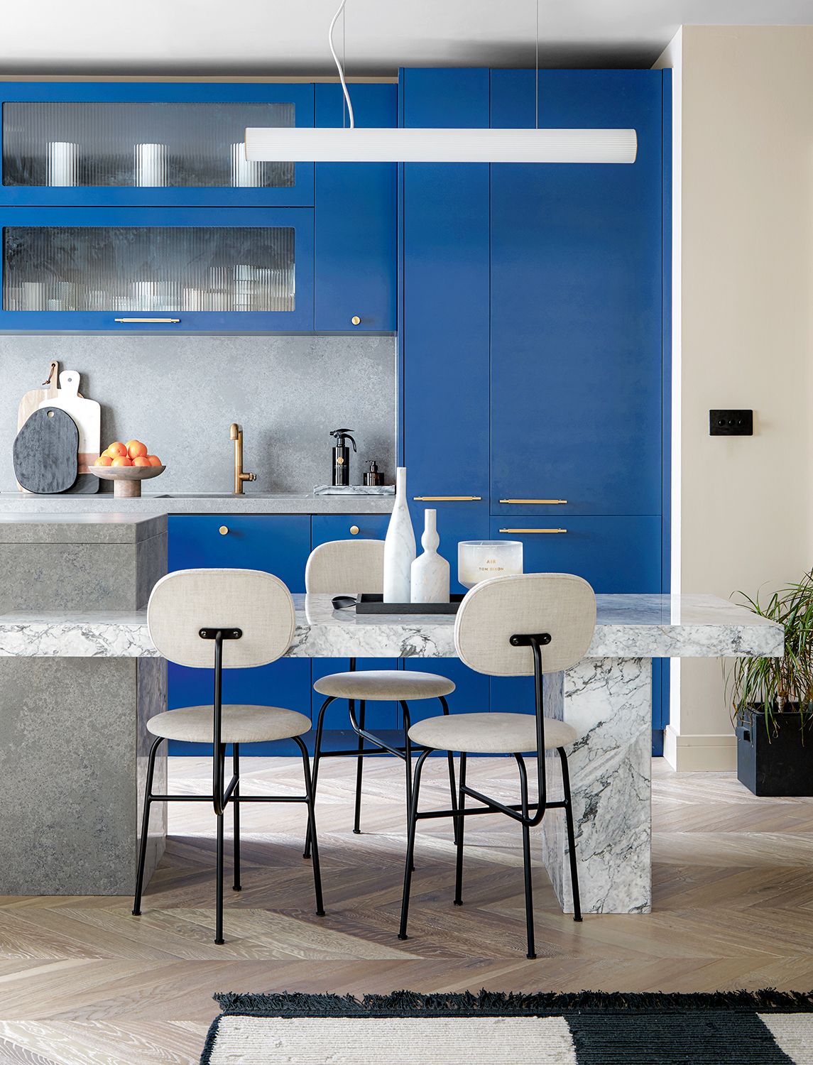
‘I inherited the developer’s bright blue kitchen which I’m thinking of changing to matt black to better go with the rest of the scheme,' Omar says. It's a surprising admission when the blue works so well, lifting the rest of muted colors in this ultra modern kitchen.
Cleverly, Omar made the kitchen island split level, so it's high enough to prep food on while standing, and then low enough to have normal-sized seats around. Originally, this was a wooden table, which Omar replaced with show-stopping marble.
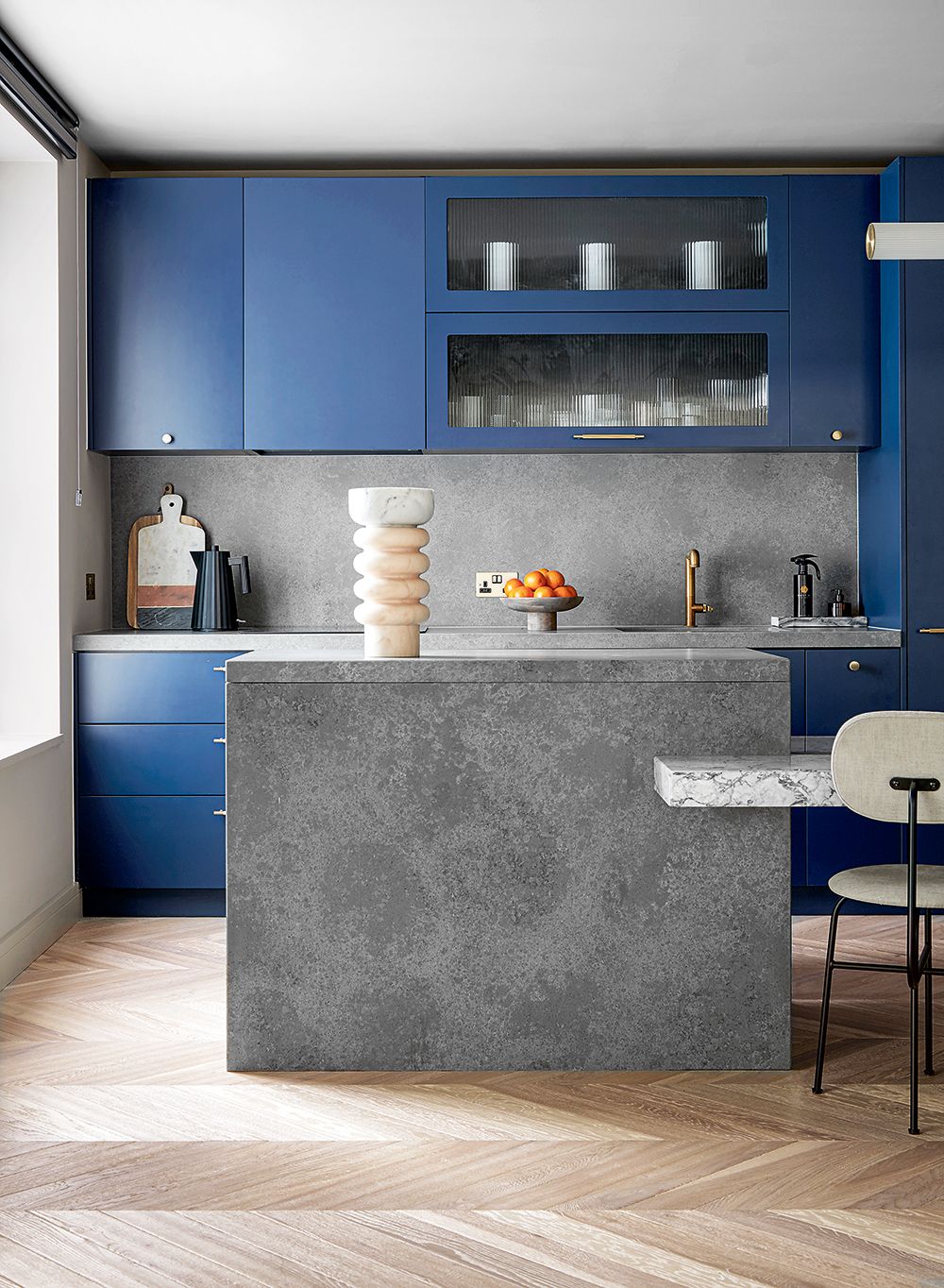
By switching out the plain glass in the modern kitchen cabinets for fluted panes, Omar transformed the feel of this space, elevating it completely. It’s these, comparatively small adjustments, that make the home sing, rather than simply speak.
Living room
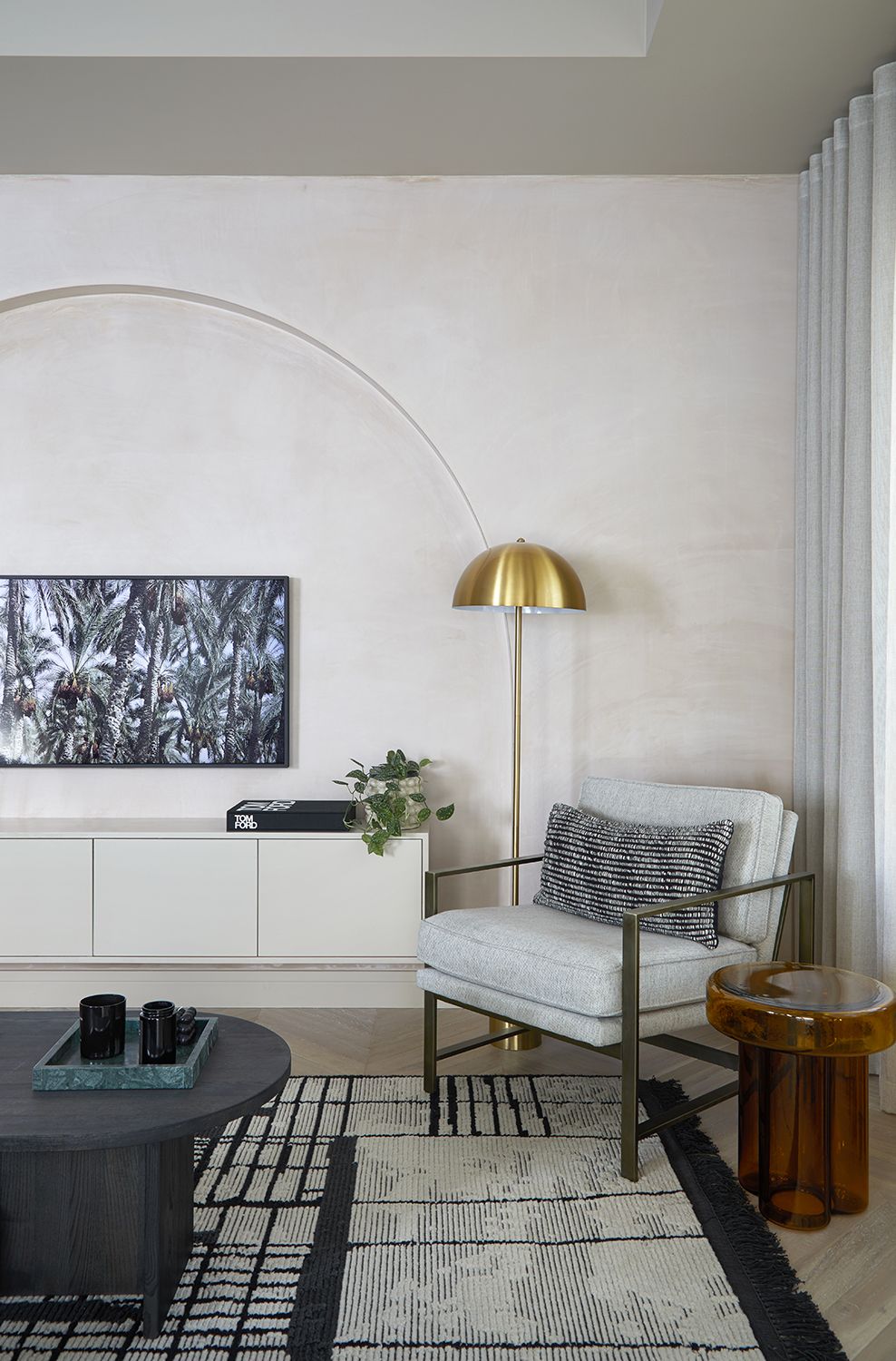
In the living room, Omar was able to create a focal point curved accent wall. 'I had planned to paint it in a khaki green lime washed paint but the raw plaster looked so beautiful I simply sealed it and left it as it was,’ he says.
In fact, the arched wall is the perfect way to steal the eye's focus from the living room TV, swooping above the set and making a feature of the architecture instead.
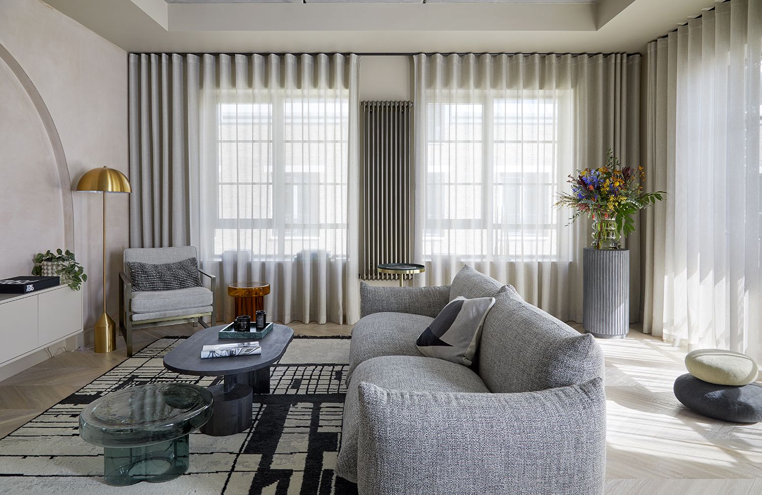
The initial inspiration for the decor here was a large, dramatic, graphic living room rug in black and cream. ‘I fell in love with it and designed the furniture and furnishings around it,’ Omar says ‘but then it was out of stock so I substituted with a muted pale version - which I grew to live with, then actually thought I preferred,’ he says. But when the original rug came back into stock he tried it out and his initial instincts were confirmed.
‘It makes a statement and lifts the space out of the ordinary, tying everything together and adding gravitas,’ he says. Proof that initial instincts are often right.
Entryway
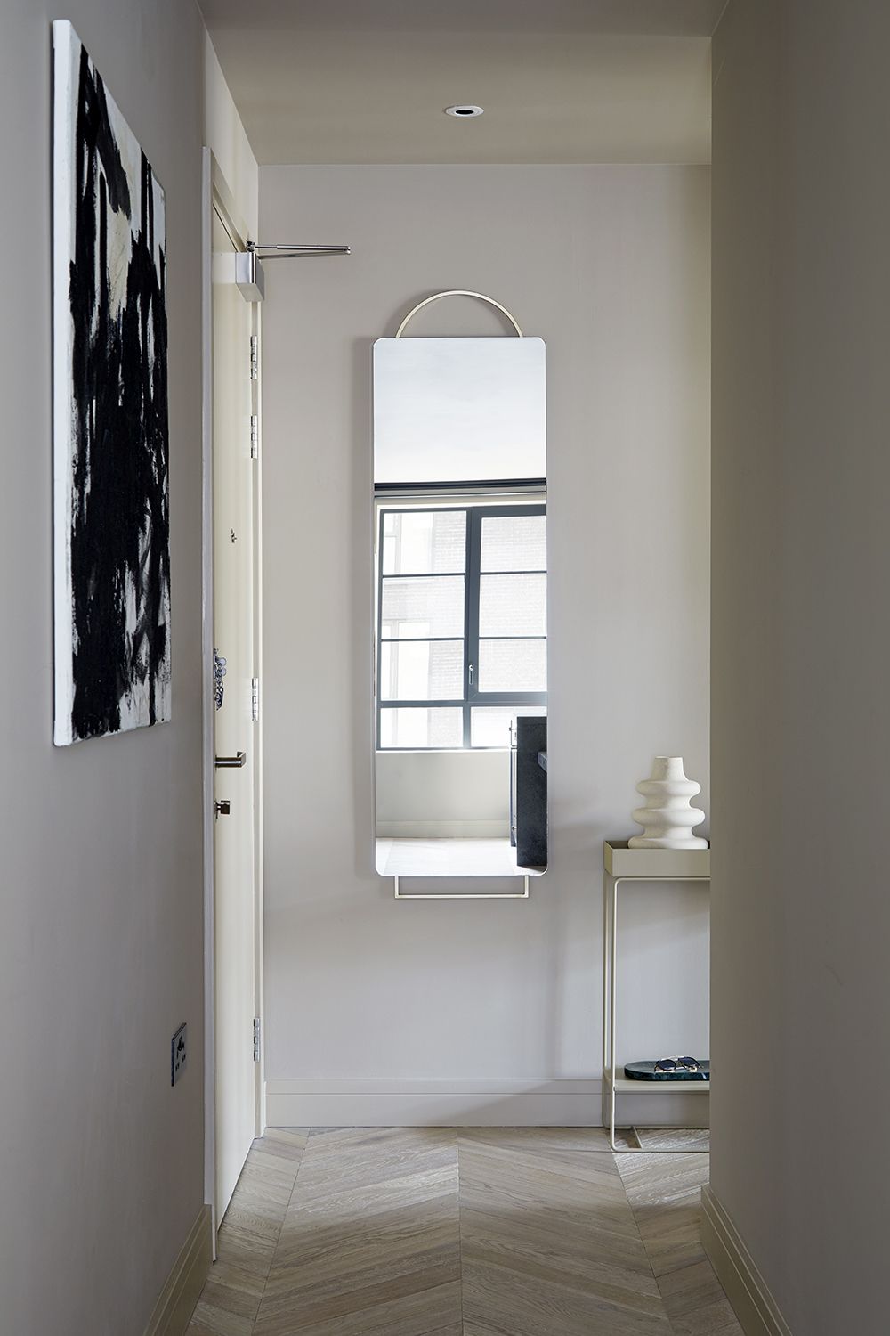
Without its own characterful features, but leading onto the open plan living spaces, Omar wanted his entryway to be purposefully neutral.
‘I deliberately kept this space simple and calm to create a breather between the living and sleeping areas.’
Bedroom
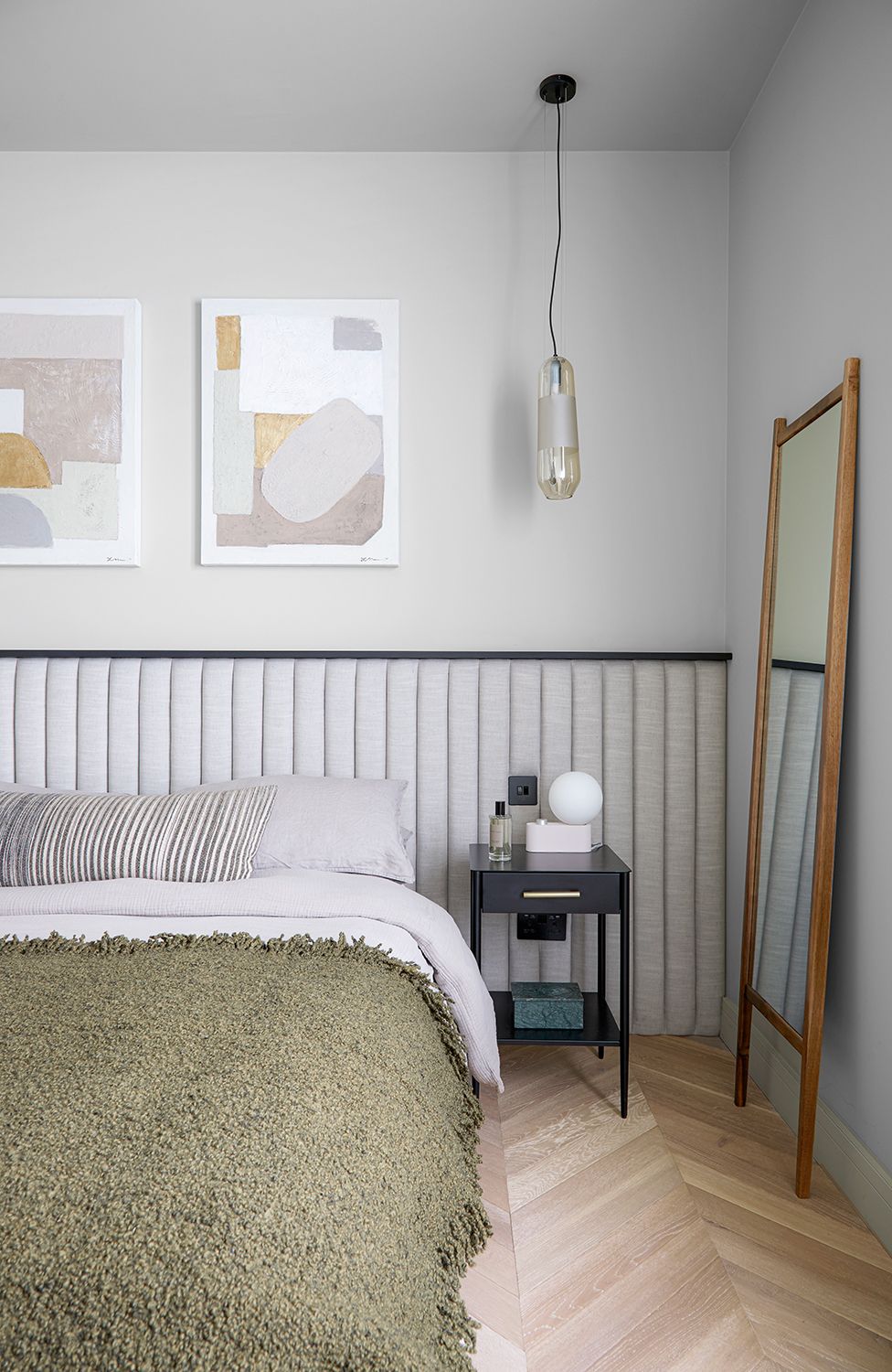
‘I wanted to wake up and go to sleep feeling zen, and the color palette and choice of materials has really allowed this to happen,’ says Omar of his modern bedroom. This space is another perfect example of making a visual statement that doesn't overwhelm the scheme - the padded headboard, made bespoke by Omars studio Shape Shack, is an arresting design but, in soft shades, is soothing rather than jarring.
Bathroom
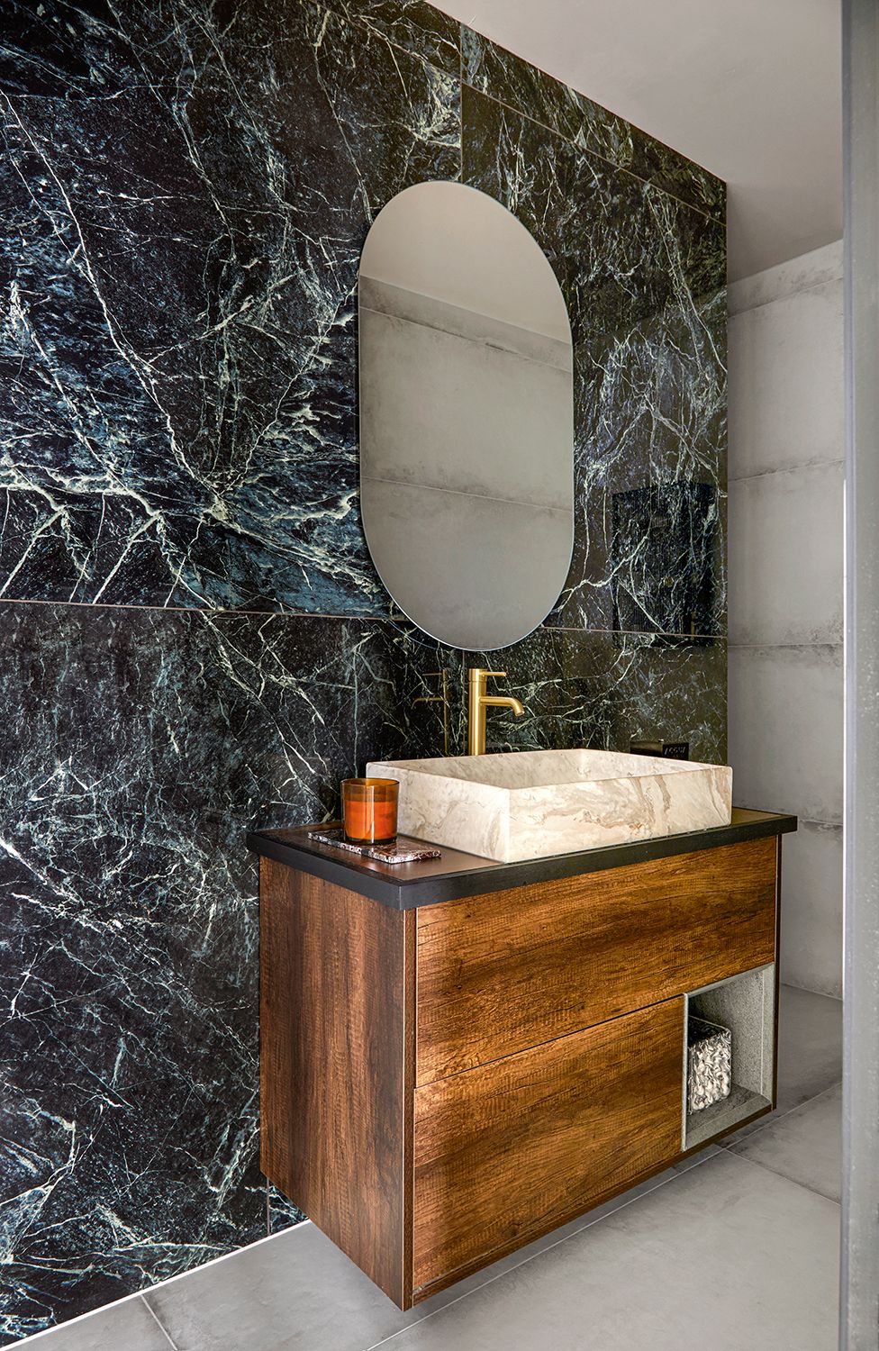
The ensuite to Omar's bedroom is a modern bathroom that looks super luxe thanks to the dramatically veined tiling. ‘I wanted a sense of understated luxury, mixing luxurious marble-look tiles with the soft concrete shell,' Omar says.
Pairing marble with concrete is a wonderfully spa-like approach to design, the opulent with the understated creating a backdrop which feels instantly relaxing.
See more of Omar’s work at Space Shack.
Be The First To Know
The Livingetc newsletter is your shortcut to the now and the next in home design. Subscribe today to receive a stunning free 200-page book of the best homes from around the world.
A legendary houses editor, Mary Weaver held the job of Homes Editor on Livingetc for over a decade. She set the aesthetic for which the brand has become known. She is now a freelance stylist, art director and writer, regularly contributing to Livingetc and overseeing the brand's successful House Tours franchises of live and webinar events.
-
 These 12 Best Table Lamps for Your Desk — Perfect Glows for a Creative Home Office
The best table lamps for your desk is have a soft, targeted glow. Elevate your WFH set-up with these stylish picks endorsed by Style Editor Brigid Kennedy
By Brigid Kennedy Published
-
 The Nespresso VertuoPlus is 30% Off for President's Day, and it's Kim Kardashian's Coffee Maker of Choice
This sleek and stylish coffee maker was spotted in Kim's home bar, and you can currently save $60 if you buy yours from Amazon
By Lilith Hudson Published

