Edgy color combinations and arresting art have brought a good dose of glamor to this London townhouse
Jewel hues and flash metallics weave their way through the five floors of this cleverly remodelled Regency terrace in Primrose Hill

Fiona Armstrong lives in this Grade II listed modern home in north London with her financier husband and their three children. ‘I always knew this house could take a lot of color,’ says Fiona of the jewel hues and flash metallics that weave their way through the five floors of her Regency terrace. She continues, ‘When we first moved in, we went for a neutral base with accents of color but I sensed we could be much braver. This is a London townhouse and I wanted it to be glamoros and fun.’
The resulting schemes – which UK Livingetc readers were able to witness first-hand during House Tours Live last September – come courtesy of interior designer Jo Berryman, who taught Fiona some important lessons when it comes to working with color: ‘I learnt that everything doesn’t need to perfectly co-ordinate,’ recounts Fiona. ‘If you take the family room, Jo suggested a multi-coloured floral rug and a blue-green sofa and coral ottoman, all of which made absolute sense, but then she threw in a large scale geometric print in acid yellow for the wing chair. It doesn’t relate to anything else in the space, yet it is so effective.’
It is curve balls such as these that add a little irreverence to the interiors of the gracious Grade II listed house, which Fiona and her husband renovated from top to toe in 2018. Let's step inside...
DRAWING ROOM

‘We lived here for seven years before we took the plunge, which was just as well as in that time, we had our third child, Clara, and so we needed another bedroom,’ explains Fiona, whose architect convinced the couple to turn their first floor drawing room into a master suite in order to create four more bedrooms on the levels above. The lower ground floor was opened up and a pastiche, Victoriana-style modern home extension idea was replaced with a double height glass box featuring a glazed mezzanine that Fiona uses as a home office.
The ground floor reception spaces became a chic drawing room and a library cum home office – think plush velvet furniture and statement lighting that emphasizes the soaring ceilings – while the loss of the first floor social space was mitigated with a new snug situated in a glazed extension built above the powder room.
When the impressive, orb-like lantern was first installed, Fiona was panic-stricken: ‘I walked in and saw it before the other pieces had arrived and thought ‘Oh God, it’s massive, this will never work’, but once everything else was in place, I loved it,’ she confides.
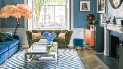
A Stockholm hotel was the inspiration for the Nordic blue living room walls, which feature a polished plaster treatment that adds a sense of subtle movement. The shapely velvet sofa nods to the Art Deco era. And the cabinet’s ombré effect marquetry contributes to the layered feel of the room.
FAMILY ROOM

While the couple were happy to sell or give away a lot of their existing furniture, they possess an extensive, ever-growing collection of art that they wanted to celebrate in the new schemes.
The cue for the main bedroom’s curvy Art Deco design forms and calming palette of eau de nil, oyster and blush pink, therefore, was provided by a 1920s gouache of Parisian actress and singer Mistinguett that hangs above the fireplace; the moody, Nordic blue walls in the drawing room – created using a polished plaster treatment – were chosen as a foil to a contemporary reinterpretation of François Boucher’s The Three Graces, picked up by the couple at a graduate show.
The huge photograph on aluminium of Repton Boys’ Club was the starting point for the color palette in this family room. The space cleverly doubles as a media room and features blackout blinds for the windows, a blind that pulls across the ceiling and a curtain to block out light from the adjoining dining area.
DINING AREA

Shelves backed with antiqued mirror bounce the light around and help ramp up the glamor factor at night in this modern dining room. The chairs are upholstered in PU leather, a practical choice for a family.
‘The beauty of everything being quite colorful is that it is relatively easy to introduce new pieces of art as we go along’
KITCHEN

A contemporary pendant light brings a sense of understated luxury to this streamlined space, where natural materials such as reclaimed timber and Quartzite Calacatta add a tactile quality.
‘If I had decorated the house myself I might have managed a seven out of ten, but when we considered the investment we were about to make, we felt it probably warranted a ten out of ten.’
LIBRARY

Near-black joinery and herringbone parquet wood flooring idea in fumed oak offer a moody foil to colorful pieces that include a vintage French poster and an Art Deco inspired rug.
The joinery also neatly frames the upright piano and a portrait of Keith Richards by the couple’s friend, photographer Michael Donald.
HALLWAY

Antiqued glass panels ensure double whammy visuals of the alabaster wall lights and pendant. The subtly distressed wallpaper idea has a soft sheen which works well with the mirrored pieces.
SNUG

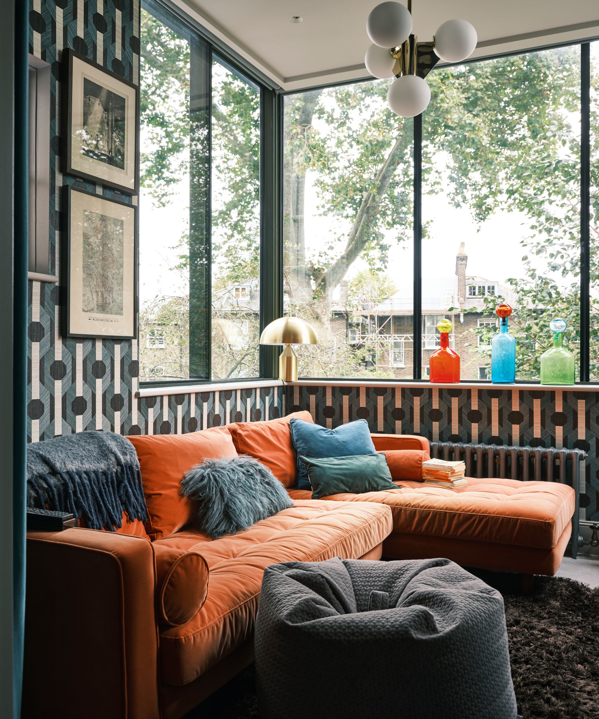
‘We created the snug so that our teenage sons and their friends have somewhere to hang out,’ Fiona explains, adding, ‘At first I worried that it was going to be too small as it's a narrow room but I realized that teenagers always seem to bunch up at one end of a sofa, anyway.’
A geometric sisal wallcovering adds a playful touch to the teenage hang-out zone, which is filled with a comfortable orange velvet sofa.
MAIN BEDROOM

The statement headboard’s ruched velvet detailing adds to the scheme’s sense of luxury. Devoré velvet curtains are finished with pelmets in chartreuse yellow velvet – one of Jo’s left-of-field suggestions that Fiona particularly loves.
MAIN BATHROOM

The built in fitted wardrobe doors of the walk-through dressing area have an elegant wabi-sabi effect. The diamond patterned tiles feature insets that echo the eau de nil hues of the adjoining bedroom.
Carrara marble is a chic complement to the room’s ornate plasterwork.
KIDS BEDROOM

Shades of dusky pink and pistachio make for a pretty combination. Jo designed the curtained bed as the perfect place to hide away with a book.
The common theme between the spaces is the sober architectural shell: fumed oak, antiqued bronze and natural stone provide an earthy backdrop that helps tie the palettes together.
‘As you move from one space to the next, there is a sense that everything is connected,’ approves Fiona, who adds, ‘The real test of this redesign was when we all found ourselves at home during the pandemic. Everyone had their own space to work or study, and then we would all get together on the slouchy sofa in the family room. We use every part of the house, which I think says it all.’
See more: Industrial meets chic in this loft-style new build apartment in east London
Be The First To Know
The Livingetc newsletter is your shortcut to the now and the next in home design. Subscribe today to receive a stunning free 200-page book of the best homes from around the world.
-
 The 4 Things People With Really Organized Kitchen Drawers Always Have
Level up your ‘drawer decor’ and keep things tidy and organized with these 4 essential ideas for uncluttered storage
By Becca Cullum-Green Published
-
 Experts say These 6 Paint Ideas are Devaluing Your Home — 'Be Sure to Redecorate if you Plan to Sell!'
Thinking of selling up? Avoid these paint colors to maximize the potential of your space and appeal to prospective buyers
By Ottilie Blackhall Published

