First look inside Brooklyn's tallest tower, with open plan apartments designed by Gachot Studios
The views aren't the only star at the brand new Brooklyn Tower, as the approach to interior design is a leading light in urban apartment living


It's hard to miss The Brooklyn Tower, Brooklyn's brand new skycraper and its first building classified as a supertall. Coming in at 93 stories, it expands upon a bank built in the early 1900s, reaching up, and up, an up.
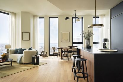
The architecture and design was carried out by Gachot Studios and have become a shining example of what modern homes need to be. Detraciting nothing from the stellar views, the living area, kitchen and dining area all exist happily in an open plan layout, while clever tricks allow them to feel zoned, separate and distinct.
The color palette of this apartment on the 60th story is kept - mostly - neutral. The shapes of the furniture are sophisticated, yet with comfort at their core. 'Our goal was to create a serene space that harmonized with the incredible light and expansive views,' says Christine Gachot, co-founder of Gachot Studios. 'You're high above a bustling city below - you can truly see it all. We wanted to let the surrounding environment tell the story while providing some comfort.'

The interior design inside The Brooklyn Tower

As the center of the apartment, the modern kitchen is about as sleek and chic as they come. The cabinets don't have handles, and the matte finish doesn't create any distracting shine.
This was all highly intentional. 'In an open plan kitchen design, you want the kitchen to feel like a part of a greater whole,' says Christine. 'Simplifying forms and focusing on quality of materials is a great way to keep things feeling cohesive with other spaces in a home.
The gold pendant light, above the kitchen island is custom by GACHOT. Just a slither of metallics, it's a smart way to create just a glimmer of sparkle in an otherwuise mostly monochrome scheme. The kitchen itself is also custom by GACHOT.
Party ready

At the end of the kitchen area is a large walnut dining table, capable of comfortably seating eleven people. Sourced from Bertu Furniture via 1st Dibs, the dining room part of this apartment, the warmth of the wood is a welcome contrast to the sight of the city beyond.
'The building is not just tall, but significantly taller than anything around it,' says Christine. 'Grounding the space, so it felt inviting and comfortable, was a top priority.'
Even for those not decorating an apartment that touches the sky, there are some easy lessons to take here. The materials used at this end are softer than in the kitchen, the Rajmund Halas chairs - also from 1st Dibs - have a roundness to their seats that make them look plump and comfortable.
All white (mostly)

Throughout the apartment, most of the walls are kept white, painted in Farrow and Ball's Wimborne White. By keeping much of the space one color, the light flows freely around the space, zoned by furniture rather than decor.
'There are so many ways to delineate space, from a keen eye on furniture layout, to rug placement, and shifts in color or light,' Christine says. 'As a studio with a rich history in hospitality design, the team is used to designing large spaces and breaking them into unique and identifiable parts. Look to your favorite hotel lobbies for inspiration.'
Notice the grey-blue of the cabinet in the corner of the dining room area - that's important, more on it later...
A round and about

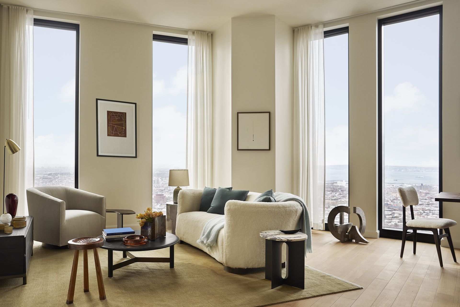
The way that the furniture is placed in the living room part of the apartment aid conversation, angled so as to create a small pool where people can gather.
'As a studio that mixes hospitality design practices with the best of residential interiors, we are always thinking about how to make people feel comfortable and encourage good living,' Christine says. 'We embraced the non-rectilinear layout of the space and envisioned a semi-circular seating area in the living space to encourage conversation and fun.'
The sofa is from 1st Dibs, and the living room rug is from Joseph Carini.

Feel the blues

Remember the blue cabinet seen in the corner of the dining area above? That exact shade is picked up on accent walls in what has become a little reading nook that feels distinct from the rest of the home.
Painted in Oval Room Blue by Farrow and Ball, this is actually the apartment office, a separate room in between the main living space and the primary bedroom. By using a color seen elsewhere, this sudden jolt of brightness doesn't feel out of place in an otherwise neutral scheme.
The daybed is from Amsterdam Modern, and the side table is from Maison Gerard.
Let the light in

You may have noticed that throughout the apartment, the curtains have been kept sheer, filtering the light but not blocking it. Is this modern bedroom dark enough to sleep in?
'When the shades are down, of course!' Christine says.
In fact, this element throughout the decor is important to the overall look. 'The sheer curtains provide softness and natural texture in an otherwise architectural space,' Christine says. 'They also filter in the ample light that floods the space, creating a glow throughout the day.'
The bed from is from Rove Concepts.

Extra warmth

The powder room is a total contrast to the airy whites of the main living space. Though notice how the walnut tones of the vanity match the dining table seen earlier? Another example of how attention to detail sees a through line carried through this scheme.
Hot and cold

In the modern bathroom, walnut appears again, this time paired with the same glossy black as the kitchen countertop.
'In an apartment with such generous natural light, there was a great opportunity to introduce more handsome details such as dark millwork and brass accents,' Christine says. 'In such an airy space, these materials help keep things grounded.'
See more from Gachot Studios
Be The First To Know
The Livingetc newsletter is your shortcut to the now and the next in home design. Subscribe today to receive a stunning free 200-page book of the best homes from around the world.

The editor of Livingetc, Pip Rich (formerly Pip McCormac) is a lifestyle journalist of almost 20 years experience working for some of the UK's biggest titles. As well as holding staff positions at Sunday Times Style, Red and Grazia he has written for the Guardian, The Telegraph, The Times and ES Magazine. The host of Livingetc's podcast Home Truths, Pip has also published three books - his most recent, A New Leaf, was released in December 2021 and is about the homes of architects who have filled their spaces with houseplants. He has recently moved out of London - and a home that ELLE Decoration called one of the ten best small spaces in the world - to start a new renovation project in Somerset.
-
 The 12 Best Table Lamps for Reading —I'm a Certified Bookworm (and Shopping Expert)
When it comes to table lamps for reading, I don't mess around. If you're the same, this edit is for YOU (and your books, or course — and good recommendations?)
By Brigid Kennedy Published
-
 "It's Scandi Meets Californian-Cool" — The New Anthro Collab With Katie Hodges Hits Just the Right Style Note
The LA-based interior designer merges coastal cool with Scandinavian simplicity for a delightfully lived-in collection of elevated home furnishings
By Julia Demer Published

