This Bondi Beach home has been transformed slowly over a decade to meet the needs of a growing family
Already renovated three times, this Sydney property is a creative playground for architect Jeremy Bull, his wife and their four sons

Through its style, layout and evolution, this Sydney modern home is the best representation of its inhabitants. Jeremy Bull, principal and founder of Alexander &CO., and Tess Glasson, who helms the studio’s marketing department, immediately saw the potential in this Victorian property - located in the eastern suburbs of Sydney, a five-minute drive from the famous Bondi Beach - for their family, which included their four sons and dog, a Japanese Spitz.
The couple, who at the time of purchasing the home a decade ago, had six-month-old twin babies, lived in the house for 18 months without changing a thing. This period allowed them to think about the transformations they wanted before starting the first major alteration and addition.
This would be followed by a second renovation (which included the building of a loft space built from plywood with caged mast lights) and a third (which consisted of an extension of the kitchen area to include a new laundry, sunken lounge and dining area joinery, as well as the external mezzanine storeroom to house the many skateboards, surfboards and bicycles of the now larger family), which would all take place over seven years.
‘Our vision for the space was an unfolding story’, Bull says. ‘Each alteration and addition is representative of the introduction of each new child and our growing family’s needs’, Glasson adds.
Exterior

For Bull, designing a home and modern home extension ideas for himself and his loved ones was much easier than doing so for a client. ‘The marvellous thing about creating your own house is the fact that it can really be a mix of experimentation and ideas,' he says.
‘The home is on eight different levels, albeit minor in places. They grew from the existing constraints until we grew to love them. Circulation space is minimised and when hallways are required, they play a dual role of also acting as a theatre space. We have placed rooms and usages in every nook; nothing is wasted.’
Sunken living space

‘The sunken lounge has a beautiful connection to the modern garden outside and the idea behind it was that there were no boundaries between the two,’ he explains.
From the couple’s perspective, two other key characteristics define their home: the spatial efficiency and the exploration of “the unfinished”. Maximising every square metre, reducing building costs and studying material expressiveness are reflected in the house that Glasson describes as ‘a carefully curated space but also a strangely idiosyncratic origami box that we've built around our family and boys’.
For Bull, the whole process of designing and making this home evolve throughout time has also been the perfect opportunity to share with his children the role of modern architecture in his daily life.
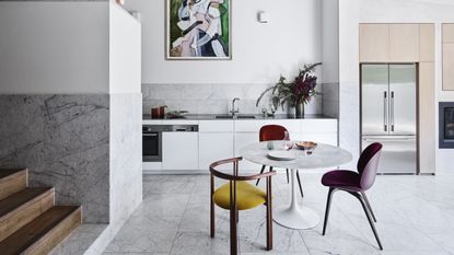
Kitchen

‘We wanted this to be a really practical space but also have scale and drama to be really surprising,' he adds. 'We discussed having an island bench but in the end we left the space free and it can have a marble dining table in it or be completely clear and is used daily as a handball court!’
Influenced by the work of Alvar Aalto and Louis Kahn, the project refers to a modernist philosophy while giving priority to what is locally available, and featuring a Scandinavian-inspired sensibility. Low-cost pine structures and exposed pine ply sheeting makes up the majority of internal finishes, while Carrara tiles adorn the bathrooms, kitchen backsplash and floor surfaces.
Living room

The sophisticated and muted color palette helps to highlight the furniture pieces and artworks, including “Matriarch” by Henrik Godsk (which adds a dose of femininity in a house of five males) in the small living room and “In-xcess” by Isabelle de Kleine (with its hues of green - Glasson’s favourite color - and soft pink) in the kitchen.
‘The multi-levelled space had to accommodate the needs of both of our sons and also allow space for Tess and I and any adult guests and conversation. This simple level change is an effective tool to distinguish functions, even though it’s only two steps!’
Kids room

‘There was a big old Eucalypt tree in our backyard when we bought the property and the view to that tree was central to the planning of the shutters in the kids' room. The style classic indoor shutters were inspired by Luis Barragan. They allow privacy and also flexibility in terms of how much light and ventilation you want in.’ Have a small person's room to get right at home? Here's how to design a kid's room.
Main bathroom

Here's a chic marble bathroom idea that looks effortlessly elegant. ‘We wanted it to be beautiful, simple and highly practical. It’s a mix of Carrara marble and penny round tiles which have a playful, textural edge.
Main bedroom

‘Tess always wanted our bedroom to have the feel of a hotel room; a luxury bedroom. The full drop linen curtains and the darker wall colour make it a little more nocturnal and cosy.’
‘It is a house filled with light and life’, says Glasson. ‘Despite having four kids running around, I feel grounded, relaxed and peaceful here.’ Oscillating between football field and sanctuary - and everything in between - this quirky home is infused with the spirit of its occupants and the vision of the creative mind behind it. ‘Although simple in patina, the house is actually wonderful in its concealed complexities’, Bull says. ‘It’s a constant unfolding of events and opportunities, views and experiences.’
See more: An Edwardian house that skipped the classic side return extension for a curved glass wall instead
Be The First To Know
The Livingetc newsletter is your shortcut to the now and the next in home design. Subscribe today to receive a stunning free 200-page book of the best homes from around the world.
A French trilingual editor, content creator, and interior stylist living in Southern California. A compulsive reader of design, architecture, and lifestyle magazines, and an avid traveler, Karine lives and breathes interiors and is inspired by designers Nika Zupanc, Charles and Ray Eames, and Marcel Wanders; architects Luis Barragán and Frank Gehry; artists Gerhard Richter, Beatriz Milhazes, and Anish Kapoor. For the past 12 years, Karine has been contributing to international design, architecture, and fashion publications including Architectural Digest, ELLE Decor, Vogue Living, Design Anthology and MilK Decoration, among many others.
-
 How to Thaw a Frozen Pipe — Learn Everything You Need to Know in 5 Minutes With This Guide
Winter storm caught you off guard? We asked an expert — just how do you thaw a frozen pipe?
By Hugh Metcalf Published
-
 The 12 Very Best Silk Bedding Pieces — As Our Style Editor Says: 'It's What Dreams Are Made Of!'
Slumber in lustrous luxury with the very best silk bedding sheets, duvets, pillowcases, and more — your sleep score will thank us later
By Julia Demer Published

