An Edwardian house that skipped the classic side return extension for a curved glass wall instead
Architect Andrew Mulroy cleverly extended this London home while preserving its ornate rear by adding a striking curved wall linked to a new living zone

When Jessica and Simon decided to extend their modern home to accommodate the needs of their growing family, they didn’t choose an obvious route. ‘Out of the box’ sums up their leftfield approach - both figuratively and literally.
While classic rear extensions tend to involve square-shaped additions, this couple chose to complement the graceful outline of their Edwardian home with a strikingly modern curved wall, leading to a roomy dining extension.
‘When we bought this house seventeen years ago, it was because of its period features,’ says Jessica. ‘We spent a good while restoring them – exposing fireplaces, cornicing, architraves and original parquet flooring. The biggest draw was the bay doors at the rear. So the last thing we wanted to do was compromise that by shaving away those details.’
Sitting down with architect Andrew Mulroy, they cast their net for an inventive way to introduce more room at the rear, which housed a basic side extension, while keeping the all-important bay intact.

‘When our kids were younger, we wanted a set-up that allowed us to easily keep an eye on them,’ says Jessica.
‘But now they are growing, it’s important that there are spaces where they can be ‘unseen’ too. So we’ve avoided the goldfish bowl of a fully open-plan space and created a way that five people can live independently and collectively. We can come together to share the social aspects of family life - all centred around a kitchen and dining area that enjoys views of both new and old.’

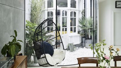
Throughout the house, vintage finds, from a mid-century sideboard to a pair of Czech lounge chairs, offer a relaxed counterpoint to the minimal feel of the glass wall and near-frameless picture windows. Hanging chairs in the dining area and the new bedroom hint at a sense of playfulness.
‘I think we are quite informal in our approach,’ agrees Jessica. ‘I wouldn’t say our interiors are particularly refined, but we’ll always go for the quirky or the one-off over a trend or a label.’

Inspiration came from Japanese architecture. ‘We looked to the work of a specific firm who specialise in art galleries that have incorporated curved walls,’ says Andrew. ‘We realised that a curved glass wall linking to a new extension would wrap around the existing bay – creating a compact courtyard in the process – allowing plenty of room for a galley kitchen and offering a fluid view from the front door to the garden.’
Unsurprisingly, the couple say the new space is the hub of family life, where the kids bake, new puppy Mabel, a Beagle, gets cosy on the underheated resin floor, or where Jessica relaxes with the papers on a Sunday morning. Most importantly, the curved wall has framed the rear of the house in a new and unexpected way. ‘It echoes the shape of the bay while standing apart from it,’ says Jessica. ‘I’m sure not everybody ‘gets’ it when they see it, but it feels pretty joyful to us.’
Four curved, floor-to-ceiling glass panels are the lynchpin of this renovation, creating a path that weaves gracefully towards a brick finished, timber-framed dining area topped by a green roof overflowing with grasses and wild flowers. Within, softening elements, such as textured concrete walls, a poured resin floor and warm wood provide that essential sense of domesticity.

The key was to marry this highly contemporary approach with the features of the existing building and that meant scaling down the concept to a level that felt relaxed and domestic.
A vintage leather chair and a baby grand piano are both family favourites – each contrasted by contemporary elements.

‘I’m a firm believer that just because you haven’t seen something done before, it doesn’t mean that it’s not possible,’ says Andrew, who also incorporated a first-floor bedroom-cum-study and bathroom into the new design. ‘We consulted glass specialists and pushed the limits of what was possible.’

Inset shelving negates the need for freestanding storage in the main bedroom. Lined with a silk multi-coloured fabric from Designers Guild, they add a bold splash to an otherwise serene scheme.
See more: a Georgian Stucco-fronted townhouse that's modern and sleek on the inside
Be The First To Know
The Livingetc newsletter is your shortcut to the now and the next in home design. Subscribe today to receive a stunning free 200-page book of the best homes from around the world.
Specializing in interiors, travel, food, lifestyle and thought pieces, Emma J Page is a UK journalist, editor and commissioning editor. She has a prolific freelance career, writing for publications including Livingetc, Homes & Gardens, The Times Magazine, House & Garden, The World of Interiors, Stella, Architectural Digest, The Telegraph Magazine, Food & Travel and Evening Standard among many others. An influential voice among a number of genres, she regularly writes trends pieces, in-depth profiles, homes stories and interiors news. Her first book, London Shopfronts, in collaboration with photographer Rachael Smith, was published in autumn 2021 by Hoxton Mini Press.
-
 What are the Most Comfortable Pillowcases? From Temperature Regulating to the Best for Your Skin
When you're looking for comfort in your pillowcases, material matters. These are the best you can buy
By Faaizah Shah Published
-
 5 Simple, but Genius Bathroom Layout Tricks That Will Make Your Space Work so Much Harder
Small switches to how you lay out your bathroom that help make the most of a small space
By Luke Arthur Wells Published

