'This is How you do Modern Interiors in 2024' — This Interior Designer's Home Perfectly Balances Contemporary and Cozy
This Vancouver home combines the classic with the contemporary to create a sleek country abode

Interior designer Kelly Keay and her family were all set for a short-term move abroad when their dream property in the equestrian community of Southlands, Vancouver came on the market. Fast forward two years and with the help of expert landscape architect Paul Sangha, the re-designed modern home is a masterclass in how to blend the indoors with the outdoors without losing its sense of homeliness.
Having worked together before, Kelly and Paul were no strangers to merging the interior with the exterior. Together, they have created a home which Kelly describes as having a 'Tom Ford in the Country aesthetic'. She is behind all of the interior design decisions whilst Paul managed the landscaping to make the modern country home a residence with socialising and entertaining at its heart. Cozy fire pits and seating areas scattered around the outside along with a distinctive sunken sofa indoors invite relaxation and togetherness for the family and guests alike.
'We strive to create a fluid connection between indoor and outdoor spaces, inviting your view to stretch beyond the glass,' says Paul who adapted designs as Kelly's house interiors evolved to create the evident harmony which runs from the very centre of the house all the way to the edges of the grounds, including the many sculptures meticulously located across the property.
Year-round Outdoor Living
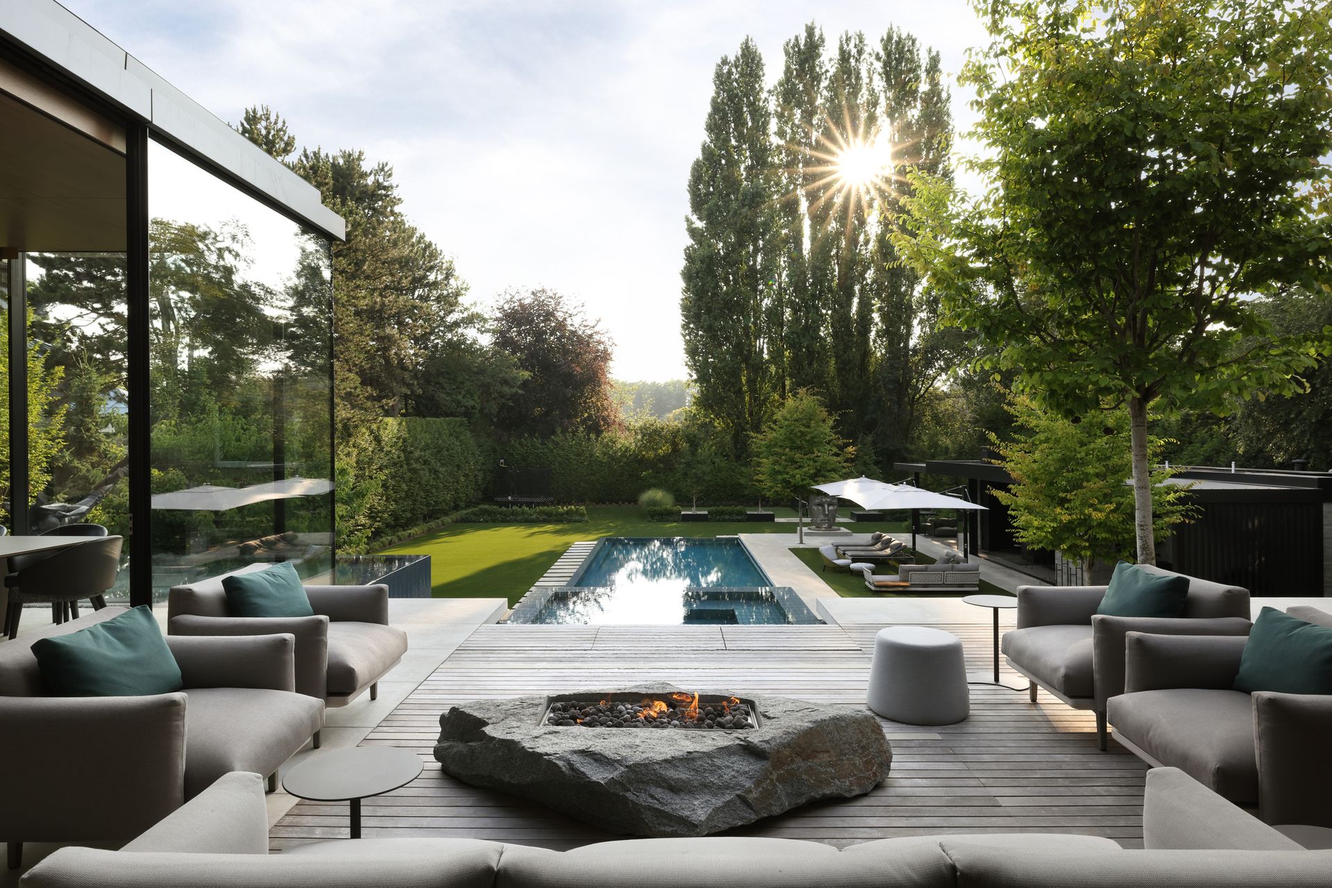
One of the cozy firepits in the property's garden
The property boasts multiple outdoor living areas designed for family get-togethers and hosting friends. In keeping with the indoor outdoor harmony, landscape architect Paul Sangha wanted the outdoor lounging areas to be able to be enjoyed year-round. Particular design features, such as fire pits and awnings were fitted so that the areas can host guests whether gossiping over a bottle of summery rosé or congregating for a Christmas mulled wine.
A poolside seating area is home to a warming fire pit which is set in stone to seamlessly match the house's granite stone exterior. On the upper level, a sprawling set of sofas and chairs acts as an extension of the indoor dining room and living areas. 'Equipped with a fully retractable awning for year-round comfort, this space harmoniously merges the garden with the home environment,' says Paul.
Sunken Living Area
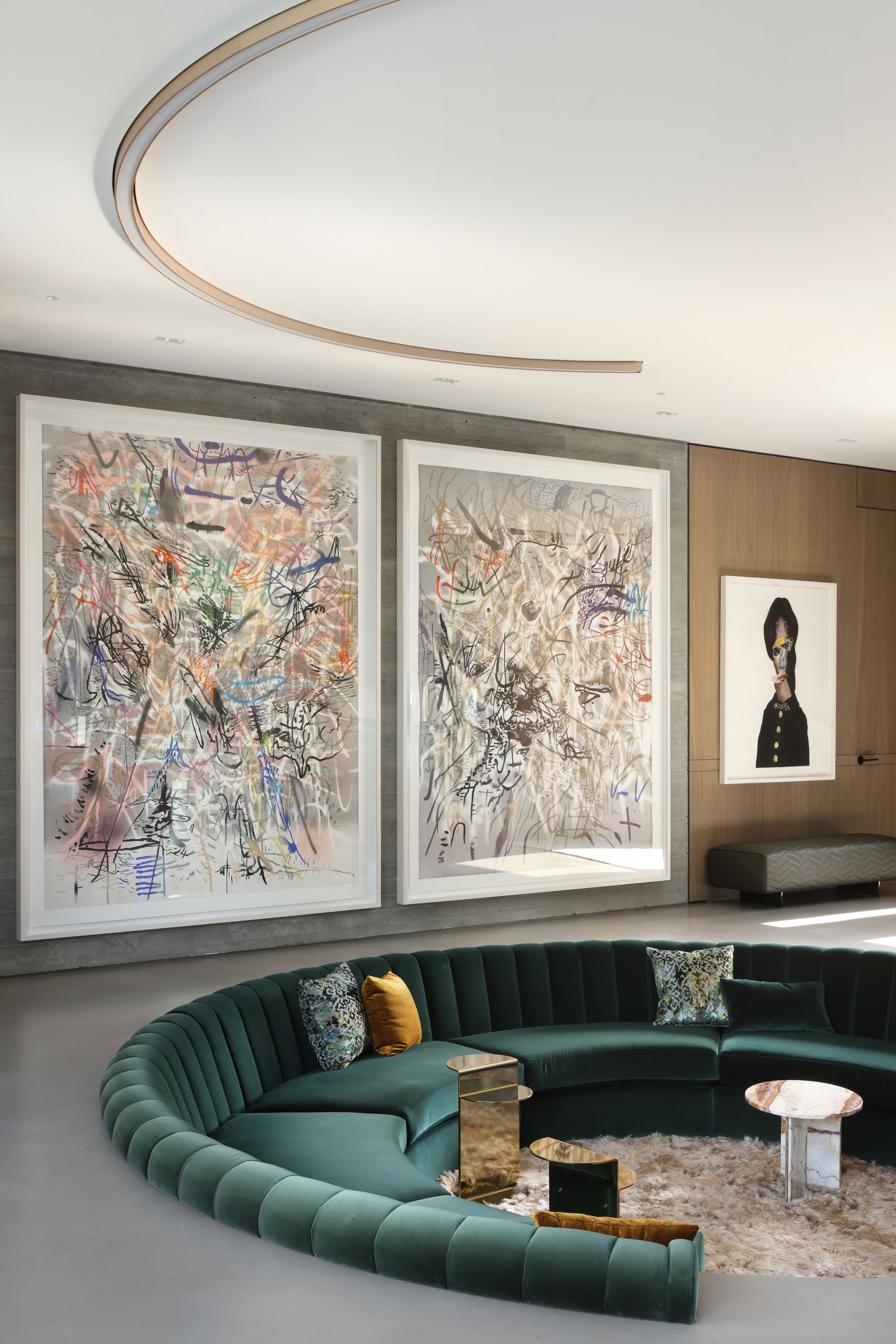
A sunken lounging area is a distinctive feature of the interiors
The impressive sunken living area, reminiscent of 1970s interiors, exudes comfort and acts as a gathering place for the family to enjoy each other's company or host guests before and after dinner parties. The use of a richly colored green velvet fabric oozes luxuriousness which perfectly balances the sleek concrete floors and more striking lighting. By choosing flatter materials for the walls, countertops and flooring such as natural marble and stones and millwork cladding on the walls, the textured furnishings and creative artworks seen across the indoor living areas standout and offer the warmth and charm that the family wanted for the home.
Contrasting Textures in the Kitchen
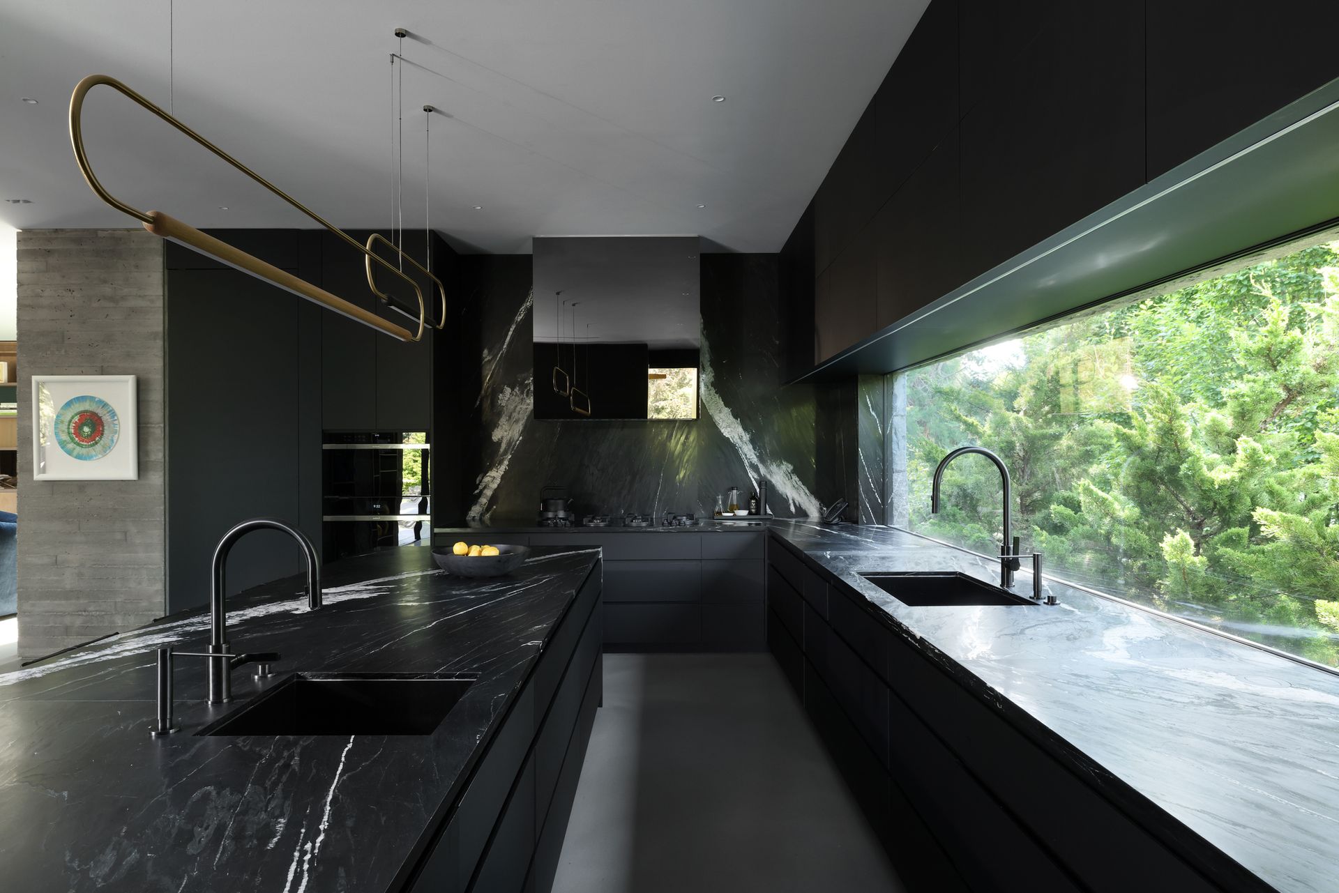
The kitchen uses different textures throughout
The modern kitchen is replete with varying textures and materials but maintains much-needed practicality at its heart. The cabinetry is made from Fenix, a material well-loved for its durability, which gives a matte black finish to contrast the marble countertop. 'The kitchen countertop marble was selected first for its life and body, so I then wanted to emphasize that with having a matte black backdrop to make the countertop pop,' says Kelly. Layering different textures in a room is an easy way of making sure that the room doesn't feel flat. When working with the same color, in this case the black of the kitchen, the change in texture grabs the eye and allows certain features, like the marble countertop, to standout.
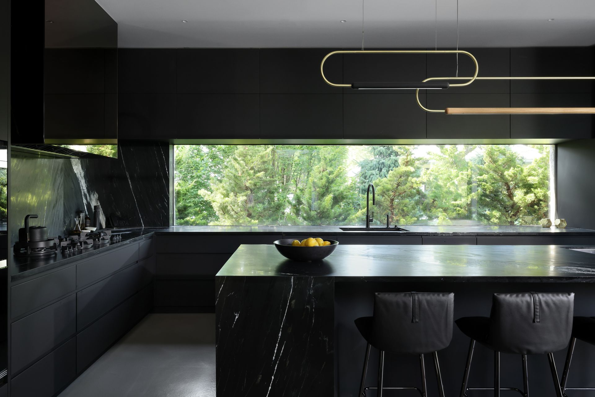
Never straying from the brief of harmony, Kelly chose a bronze cladding for the hood fan to mirror the champagne accents featured throughout the rest of the residence. Establishing some consistency through the use of a color palette is a perfect way of bringing a home together and creating flow throughout the property.
The kitchen was purposefully designed to be open-plan so that the family can host guests with ease in the ample entertaining space. Another benefit of this design, though, is that it allows natural light to flow through the house, brightening up the darker color scheme of the kitchen. The lack of walls helps the lower level of this house look large and airy which perfectly suits their social lifestyle.
The Pool
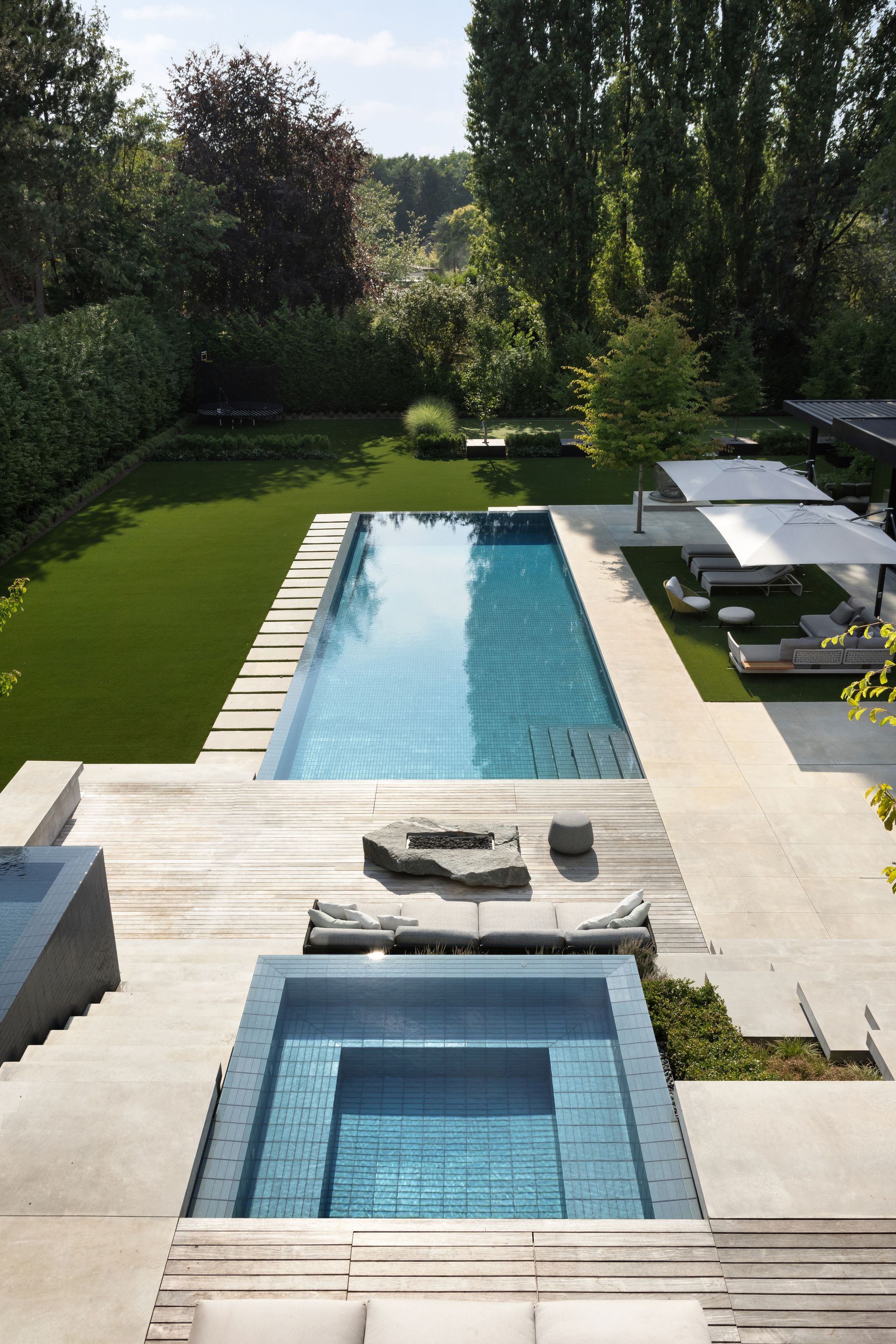
The swimming pools at the modern country home
Much of the design in the residence was inspired by Japanese architecture and the outdoors was no exception. 'We drew inspiration from the Japanese approach of grounding a house within its landscape,' says Paul who meticulously considered different pool designs. The finished product offers plenty of swimming space to be enjoyed whilst still reflecting the broader landscape of the grounds in which the house is set.
The pool is made from uniform glass tiles which give bold color to the water whilst offering a serene ambience reflective of the surroundings. 'This design prioritizes tranquility over ornate details in the pool area,' says Paul. 'The intention is to create a seamless visual flow between the hot tub/spa and the surrounding landscape, establishing a connected feel with the swimming pool'.
Simplistic Exterior Materials
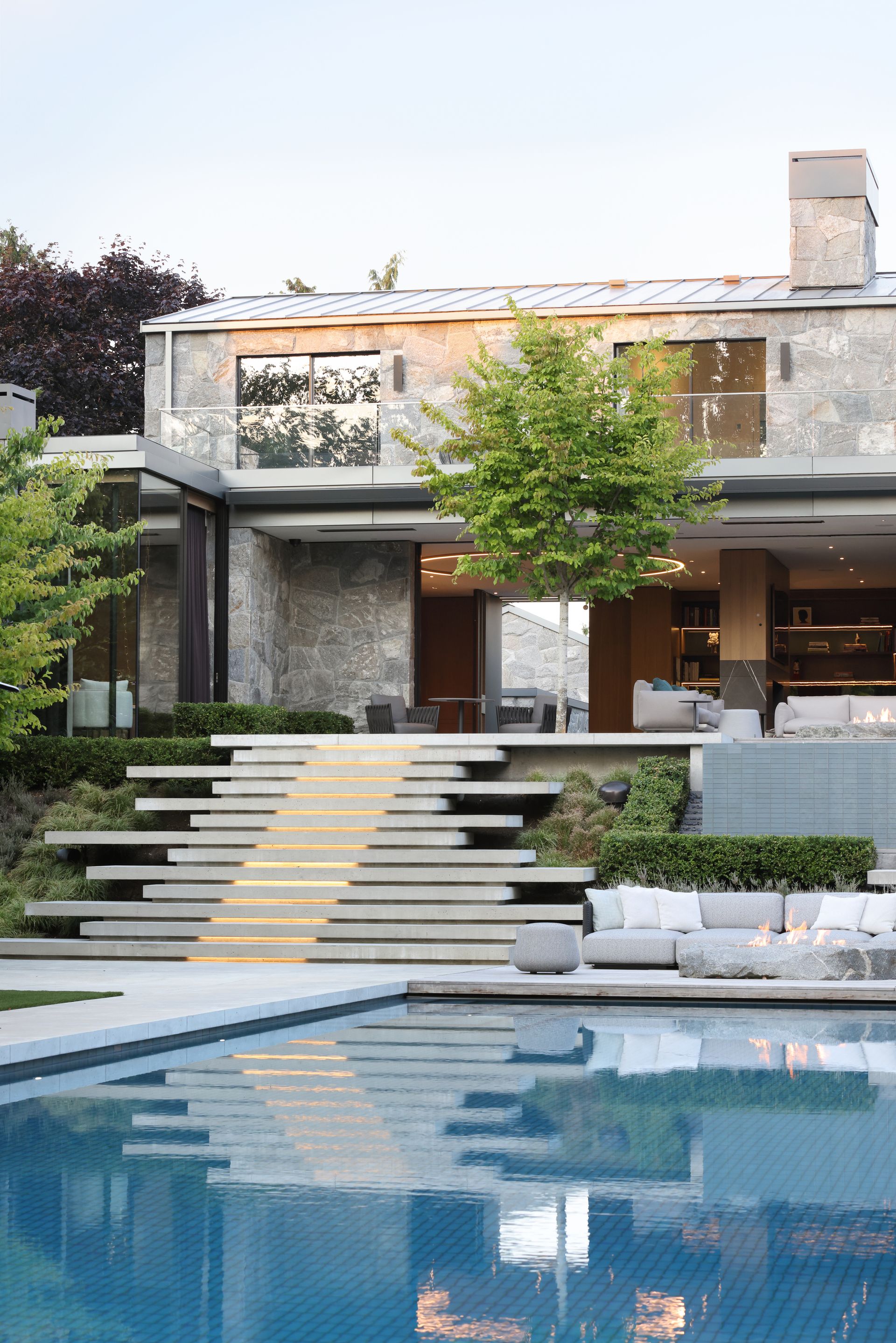
Simplistic materials were used for the exterior
When considering the exterior design for the residence, Paul's focus lay with the idea of keeping it simplistic. A pale split-face granite makes up the outside of the house, interrupted only by extensive glass doors and windows, some of which reach 20 foot high. 'Given that the house was positioned significantly higher than the neighboring ground, ensuring it didn't become an overwhelming base was crucial,' says Paul. The paler colored granite stone works to soften the exterior of the home, allowing it to remain in keeping with the tranquil surroundings.
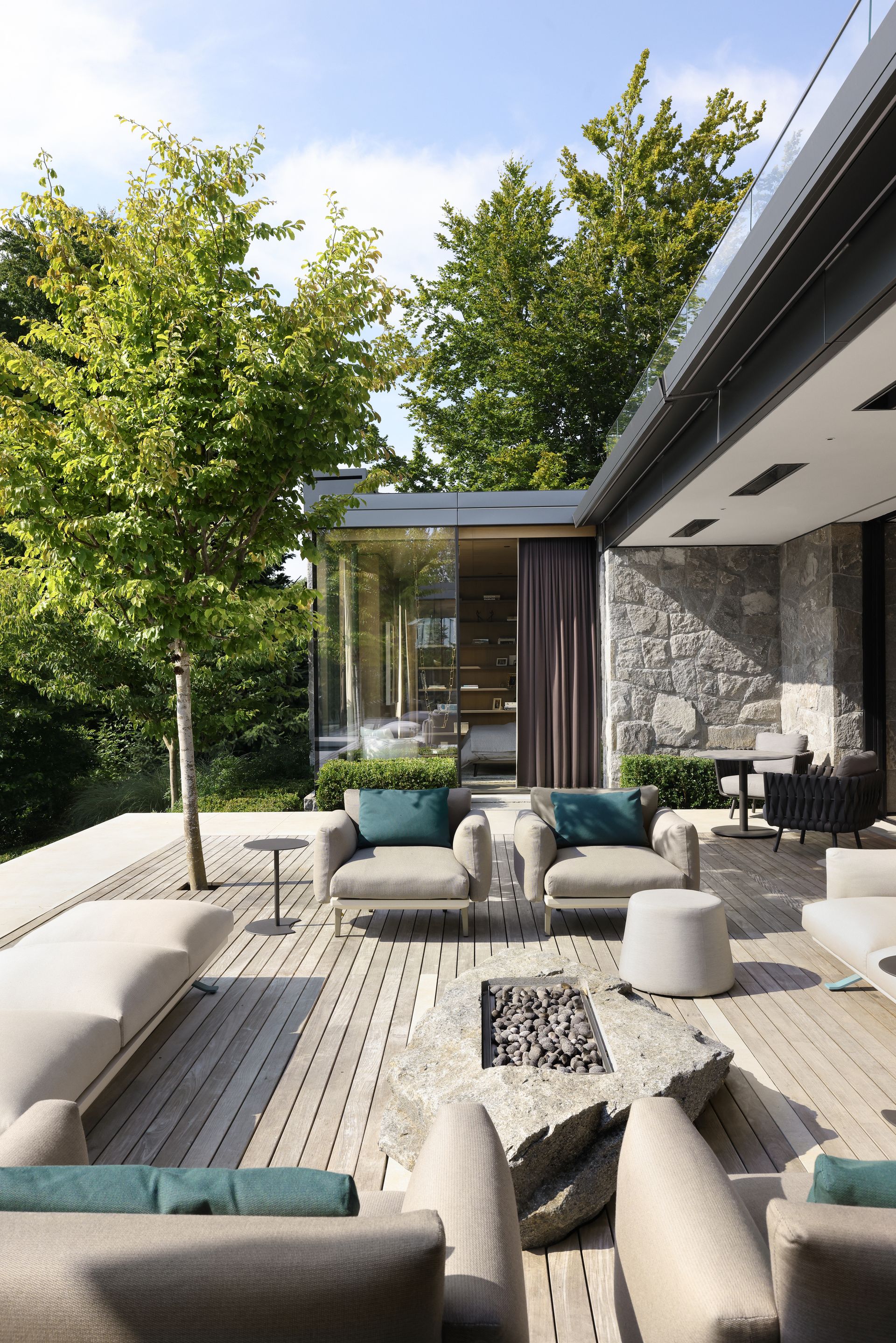
Wooden decking helps to maintain the indoor/outdoor feel
Paul chose a stylish garden decking made from wood to create what he called a 'carpet-like effect' for the outdoor living and dining areas. Much of the exterior flooring and building is concrete or granite which allows the wooden decking to boast a softer feel and adds more warmth to the residence. It flows out well from the open-plan indoor dining area and is the perfect base for the plush and comfortable outdoor furnishings scattered throughout the garden.
Concrete Staircases
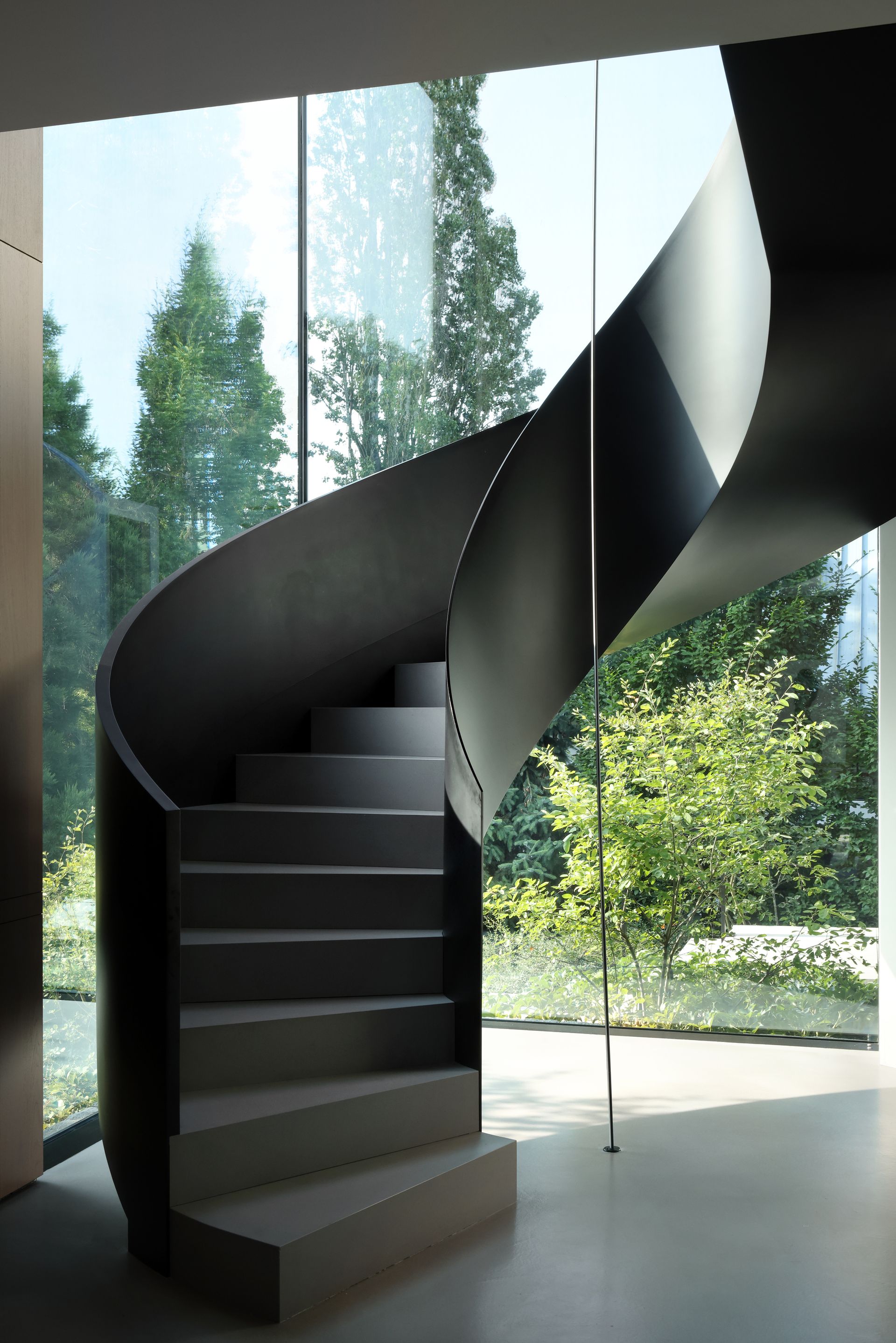
Spiral staircases are a design feature loved by architects for their efficiency and space-saving quality, and these ones were made from poured concrete. 'Stairs made of poured concrete create wide, visually captivating steps that give the impression of floating, seamlessly connecting the house to the landscape,' says Paul. The material choice matches that of the interior floors and adds the modern twist to the house that the owners were looking for. Bringing concrete indoors is another way to blend the interior with the exterior but by adding textured, luxurious furnishings nearby, you can still achieve a soft look and find the balance between the contemporary and the classic.
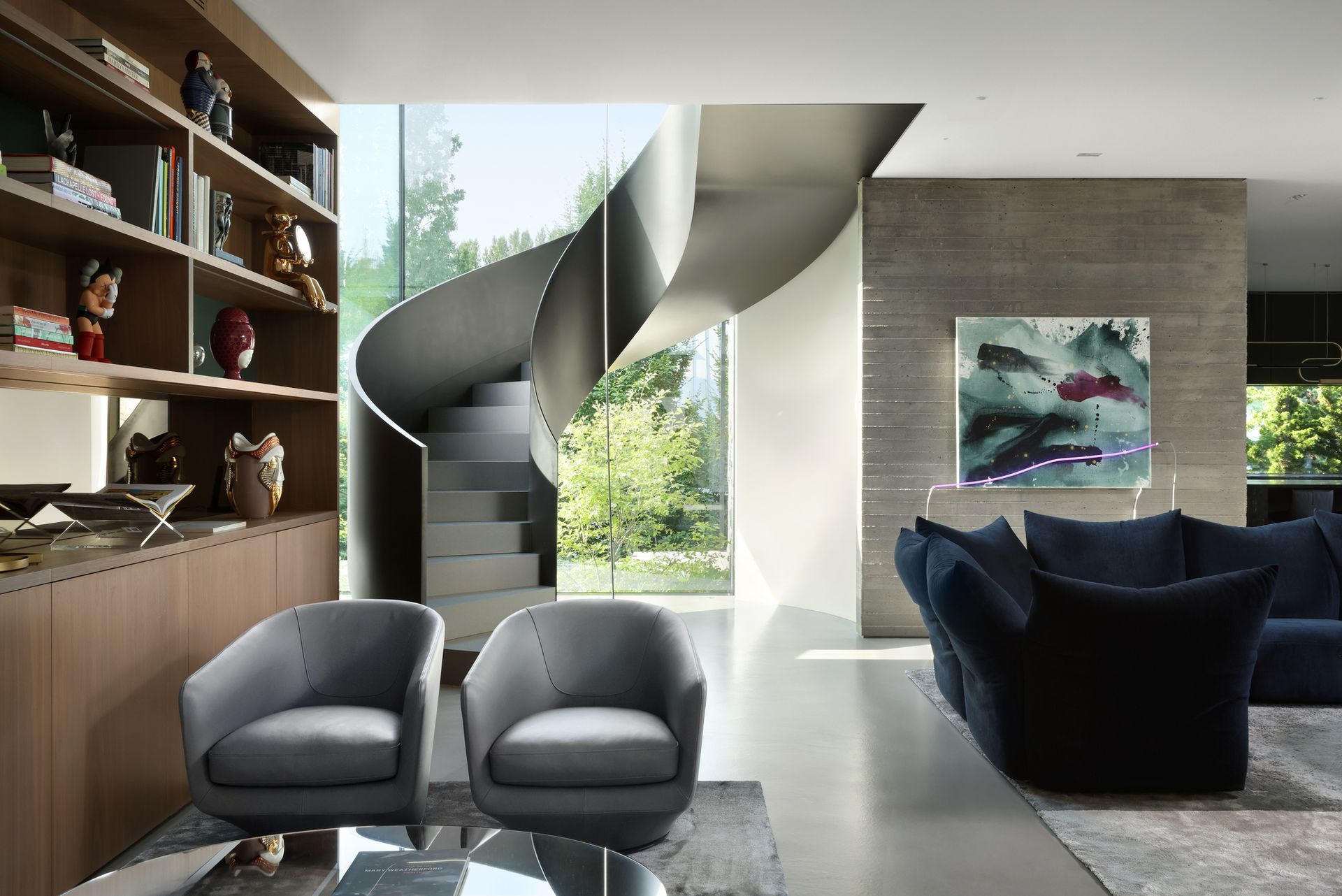
The concrete staircase paired with softer, rich furnishings
The Driveway
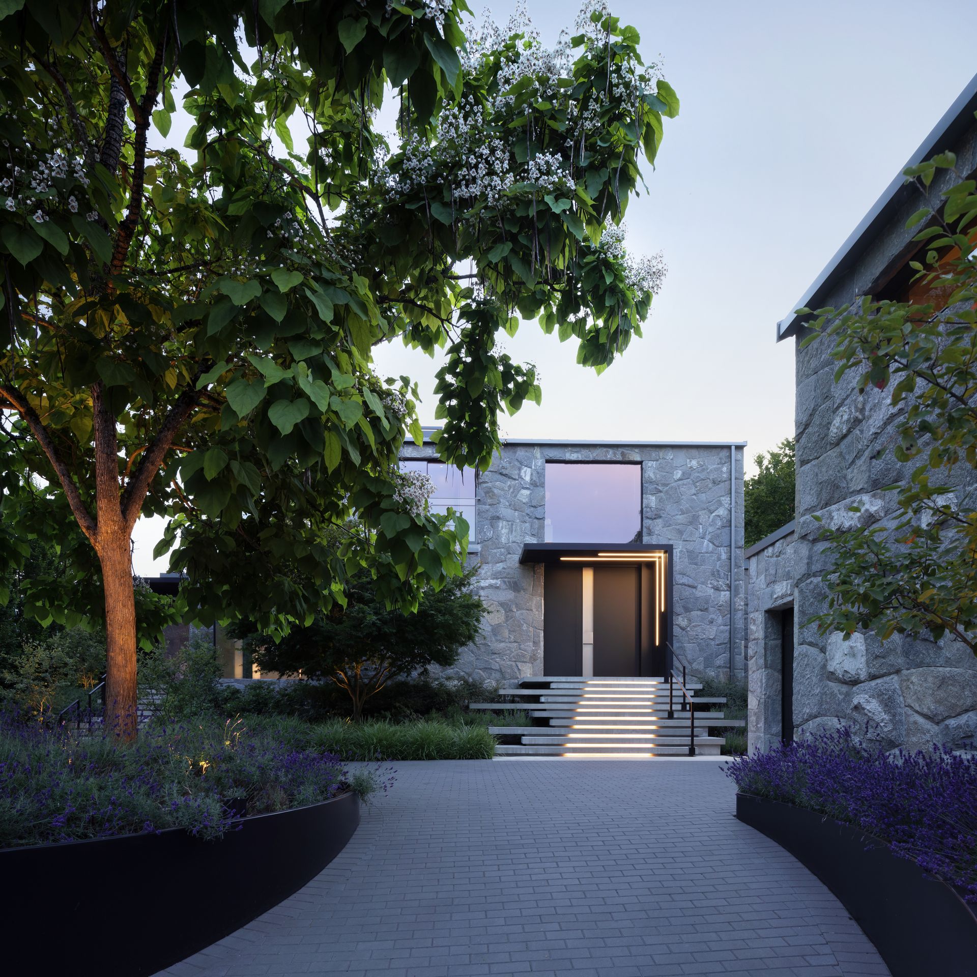
A long entrance leads up the front door of the residence
First impressions count and houses are no exception. A long sweeping driveway leads up to the front yard of the country house and has been designed with meticulous care. Captivating you from the very first second you arrive on the property, the entry arrival court has considered greenery: a Catalpa tree serves as the focal point, offering a strong sense of grandeur on arrival but positioned to still allow a convenient drop-off spot.
'The landscaping frames the house and offers views of the horses alongside the driveway,' says Paul. The front yard was just as considered as the back of the house so that all areas of the residence seamlessly glide into one another and the harmony of indoor/outdoor living is maintained.
The Bedrooms
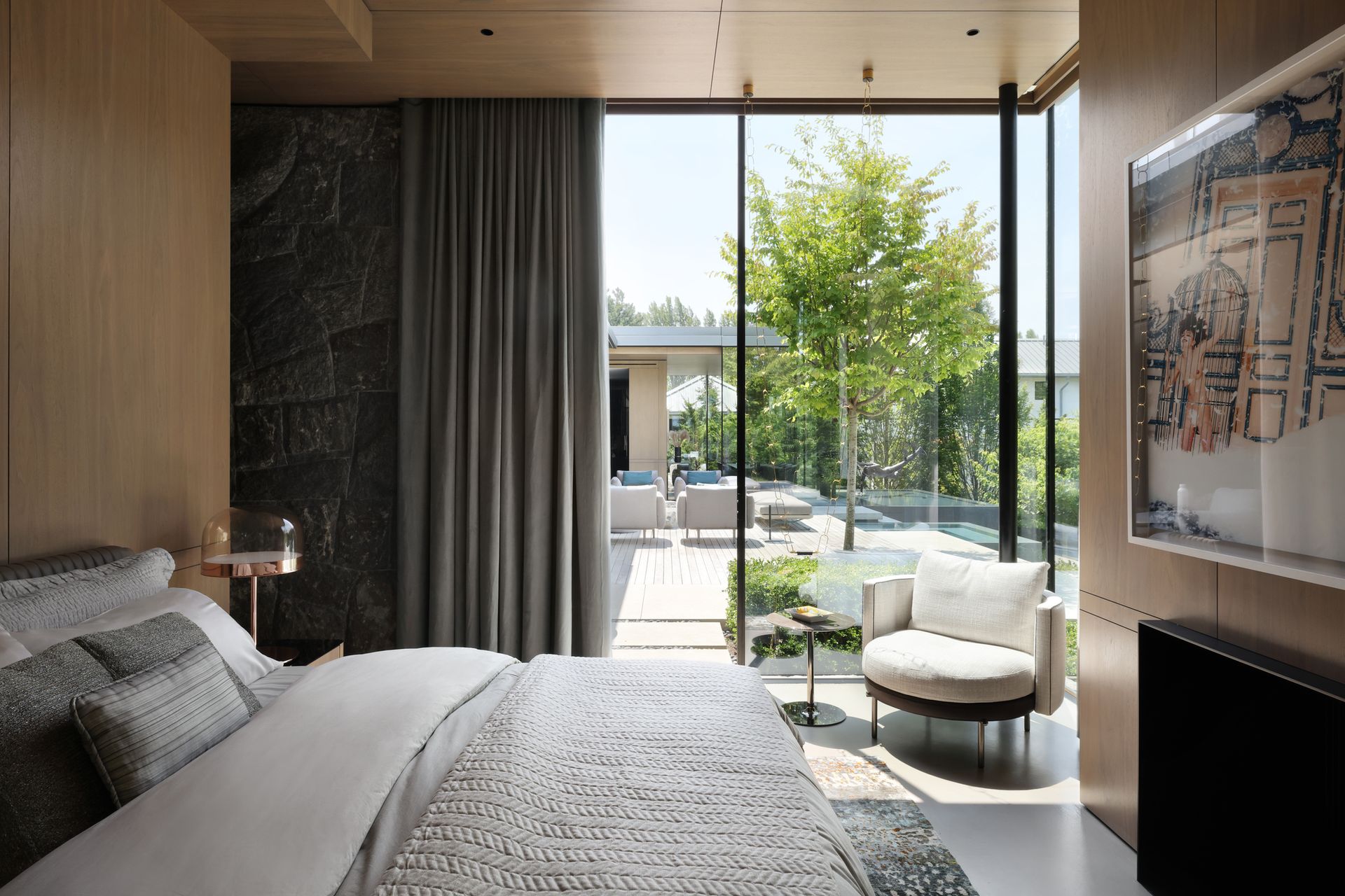
One of the three bedrooms in the property
The modern bedrooms are cool yet cozy, and positioned on the upper level of the house. In keeping with the residence's style, however, they flow out onto the outdoor seating area, separated only by tall floor to ceiling windows. The glass corner window gives the bedroom a light, open and airy feel making it seem larger than it is and giving the sense of the outdoors inside. The soft, pale coloured bed and furnishings along with lighter wood walls balance out the granite stone wall at the entrance to the bedroom giving texture to the room and harmonizing it with the rest of the house.
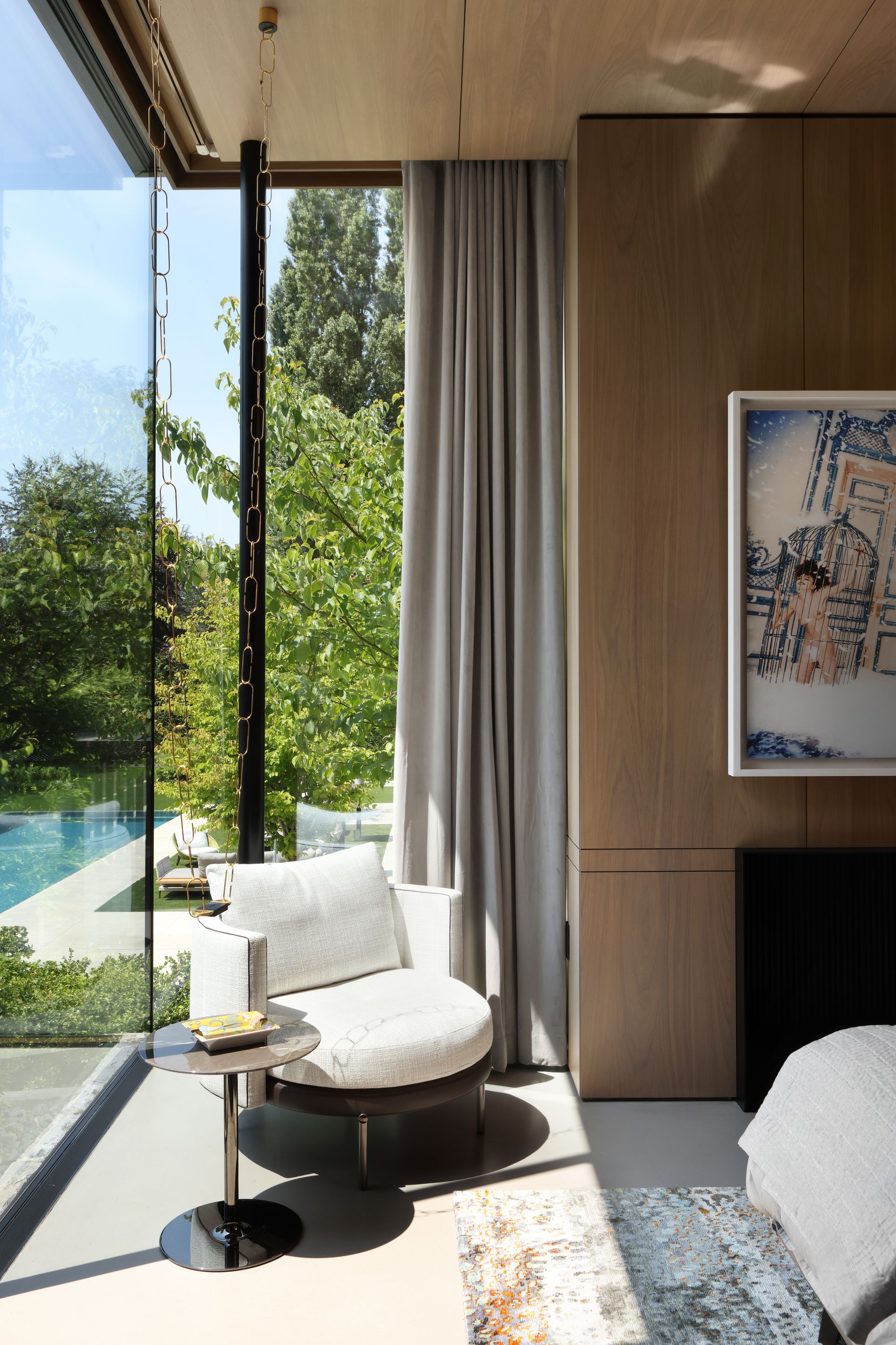
Soft furnishing add a cozy touch to the corner of the bedroom
The Minotti chair which sits in the corner of the room creates the most inviting reading corner to sit back in and relax. The corner windows allow you to take in the surroundings of the property or you could choose to close the floor to ceiling curtains for a more intimate and cozy feel to the area. The vast windows are perfect for blending with the outdoors but by adding the warm coloured curtains, the space can be instantly transformed.
The Gardens
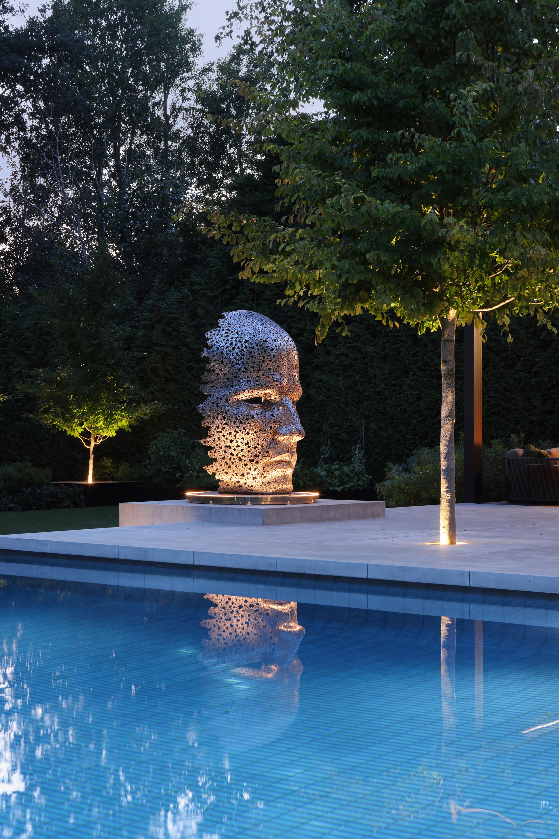
Sculptures are scattered across the grounds
The owners' love and appreciation for art is evident in the pieces and works inside and outside of the house. There is a sculptural garden with carefully chosen pieces placed strategically across the grounds. During the design process, Paul spent time considering the landscape lighting to make sure that the gardens looked just as beautiful as dusk falls as they do in the day. Uplighting was installed by the sculptures to showcase them at night. Kelly's husband has what Sangha calls 'an exquisite appreciation for sculpture and art' which meant that the placement of his pieces was a primary consideration in the design process.
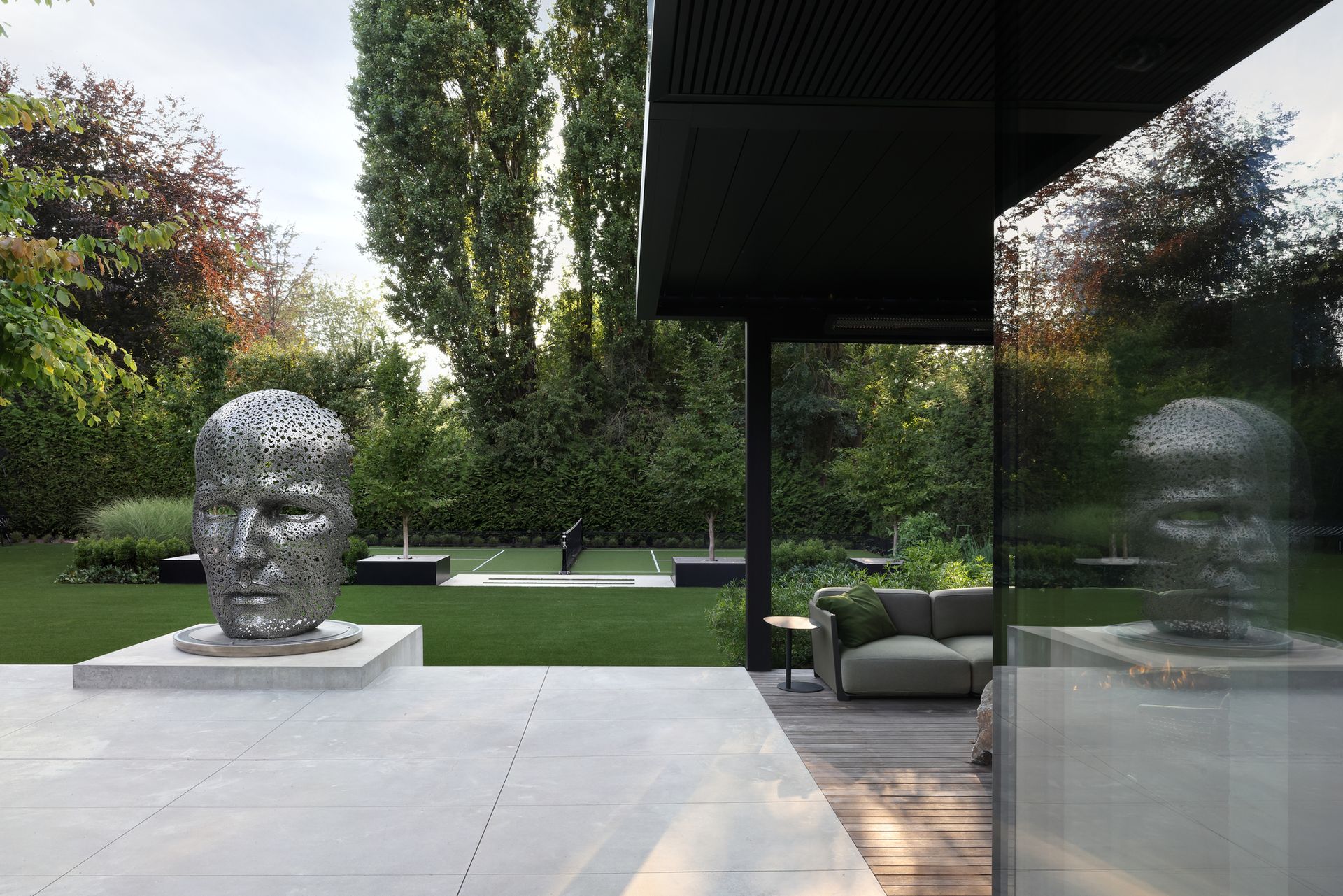
A pickleball court sits behind the poolhouse
For the active family, space for the children to pursue their sporting passions was crucial and resulted in a pickleball court which blends into the wider landscape. The surface is all-weather meaning that the family can use the court come rain or shine whilst it also doubles-up as a space for entertaining. An adaptable surface was chosen which means the space can transform for all sorts of events. Paul designed the court specifically to sit in line with the pool house allowing easy access to this lounging space when hosting events on the court or watching the children play. As for the rest of the pool surroundings, open lawn areas offer 'the opportunity to relish the vast landscape surroundings'
Be The First To Know
The Livingetc newsletter is your shortcut to the now and the next in home design. Subscribe today to receive a stunning free 200-page book of the best homes from around the world.

Imogen is a freelance writer and student on the Magazine Journalism master's degree at City, University of London following her Modern Languages degree at The University of Exeter. She has written for lifestyle and popular culture magazines as well as wellness and sports magazines. She has a long-standing interest in interior design and London architecture and is a firm believer in the power of bold wallpaper.
-
 How to Organize your Bathroom for a Better Morning Routine — 6 Steps for a Seamless Start to the Day
The ease of your morning routine can have a huge influence over the rest of the day, so make sure you optimize you space for a stress-free start to the day
By Lilith Hudson Published
-
 5 Trees You Should Prune in Your Backyard in February — 'It Makes Much Sense to Cut These Ones Back Now'
If you think pruning trees is best left to spring, think again. These trees all could use some cutting back now for several very important reasons
By Hugh Metcalf Published
