Architects love this new living room trend that makes the space way more social, comfy and cozy
Architects are embracing a new trend for living room design which is turning the space into a haven of hospitality and comfort
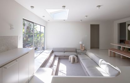
For those with their ear to the ground, you’ve surely heard the chatter about conversational seating – layouts that bring us closer, if not face to face, are all the rage as we distance ourselves from the Zoom era. But there may be no architectural feature more on the nose than the conversation pit.
Otherwise known as sunken living rooms, conversation pits were a hallmark of mid-century modern interiors in the United States when entertaining at home was at an all-time high. Often located within a living room, they were built below the floor, a few steps down, and lined with built-in seating. Today’s architects and designers embrace the feature for many of the same reasons conversation pits were popular in the first place: as an interior design trend they bring a cozy dynamic with surprising dimensions.
‘There are so many benefits to a sunken living room; from denoting space with an elevation change, to the feeling of increased spatial volume, to a more intimate sense of lounging… none of which can be achieved from furnishings alone,’ says Kristin Korven, co-founder of Los Angeles’ Part Office.
Eliminating furniture, in fact, is one of the conversation pit’s primary perks, creating a space free of table legs and clutter, particularly in rooms with outdoor views easily blocked by a clunky couch. But at the end of the day, the sunken living room trend creates a place to sink in and relax.
‘I think it has to do with the more general trend of cocooning, the conversation pit is the ultimate place to hang out with your family,’ says interior designer Joanna Lavén, co-founder of Stockholm’s Studio Lawahl. ‘It is cozy, comfortable and good looking.’
As an architectural feature, it remains the ultimate conversation piece – here are a few tips that will hit the spot.
1. Be wary of size
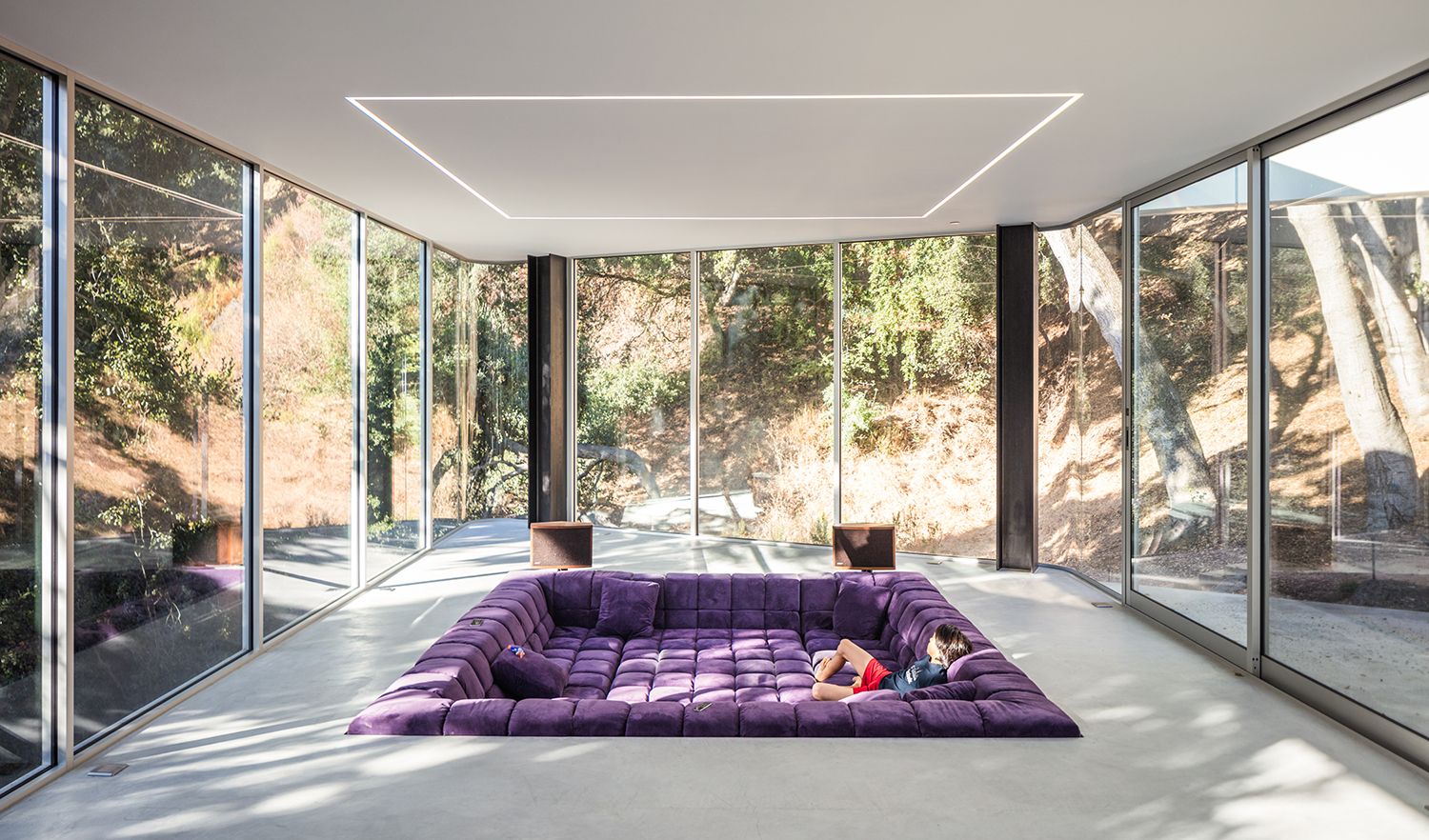
San Francisco architect Craig Steely dreamed up this perfectly padded pit in order to demarcate space in a voluminous room without obstructing outdoor views. He’s careful to note, however, that sunken rooms aren’t a perfect fit for every interior – they make the most sense when there’s room to spare, both within and around the pit.
‘Make sure your conversation pit is big enough,’ says Steely. ‘At least 12’x12’.’ There should be enough leg room to get that lounge effect, or to place a central coffee table which you can still walk around.
2. Double up the seating
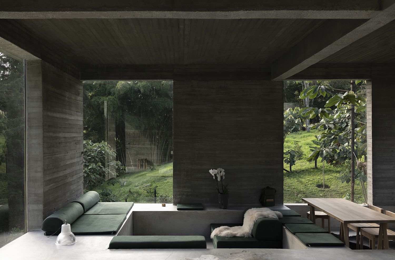
In this edgy design, LCLA office took the conversation pit to the next level; unlike the traditional living room layout, the pit’s border acts as an extra layer of seating thanks to thin cushions atop concrete slabs.
‘Using different levels for seating can also make the space contract and expand in section, therefore the flat roof works very well,’ says architect Luis Callejas, noting how the space – with two layers of seating – feels taller even with a standard room height, a common perk of conversation pits.
3. Create a flow between open plan spaces
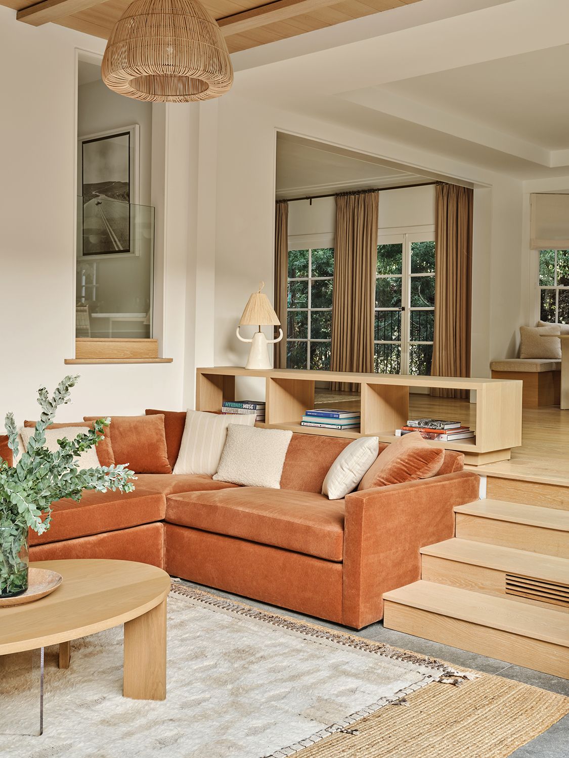
‘A sunken space is a great touch that can add a lot of joy to your home so whether you’re considering a cozy sunken nook, or living room, or seating area it’s essential to keep the design light and fluid,’ says Los Angeles interior designer Jaqui Seerman.
While decor and finishes can do wonders to lift a space – like the warm woods and woven rugs used here – applying this ‘step-down’ concept to transitional spaces that might otherwise be separated with a wall (like from an open plan kitchen to a living room) can help create a seamless, dynamic flow as you pivot from one space to another.
4. Add curves to the sunken area
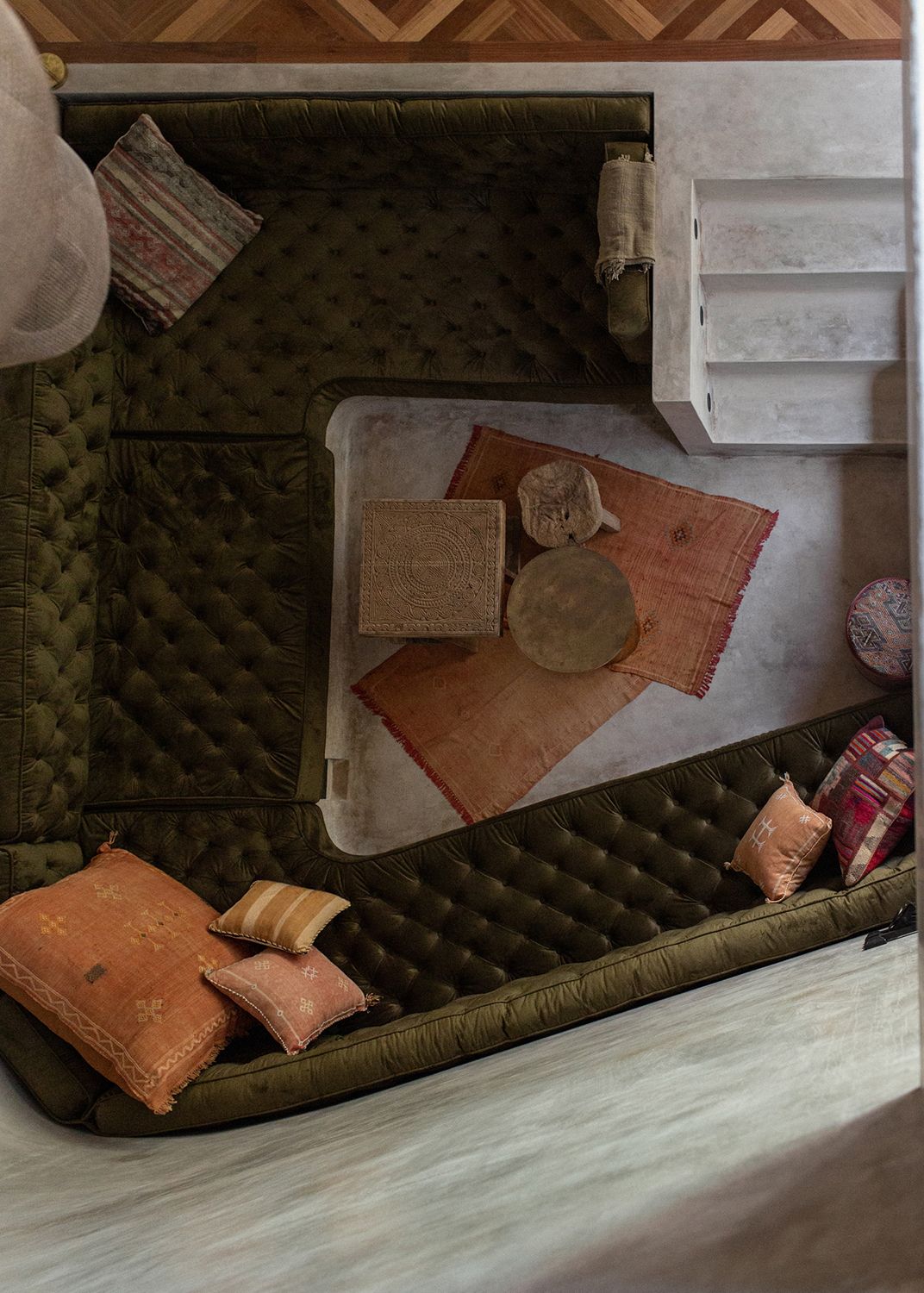
While the textbook layout for a sunken space is one of right angles, don’t be afraid to think outside the box, creating curves or non-traditional shapes. Overlooking a yard and pool, a sunken seating area includes a rounded corner within the pit, creating a space that truly hugs as you sit on the velvet chesterfield cushions.
Switching up the traditional shape also gave designers more flexibility to play with the pit's proportions – especially in the curved corner, where the cushioned seat is extra deep for even more legroom.
5. Go higher than floor level
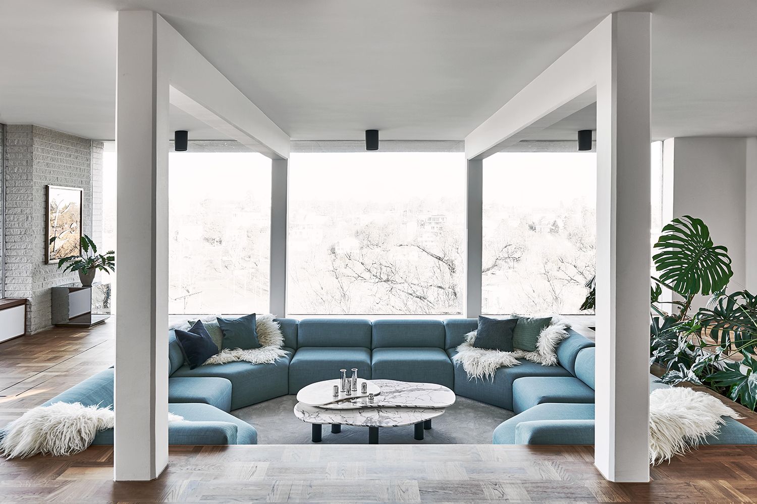
Doubling down on comfort, conversation pits are often outfitted with built-in, deep-seated cushions. But when constructing the space, consider a couch that really pads the perimeter.
‘I think that it is nice to have the sofa a bit higher than the floor level, that way you don’t get any sharp edges when you lean back on the couch and it also looks very inviting,’ says interior designer Joanna Lavén, who lined her design with a plump blue sofa that softens the pit’s otherwise harsh angles.
6. Arrange for low sightlines
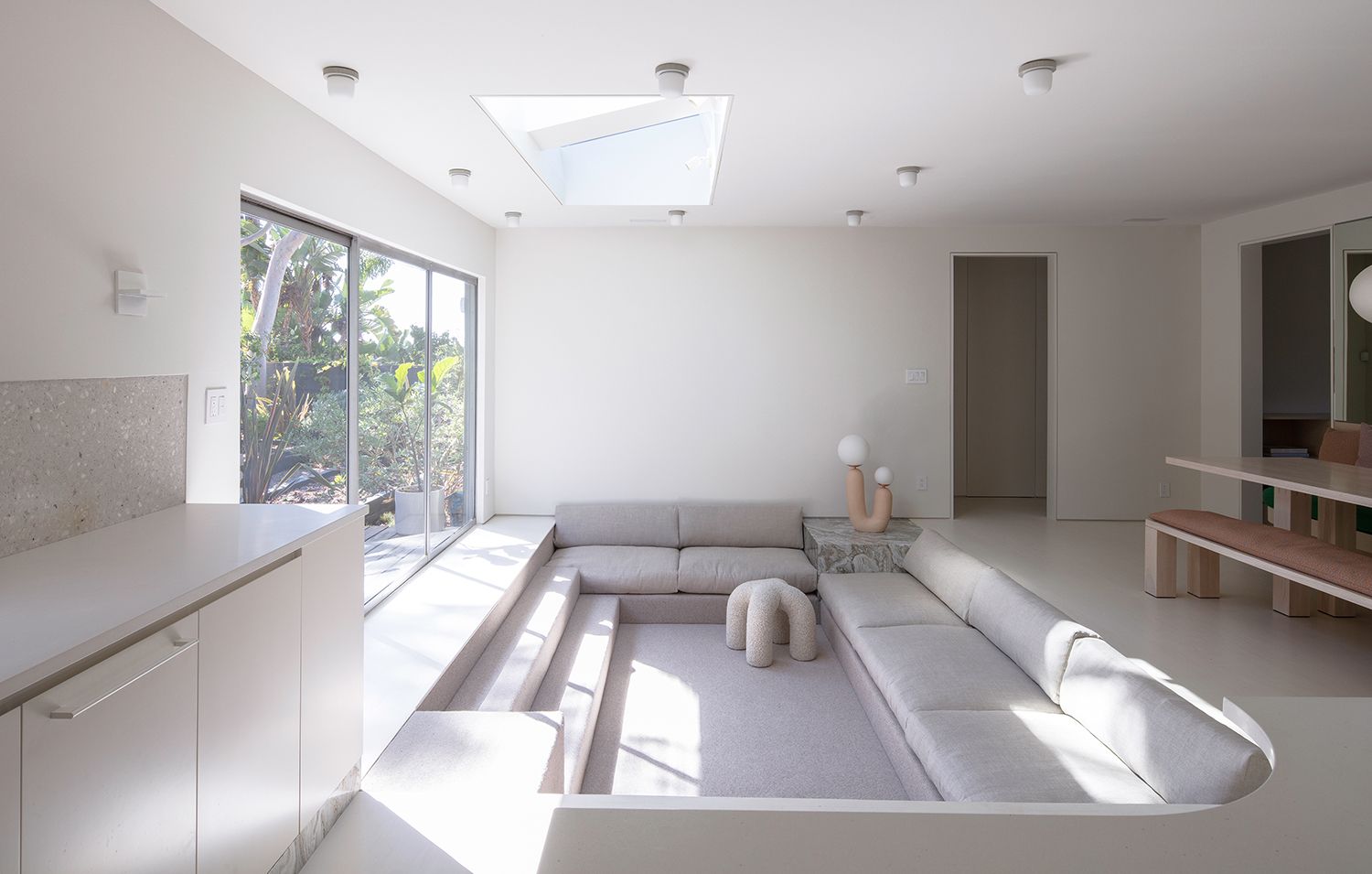
Design by Part Office
When you sit in a sunken space, you see a room from a different floor-level vantage – think through every detail in this direct line of vision. ‘We made sure there were a lot of special details at eye level, like the stone toe kick in the modern kitchen, so when you're sitting in the pit, adjacent to the kitchen, you aren't staring at dusty baseboards,’ says designer Kristin Korven of this monotone scheme.
Architectural details to keep in mind (or out of sight) include wall outlets, vents, and other utilities, while things worth highlighting are items like table legs, mouldings, and objet d'art on the bottom shelves of bookcases.
Be The First To Know
The Livingetc newsletter is your shortcut to the now and the next in home design. Subscribe today to receive a stunning free 200-page book of the best homes from around the world.
Keith Flanagan is a New York based journalist specialising in design, food and travel. He has been an editor at Time Out New York, and has written for such publications as Architectural Digest, Conde Nast Traveller, Food 52 and USA Today. He regularly contributes to Livingetc, reporting on design trends and offering insight from the biggest names in the US. His intelligent approach to interiors also sees him as an expert in explaining the different disciplines in design.
-
 These 12 Best Table Lamps for Your Desk — Perfect Glows for a Creative Home Office
The best table lamps for your desk is have a soft, targeted glow. Elevate your WFH set-up with these stylish picks endorsed by Style Editor Brigid Kennedy
By Brigid Kennedy Published
-
 The Nespresso VertuoPlus is 30% Off for President's Day, and it's Kim Kardashian's Coffee Maker of Choice
This sleek and stylish coffee maker was spotted in Kim's home bar, and you can currently save $60 if you buy yours from Amazon
By Lilith Hudson Published
