Explore this open-plan Barcelona apartment that's a Scandi-inspired urban oasis
This ultra-bright open-plan Barcelona apartment is full of inspiring industrial-luxe ideas


THE PROPERTY
A first-floor open-plan Barcelona apartment in a 19th-century mansion block in the centre of the city. There’s an open-plan living space with a modern kitchen, dining area, living area and study, which is set in an internal glazed room. The rest of the flat is divided into four bedrooms, five bathrooms and a laundry. Two terraces look on to the communal garden at the back of the building.
See more beautiful modern homes for ultimate home decor inspiration
LIVING AREA
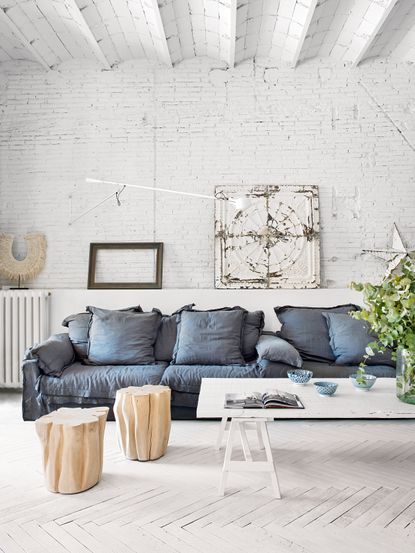
Located on the first floor of a turn-of-the-century building, the open-plan space strikes that requisite contemporary but convivial balance. Sofas are low and slouchy and there’s a long, rustic table for family meals. A cosy reading nook is framed by pillars recalling the building’s 19th-century roots.
In many ways the apartment is the exact opposite of the traditional Spanish aesthetic, which tends towards moody colours and heavy textures. This interior is a fusion of influences – Scandinavian, industrial, bohemian – absorbed from all over the world.
The living space has been painstakingly transformed from two separate pokey apartments full of small, dark rooms with damask wallpaper, wood beams and chandeliers – typically bourgeois Spanish – to light and airy oasis.
The interior designer, Marta Castellano, worked closely with local architects Enric Serrat and Albert Tort to unite the two flats. Out went the light-guzzling partition walls; granite pillars and beams were painted white; and the worn and stained parquet flooring ripped up, painstakingly renovated then painted. Now light pours into the 300sq m of space.

This flat has minimal possessions, and is all about space, luminosity and tranquility rather than objects.The less is more aesthetic stretches to every detail –the large white panel, for example, is a period roof tile discoveredin an antiques market in Girona.
Throughout the apartment, the original oak parquet floor was painted white to enhance the low-key mood.
The space is designed so that all the key living areas lead to the terraces at the back of the flat – it adds to that easy living feel.
There is no technology on show in the apartment. So, instead of a TV, a projector and pull-down screen is tucked above the study.

The space is a mix of vintage finds; apleasingly scruffy armchair is Belgian; the linen-clad designer sofa is Dutch; a vintage roof tile became an artwork
READING PLATFORM
The reading platform and black window frames work together to help to break up the space.

KITCHEN
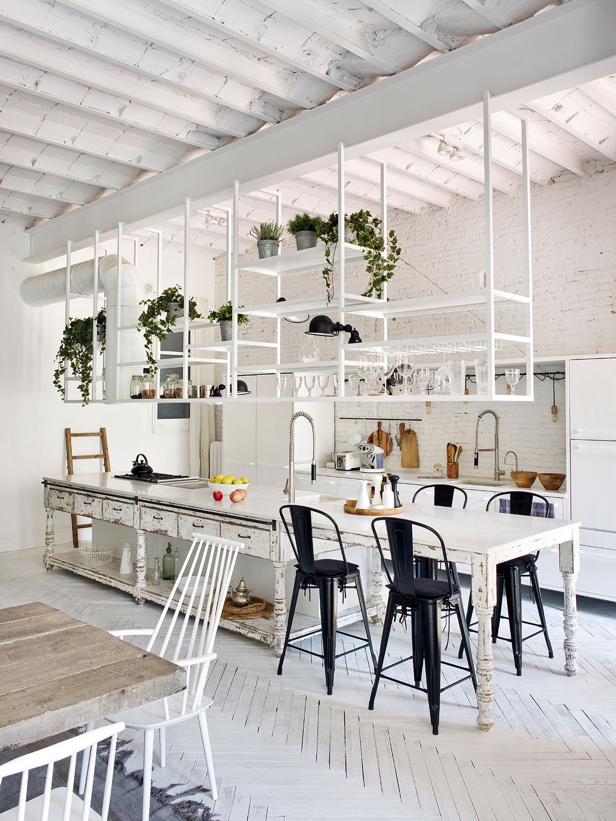
Industrial meets vintage meets modern in this bright and airy open-plan kitchen.
The painted floors create a flow from one space to another. The rustic-looking island was inspired by an antique table, while the metal kitchen cabinetry took its cue from a Danish kitchen.

See Also: Scandi-style kitchen ideas
DINING AREA
With the original stone fireplace making an impressive central feature and the new glazed study to its rear, this airily spacious zone is the hub of the apartment.
The bamboo statement dining room lights above the table (itself made from recycled floorboards) are clad in gauzy drapery, highlighting the height and lofty proportions.

TERRACE
Here, plaster was scraped off to reveal the original 19th-century brickand period-style shutters were installed to create an outdoor room perfect for summer entertaining.

MASTER BEDROOM
Sparsely furnished, but not remotely Spartan, this chic, airy space includes a vast dais to raise the bed, industrial-style rafters in the ceiling and an impressive tiled bedhead/divider that conceals the bathroom beyond.
The ceiling in the master bedroom soars up to four metres high. A pair of matching walk-in wardrobes on either side of the bed help to break up the space. Instead of doors, linen curtains were used for a softer feel. The four-poster was inspired by a Balinese design; a tiled room divider conceals the shower and basin behind.

The wooden stool helps add some warmth and texture to the white space.
A bathfits in perfectly within the large arched window.

MASTER ENSUITE
Throughout the apartment, details such as these hanging Australian light fittings are minimal, so that nothing detracts from the feel that you’ve stepped into a peaceful urban oasis.

See more of Marta’s interior design work at martacastellano.com.
Photography ⁄ Montse Garriga Grau
See Also: Cool, Scandi Kids Room Designs To Suit Modern, Minimalist Homes
Be The First To Know
The Livingetc newsletter is your shortcut to the now and the next in home design. Subscribe today to receive a stunning free 200-page book of the best homes from around the world.
The homes media brand for early adopters, Livingetc shines a spotlight on the now and the next in design, obsessively covering interior trends, color advice, stylish homeware and modern homes. Celebrating the intersection between fashion and interiors. it's the brand that makes and breaks trends and it draws on its network on leading international luminaries to bring you the very best insight and ideas.
-
 These 12 Best Table Lamps for Your Desk — Perfect Glows for a Creative Home Office
The best table lamps for your desk is have a soft, targeted glow. Elevate your WFH set-up with these stylish picks endorsed by Style Editor Brigid Kennedy
By Brigid Kennedy Published
-
 The Nespresso VertuoPlus is 30% Off for President's Day, and it's Kim Kardashian's Coffee Maker of Choice
This sleek and stylish coffee maker was spotted in Kim's home bar, and you can currently save $60 if you buy yours from Amazon
By Lilith Hudson Published

