Embracing its lack of natural light, this designer enhanced a small, dark home with a moody color scheme
Faced with a property that's heavily shaded with trees, interior designer Chloé Mason Gray leaned in to create atmospheric, unapologetic spaces in this Mexican home
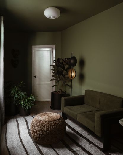

When faced with compact rooms with low natural light levels, it can be tempting to paint everything white and hope for the best. Yet, in this home in Mexico City, interior designer Chloé Mason Gray embraced the property's natural qualities with a dark, moody color scheme.
'In general, making the home feel bigger wasn't a major focus of the design,' Chloé tells us. 'It wasn't something the client was particularly worried about, either. We were more focused on making the space functional and beautiful, getting rid of all the outdated finishings, and finding pieces that fit the quirky layout of the space.'
The result is a modern home that feels rich, textured and cocooning. 'It is a place where playfulness and restraint in design happily coexist, and a source of relaxation and inner peace for the inhabitant,' Chloé explains.
Beyond the atmospheric design, it's a home with remarkable features, too. Built in the 40s/50s, the home is located in Mexico City's Condesa neighborhood, known for its Art Deco architecture. With simplified, yet intriguing Art Deco features at its heart and unusually shaped rooms, it's a house that has an undeniable charm. Here are some of our favorite spaces.

Chloé is an interior designer running her studio between New York and Mexico City, where she works with a diverse team of designers, artists, fabricators and more. Here, we tour one of her latest projects in Mexico, as she explains her thought process and highlights the home's hero pieces.
Library
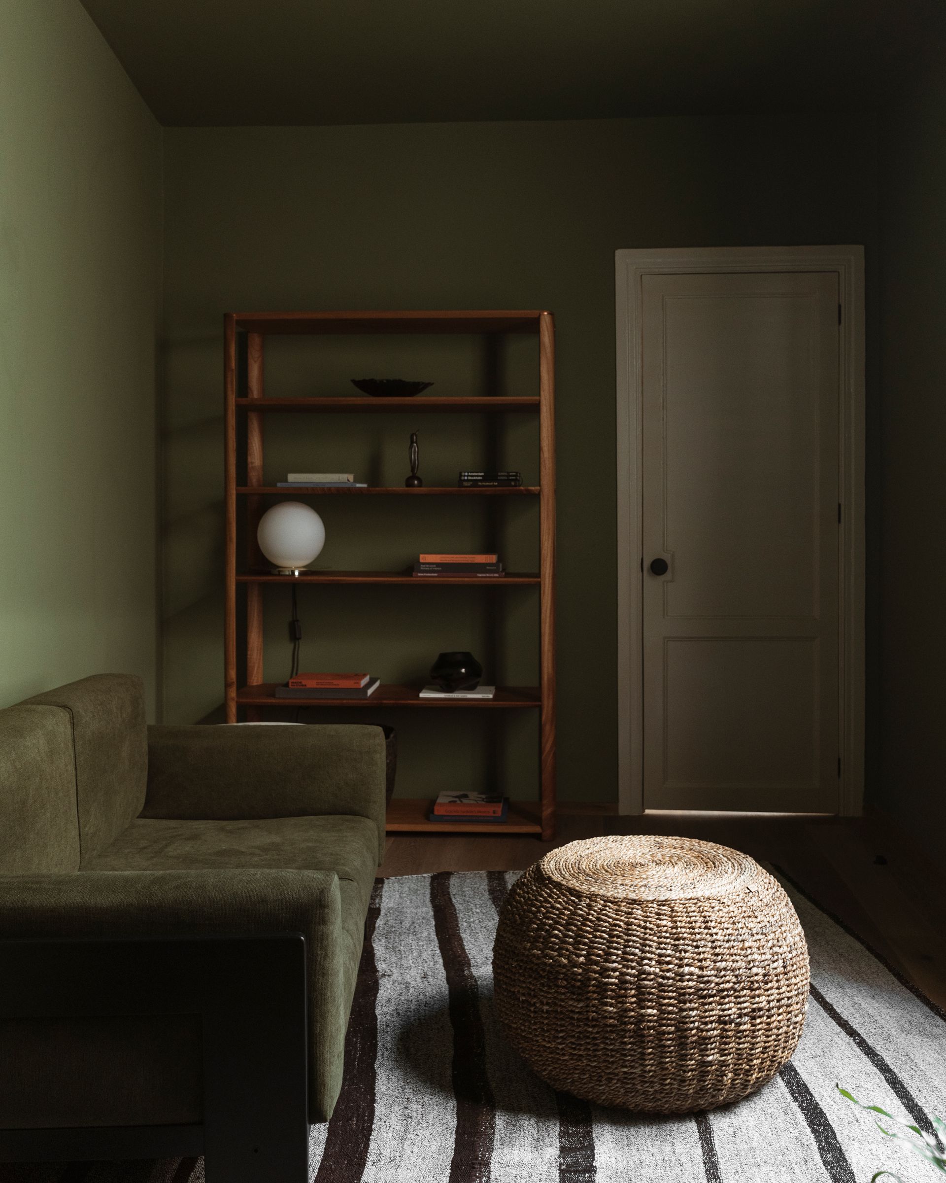
Undoubtedly, what you'll notice first about this rich green living room turned library is the envelope of color — and this is not by accident. The green not only helps to install the 'sensual, rich, and cozy' mood Chloé envisaged for this dim room, shaded by the beautiful trees that line the avenue, but it also helps to moderate the room's quirky angles, where a contrast painted ceiling would accent it. 'It’s a very oddly-shaped house. I don’t think there is a single straight wall in the whole house,' Chloé tells us. 'Every wall and room is at an angle, so at times positioning furniture and art in a way that felt natural and correct was challenging.'
To complement the color palette, Chloé choose a wooden furniture that would be considered unusual in this part of the world. 'I think red cedar pairs beautifully with the green tones in the house,' says Chloé. 'In Mexican spaces you tend to see a lot of either very pale wood, tzalam, or walnut, and I liked the idea of using a medium red-toned wood instead.'
Dining room

In the less darker spaces, lighter colors have been used for the walls. For the dining room, in place of paint an off-white plaster finish creates a textured canvas for the furniture, which is simple, yet elevated.
A modern metallic pendant light, the KTribe Suspension 3 by Flos, brings a modern contrast to the rustic backdrop, suspended over an oval dining table, which helps this small dining room retain a sense of spaciousness. 'The interior designer found an incredible quartzite slab for the custom dining table at the stone yard,' Chloé says. 'It has a mix of greens with a little bit of brown and blue. It ties in the colors of the house really nicely, and since it’s quartzite nobody has to worry about it staining— it’s extra durable, which makes it great for entertaining.'
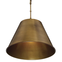
Alden pendant, $224, Lumens
Lumen's may stock Flos' KTribe Suspension Light, but at nearly $1,000 dollars, it's a choice for those with deeper pockets. This warm brass pendant offers a similar shape, for less.
Living room

Beyond the dining room, a small living room embraces the textured plaster finish, too — once again, by using the same finish on the walls and ceilings, the space feels intimate, while also downplaying its compact dimensions.
A low-slung Nube sofa and ottoman by Siete Studio creates a casual elegance in the room, while the Bellhop floor lamp by Flos creates a dramatic lighting scheme during the evenings, paired with a copper hanging lamp by KyoSag. The coffee table, which is upcycled, was found on Trouva.

Of course, you can't enter the living room without noticing the original, sculptural staircase which connects the ground and first floor. Chloé had re-coated in a custom navy blue concrete — an unexpected material choice, but one that cements it as a highlight of the home. 'I love how it turned out,' Chloé says. 'It’s one of my favorite parts of the house!'
Bedroom
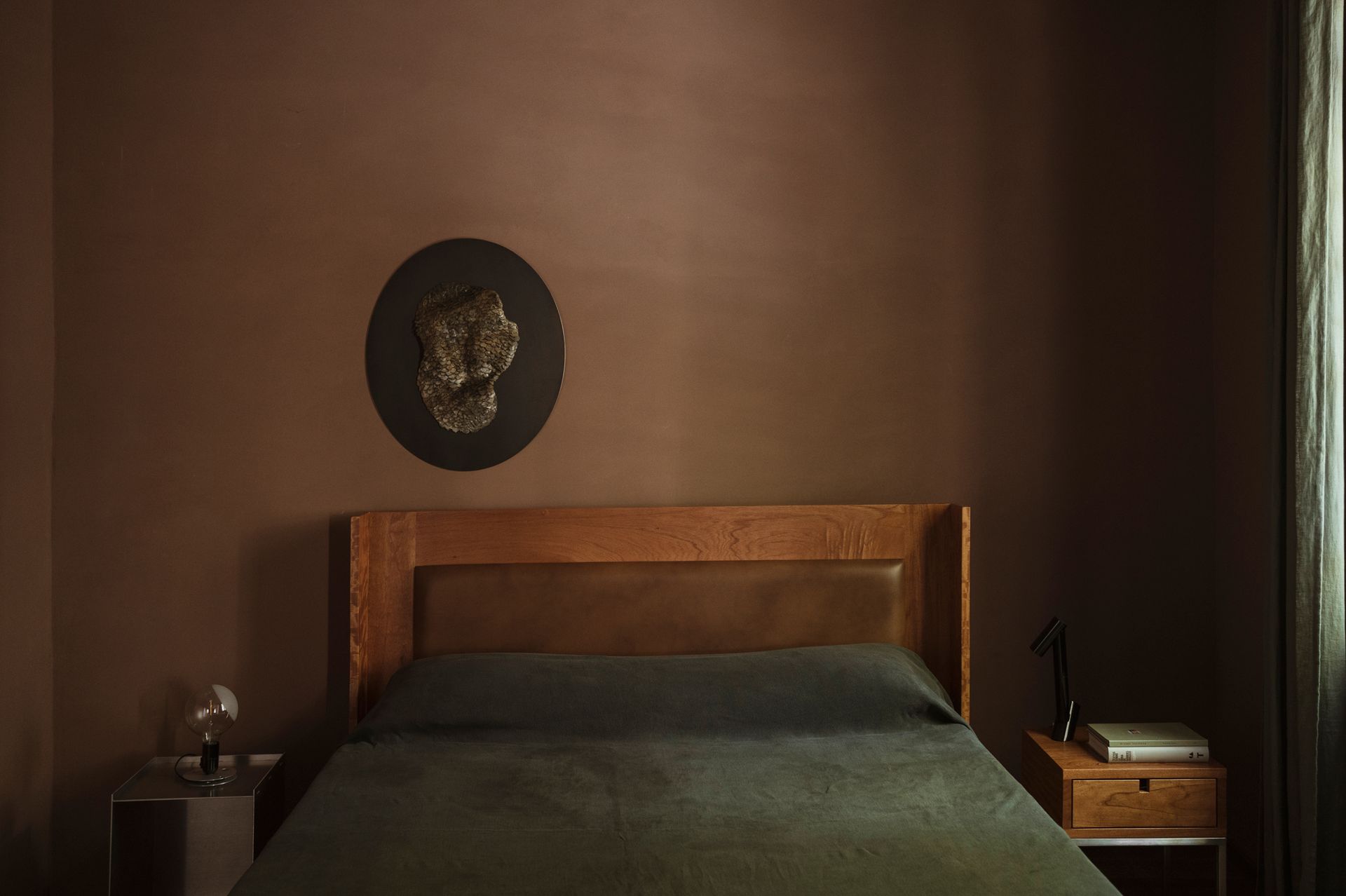
Another plaster finish was used to bring a grainy textured to the wall in the main bedroom, applied to feel modern yet rustic, adding depth than a standard paint couldn't portray. The room is color drenched in a pinky-brown - a dark color scheme that once again straddles this home's relationship between contemporary design and more naturalistic elements. 'I think the moody color palette also helps the room feel like a calming and soothing space,' Chloé explains.

If there's one place Chloé does use visual tricks to make the home feel larger, it's in the bedroom storage. 'The mirrored doors on the closet in the primary bedroom definitely help that room feel larger, and they reflect light beautifully.' The unit, a simple off-the-shelf purchase, has been customized with large panes of mirror, helping what could be a monolithic block of storage recess against the richly colored walls.
Be The First To Know
The Livingetc newsletter is your shortcut to the now and the next in home design. Subscribe today to receive a stunning free 200-page book of the best homes from around the world.

Hugh is the Editor of Livingetc.com. From working on a number of home, design and property publications and websites, including Grand Designs, ICON and specialist kitchen and bathroom magazines, Hugh has developed a passion for modern architecture, impactful interiors and green homes. Whether moonlighting as an interior decorator for private clients or renovating the Victorian terrace in Essex where he lives (DIYing as much of the work as possible), you’ll find that Hugh has an overarching fondness for luxurious minimalism, abstract shapes and all things beige. He’s just finished a kitchen and garden renovation, and has eyes set on a bathroom makeover for 2024.
-
 5 Trees You Should Prune in Your Backyard in February — 'It Makes Much Sense to Cut These Ones Back Now'
If you think pruning trees is best left to spring, think again. These trees all could use some cutting back now for several very important reasons
By Hugh Metcalf Published
-
 The 4 Things People With Really Organized Kitchen Drawers Always Have
Level up your ‘drawer decor’ and keep things tidy and organized with these 4 essential ideas for uncluttered storage
By Becca Cullum-Green Published
