Before & After – Singer Mayer Hawthorne transformed his Spanish-style LA bungalow into a rustic boho haven
The musician and his wife renovated the home themselves, infusing original features with their organic modern rustic style


Nestled in the artsy enclave of LA's Los Feliz hills lies the Spanish-style bungalow belonging to Drew Cohen, better known by his stage name Mayer Hawthorne. On top of his many accolades, the Grammy-nominated singer, DJ, and producer can now add the title of home renovator to the list, having transformed his quaint home into a calming modern rustic retreat.
Before Drew and his wife Karina set to work on the project, the home lacked any notable character or personality. Despite the modern styling and tasteful decor, there were many dated features, including kitsch, Miami-Vice-looking light fixtures that looked totally out of place. However, there were also beautiful original features that the couple wanted to retain, too. Originally built in 1937, the property has characteristic Deco and Spanish influences, and those inspired Drew and Karina's vision for their new home.
'It was our first time remodeling a house and we learned so much,' the couple explain. 'The best advice we got was to let the style of the house dictate the design, so we tried to honor the Spanish and Art Deco aesthetic while still infusing some of our own unique character into the design.' Here, we take a peek inside to see how that manifested in the finished result of their modern home.
Living Room

Before
Before the renovation, the main living room - referred to by the couple as 'the view room' due to its panoramic vistas of the surrounding hillside - was a wonderfully light and airy space, but fell short of any cohesive styling. Modern furniture including intriguing geometric side tables offered a comfortable zone to relax, but there were no noteworthy details in terms of interior design.

After
Since the couple worked their magic however, a real sense of life has been breathed into the space. Lighter flooring and a darker wood stain on the paneled ceiling refresh the room, creating a crisp, clean, and contemporary feel.
'We also replaced some cloudy glass in the windows and added a vintage George Nelson bubble lamp that was made in Michigan where Andrew (Drew) grew up,' says Karina. Despite some more modern furniture updates, they generally kept to a neutral theme with a rustic, bohemian vibe that feels distinctly Californian. As Karina adds: 'Trends come and go but California never goes out of style.'

After
The boho living room also features a DJ booth where Drew hosted 'Wine & Vinyl', a weekly livestream on YouTube. 'One of the big challenges was finding a home for Andrew’s massive vinyl record collection,' says Karina. 'We ended up taking a corner of the view room and building custom shelving to wrap around the walls. The DJ console was built by Colin Sonnichsen and was based off of an old Charlotte Perriand sideboard.'
Notably, the pair decided to tone down the color palette here, too. 'Natural wood is warm and beautiful and timeless, and we have a lot of art so we kept the palette neutral to let the artwork shine,' Karina says. 'The lighter-toned furniture helps to not distract from the real star, which is obviously the view.'
Kitchen

Before
Of all the rooms in the home, it was the 80s kitchen that was seriously crying out for some TLC. Prior to the remodel, the floors were uneven and warped, with heavy wood cabinetry that felt oppressive in such a small space. A faux cabinet door was even used to disguise the garage access.

After
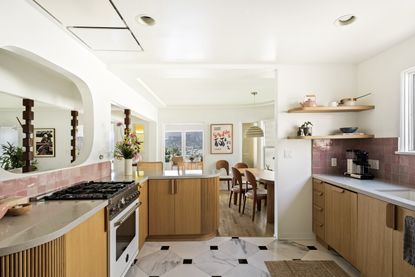
Now, though, the space is brimming with charm. Drew and Karina used pink Zellige tiles for the backsplash which contribute an organic textured theme in line with the home’s Spanish feel. Custom oak and walnut built-ins also bring warmth, depth, and character while the marbled monochromatic kitchen floor tiles introduce a more modern touch.
To create the illusion of more space, they made some subtle changes that didn't require an entire restructuring of the walls. 'The original kitchen was completely closed off from the living room, so our solution was to cut out a large rounded rectangular window within the wall,' explains Drew. 'We also added a beam and raised the ceiling over the peninsula as well.'
Dining Area

Before
The original adjoining dining room had worthy features such as the cute breakfast bar that oversaw the kitchen and the curved wall that hugs the space, but the organic modern decor fell a bit flat. It was clear that a little more tonality was needed to create some depth.

After
So that's exactly what the couple did. Despite sticking with neutral wooden hues, the varied tones and textures now make for a far more dynamic space. A Mid-century influenced dining table adds an element of sophistication, while the custom banquette features Alexander Girard fabric and cognac leather from Maharam for some much-needed attention to textiles.
'We’re big breakfast people, so we really wanted that banquette,' says Drew. 'The design took some trial and error but eventually, we got it right. It allowed us to have a bigger table and more seating, and the three large storage drawers underneath are really convenient as well. The Alexander Girard checkerboard fabric from Maharam was a shout-out to crossword puzzles, which we’re kind of obsessed with!'

This reeded side table is perfect for mastering a modern organic style in your home. The round drum shape is simple and elegant, and the reeded accents of the silhouette offer a textured look to add visual interest to your space.

A woven jute rug is a super versatile choice for a boho interior style like the one shown here. Offering the perfect natural base to any space, they're a great flooring idea for more minimalist schemes.

Woven lampshades are all the rage, the textured material allowing just enough light to seep through for a soft and cozy glow. This pendant from Walmart is made of bamboo which creates a natural, organic feel in your space.
Family Room

Before
A preference for a modern rustic style was evident before the transformation, but the color palette in the family room was dominated by grey tones, giving it a dated feel.

After
To modernize this second living area, the couple injected some subtle colors with a soft peach sofa and varied wood tones. It now feels far cozier, too, with the tufted rug offering more comfort underfoot.
Attention to small details results in a more harmonious and cohesive space, such as the way in which the dark wooden sideboard echoes the tones in the pillars and window trim. 'Those dark walnut pillars are actually vintage JBL Aquarius IV speakers from the 70s,' Drew explains. 'We love the structural look of them. The other rooms are all lighter colors and white oak so it was nice to switch it up in the living room.'
Bathroom

Before
The previous bathroom was seriously dated, with clashing red and blue patterned tiles overwhelming the space. It certainly wasn't the sort of bathroom you'd feel able to relax in easily.

After
Now though, the modern bathroom has the spa-like feel we're all searching for in self-care spaces. Notably, Drew and Karina decided to retain the intriguing tiling idea but with more calming colors, only extending the tiles part way up the walls so as not to dominate the room.

The primary bathroom has the same calming effect. Here, the couple raised the ceiling slightly and put a larger window in with new vertical privacy glass to let in more light.
Besides that, the white theme does wonders for creating a clean aesthetic and an airy atmosphere. 'During the pandemic it was really difficult to find certain materials so we drove to five or six different stores to cobble together enough of the white subway tiles,' Karina goes on to explain. 'We couldn’t find any vanities that we liked so we took a vintage John Van Koert walnut dresser and dropped a deco-style Kohler sink in the top then made the mirror ourselves using small Zellige tiles.'
Music Room

Last but not least, the music room couldn't go without a mention. Originally a bedroom, this room has beautiful views overlooking the hills, making it the perfect space to inspire Drew's creativity. 'The diagonal orientation of the desk helps with acoustics and opens more to the fantastic view of Griffith Park out of the window,' he says. 'Most recording studios are dark and dungeon-like, so it’s great to have this organic feeling space with so much natural light.'
Be The First To Know
The Livingetc newsletter is your shortcut to the now and the next in home design. Subscribe today to receive a stunning free 200-page book of the best homes from around the world.

Lilith Hudson is the News Editor at Livingetc, and an expert at decoding trends and reporting on them as they happen. Writing news, features, and explainers for our digital platform, she's the go-to person for all the latest micro-trends, interior hacks, and color inspiration you need in your home. Lilith discovered a love for lifestyle journalism during her BA in English and Philosophy at the University of Nottingham where she spent more time writing for her student magazine than she did studying. After graduating, she decided to take things a step further and now holds an MA in Magazine Journalism from City, University of London, with previous experience at the Saturday Times Magazine, Evening Standard, DJ Mag, and The Simple Things Magazine. At weekends you'll find her renovating a tiny one-up, one-down annex next to her Dad's holiday cottage in the Derbyshire dales where she applies all the latest design ideas she's picked up through the week.
-
 How to Thaw a Frozen Pipe — Learn Everything You Need to Know in 5 Minutes With This Guide
Winter storm caught you off guard? We asked an expert — just how do you thaw a frozen pipe?
By Hugh Metcalf Published
-
 The 12 Very Best Silk Bedding Pieces — As Our Style Editor Says: 'It's What Dreams Are Made Of!'
Slumber in lustrous luxury with the very best silk bedding sheets, duvets, pillowcases, and more — your sleep score will thank us later
By Julia Demer Published

