Boho living rooms - the 9 rules interior designers use to make spaces feel full of personality
Boho living rooms are full of pattern, color and objets so getting the curation right needs expert design advice

Boho living rooms are hard to categorize, because the essence of boho style is relaxed, free-spirited and personal. There is no one way to get them right. But that just makes for an ideal design philosophy for a living room, given its ability to create optimal conditions for comfort and conversation. No white-sofa anxiety, no need for dull design conventions, and not even really any such thing as an object out of place - it’s about as forgiving as an interior style can be. A boho living room is a place for fun, for richness, for abundance, for color, for clashes, for culture, for history, for rebellion.
However, all that could spell a lethal interior design cocktail. Achieving that “perfectly thrown together” spirit takes anything but, notes the American interiors writer Carl Dellatore in his forthcoming book More is More is More: Today's Maximalist Interiors . “Designers know there is a difference between curated and cluttered rooms,” he writes. “For example, interior designers understand the subtle ways to link the objects in a room to form a narrative, telling a story as the eye lands on each element and then moves to the next.”
It’s as the South African interior designer Hubert Zandberg says, “If it's a calm conversation between the objects, there can be any number of them involved in the conversation if the moderator - the designer - does their job.” Here are a few more tips for striking just the right note.
Boho living rooms, and how to design them
1. INTRODUCE AN ELEMENT OF SURPRISE

It’s all too easy to fall into the trap of boho cliches - the brass pineapple, the flamingo light, the cabbage leaf dinnerware. The last thing you want is for your furnishings to become, well, part of the furniture and be rendered essentially invisible because of their ubiquity. You want to jolt your visitors with the unexpected, with something that sparks wonder and of course conversation. Something perhaps like a gymnast’s pommel horse, as shown in this boho living room here. (It’s not actually such a crazy idea - you can use it for both storage and seating.)
“I like the idea of a folly - to bring something into the mix that is out of context, that throws it off,” says the American vintage shop-owner Sean Scherer, author of Sean Scherer's Kabinett & Kammer: Creating Authentic Interiors .
Such surprises don’t just lend visual pleasure, says Sean: “They lighten the mood, and in turn that makes the interior more comfortable; they put people at ease - as opposed to the perfectly-perfect interiors that we’re seeing a lot of in home design at the moment. People become really uptight in those places.”
2. KEEP A SENSE OF HUMOR TO HAND

What could be better than a stuffed bookshelf of well-loved books - and even better, where all the books have received the same monochrome memo? Well, perhaps the fact that there isn’t actually a single book on the non-existent bookshelf, but instead a playful trompe l’oeil living room wallpaper by the British print artist Deborah Bowness. Boho style is nothing if not an opportunity for humor and for suggesting that all is not as it seems - this isn’t an aesthetic for emptying the mind but for amusing and stimulating it.
It’s something that the designer of this house, Sue Miller of the cult consultancy Mad Cow Interiors understands implicitly. She worked together with Deborah to create the bespoke wallpaper - the fun, she says, is in making people look twice. Those books are deliberately “cluttered and messy”, she says. “That's the appeal.” It also makes them look more authentic - ironically.
3. SOURCE FROM A SALVAGE YARD

You can get the boho look by bringing all manner of boho-inspired furniture and furnishings into your home, but you’ll take it to a whole new level if you can alter the fabric of your place. The renowned interior designer Sera Loftus, whose London home had been modernized - aka stripped of any period details and charm - in the 1980s by a property developer, found this antique French limestone fireplace in an architectural reclamation yard and installed it in her living room (she also stripped the holding wall back to bare bricks).
“It adds so much history to an apartment that has no history,” she says. “It brings charm and romance.” The fact that it is “really chipped” doesn’t matter in the slightest, adds Sera. “It just adds to the charm. I don’t like things to be perfect - it’s just a beautiful, relaxed way of living.”
4. BALANCE THE BUSY-NESS WITH SPACE AND STRUCTURE

Achieving a sense of calm when you have a long inventory of objets is quite the feat. The living room of this city apartment, designed by the South African interior designer Hubert Zandberg, offers both intrigue and depth, but also ample serenity.
“I don’t believe that heavily layered rooms make people feel less calm,” says Hubert. In order to create calm “out of the cacophony”, Hubert thinks of installations as still lifes, he says, “but in a Cubist way - essentially, everything becomes a Mondrian painting.”
He is also drawn to the Brazilian aesthetic, “which starts with a modernist cornerstone and is then loosened up with a bossa nova feel - it means it’s less easy for it to become a mess.”
Think right angles and angularity - these homogeneous, leather-bound books help with that (they’re actually not fakes, says Hubert, as the client collects them). Taking a monochrome approach to color is also advised, as in this brown living room: “That calms the whole thing down” though it can look quite moody, so to make it sparkle, Hubert brings in “jewelry” - here glass and metal. After all, he says, “Every outfit needs a good brooch.”
5. GO ALL OUT ON A WALLPAPER YOU CAN LOSE YOURSELF IN

A bare wall can present a big task when it comes to conjuring a boho vibe. Let a busy wallpaper do the hard work for you - eyes will immediately drift towards a picturesque wall design given half a chance, and there are so many beautiful options available, with which you can set the mood.
Here, the designer Rachel Chudley used a busy, dark William Morris-printed wallpaper, with coppers and golden woods, “to accentuate the feeling of a warm glow in the room”, she says. “Rather than trying to turn this room into one that was light and airy, I worked with the fact that it had a natural cozy feeling. I like to use Morris designs in unlikely areas to give them a new perspective and lease on life.”
6. EMBRACE KITSCH (AND COURAGE)

The essence of boho is brave and busy, and the absolute opposite of sterile. This media room by the interior design agency Creative Tonic, which appears in the American interiors writer Carl Dellatore’s new book More is More is More , is “exactly what it would feel like to step inside a genie bottle for movie night,” says its creator Courtnay Tartt Elias. “It’s inspired by the opulent interiors of the belle époque era with a nod to Maison Jansen,” she explains.
But in the wrong hands, the combination of animal print, bubble-gum pink, clashing prints and one massive statement sofa could be a visual catastrophe. It works, says Carl, because "the repeating shades of pink and green work to unify the space. But it's also the inherent movement in the patterns - the stylized palm fronds on the upholstery, the leopard carpet and the waving-ribbon wallpaper - that dynamically draw you around the space. It's a subliminal detail, but as Mrs. Vreeland declared, ‘The eye must travel!’”
7. USE PLANTS TO ADD RICHNESS

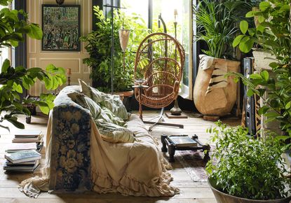
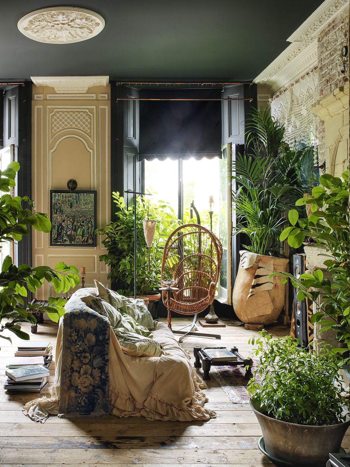
This one’s for the commitment phobes. If you’re not quite sure boho is for you, consider adding a rich layer of detail by decorating with plants. The interior designer Sera Loftus advises buying both big and small, mixing all the plants together and playing around with the placement of them “until it feels right - you have to be quite brave”. It is, she adds, “important that you put your plants in lovely urns and vases”, or for a cheaper option, “really beautiful baskets”, and advises opting for plants that are easier to look after (she recommends Kentia palms and cheese plants).
You can even go one boho step further, Sera suggests: “Put a backlighter (with a warm lightbulb) behind each plant, so that their shadows go all over the walls at nighttime - it brings the whole place alive.” And of course introduces a layer of pattern to your living area. And if it is too much of a leap, you can always place the plants in a more orderly fashion for a natural living room vibe.
8. Embrace old things

If you looked up boho style in the text books, you’d probably discover that officially the aesthetic takes inspiration from the 1960s and 1970s. But remember - there are no real rules here, only suggestions, and besides, if you decked out your maximalist living room only in artifacts from the swinging sixties and the psychedelic seventies, it might all start to look all a bit Mork & Mindy, a bit pastiche.
More generally though, vintage and antique pieces “add an authenticity that a brand new piece of furniture can’t”, notes the vintage specialist Sean Scherer. “If you try to do it with all new pieces, it would be too cold. You need old pieces that are worn and textured - that’s what creates the sense of comfort; it makes it more down to earth. That’s key to boho.”
Sean advises against anything that is too themed, however: “You don’t want them to come across too ‘these are from my international travels’”. The pieces Sean favors are mostly utilitarian, and, he says, “just happen to be beautiful from their years of use, rather than being made to be aesthetic.”
9. FILL SPACE WITH A BEAUTIFUL SCREEN

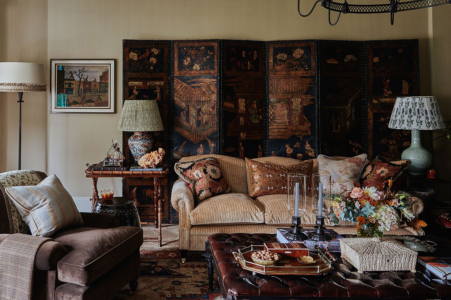
Possibly one of the biggest challenges of putting together a boho interior is finding the things - and the right things - to fill the space. Enter the folding screen - a problem-solving panacea which brings richness, shape, depth and - critically - volume to a room.
“I adore screens,” says the interior designer Hubert Zandberg. “As well as bringing another layer against which you can style, it’s also good for hiding stuff, for dividing rooms, for introducing another layer, and for softening a corner.” Plus it brings in that sense of travel and culture, he adds. “And it’s often a much less expensive way of bringing craftsmanship into a room - if you don’t have the Old Master to hang there, you can buy a good quality Chinese lacquer screen. Decoratively, it does the same thing.”
Be The First To Know
The Livingetc newsletter is your shortcut to the now and the next in home design. Subscribe today to receive a stunning free 200-page book of the best homes from around the world.
Fleur Britten is a well-respected journalist who for years was the Senior Features Editor at Sunday Times Style. She is known as one of the smartest lifestyle journalists around, revered for being able to decode trends and report on new zeitgeists as they happen. She now writes for the Telegraph, Livingetc, Vogue, The Times, Harper's Bazaar and the Guardian.
-
 5 Things You Should Never Store in Your Shed, According to Experts
It's crucial to be mindful about the objects you choose to store outdoor spaces
By Katie Baxter Published
-
 What are the Most Comfortable Pillowcases? From Temperature Regulating to the Best for Your Skin
When you're looking for comfort in your pillowcases, material matters. These are the best you can buy
By Faaizah Shah Published

